5 Cool CSS Hover Effects You Can Copy and Paste
Need a cool hover effect for something on your site? Look no further! We’ve created several custom examples that you can view live for inspiration.
If you like the effect, steal it! We’ve got the CSS ready and waiting for you to copy.
Bring Your Boring Site to Life
Hover effects can make your site feel much more dynamic and alive. It used to be the case that JavaScript was required to do anything really interesting with a hover effect but these days CSS3 is capable of doing a ton of really cool stuff if you’re creating enough.
The effects we’ll be using today all use code that is supported by modern browsers, meaning of course Mozilla and Webkit for the most part. IE support is spotty at best across various versions so be sure to test thoroughly in your own implementation. Fancy hover effects are one of those things that you can usually degrade fairly gracefully so that older browsers still see some change.
Bump Up
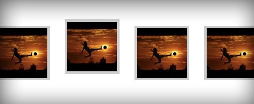
Live Demo: Click Here to Launch
This works best when you have a series of horizontal items. That way when you run your mouse across them you get a nice wave effect.
This one is super easy to implement and there are in fact several ways to go about it. What I did below is just apply a margin to each image and then reduced that margin on hover. The margin starts at 15px, then reduces to only 2px on hover, which makes the image jump up. You could easily use this same effect on text items if they were in a list.
The transition here is completely optional as the effect still works quite well without it. Just to make it a little smoother though I threw in a quick animation set to ease-out, which I thought provided the best effect for this particular subject.
Bump Up CSS
.ex1 img{
    border: 5px solid #ccc;
    float: left;
    margin: 15px;
    -webkit-transition: margin 0.5s ease-out;
    -moz-transition: margin 0.5s ease-out;
    -o-transition: margin 0.5s ease-out;
}

.ex1 img:hover {
    margin-top: 2px;
}
Stack & Grow
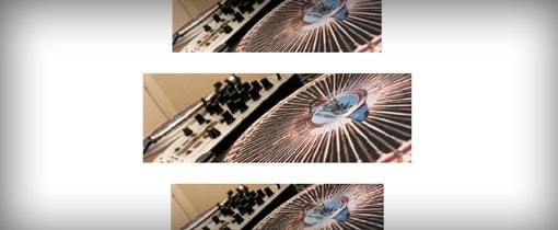
Live Demo: Click Here to Launch
For this one I wanted a sort of lava lamp effect so that as you move your mouse down the list, each image slowly expands and then goes back to its original size.
To accomplish this, I inserted a stack of images that were 400px wide by 133px tall. I then sized those images at 300px by 100px in the CSS and expanded on hover. Since I had a center alignment, the new size of the image threw off my alignment, a negative margin set to half the size of the growth in the width addressed this problem.
Stack & Grow CSS
/*Example 2*/
#container {
	width: 300px;
	margin: 0 auto;
}

#ex2 img{
    height: 100px;
    width: 300px;
    margin: 15px 0;
     -webkit-transition: all 1s ease;
    -moz-transition: all 1s ease;
    -o-transition: all 1s ease;
}

#ex2 img:hover {
	height: 133px;
	width: 400px;
	margin-left: -50px;
}
Fade Text in
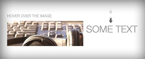
Live Demo: Click Here to Launch
For this one I wanted to create a JavaScript-like event where you could hover over one item and see an effect on another. What I’ve done to accomplish this is to throw some text and an image into a div and then float everything left so that the text is in line with the image. Next, I applied color: transparent and line-height: 0px to the div. This places the text at the top of the div and hides it.
To make the text appear on hover, I simply changed the color and line-height. When you hover over the image, the text zooms into view! It’s a pretty neat trick considering it’s all CSS.
Fade Text In CSS
#ex3 {
	width: 730px;
	height: 133px;
	line-height: 0px;
	color: transparent;
	font-size: 50px;
	font-family: "HelveticaNeue-Light", "Helvetica Neue Light", "Helvetica Neue", Helvetica, Arial, sans-serif;
	   font-weight: 300;
	text-transform: uppercase;
	-webkit-transition: all 0.5s ease;
	-moz-transition: all 0.5s ease;
	-o-transition: all 0.5s ease;
}

#ex3:hover {
	line-height: 133px;
	color: #575858;
}

#ex3 img{
	float: left;
	margin: 0 15px;
}
Crooked Photo
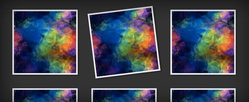
Live Demo: Click Here to Launch
This one is super simple but it’s a great effect for a thumbnail gallery. The basic premise is that you create a grid of images and then set the images to rotate when you hover over them, creating the illusion of a crooked photo hanging on a wall.
We’ll use lots of newer, browser-specific CSS on this one so you might want to add in something for older browsers as well. Our gallery will use box-shadows (optional), transitions and transforms to pull off the effect we want. The transform will handle the rotation and the transition will make it nice and smooth.
To take this one even further, you could use pseudo-selectors to make the images lean in different directions.
Crooked Photo CSS
#ex4 {
	width: 800px;
	margin: 0 auto;
}

#ex4 img {
	margin: 20px;
	border: 5px solid #eee;
	-webkit-box-shadow: 4px 4px 4px rgba(0,0,0,0.2);
	-moz-box-shadow: 4px 4px 4px rgba(0,0,0,0.2);
	box-shadow: 4px 4px 4px rgba(0,0,0,0.2);
	-webkit-transition: all 0.5s ease-out;
	-moz-transition: all 0.5s ease;
	-o-transition: all 0.5s ease;
}

#ex4 img:hover {
	-webkit-transform: rotate(-7deg);
	-moz-transform: rotate(-7deg);
	-o-transform: rotate(-7deg);
}
Fade In and Reflect
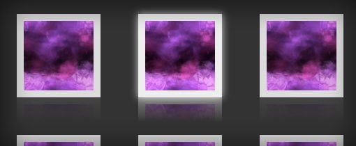
Live Demo: Click Here to Launch
This one is pretty complicated so I had to wrestle with it quite a bit before I came up with an effect that I liked. The default state of the image is at a slightly reduced opacity. Then, when you hover over it, the opacity cranks to full, a glow appears around the edges and a reflection (Webkit only) pops up.
Unfortunately, the reflection isn’t something that responds to a transition, so it sort of just pops in right away while the rest fades in, but it’s still a pretty nice overall transition.
If you’re confused about how CSS reflections work, you can read all about them in a great article from David Walsh.
Fade In and Reflect CSS
#ex5 {
	width: 700px;
	margin: 0 auto;
	min-height: 300px;
}

#ex5 img {
	margin: 25px;
	opacity: 0.8;
	border: 10px solid #eee;

	/*Transition*/
	-webkit-transition: all 0.5s ease;
	-moz-transition: all 0.5s ease;
	-o-transition: all 0.5s ease;

	/*Reflection*/
	-webkit-box-reflect: below 0px -webkit-gradient(linear, left top, left bottom, from(transparent), color-stop(.7, transparent), to(rgba(0,0,0,0.1)));
}


#ex5 img:hover {
   opacity: 1;

   /*Reflection*/
  -webkit-box-reflect: below 0px -webkit-gradient(linear, left top, left bottom, from(transparent), color-stop(.7, transparent), to(rgba(0,0,0,0.4)));

   /*Glow*/
  -webkit-box-shadow: 0px 0px 20px rgba(255,255,255,0.8);
  -moz-box-shadow: 0px 0px 20px rgba(255,255,255,0.8);
  box-shadow: 0px 0px 20px rgba(255,255,255,0.8);
}
Conclusion
These five examples should be enough to inspire you to create your own awesome CSS hover effects. Remember to experiment with these, combine them and add in your own flair to make them more interesting.
If you’ve spotted any cool hover effects around the web, we want to see them! Leave a comment below and link to a page with an example.