Build a Freaking Awesome Pure CSS Accordion
Who has two thumbs and loves to push the bounds of CSS? This guy. Let’s jump into a project that does just that. It’s pretty experimental and won’t pass the semantic police, but it’ll teach you a heck of a lot about advanced CSS tactics and will be tons of fun.
What we’re going to build is a pure CSS horizontal accordion slider. You’ll be able to insert as many slides as you want, each with unique content and each accessible via a click event, all without a lick of JavaScript. Impossible you say? Never!
What We’re Building
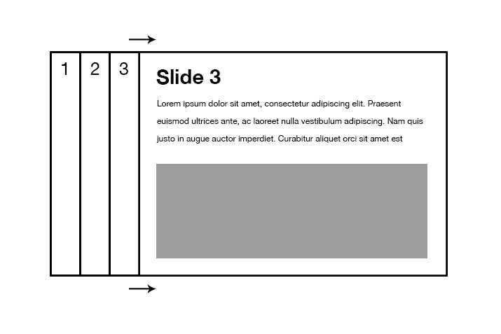
The end product of today’s efforts will be a sliding, animated and clickable horizontal accordion menu. We want a few narrow bars that, when clicked, expand to show hidden content.
Demo: Click here to launch.
Clickable CSS
As you well know, CSS doesn’t support click events, so how in the heck are we going to get this thing to move from slide to slide? We could take the easy way out and use a hover, but where’s the fun in that? Instead, let’s try something a little more difficult and hijack a set of radio buttons.
With radio buttons, we have everything we need: a group of clickable items where only one can be selected and that selected item is easy to target and style. Perfect! Semantic? Not quite… If you want to do this in a way that’ll hold up under a peer review, use JavaScript. Today we’re simply pushing CSS as far as we can make it go to see if we can learn anything along the way.
Step 1: HTML Frame
Building a new web design project is like building a house. The first step is to get a basic but solid frame in place upon which you can build the rest. To accomplish this, we’ll lay down some starter HTML.
The first thing that we need is an unordered list inside of a form element. This seems a little weird at this point, but it’ll make more sense in a minute.
<form>
  <ul>
    <li></li>
    <li></li>
    <li></li>
  </ul>
</form>
Here each list item represents a slide. If you want five slides, you should have five list items. Our test project will use three slides. So why the form element? Let’s attack that next.
Inside of each list item, we’re going to place three elements: an input, label and div. The inputs will be radio buttons, which are attached to labels. Together, these two items will make up our accordion controls. The div will hold the content that we want inside of each slide.
<form>
  <ul>
    <li>
      <input id="rad1" type="radio" name="radio">
      <label for="rad1">1</label>
      <div class="accslide">
      </div>
    </li>
    <li>
      <input id="rad2" type="radio" name="radio">
      <label for="rad2">2</label>
      <div class="accslide">
      </div>
    </li>
    <li>
      <input id="rad3" type="radio" name="radio">
      <label for="rad3">3</label>
      <div class="accslide">
      </div>
    </li>
    </ul>
</form>
As I mentioned above, we’re using radio buttons here because they provide all of the functionality that we need to pull off this little feat. The problem of course is that they look like radio buttons. We can fix this though with the magic of CSS.
Step 2: Override the Form Styles
Our next challenge is to make ugly radio buttons pretty. Here’s what our HTML will look like without any styling:
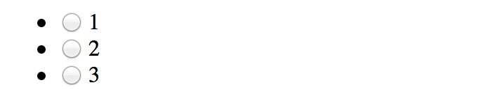
As you can see, between the list bullets and the radio buttons, we’ve got our work cut our for us. First things first though, before we do anything else, let’s toss out a lazy man’s reset:
* {
  margin: 0;
  padding: 0;
  -moz-box-sizing: border-box;
  -webkit-box-sizing: border-box;
  box-sizing: border-box;
}
This makes sure our margins and padding will work right across various browsers and that any padding won’t interfere with our explicitly stated dimensions. Border-box does this by manipulating the standard CSS box-model to be a little more user-friendly.
Clear the List Styles
Next, let’s tackle something easy. Those bullet points can be killed with a simple style block that I’m sure you’re familiar with.
/*LIST*/
ul {
  list-style: none;
}
Hide the Radio Buttons
Now it’s time to target the radio buttons and kick them off of the screen. To do this, we’ll simply set their position to absolute and then place them far away.
/*FORM*/
input {
  position: absolute;
  top: -9999px;
  left: -9999px;
}
Note that my selector here is super generic. If you’re placing this object into any project, make sure that you don’t target all inputs the way I’ve done here. Toss the entire thing into a div with a class and target only the inputs associated with that class.
Style the Label
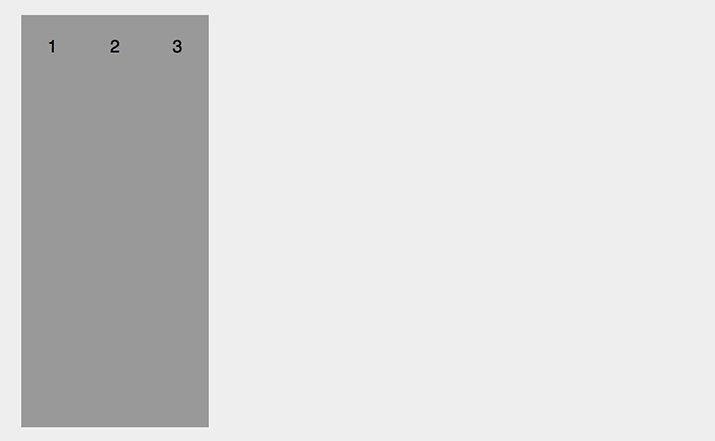
Now our radio button is hidden, but why the heck did we decide to do that? How are we going to control the accordion? The answer of course is that a radio button’s label serves as an alternate click point and can be styled more freely. This means that even with the radio button gone, our functionality will still be present in the labels, all we have to do is make them presentable.
label {
  display: block;
  float: left;
  height: 330px;
  width: 50px;
  margin-bottom: 10px;
  overflow: hidden;

  background: #999;
  text-align: center;
  font: 14px/50px Helvetica, Verdana, sans-serif;

  -webkit-transition: width 1s ease, background 0.5s ease;
     -moz-transition: width 1s ease, background 0.5s ease;
       -o-transition: width 1s ease, background 0.5s ease;
      -ms-transition: width 1s ease, background 0.5s ease;
          transition: width 1s ease, background 0.5s ease;
}
Here I’ve split my code up into three chunks so that we can walk through it easily. The first chunk governs the form factor of the label: it’s height, width, margin, overflow, etc. We’ve basically turned the labels into big rectangles that will sit right next to each other.
Next is the chunk of styles that governs the appearance of the labels. We’ve set the background to gray, center-aligned the text (the little numbers) and set the font size.
Finally, we set up some transitions so that the changes that we’re going to make later on will be animated.
Step 3: More Label Styling
With that last chunk of styling, we’ve completely transformed our boring old radio buttons into something that looks a lot closer to what we’re looking to achieve.
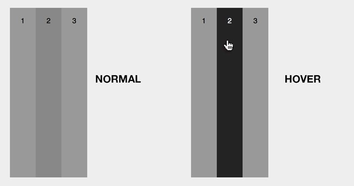
I don’t like that there’s no definition between the three tabs though, so let’s help this along with a little more styling.
#rad2 + label {
  background: #888;
  -webkit-transition: width 1s ease, background 0.5s ease;
     -moz-transition: width 1s ease, background 0.5s ease;
       -o-transition: width 1s ease, background 0.5s ease;
      -ms-transition: width 1s ease, background 0.5s ease;
          transition: width 1s ease, background 0.5s ease;
}

label:hover, #rad2 + label:hover {
  background: #232323;
  color: #fff;
  cursor: pointer;
}
Here we’ve darkened the second tab so that it stands out between the first and third tabs, added another transition, and set the hover styles to darken the tabs even further when the user mouses over them. This will make our tabs look much better:
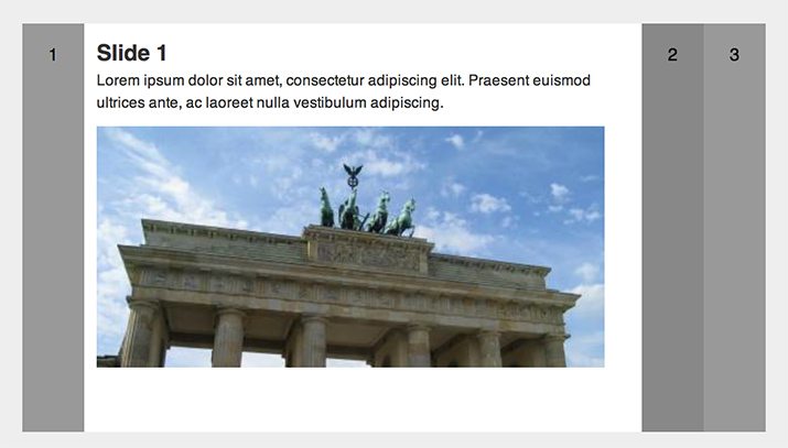
Step 4: Slide HTML
Now that we’ve got our tabs looking the way we want, let’s jump back and finish out our HTML. This content would’ve gotten in the way if we had inserted it before, but it should stay hidden now.
<form>
  <ul>
    <li>
      <input id="rad1" type="radio" name="rad">
      <label for="rad1">1</label>
      <div class="accslide">
        <h2>Slide 1</h2>
        <p>Lorem ipsum...</p>
        <img src="http://lorempixum.com/420/200/city/1" alt="">
      </div>
    </li>
    <li>
      <input id="rad2" type="radio" name="rad">
      <label for="rad2">2</label>
      <div class="accslide">
        <h2>Slide 2</h2>
        <p>Lorem ipsum...</p>
        <img src="http://lorempixum.com/420/200/city/2" alt="">
      </div>
    </li>
    <li>
      <input id="rad3" type="radio" name="rad">
      <label for="rad3">3</label>
      <div class="accslide">
        <h2>Slide 3</h2>
        <p>Lorem ipsum...</p>
        <img src="http://lorempixum.com/420/200/city/3" alt="">
      </div>
    </li>
    </ul>
</form>
Basically, all I’ve done here is inserted a headline, paragraph and image into each slide. Feel free to use whatever content you wish, you can even vary the type of content per slide. Go nuts!
Step 5: Style the Slides
Almost finished! This is our fifth and final step. All we need to do is style up our slide content and then make sure that we widen the slide that is currently selected to reveal the hidden content. Let’s get to it.
Slide CSS
Our slide CSS is a lot like the tab CSS that we used before. If we float these as well, each tab will sit right next to its tab partner, you just won’t be able to see it because its with will be set to 0px.
/*SLIDES*/
.accslide {
  display: block;
  height: 330px;
  width: 0px;
  padding: 10px 0;
  float: left;
  overflow: hidden;

  color: #333;
  background: #fff;
  font: 12px/1.5 Helvetica, Verdana, sans-serif;

  -webkit-transition: all 1s ease;
     -moz-transition: all 1s ease;
       -o-transition: all 1s ease;
      -ms-transition: all 1s ease;
          transition: all 1s ease;
}

.accslide p, h2, img {
  width: 420px;
  padding-left: 10px;
}

.accslide img {
  margin-top: 10px;
}
As you can see, I’ve pushed and padded things around a bunch just to make sure everything looks right. Start here, take a look and then customize things to the way you’d like.
Expand When Selected
All this effort and the dang thing still doesn’t work yet! In fact, it doesn’t really do anything. Fortunately, our transitions are in place and everything is perfectly styled, so as soon as well tell the browser to expand the width of the slide when a given label is selected, we’ll be all finished.
This is by far the fanciest bit of CSS in the tutorial. That being said though, you won’t believe how simple it is to bring this whole thing to life:
input[type="radio"]:checked ~ .accslide {
  width: 450px;
}
That’s it! This is all the CSS we need to take our accordion from static to functional. So what’s going on here? I know that selector seems pretty mind-blowing, but it’s not as crazy as you think. Here’s a breakdown:
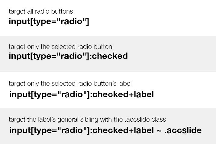
As you can see, what we’re doing is targeting the .accslide class, but if we did this alone we’d expand all of the tabs. What we do instead is select only the items with the .accslide class that are general siblings of the checked label. This way, only the tab that is partnered with the checked label will be expanded.
The funny little swoosh is the general sibling combinator, which looks for a sibling anywhere after the stated element.
Try it Out!
Congratulations, you’re all finished! Now let’s give this sucker a test drive. Click around on the various tabs to see content hidden and revealed.
Demo: Click here to launch.
Browser support here should be half way decent. It works great on modern browsers, and we’re not using anything that IE8 and above should get too upset about: a few transitions, box-sizing, and a fancy selector. If you run into problems with IE, try tossing in Selectivizr.
Conclusion
There you have it, with a little ingenuity and elbow grease, we’ve built a pretty fancy interactive element using nothing but HTML and CSS. If you’re open to the idea of hijacking either checkboxes or radio buttons, a lot of crazy stuff becomes possible! Leave a comment and let me know what you think. What would you have done differently?