Build a Responsive, Mobile-Friendly Web Page With Skeleton
Recently we published an article showcasing 20 Amazing Examples of Using Media Queries for Responsive Web Design. These web pages respond extremely well to different browser window sizes, from huge HD screens to smartphones.
Today we’re going to show you how to use a boilerplate called Skeleton to take the headaches out of designing and building a responsive web page. You’ll be stunned at how easy it is!
What Is Skeleton?
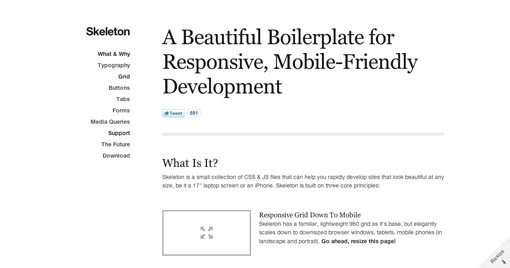
The Skeleton Home Page describes the project as “a small collection of CSS & JS files that can help you rapidly develop sites that look beautiful at any size, be it a 17″ laptop screen or an iPhone.”
Essentially, what Skeleton creator Dave Gamache has done is reform the aging 960 framework to better face the modern challenges presented by the wealth of devices that regularly access the web. Though the project also includes a few extra goodies like jQuery, today we’ll be focusing primarily on the layout aspect. Keep in mind that because this boilerplate is organized so well, it’s fairly easy to strip out anything that we don’t use. The author places a strong emphasis on customization: keep what you like, change what you don’t!
Sneak Peek
Live Demo: Click to Launch
Getting Started
Step one is to go download the project. After you’ve got everything downloaded and unzipped, open up the included HTML file and ditch everything inside of the container.
Before we get into building the page, it’s important to figure out how it all works. Skeleton is built on a grid framework, so if you hate grid frameworks, it’s not going to win you over. Feel free to stop reading now, leave a nasty comment about semantic web development and move on.
For those of you still interested, there are sixteen columns, each of which has a margin-left of 10px and a margin-right of 10px. With a total width of 960px for the container, here are the sizes for each column:
/* Base Grid */
.container .one.column			{ width: 40px;  }
.container .two.columns 		{ width: 100px; }
.container .three.columns 		{ width: 160px; }
.container .four.columns 		{ width: 220px; }
.container .five.columns 		{ width: 280px; }
.container .six.columns 		{ width: 340px; }
.container .seven.columns 		{ width: 400px; }
.container .eight.columns 		{ width: 460px; }
.container .nine.columns 		{ width: 520px; }
.container .ten.columns 		{ width: 580px; }
.container .eleven.columns 		{ width: 640px; }
.container .twelve.columns 		{ width: 700px; }
.container .thirteen.columns 		{ width: 760px; }
.container .fourteen.columns 		{ width: 820px; }
.container .fifteen.columns 		{ width: 880px; }
.container .sixteen.columns 		{ width: 940px; }
As with most column systems, your goal is to add up to the total number: 16. So if you want to split the page between two columns, you would create two separate divs and apply the classes “eight columns” to each.
There is some other helpful functionality that you should know as well, such as the ability to split the width by thirds. Simply apply the “one-third” or “two-thirds” classes, which are equal to 300px and 620px respectively.
.container .one-third.column 		{ width: 300px; }
.container .two-thirds.column	 	{ width: 620px; }
Also, to create gaps or empty columns, you add the offset classes: offset-by-one, offset-by-two, etc. Each of these essentially adds sixty more pixels of padding to account for the gaps in content.
Stylesheets
The code above comes from the included “skeleton.css” file. There are two other important CSS files as well: base and layout. The “base.css” file includes preset styles for typography, buttons, forms, tabs, etc. Most of what’s in here is completely optional and meant to be overridden by the user. If you think this boilerplate is too hefty for what you want to do or takes too much control, ditch this file.
The “layout.css” file is a heavily organized but still mostly empty stylesheet included for your convenience. This is where you will put any custom CSS that you want to add for your page. This CSS file also holds any extra @media queries that you might want to implement. The default queries are in “skeleton.css” and basically just apply a new width to all of the column classes when the window is reduced to certain sizes.
Web Page Step 1: Navigation
Now that we know the basics of Skeleton, let’s jump in and build a web page with it! We’ll keep the design nice and minimal to focus on how clean and organized everything comes out with almost no effort on your part.
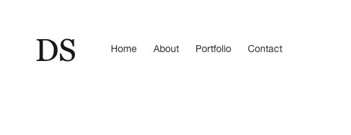
The first thing we want to add to our page is a simple logo element and some navigation links. Each of these gets its own div and we’ll give the first a width of two columns and the second a width of fourteen (2+14=16).
<div class="container">
	<div class="two columns">
	</div>

	<div id="nav" class="fourteen columns">
	</div>
</div><!-- container -->
Next, we’re going to put a simple “DS” for Design Shack in the first div and a list of links in the second div. We’ll stick with much of the default styling for the text just so you can get a feel for what the Skeleton styles are.
<div class="two columns">
	<h1>DS</h1>
</div>

<div id="nav" class="fourteen columns">
	<ul>
		<li><a href="#">Home</a></li>
		<li><a href="#">About</a></li>
		<li><a href="#">Portfolio</a></li>
		<li><a href="#">Contact</a></li>
	</ul>
</div>
Navigation CSS
Skeleton will take care of our layout and most of our text styling. All we need to do is add some vertical margins to put everything where we want it. I also decided to scrap some of the default link styling in favor or my own.
What I’ve done is applied some top spacing to the entire container just to bump it down a little. I’ve also moved the links down some because by default they were aligning with the top of the big “DS” and I wanted them near the middle.
.container {
	margin-top: 50px;
}

#nav {
	margin: 13px 0 0 0;
}

#nav ul li {
	display: inline;
	margin: 0 20px 0 0;
	margin-bottom: 130px;
}

#nav a {
	text-decoration: none;
}

#nav a:hover {
	text-decoration: underline;
}
With that, we’re off to a good start. The text styling from Skeleton is coming out great and definitely lends itself to the classic, minimal look we’re going for here.
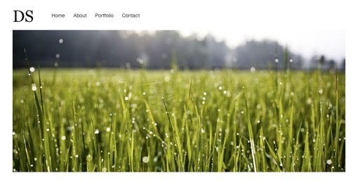
Step 2: Header Image
When designing a responsive web page, it’s important to understand how images work. Sure, anything that the browser renders can be resized but what happens when an image is too large for its contracting container?
To answer this question, let’s thrown in a huge image at the top of our page. To do this, we add in another div just like before. It’ll be the full width of our container so we need to apply the “sixteen columns” classes.
<div class="two columns">
	<h1>DS</h1>
</div>

<div id="nav" class="fourteen columns">
	<ul>
		<li><a href="#">Home</a></li>
		<li><a href="#">About</a></li>
		<li><a href="#">Portfolio</a></li>
		<li><a href="#">Contact</a></li>
	</ul>
</div>

<div id="headerImage" class="sixteen columns">
	<img src="images/field.jpg" />
</div>
CSS
Now, that alone puts our image into position but it doesn’t handle the browser size problem we mentioned. To accomplish this we need a little CSS magic. Notice that we applied the “headerImage” ID to this div, now we can target this image specifically with the following CSS.
#headerImage img {
	margin-bottom: 50px;
	max-width: 100%;
	height: auto;
}
The margins here are just to space this section out from the next step but the other two lines are very important. By setting the max-width to 100% and the height to auto, we effectively create an image that resizes according to its container.
You might be wondering why Skeleton doesn’t just do this for us, and the answer is that it does. This is actually in the code but has been commented out with the advice that it’s best not to globally apply it to all images but rather specific circumstances. This prevents it from breaking various slider and lightbox plugins.
With that, we have a nice big image at the top of our page that automatically adjusts as the page width is reduced! (Image Source: Nishanth Jois)
Step 3: Welcome Message
I’m calling this next section the “Welcome” section simply because I don’t have another good name for it. Now that we’ve tried a navigation area and an image, we still need to test out a pure text paragraph and one containing images mixed with text. This will be the former.
Building off of the same HTML we’ve already constructed, start a new sixteen column div and toss in a header and a paragraph as shown below.
<div class="two columns">
	<h1>DS</h1>
</div>

<div id="nav" class="fourteen columns">
	<ul>
		<li><a href="#">Home</a></li>
		<li><a href="#">About</a></li>
		<li><a href="#">Portfolio</a></li>
		<li><a href="#">Contact</a></li>
	</ul>
</div>

<div id="headerImage" class="sixteen columns">
	<img src="images/field.jpg" />
</div>

<div id="welcome" class="sixteen columns">
	<h1>Built with Skeleton</h1>
	<p>This page was built for Design Shack using Skeleton, an awesome framework for building responsive web pages...</p>
</div>
Welcome CSS
The only CSS we need to add is some bottom margins so we can again space it out a little. It should be pointed out that Skeleton has an “add-bottom” class that throws in some margins, but I like to have more control to set each item individually.
#welcome {
	margin-bottom: 20px;
}
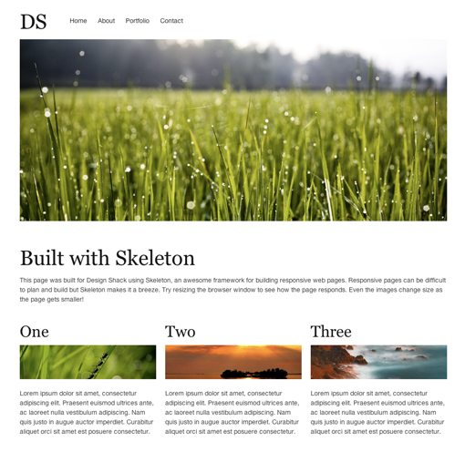
As you can see in the image below, everything just falls right into place. Despite their downfalls, grid systems sure do make layout easy!
Step 4: Three Columns
Now we’ve done a navigation section, an image by itself and a paragraph by itself. It’s time to create some columns that integrate text and images together. To accomplish this, we’ll use the “one-third” class that we learned about above. This will allow us to quickly split the width into three columns of content with almost no work on our part.
We’ll start with the block of HTML below. First we throw in an h2 tag, then an image and finally a paragraph of text.
<div class="one-third column feature">
	<h2>One</h2>
	<img src="http://lorempixum.com/400/100/nature/1" />
	<p>Lorem ipsum dolor sit amet...</p>
</div>
We’ll take this section and insert three of them in a row at the bottom of our HTML to finish off our project. This should give us three columns that span the width of the container, each containing a headline, image and paragraph.
<div class="container">
	<div class="two columns">
		<h1>DS</h1>
	</div>

	<div id="nav" class="fourteen columns">
		<ul>
			<li><a href="#">Home</a></li>
			<li><a href="#">About</a></li>
			<li><a href="#">Portfolio</a></li>
			<li><a href="#">Contact</a></li>
		</ul>
	</div>

	<div id="headerImage" class="sixteen columns">
		<img src="images/field.jpg" />
	</div>

	<div id="welcome" class="sixteen columns">
		<h1>Built with Skeleton</h1>
		<p>This page was built for Design Shack using Skeleton, an awesome framework for building responsive web pages...</p>
	</div>

	<div class="one-third column feature">

		<h2>One</h2>
		<img src="http://lorempixum.com/400/100/nature/1" />
		<p>Lorem ipsum dolor sit amet...</p>
	</div>

	<div class="one-third column feature">

		<h2>Two</h2>
		<img src="http://lorempixum.com/400/100/nature/2" />
		<p>Lorem ipsum dolor sit amet...</p>
	</div>

	<div class="one-third column feature">

		<h2>Three</h2>
		<img src="http://lorempixum.com/400/100/nature/3" />
		<p>Lorem ipsum dolor sit amet...</p>
	</div>
CSS
As before, we’ll need to make sure these images resize properly to their containers so we’ll throw in the max-width and height properties.
.feature img {
	margin-bottom: 15px;
	max-width: 100%;
	height: auto;
}
Testing it Out
With that, we’re all finished! Notice that we didn’t do anything at all with media queries to ensure that everything scales properly. All we did was build a site like we normally would. The magic of Skeleton is that it takes care of the complicated stuff for you!
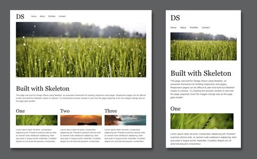
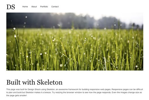
To test it out, launch the live demo and resize the window. Here’s the layout that you should see when the browser window is at full size:
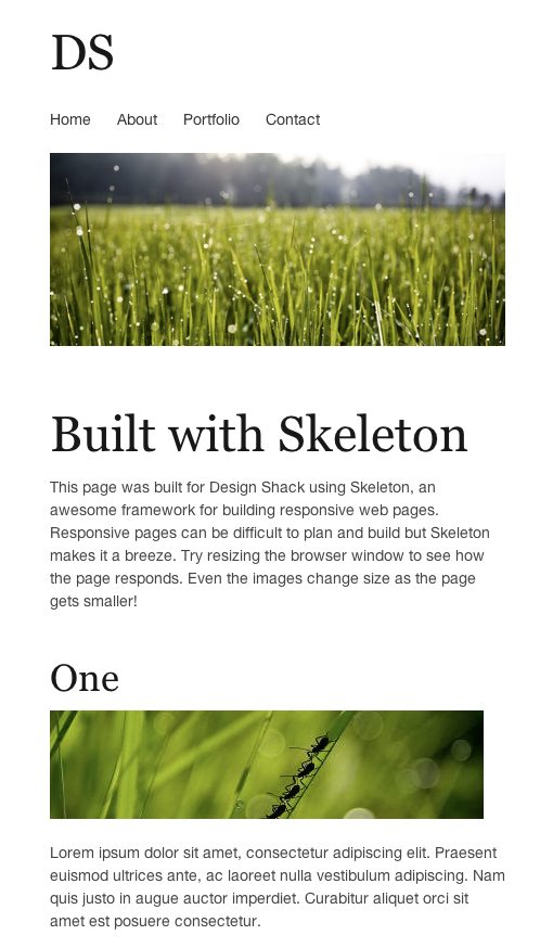
If we scale the window down a bunch, we see some dramatic changes. The layout completely reinvents itself, and the amazing part is, it still looks great! I didn’t even take the time to imagine what everything would look like when it was reformatted but here it is all nice and in a vertical stack.
To finish, you can customize the items in the images folder for your own purposes. Skeleton includes various visual resources such as the Apple Touch Icon for iOS devices and a favicon.
Conclusion
When I first started reading about responsive web design, I appreciated the obvious benefits but wasn’t too excited about the extra work that it takes to plan a website that fits any size device.
However, with a tool like Skeleton, the effort that it takes to make a webpage responsive is really quite minimal. If anything, it’s a good sample to look through and tear apart to see some good practices for implementing your own responsive system.
Leave a comment below and let us know what you think of Skeleton. Do you think that responsive web pages are worth the extra effort? Have you started making your designs friendly towards a wide range of devices?