Code a Simple Folded Corner Effect With CSS
This week we have yet another fun and simple CSS project for you to hone your coding chops on. This time around we’ll be creating the illusion of a page with one corner that has been folded over.
With the power of pseudo elements, we’ll create some CSS triangles that we can then push into place to create our page fold. Once we’re all finished, you’ll be able to simply apply a class to any div to add in the effect.
The Concept
Demo: Click here to launch.
Recently, I wanted to add a little bit of character to a simple text container and decided to try folding over one of the corners. With the help of an image, this is a pretty easy task. However, if we’re attempting to go a pure CSS route, it takes more time and effort.
The method that I came up with is surely not innovative, but I thought it was interesting enough to share here. Basically, what we need, in addition to a rectangular box, is two triangles. We’ll push these triangles into the positions shown below.
Once we have the triangles into place, we can change the top triangle to the same color as the background, and suddenly we’ve got our nice little page fold effect. Pretty easy!
Now that we have a plan in place, we can begin building our shapes using CSS. There’s really no great built-in methodology for creating triangles with CSS so we’ll have to turn to some border voodoo.
The HTML
To get started, create a div like the one shown below. I’ve thrown in a headline with a paragraph, one class for general page styles that we might want to reuse elsewhere and finally one class to apply the page fold effect (tl stands for “top left”, we’ll create another for a top right fold later).
<div class="page foldtl">
  <h2>Headline</h2>
  <p>Lorem ipsum dolor sit amet...</p>
</div>
</div>
That’s all we’ll need for now. Let’s jump over to our CSS and get this thing styled!
Page CSS
For the CSS, we’ll start by coding up the general look of our little page without the fold effect. I started by giving the background a nice dark color, then moved on to styling the actual page class. Give it a width, height and margin, and assign white to the background color.
As an optional step, I included a very subtle background gradient. As always, this takes an ungodly chunk of code if we’re trying to play nice with as many browsers as possible. If you feel that it’s not worth it, simply ditch the gradient.
body {
  background: #272822;
}

.page {
  background: #fff;
  width: 250px;
  height: 330px;
  margin: 50px;

 /* Optional Gradient */
  background: -moz-linear-gradient(top,  #ffffff 0%, #e5e5e5 100%); /* FF3.6+ */
  background: -webkit-gradient(linear, left top, left bottom, color-stop(0%,#ffffff), color-stop(100%,#e5e5e5)); /* Chrome,Safari4+ */
  background: -webkit-linear-gradient(top,  #ffffff 0%,#e5e5e5 100%); /* Chrome10+,Safari5.1+ */
  background: -o-linear-gradient(top,  #ffffff 0%,#e5e5e5 100%); /* Opera 11.10+ */
  background: -ms-linear-gradient(top,  #ffffff 0%,#e5e5e5 100%); /* IE10+ */
  background: linear-gradient(top,  #ffffff 0%,#e5e5e5 100%); /* W3C */
  filter: progid:DXImageTransform.Microsoft.gradient( startColorstr='#ffffff', endColorstr='#e5e5e5',GradientType=0 ); /* IE6-9 */
}
Now that we’ve got the basic container styled, it’s time to make the text a little better. For the h2, I made it nice and large and scooted it pretty far from the top so that it won’t get in the way of the page fold. Also, I used the Google Web Font Lilita One. Embedding this is as easy as copying and pasting the code given to you on the page in that link.
Finally, to finish off the text, I added some padding to the paragraph, set its font and made brought its color a few shades back from black to help set it off from the headline.
.page h2 {
  padding: 85px 0 0 20px;
  font: 400 35px/1.5 'Lilita One', Helvetica, sans-serif;
}

.page p {
  padding: 10px 20px;
  font: 12px/1.5 Helvetica, sans-serif;
  color: #4b4b4b;
}
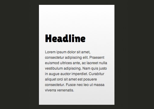
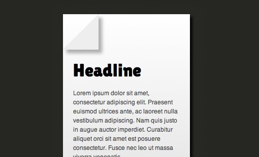
Progress Check
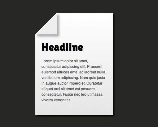
At this point, you should have a nice little page something like the one shown below. It’s not much to look at right now, but it’s a solid start.
CSS Triangles
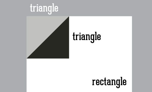
Before we proceed, we have to learn to make a triangle with CSS. To begin this process, create an empty div and give it a class of “triangle”. Now set both the height and width to zero but apply a really thick border to the bottom and the left sides (use two different colors). Here’s the result that you’ll get:
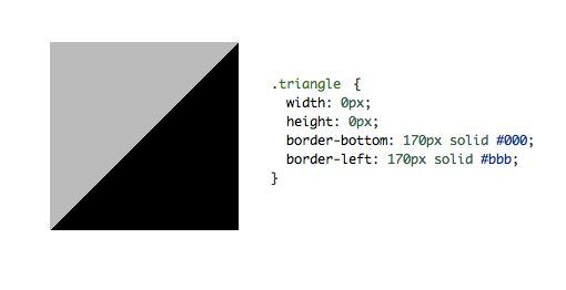
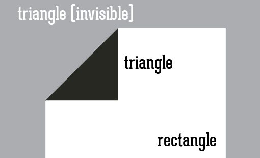
As you can see, this has created a square that’s split diagonally from the bottom left corner to the top right corner. Each border corresponds to one of the triangles that result. Now watch what happens if we turn one of those borders transparent:
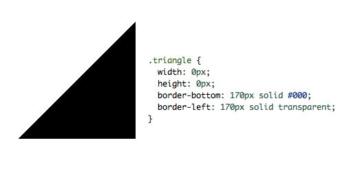
There you have it, a triangle made with pure CSS. We can even tweak the direction of the triangle by applying borders to different sides:
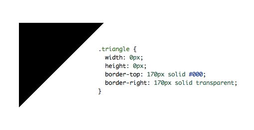
Make sure that you set the transparent border to the direction that you want the hypotenuse to be facing. So if you want it to face right, make the right border transparent. The reverse is true for the other borders. If you want the hypotenuse to face down, set the top border. If you want it to face up, set the bottom border.
Check out this Tinkerbin to see an example of all four options at work.
Folding the Page
Now it’s time to use this knowledge to fold the page over. To do this, we need to follow three steps. First, we’ll style the “foldtl” class that we set up before. Next, we’ll add one triangle using the :before pseudo element. Finally, we’ll add the second triangle using the :after pseudo element.
.foldtl {
  position: relative;
  -webkit-box-shadow: 5px 5px 5px rgba(0,0,0,0.8);
  -moz-box-shadow: 5px 5px 5px rgba(0,0,0,0.8);
  box-shadow: 5px 5px 5px rgba(0,0,0,0.8);
}
As you can see, all we’ve done for the main class is apply relative positioning (this helps the absolutely positioned triangles) and set a box shadow. As a side note, this project is much easier without shadows, but I wanted to make sure you knew that it could still work. You just have to make sure that the shadow is offset enough that it doesn’t stick out on the side with the page fold.
Now it’s time to create our first triangle. Call up the :before pseudo element, set its contents to nothing, absolutely position it to the origin, then use the triangle code we just learned above.
.foldtl:before {
  content: "";
  position: absolute;
  top: 0%;
  left: 0%;
  width: 0px;
  height: 0px;
  border-bottom: 70px solid #eee;
  border-left: 70px solid transparent;
  -webkit-box-shadow: 7px 7px 7px rgba(0,0,0,0.3);
  -moz-box-shadow: 7px 7px 7px rgba(0,0,0,0.3);
  box-shadow: 7px 7px 7px rgba(0,0,0,0.3);
}
As you can see, I set the size to 70px and the color to #eee, which is a little darker than the page color because this is the triangle that creates the fold over effect. Once again, the shadow has to be significantly offset to look right.
Cutout the Corner
To finish up, we need to position our second triangle to cut out that top left corner. This uses pretty much the same syntax as the last one, only the color of the triangle is the same as the body and the direction has been reversed.
It turns out that this step isn’t really necessary, see the Update section below for more information.
.foldtl:after {
  content: "";
  position: absolute;
  top: 0%;
  left: 0%;
  width: 0px;
  height: 0px;
  border-top: 69px solid #272822;
  border-right: 69px solid transparent;
}
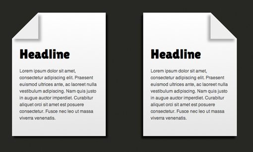
With that, our page fold effect is all finished! Here’s what it looks like:
Flipping It Around
Now that we’ve finished our top left page fold, it’s time to flip it around and see if we can pull off the same thing on the other side. The syntax is almost identical, just offset from the right instead of the left with your absolute positioning and flip your triangles around.
.foldtr {
  position: relative;
  -webkit-box-shadow: -5px 7px 5px rgba(0,0,0,0.8);
  -moz-box-shadow: -5px 7px 5px rgba(0,0,0,0.8);
  box-shadow: -5px 7px 5px rgba(0,0,0,0.8);
}

.foldtr:before {
  content: "";
  position: absolute;
  top: 0%;
  right: 0%;
  width: 0px;
  height: 0px;
  border-bottom: 70px solid #eee;
  border-right: 70px solid transparent;
  -webkit-box-shadow: -7px 7px 7px rgba(0,0,0,0.3);
  -moz-box-shadow: -7px 7px 7px rgba(0,0,0,0.3);
  box-shadow: -7px 7px 7px rgba(0,0,0,0.3);
}

.foldtr:after {
  content: "";
  position: absolute;
  top: 0%;
  right: 0%;
  width: 0px;
  height: 0px;
  border-top: 69px solid #272822;
  border-left: 69px solid transparent;
}
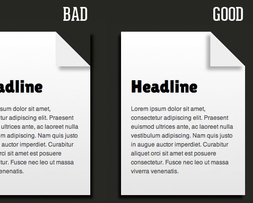
One thing that might trip you up here is the shadows, you’ll need to flip those as well otherwise the illusion will be ruined. This picture illustrates what I mean:
See It In action
Now that we’re all finished, it’s time to test drive this bad boy. Keep in mind that because we’re using :before and :after, IE7 and before won’t play nice. There are fixes available using JavaScript if that’s a major concern for you.
Demo: Click here to launch.
Update
Here’s the thing, sometimes a project like this makes sense in your head when you code it, then you come back later and realize that you were doing it all wrong! That’s exactly what happened here. Right after publishing this, I noticed that since my border trick split into two triangles on its own, I really didn’t need to go through the step of adding the :after section at all. The information above is still great to learn from so I’ll leave it alone, but here’s a better way to pull this off.
All we need to do is take the border that we were making transparent and set it to the background color. That alone serves as our second triangle, letting us cut off the :after section completely.
.foldtl {
  position: relative;
  -webkit-box-shadow: 5px 5px 5px rgba(0,0,0,0.8);
  -moz-box-shadow: 5px 5px 5px rgba(0,0,0,0.8);
  box-shadow: 5px 5px 5px rgba(0,0,0,0.8);
}

.foldl:before {
  content: "";
  position: absolute;
  top: 0%;
  left: 0%;
  width: 0px;
  height: 0px;
  border-bottom: 70px solid #eee;
  border-left: 70px solid #272822; /*Set to background color, not transparent!*/
  -webkit-box-shadow: 7px 7px 7px rgba(0,0,0,0.3);
  -moz-box-shadow: 7px 7px 7px rgba(0,0,0,0.3);
  box-shadow: 7px 7px 7px rgba(0,0,0,0.3);
}
Live and learn folks, live and learn. Always go through and make sure your code is as concise as can be. Sometimes you make dumb mistakes (I sure do). Don’t get discouraged, instead take comfort in the fact that there’s almost always a better way to do something and each time you find one, you’re making yourself a better coder.
Be sure to check out the updated Tinkerbin to see this new and improved version.
Conclusion
Thanks for reading this tutorial on how to create a page effect with CSS. I hope you found the information to be useful and are now fairly comfortable wielding both CSS triangles and the :before and :after pseudo elements.
Leave a comment below and let me know what you think and be sure to check back soon for more great CSS walkthroughs.