Create a Beautiful CSS Menu
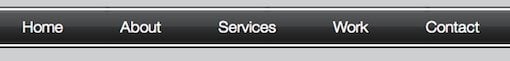
Today we’re going to create a working horizontal CSS menu from scratch. We’ll be using transparent PNGs (sorry outdated browser users) to create a glossy horizontal bar, the color of which can easily be changed using only CSS. Before we get started, check out what we’ll be building in the live demo.
Creating the PSD
The Photoshop work for the menu is quite minimal and should only take you a few minutes. I’ve broken it up into five super easy steps.
Solid Bar
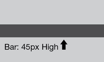
Create a new RGB file in Photoshop and draw a 45 pixel high colored bar (I used #4d4e50) all the way across your canvas.
Gradient
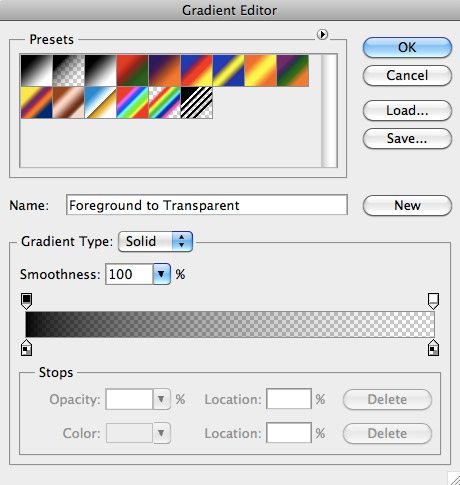
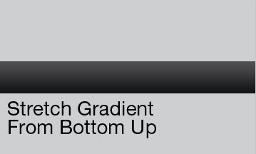
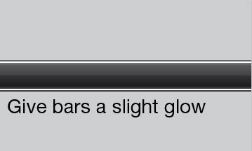
Next grab your gradient tool and make sure it’s set to a gradient that starts at black and ends at transparent. Starting at the bottom, stretch the gradient vertically over your gray bar.
Gloss
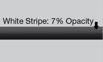
Make a white stripe that aligns with the top of your gray bar but only extends half the vertical distance. Set the opacity of this stripe to 7%.
Stripes
Make two more white stripes, this time only a few pixels high and inset them slightly from the top and bottom of the gray bar.
Saving
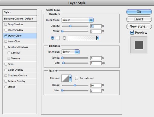
Believe it or not, that’s about all we need! Before you save the PNG turn off the original color bar layer. This is so we can change the color within our CSS. Also note that we don’t need the entire image as we’ll be setting it to repeat horizontally. Just crop off a small vertical sliver and go to “Save for Web & Devices” to save your PNG.
The HTML
I’ll assume a basic understanding of HTML and CSS here. I’ll try to be as descriptive as possible without explaining everything line by line.
The Empty HTML
We’ll start with a simple, blank HTML page.
<!DOCTYPE html PUBLIC "-//W3C//DTD XHTML 1.0 Transitional//EN" "http://www.w3.org/TR/xhtml1/DTD/xhtml1-transitional.dtd">
<html xmlns="http://www.w3.org/1999/xhtml">
<head>
<meta http-equiv="Content-Type" content="text/html; charset=iso-8859-1" />
<title>DesignShack CSS Menu</title>
<link href="style.css" rel="stylesheet" type="text/css" />
</head>
<body>

</body>
</html>
Container
Now we’ll add a container div that will hold the navigation menu div.
<body>
<div id="container">
	<div id="navMenu">
	</div>
</div>
</body>
Menu Structure
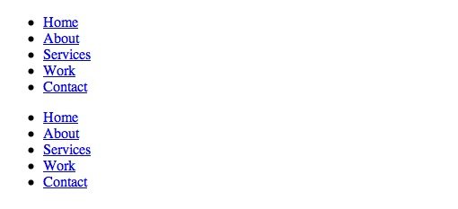
To finish off our HTML, throw in an unordered list containing span items for Home, About, Services, Work and Contact. This will be the basis for our menu items. We’ll insert the background and style this list all in CSS.
	<div id="navMenu">
		<ul>
			<li><a href=""><span>Home</span></a></li>
			<li><a href=""><span>About</span></a></li>
			<li><a href=""><span>Services</span></a></li>
			<li><a href=""><span>Work</span></a></li>
			<li><a href=""><span>Contact</span></a></li>
		</ul>
	</div>
The CSS
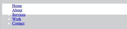
The CSS will contain the bulk of the work. All we’ve done so far is create a list of links so your page should look like this:
Background Color
The first thing we’ll do is tint the background a bit to break up the boring white background. Just add the following snippet to the body.
body {
	background-color: #cdcfd0;
}
Basic Container Styling
To get started on styling the container, set the position to relative and the height 45 pixels (which is the height of our Photoshop graphic). Then set color and background to white and the width to 100% so it stretches all the way across the window.
#container {
position:relative;
height:45px;
color:#ffffff;
background:#ffffff;
width:100%;
}
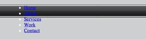
This code should result in a mess in your preview. Don’t worry, that’s exactly how it should look at this point!
Adding and Styling the Image
Now we’ll get into the stuff that’ll make it look like a menu! This time we’ll target the navMenu div containing the links. Once again, set your position to relative and height to 45px. We won’t add any text at this stage but go ahead and set the font-size to 17px. Next I set the background color and image with a single line of code. Notice that the color (#4d4e50) is the color of our original color bar in Photoshop. This setting is the key to the flexibility of this menu. Changing this value will change the color of the navigation menu, making it super easy to customize. After setting a color, throw in the background image and set it to repeat on the x axis.
#navMenu {
position:relative;
height:45px;
font-size:17px;
background:#4d4e50 url(images/background.png) repeat-x bottom left;
padding:0 0 0 50px;
}
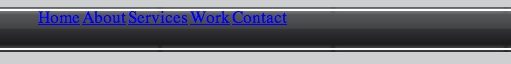
Now if you preview the page you should see a slick and shiny menu bar! Experiment with changing that color value to see how the image retains its gloss while changing colors.
Addressing the Links
Next we’ll add a big chunk of CSS to the unordered list to start getting our links into position. For the general unordered list section, set the margin and padding to 0, the list style to none, the width to auto and the float to left. Then style the list items contained in the unordered list (li). Again we float left but note this time we set display to “block” and our margins to 0 1px.
#navMenu ul{
margin:0;
padding:0;
list-style-type:none;
width:auto;
float:left;
}

#navMenu ul li {
display:block;
float:left;
margin:0 1px;
}
Take a look at your page in Safari. The list items should be lining up horizontally now.
Styling the Text
Now target the link items (a) in the menu. Set the display to block, the float to left, the height to 45px and the color to white. To eliminate the link underline, set the text-decoration to none. Finally, to space out the links a little set the padding to 0 0 0 30px (clockwise: top 0, right 0, bottom 0, left 30).
#navMenu ul li a {
display:block;
float:left;
color:#ffffff;
text-decoration:none;
padding:0 0 0 30px;
height:45px;
}
The text should look closer to where we want it now, but it’s still a bit off.
This time target the unordered list, list item, link span items (targeting gets a little crazy). Notice I’ve added more padding to line things up better and set a height and float. Next we see a bit of code that I borrowed from Chris Coyier at CSS-Tricks that gives us a really nice font for the menu. Essentially, HelveticaNeue-Light is our preferred choice here so those viewers that have it installed will see it. Those who don’t will simply revert to the next font inline until their browser finds an installed option. In the words of Chris “Might as well use the nicest Helvetica you can…”
#navMenu ul li a span {
padding:12px 30px 0 0;
height:21px;
float:left;
font-weight: 100;
font-family: "HelveticaNeue-Light", "Helvetica Neue Light", "Helvetica Neue", Helvetica,
Arial, "Lucida Grande", sans-serif;}
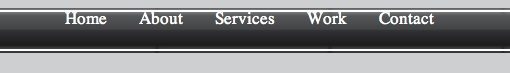
Now our menu text is beautifully styled and in place!
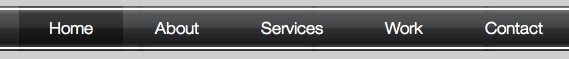
Adding Hover Effects
Our final step is to add some nice hover effects so you can easily see which option you are about to select. We’ll target the links on hover with our first snippet and the spans on hover on our second. Notice under “background” I inserted the same background image as we are using for the menu bar itself. This is so our hover option retains the nice glossy look. However, this time I set the background color to a darker gray. This provides the differentiation in our hover effect.
#navMenu ul li a:hover {
color:#fff;
background:#2d2d2e url(images/background2.png) repeat-x bottom left;
}

#navMenu ul li a:hover span {
display:block;
width:auto;
cursor:pointer;
}
Voila! Now we have a beautifully shiny CSS menu with a nice rollover effect.
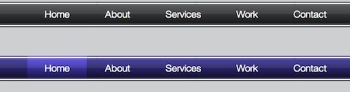
Changing the color
The bad news is that browsers without PNG support won’t display this properly at all. The good news is, for browsers that do support PNGs (you know, the 21st century browsers), this setup makes it crazy easy to completely change the look of the menu with only two CSS color value tweaks!
Just find the two places in your CSS where the background image appears (once for the bar and once for the rollover) and change the preceding colors. Look what happens if we create another menu and substitute #3d359a for the main color and #5749e7 for the hover color.
Conclusion
I hope you’ve learned a thing or two about CSS and have been inspired to experiment with transparency for the sake of flexibility. You can easily create this same effect using JPGs, but it would take more images and would require you to create new images in Photoshop every time you wanted to change the color.