Create a Fun Animated Navigation Menu With Pure CSS
In recent years jQuery has become the easiest and best supported way to implement simple animations online. JavaScript is exceptionally good at what it does and this article is in no way an argument against it.
However, CSS3 offers a glimpse into a possible future where basic animations are performed with straight CSS completely independent of scripting. Today we’ll take a look at how to use CSS3 to create a fun and unique navigation menu that uses @font-face, transforms and transitions.
Introduction
Your website’s navigation can communicate a lot about your business or service. Clean, usable navigation is a staple in good web design and is always your safest bet.
However, if you’re ever creating a site that doesn’t necessarily have to be so professional, the navigation provides a great place to have a little fun and insert some personality.
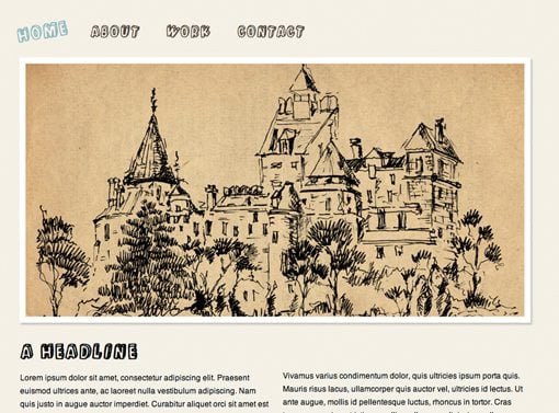
To get a glimpse of what we’ll be building, take a look at the live demo. I’ve added some placeholder content but the main idea here is the navigation menu.
The HTML
To start off our project, paste in the following blank HTML5 template. Notice that I’ve tossed in HTML5 Shiv to make IE and HTML5 play nice together.
<!DOCTYPE html>
<html>
<head>
<meta charset=utf-8 />
<meta name="description" content="description">

<title>Animated Navigation: Design Shack</title>

<link rel="stylesheet" media="screen" href="style.css" />

<!--[if IE]>
<script src="http://html5shiv.googlecode.com/svn/trunk/html5.js"></script>
<![endif]-->

</head>

<body>
</body>

</html>
Next, throw a simple unordered list into the body portion. Include some links and any text that you want for the individual menu items.
<ul id="nav">
	<li><a href="#">Home</a></li>
	<li><a href="#">About</a></li>
	<li><a href="#">Work</a></li>
	<li><a href="#">Contact</a></li>
</ul>
Believe it or not, that’s really all we need here. We might come back and tweak this a bit later but overall our navigation menu will remain pretty basic and easy to throw together in only a few minutes.
Basic Styles
Next create a CSS file, perform a basic reset and add some basic body settings. Since this project is so simple, we don’t need a big fancy CSS reset but it often helps to make sure all browsers are on the same page with margins and padding.
* {
   padding: 0;
   margin: 0;
}

body {
   background: #f4f1e5;
   color: #544738;
   font-family: helvetica, sans-serif;
}
The next thing we want to do is take our vertical list, make it flow horizontally, and add a hover effect. Do that with the following code.
ul li {
	float: left;
	list-style: none;
	margin-right: 1em;
}

li a {
	color: #544738;
	text-decoration: none;
	float: left;
	font-size: 25px;
	padding: 12px;
}

li a:hover {
	color: #7eb9be;
}
There’s nothing here you haven’t seen a thousand other places. By floating an unordered list left, we put all of the list items on the same line (remember to clear your floats if you add more content!). Other than this we’ve simply spaced the elements out and applied a hover color.
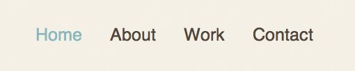
We’ll be adding fancier hover effects later but it’s important that we don’t depend entirely upon them. If we want graceful degradation across browsers then the menu should be fully functional without any CSS3. As you can see in the image below, we’ve obtained that goal and should now have a simple text-based menu that changes color on hover.
Customizing the Font
Since we’re just having fun I want to use a crazy font. My favorite option for implementing custom fonts online is pure @font-face using Paul Irish’s Bulletproof @font-face syntax .
This way we don’t have to worry about third party systems, domain, registering etc. We can simply find a font that we like and toss it straight in via CSS.
Font Squirrel
Setting up fonts with @font-face isn’t the easiest task if you’re a beginner. First you have to find a font that’s legal to use (which can be a major headache), then you have to track down multiple versions of the font and plug those versions into the Bulletproof Syntax; it’s a real pain.
Fortunately, Font Squirrel has taken just about all the work out of the process with their pre-built @font-face kits.
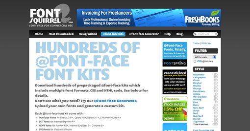
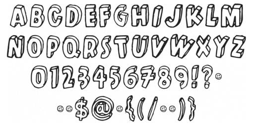
An @font-face kit contains everything you need: the fonts, the code, an example, etc. Simply browse the site until you find a kit that you like and click the download button. I decided to go with Kulminoituva under the “Novelty” section. It’s a crazy 3D block letter font that I would normally never use so it’s perfect for this project.
After you’ve downloaded the kit, copy the fonts to your page’s root directory and past the included text into your CSS file.
@font-face {
	font-family: 'KulminoituvaRegular';
	src: url('kulminoituva-webfont.eot');
	src: local('‚ò∫'), url('kulminoituva-webfont.woff') format('woff'), url('kulminoituva-webfont.ttf') format('truetype'), url('kulminoituva-webfont.svg#webfontHNAi9IoX') format('svg');
	font-weight: normal;
	font-style: normal;
}
If you followed the bulletproof syntax link above, you should know what all this code does. If not, the only thing you really need to know is that the first line tells us how to refer to the font elsewhere in our code: ‘KulminoituvaRegular’
So now we apply a font family to the list items using the same method we normally would while using our new font as the default.
ul li {
	float: left;
	list-style: none;
	margin-right: 1em;
	font-family: 'KulminoituvaRegular', helvetica, sans-serif;
	font-size: 25px;
	padding: 12px;
}

li a {
	color: #544738;
	text-decoration: none;
	float: left;
}

li a:hover {
	color: #7eb9be;
}
And now our navigation menu should look a lot more fun.
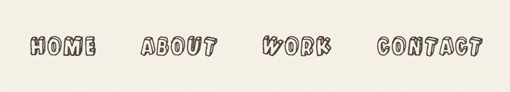
We now have a pretty decent little navigation menu. Notice that we applied some backup fonts as well so that anywhere @font-face doesn’t work, Helvetica will load instead.
To finish it off, let’s throw in some CSS3 animations.
Animating the Menu
Currently the best way to do CSS animations is a two step process involving both transforms and transitions. So the first thing we want to do is decide how to manipulate the objects in our menu using a transform, then we’ll apply a transition to animate the transformation.
If you take a look at the font we’ve chosen you’ll see that the letters are all rotated back and forth to give it a sloppy hand-drawn sort of feel. We’ll use this as inspiration for our transform and introduce some more rotation when the user hovers over a link. To give even more emphasis, we’ll also introduce a scaling effect.
Transforming the Text on Hover
With CSS transforms we have four basic options: rotate, scale, skew and translate (move left and right). Since we don’t want our text to get all skewed or move around too much, we’ll stick to rotate and scale.
The syntax for implementing these is super basic and conveniently identical across the Mozilla, Webkit and Opera versions.
li a:hover {
	-webkit-transform: rotate(-10deg) scale(1.2);
	-moz-transform: rotate(-10deg) scale(1.2);
	-o-transform: rotate(-10deg) scale(1.2);
}
As you can see, we simply applied a rotation of -10 degrees and a slight scaling of 1.2. Now when you hover over a link in the navigation, it should appear rotated and larger.

After playing with this a bit, I decided that I didn’t like the fact that all the links rotated the same way. The text feels a bit more random than that so I wanted to introduce some variation here.
The solution is to apply classes to the list items in our HTML so we can style some independently of others.
<ul id="nav">
	<li class="left"><a href="#">Home</a></li>
	<li class="right"><a href="#">About</a></li>
	<li class="left"><a href="#">Work</a></li>
	<li class="right"><a href="#">Contact</a></li>
</ul>
Now that we have two different classes, we can apply a separate rotation to every other link so that the first and third links will rotate counter-clockwise and the second and fourth links will rotate clockwise.
.left a:hover {
	-webkit-transform: rotate(-10deg) scale(1.2);
	-moz-transform: rotate(-10deg) scale(1.2);
	-o-transform: rotate(-10deg) scale(1.2);
}

.right a:hover {
	-webkit-transform: rotate(10deg) scale(1.2);
	-moz-transform: rotate(10deg) scale(1.2);
	-o-transform: rotate(10deg) scale(1.2);
}
Voila! Now we have an awesome hover rotation effect. The last thing that we want to fix is the transition. Currently, hovering over the text causes an immediate rotation. We want this to be gradual like you’d find in a cool jQuery effect.
Animating the Rotation
Our final step is to add in a CSS3 transition to animate the hover effect. As with transforms, transitions are very easy to implement and contain the same basic syntax for Webkit, Mozilla and Opera.
All you have to do is set the property that you want to animate (in this case “all”), the duration and the easing. You can choose between ease, linear, ease-in, ease-out, and ease-in-out. These effect the way the animation ramps up and slows down.
.left a:hover {

	/*Transition*/
	-webkit-transition:All .5s ease;
	-moz-transition:All .5s ease;
	-o-transition:All .5s ease;

	/*Transform*/
	-webkit-transform: rotate(-10deg) scale(1.2);
	-moz-transform: rotate(-10deg) scale(1.2);
	-o-transform: rotate(-10deg) scale(1.2);
}

.right a:hover {

	/*Transition*/
	-webkit-transition:All .5s ease;
	-moz-transition:All .5s ease;
	-o-transition:All .5s ease;

	/*Transform*/
	-webkit-transform: rotate(10deg) scale(1.2);
	-moz-transform: rotate(10deg) scale(1.2);
	-o-transform: rotate(10deg) scale(1.2);
}
As you can see, we applied the same transition to both classes. Feel free to vary this if you wish and change the transition of the first or second class.
All Finished!
That completes our navigation menu. Click here to see the live demo. Remember that you can use these animation techniques on anything you like, not just text. Try creating a thumbnail gallery or something else image-driven that uses the same effect.

Closing Thoughts
Obviously, IE users will only experience a plain menu (though it will be fully functional). You’re definitely better off with JavaScript if you want animations like this to work across all browsers. Further, the text tends to get a little choppy in Webkit during the transition. I found this to be quite annoying but couldn’t figure out a fix (let me know if you do!).
Despite any arguments against its use, CSS animations are definitely fun to play with and extremely easy to implement. Leave a comment below with a link to any cool CSS3 animations you’ve created along with a brief description of the properties you used.