CSS Card Tricks
Know any good card tricks? Hopefully, after today, you will! We’re going to build some simple and attractive playing cards with pure CSS, then we’ll learn how to target and animate each card for some added fun.
Along the way, we’ll see how to use before and after to build the cards with minimal markup. Let’s get started!
Building a Card
The first task on our list is obviously to build a card. We’ll pull this off with minimal markup and without embedding any images. Impossible you say? Nay! Let’s see how it works.
Start by creating a new HTML document and inserting a basic div with two classes: card and suitdiamonds.
<div class="card suitdiamonds">
</div>
Now it’s time to put something on the card. We’ll make everything an ace for the sake of simplicity, so all you need is a paragraph with an “A”.
<div class="card suitdiamonds">
  <p>A</p>
</div>
As we proceed, keep in mind that my entire goal here is minimal, reusable code. Notice that I’ve used classes, not IDs. This is of course because classes are reusable. Also, there’s a reason the class name here isn’t just “diamonds”, which we’ll see later. As we go forward and look at our CSS, notice where I chain together selectors and create an almost module-style code base to cut down on repetition.
Card CSS
Believe it or not, that’s all the markup that we need for our card. Everything else will be pulled off with CSS. To begin here, we need some basic page styles, followed by our card class styles.
* {margin: 0; padding: 0;}

body {
  background: #00a651;
}

.card {
  position: relative;
  float: left;
  margin-right: 10px;
  width: 150px;
  height: 220px;
  border-radius: 10px;
  background: #fff;
  -webkit-box-shadow: 3px 3px 7px rgba(0,0,0,0.3);
  box-shadow: 3px 3px 7px rgba(0,0,0,0.3);
}
As you can see, the card styles are pretty simple. We make the card white, round the corners, apply a shadow, etc. Nothing too fancy aside from the relative positioning.
Now let’s make our “A” look a little more attractive. Again, not much here, just some text alignment and font styles.
.card p {
  text-align: center;
  font: 100px/220px Georgia, Times New Roman, serif;
}
We should be doing pretty well at this point, let’s take a look and see what we’ve got:
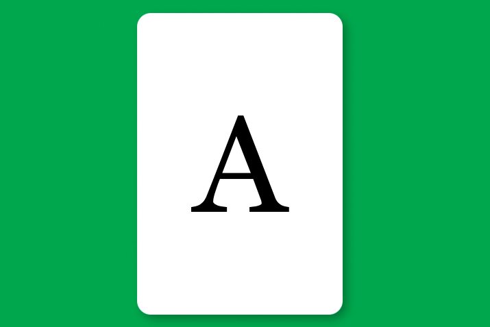
It looks like a card, does it not? There’s something missing though… the suits! Diamonds, hearts, clubs, spades; you have to have suits. This gets difficult if we want to stay away from images, but I’ve got a few tricks up my sleeve.
Suit CSS
Given that we don’t want to add any extra markup to our page, we’ll obviously want to look to before and after to insert the suit icons. Fortunately, most standard browsers recognize a wide variety of symbols. If you check out CopyPasteCharacter, you’ll find exactly what you need for a deck of cards.
.suitdiamonds:before, .suitdiamonds:after {
  content: "♦";
  color: #ff0000;
}
As you can see, here we inserted a diamond using both before and after (so we’ll have two). Next, we need to repeat this across all four suits:
.suitdiamonds:before, .suitdiamonds:after {
  content: "♦";
  color: #ff0000;
}

.suithearts:before, .suithearts:after {
  content: "♥";
  color: #ff0000;
}

.suitclubs:before, .suitclubs:after {
  content: "♣";
  color: #000;
}

.suitspades:before, .suitspades:after {
  content: "♠";
  color: #000;
}
If you’re quick, you’ll realize that one of these symbols on every card should be upside down. This would be simple enough with a CSS transform, but given that we’ll never actually view the card upside down on our screen, I think this is an unnecessary bit of reality that’s not worth the execution code.
Now, all we’ve done up to this point is create the symbols, we still have to properly size and position them. Normally, this would take a ton of selectors given that we have four suits, each of which has a before and after version to style. We were clever though and we used the word “suit” in each class name. This means that we can easily target all of the suit classes at once. Then, we need only style the before and after classes separately. Awesome!
div[class*='suit']:before {
  position: absolute;
  font-size: 35px;
  left: 5px;
  top: 5px;
}

div[class*='suit']:after {
  position: absolute;
  font-size: 35px;
  right: 5px;
  bottom: 5px;
}
What the heck? If you’ve never seen this before, it’s something super fancy with a name that I love to say because it makes me sound smarter than I really am: the arbitrary substring attribute value selector. It allows you to target parts of an attribute and grab anything that has that part in common.
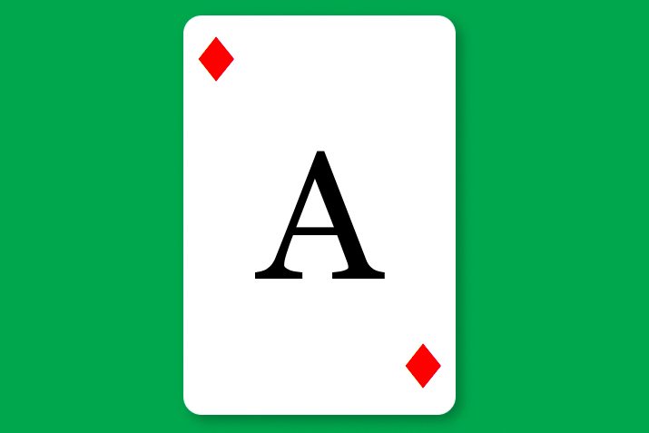
With that, we’ve got a complete card styled up! It looks pretty impressive considering our markup is so brief.
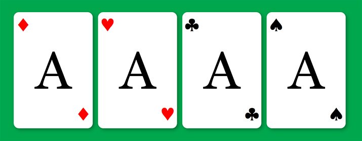
A Hand of Cards
We only put a single card on our table, but we’ve provided the style for all four suits. Let’s create a “hand” of cards to show them all off. Here’s the markup:
<div class="hand">

  <div class="card suitdiamonds">
    <p>A</p>
  </div>

  <div class="card suithearts">
    <p>A</p>
  </div>

  <div class="card suitclubs">
    <p>A</p>
  </div>

  <div class="card suitspades">
    <p>A</p>
  </div>

</div>
This is pretty much the same as before, only this time we’ve got a wrapper div with a “hand” class and we’ve used all four suit classes. For our hand class, we don’t really need a lot of styling. However, we do use floats on our cards, which means we’ll need a clearfix on the card parent, which is the hand div. Here’s Nicolas Gallagher’s code for this along with a simple hover for the cards.
.hand {
  margin: 50px;
}

/* For modern browsers */
.hand:before,
.hand:after {
    content:"";
    display:table;
}

.hand:after {
    clear:both;
}

/* For IE 6/7 (trigger hasLayout) */
.hand {
    zoom:1;
}

.card:hover {
  cursor: pointer;
}
That’s it! Now we have ourselves a nice little set of cards made with pure CSS and HTML. Here’s what they look like:
Spread ’em
Now that we’ve built our cards, let’s have some fun with them. What I want is to have a single card, that when hovered over, fans out into our full hand. In the fanned out form, the cards shouldn’t be straight like we saw above, but rotated like when you hold them in your hand.
HTML
The HTML to pull this off is pretty much exactly what we saw before. Only this time, add a “spread” class to the container div.
<div class="hand spread">

  <div class="card suitdiamonds">
    <p>A</p>
  </div>

  <div class="card suithearts">
    <p>A</p>
  </div>

  <div class="card suitclubs">
    <p>A</p>
  </div>

  <div class="card suitspades">
    <p>A</p>
  </div>

</div>
CSS
Pulling this off is going to take quite a bit of CSS, but it’s all pretty easy to wrap your mind around. First, we’re going to be a little bit more specific about our container. Do this by setting a height, width and positioning context on the spread class.
Next. absolutely position the cards so that they all stack on top of each other relative to the spread div. Reset the positioning values and set up a transition for those positioning values so that any changes will be animated.
.spread {
  width: 350px;
  height: 250px;
  position: relative;
}

.spread > .card {
  position: absolute;
  top: 0;
  left: 0;
  -webkit-transition: top 0.3s ease, left 0.3s ease;
  -moz-transition: top 0.3s ease, left 0.3s ease;
  -o-transition: top 0.3s ease, left 0.3s ease;
  -ms-transition: top 0.3s ease, left 0.3s ease;
  transition: top 0.3s ease, left 0.3s ease;
}
Now we have to set up a bunch of hover states that manually position each card in the array that we want. We do this with CSS3 transforms targeted at each suit along with varying top and left values. Ultimately, setting this up was a lot of trial and error. Fortunately, I’ve done that work for you, here’s the code that you’ll need.
.spread:hover .suitdiamonds {
  -webkit-transform: rotate(-10deg);
  -moz-transform: rotate(-10deg);
  -o-transform: rotate(-10deg);
  -ms-transform: rotate(-10deg);
  transform: rotate(-10deg);
}

.spread:hover .suithearts {
  left: 30px;
  top: 0px;
  -webkit-transform: rotate(0deg);
  -moz-transform: rotate(0deg);
  -o-transform: rotate(0deg);
  -ms-transform: rotate(0deg);
  transform: rotate(0deg);
}

.spread:hover .suitclubs {
  left: 60px;
  top: 5px;
  -webkit-transform: rotate(10deg);
  -moz-transform: rotate(10deg);
  -o-transform: rotate(10deg);
  -ms-transform: rotate(10deg);
  transform: rotate(10deg);
}

.spread:hover .suitspades{
  left: 80px;
  top: 10px;
  -webkit-transform: rotate(20deg);
  -moz-transform: rotate(20deg);
  -o-transform: rotate(20deg);
  -ms-transform: rotate(20deg);
  transform: rotate(20deg);
}
Finally, when the cards are in their spread out form, I want another hover state that subtly highlights each card. We can do this by darkening that box shadow that we applied earlier.
.spread > .card:hover {
  -webkit-box-shadow: 1px 1px 7px rgba(0,0,0,0.4);
  box-shadow: 1px 1px 7px rgba(0,0,0,0.4);
}
See It In Action!
Now that we’re all finished with the code, it’s time to take another look at the live example. As a bonus, I threw in a third hand that grows when you hover over a card.
Demo: Click here to launch.

What Will You Do With Them?
So there you have it, pure CSS and HTML playing cards. To be honest, I have no idea what to do with them, but they were sure fun to build. If you have any great ideas for improving or using these in a fun way, leave a comment below and let me know!