Convert a Pricing Table PSD to HTML and CSS
Today we’re going to grab some PSD pricing tables from Design Curate and try to convert them to pure CSS so you can easily drop them into your site.
It’ll be a super basic but fun exercise in bringing a static design to the web and you’ll learn plenty of fun stuff along the way such as how to style hr tags a create a superscript effect.
Original Design
The design of our pricing tables is super minimal. They’re basically just a rounded corner rectangle with some text and buttons. Download the original PSD here for a closer look (we’re scrapping the Best Value banner).
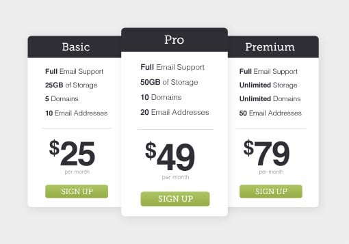
As you can see, the primary task here will merely be shuffling elements into place. The top bar may seem like it’ll be tricky, but in reality it’s a cinch. More interesting from my perspective is how to style that thin dividing line and pulling off a superscript in the text.
Also of interest is the fact that the center pricing table is a little larger than the others and overlaps them. This could mean styling two unique versions of the table, but we’ll use a nice little trick that takes all the effort out of this. Let’s jump in and get started.
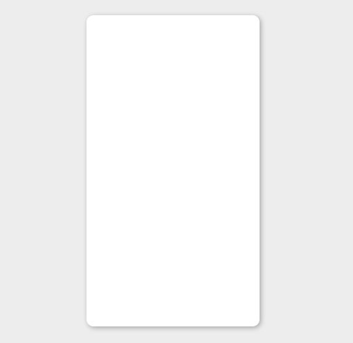
Basic Shape
To begin, we’ll focus on creating one pricing table. Once we have that one built, we can expand it into three fairly easily. Our first step is to create the basic shape of a single table: a vertical rectangle with rounded corners.
We’ll start with a div that will hold all the code for one pricing table. Assign the class of “pricingtable” so that we can easily reuse this element again later.
<div class="pricingtable">
</div>
Now let’s add some style. Our pricing tables will be white so I set a gray background color to help them stand out. Then I applied some sizing to our class, rounded the corners and added a shadow.
* {margin: 0; padding: 0;}
body {background: #ededed;}

.pricingtable {
  width: 250px; height: 450px;
  background: #fff;
  margin: 50px;

  -webkit-border-radius: 10px;
     -moz-border-radius: 10px;
          border-radius: 10px;
  -webkit-box-shadow: 2px 2px 9px rgba(0,0,0,0.3);
     -moz-box-shadow: 2px 2px 9px rgba(0,0,0,0.3);
          box-shadow: 2px 2px 9px rgba(0,0,0,0.3);
}
Progress Update
This step should give you a simple white box. Make sure that your dimensions are correct and that your shadow and rounded corners are functioning properly.
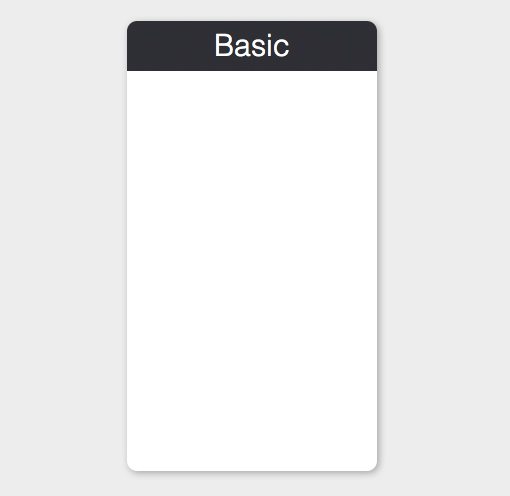
Top Bar
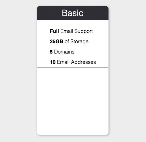
Now that we’ve got our basic shape in place, we’ll start at the top and work our way down. The first thing that we need is obviously that colored bar at the top that holds the name for each of our pricing plans: Basic, Pro and Premium. To pull this off, create another div with the class of “top”. Don’t worry, we’re not going div crazy, this will be the last one that we need for our base pricing table template.
Inside the div, place an h2 (we’ll use the h1 later) with the name of the pricing table. We could simply use this h2 without the div to create the top bar, but structuring it this way makes it easier to add a sub tag or other content here later.
<div class="pricingtable">
  <div class="top">
    <h2>Basic</h2>
  </div>
</div>
Turning that div into our top bar is pretty simple. To start, we give it a width of 250px, a height of 50px and sample the PSD to get a background color of #2F2E35. Then we apply the same border-radius that we used before (10px), only this time we apply it to only the top two corners, leaving the bottom corners square.
Next it’s time to target the h2 and give it some styling. I simply changed the color to white, aligned the text to the center and used some fancy font shorthand to set the weight, size, line-height and font-family for our headline.
.top {
  width: 250px; height: 50px;
  background: #2F2E35;
  -webkit-border-radius: 10px 10px 0 0;
     -moz-border-radius: 10px 10px 0 0;
          border-radius: 10px 10px 0 0;
}

.top h2 {
  color: #fff;
  text-align: center;
  font: 300 30px/50px Helvetica, Verdana, sans-serif;
}
Progress Update
Our plain white box is already starting to look like the pricing table we’re going for. Now we just fill in the center contents and we’ll be ready to go.
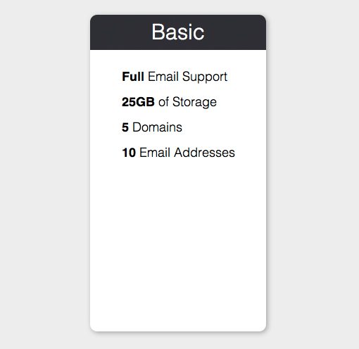
Features
Moving down the table, next we find a list of features. Right away that sentence should give you a hint as to how we can mark this section up: with a list. The order isn’t anything specific here so we’ll use an unordered list.
Notice that in our original design, the first word of each feature is bolded. We’ll toss in some strong tags to help us pull this off in our design.
<div class="pricingtable">

  <div class="top">
    <h2>Basic</h2>
  </div>

  <ul>
    <li><strong>Full</strong> Email Support</li>
    <li><strong>25GB</strong> of Storage</li>
    <li><strong>5</strong> Domains</li>
    <li><strong>10</strong> Email Addresses</li>
  </ul>

</div>
Styling up this list is quite easy. To start, we want to ditch the bullet points, so set the list-style-type to “none”. After that, I use the same font shorthand as above but this time with a different size and line-height.
Notice that the line-height is set without a unit of measure (2, not 2px). This is a simple multiplier that takes the font-size into account (18px * 2 = 36px line-height). You can read more about this technique here.
To finish off this block of styles, target those strong tags and be sure that they’re set to bold.
.pricingtable ul {
  list-style-type: none;
  font: 300 18px/2 Helvetica, Verdana, sans-serif;
  margin: 20px 0 0 45px;
}

.pricingtable ul strong {
  font-weight: bold;
}
Progress Update
Our feature list is looking perfect! Those bolder styles really help you focus on the important pieces of information.
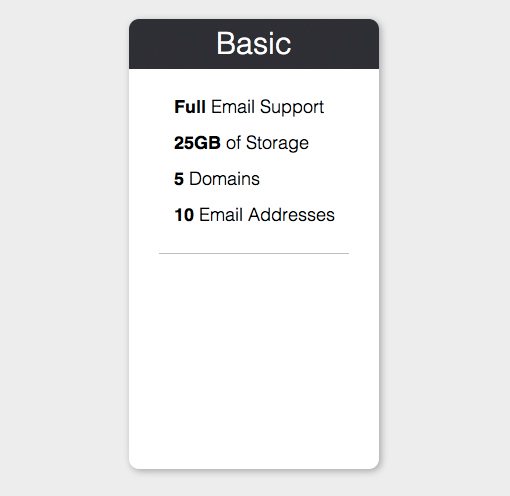
Dividing Line
In the original design, there’s a subtle line that separates the feature list from the price. This can be accomplished with a simple horizontal rule tag:
<div class="pricingtable">

  <div class="top">
    <h2>Basic</h2>
  </div>

  <ul>
    <li><strong>Full</strong> Email Support</li>
    <li><strong>25GB</strong> of Storage</li>
    <li><strong>5</strong> Domains</li>
    <li><strong>10</strong> Email Addresses</li>
  </ul>

  <hr />

</div>
The default styling for the horizontal line is close to what we want, but not quite there. For instance, notice that it stretches all the way across the pricing table. We actually want it narrower and centered.
Styling an hr can be tricky and frustrating if you don’t know what you’re doing. You’d think that all we would have to do is set the width and color and we’d be good to go, but that’s not the case.
By default, certain browsers apply some weird styles that you have to clear. To be sure we get the look we want, we have to clear the borders, declare both a height and width, and set a background color. Then we center it using basic math: if our table is 250px wide and our line is 190px, that leaves 60px of width left. Using margins, we cut that value in half and assign thirty pixels of space to the left side of the line.
.pricingtable hr {
  border: 0;
  background-color: #BCBEC0;
  color: #BCBEC0;
  height: 1px;
  width: 190px;
  margin: 20px 0 0 30px;
}
Progress Update
With that bit of styling, our little line is looking exactly like we want it to. Feel free to experiment with your hr to see what sort of fancy styles you can make. CSS-Tricks has some great examples for inspiration.
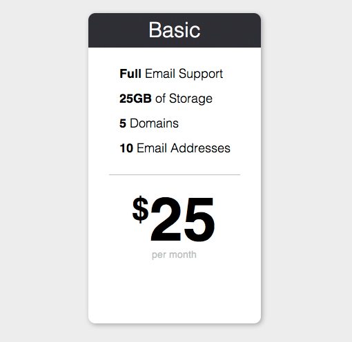
Price
Next up is the price tag. This comes in two parts, the big price and the small text underneath that says “per month.” The tricky part is that, in the original design, the dollar sign is superscript.
I wanted to be semantic about this so I went ahead and used the “sup” tag. Some sources seem to think that this is a deprecated tag, but as far as I can tell, that’s not the case. Both sub and sup appear to be valid in HTML5 and have plenty of browser support across the board. I’m open to opposing arguments here, so let me know in the comments if you disagree.
Another potential point for a huge semantic argument here is my use of h1. Some would no doubt reserve h1 for the plan title at the top, but the price point here seemed to be the most important piece of information (importance trumps order), so I thought it was best to utilize it here. Once again, feel free to disagree and go your own way.
<div class="pricingtable">

  <div class="top">
    <h2>Basic</h2>
  </div>

  <ul>
    <li><strong>Full</strong> Email Support</li>
    <li><strong>25GB</strong> of Storage</li>
    <li><strong>5</strong> Domains</li>
    <li><strong>10</strong> Email Addresses</li>
  </ul>

  <hr />

  <h1><sup>$</sup>25</h1>
  <p>per month</p>

</div>
Now for our CSS we have three different things to target: the h1, the h1 sup and the paragraph. There’s nothing fancy here, just some more font-sizing and a little bit of margins to scoot things into place. Notice that all we need to do for the sup tag is reduce the font size.
.pricingtable h1 {
  text-align: center;
  font: bold 88px/1 Helvetica, Verdana, sans-serif;
  margin: 20px 0 0 0;
}

.pricingtable h1 sup {
  font-size: 45px;
}

.pricingtable p {
  text-align: center;
  font: 500 14px/1 Helvetica, Verdana, sans-serif;
  color: #BCBEC0;
}
Progress Update
Our pricing table is nearly complete! Thus far we’ve conquered the four most difficult pieces of the puzzle, all that’s left is to create a button at the bottom.
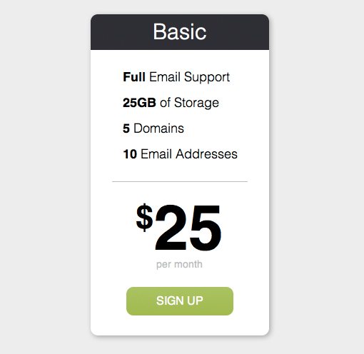
The Button
To finish off our pricing table, let’s put a sign up button at the bottom. To accomplish this, just throw an anchor tag into your HTML. This will finish up our reusable pricingtable div.
<div class="pricingtable">

  <div class="top">
    <h2>Basic</h2>
  </div>

  <ul>
    <li><strong>Full</strong> Email Support</li>
    <li><strong>25GB</strong> of Storage</li>
    <li><strong>5</strong> Domains</li>
    <li><strong>10</strong> Email Addresses</li>
  </ul>

  <hr />

  <h1><sup>$</sup>25</h1>
  <p>per month</p>

  <a href="#">Sign Up</a>

</div>
To turn this simple text link into a button, set the display to block and define a width and height. Also be sure to fix the default link styling by setting the color and text-decoration. I transformed the text into uppercase as well to match the original design. Finally, apply the same border-radius as before.
To finish off the button, you can use a solid color to keep things simple, but I opted for a basic gradient that gets lighter when you hover over it. It’s a big, scary chunk of CSS but don’t worry, it’s all fairly basic. Use a free tool like this one to save you some trouble if you’re creating your own gradient.
.pricingtable a {
  display: block;
  height: 40px;
  width: 150px;
  color: #fff;
  margin: 25px 0 0 50px;

  text-decoration: none;
  text-align: center;
  text-transform: uppercase;
  font: 500 16px/40px Helvetica, Verdana, sans-serif;

  -webkit-border-radius: 10px;
     -moz-border-radius: 10px;
          border-radius: 10px;

  /*Gradient*/
  background: #9dcc55; /* Old browsers */
  background: -moz-linear-gradient(top,  #9dcc55 0%, #96c23d 100%); /* FF3.6+ */
  background: -webkit-gradient(linear, left top, left bottom, color-stop(0%,#9dcc55), color-stop(100%,#96c23d)); /* Chrome,Safari4+ */
  background: -webkit-linear-gradient(top,  #9dcc55 0%,#96c23d 100%); /* Chrome10+,Safari5.1+ */
  background: -o-linear-gradient(top,  #9dcc55 0%,#96c23d 100%); /* Opera 11.10+ */
  background: -ms-linear-gradient(top,  #9dcc55 0%,#96c23d 100%); /* IE10+ */
  background: linear-gradient(top,  #9dcc55 0%,#96c23d 100%); /* W3C */
  filter: progid:DXImageTransform.Microsoft.gradient( startColorstr='#9dcc55', endColorstr='#96c23d',GradientType=0 ); /* IE6-9 */
}

.pricingtable a:hover {
  background: #b2e560; /* Old browsers */
  background: -moz-linear-gradient(top,  #b2e560 0%, #96c23d 100%); /* FF3.6+ */
  background: -webkit-gradient(linear, left top, left bottom, color-stop(0%,#b2e560), color-stop(100%,#96c23d)); /* Chrome,Safari4+ */
  background: -webkit-linear-gradient(top,  #b2e560 0%,#96c23d 100%); /* Chrome10+,Safari5.1+ */
  background: -o-linear-gradient(top,  #b2e560 0%,#96c23d 100%); /* Opera 11.10+ */
  background: -ms-linear-gradient(top,  #b2e560 0%,#96c23d 100%); /* IE10+ */
  background: linear-gradient(top,  #b2e560 0%,#96c23d 100%); /* W3C */
  filter: progid:DXImageTransform.Microsoft.gradient( startColorstr='#b2e560', endColorstr='#96c23d',GradientType=0 ); /* IE6-9 */

}
Progress Update
With that, our first pricing table is complete! If we wanted to go further, we could grab a slab serif web font to make it look just like the PSD, but I like the Helvetica just fine here. Now we have to take this one item and turn it into three!
Making Three Tables
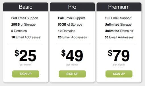
To expand this into three unique tables, copy and paste the HTML that you just created so that you have three pricingtable divs and place them all inside of a container div. Then customize the text on each so that the features and price point are correct. Finally, add a “featured” class to the second table. We’ll us this to pull off the enlarged effect.
<div id="container">
    <div class="pricingtable">
      <div class="top">
        <h2>Basic</h2>
      </div>
      <ul>
        <li><strong>Full</strong> Email Support</li>
        <li><strong>25GB</strong> of Storage</li>
        <li><strong>5</strong> Domains</li>
        <li><strong>10</strong> Email Addresses</li>
      </ul>

      <hr />

      <h1><sup>$</sup>25</h1>
      <p>per month</p>

      <a href="#">Sign Up</a>
</div>

    <div class="pricingtable featured">
      <div class="top">
        <h2>Pro</h2>
      </div>
      <ul>
        <li><strong>Full</strong> Email Support</li>
        <li><strong>50GB</strong> of Storage</li>
        <li><strong>10</strong> Domains</li>
        <li><strong>20</strong> Email Addresses</li>
      </ul>

      <hr />

      <h1><sup>$</sup>49</h1>
      <p>per month</p>

      <a href="#">Sign Up</a>
    </div>

    <div class="pricingtable">
      <div class="top">
        <h2>Premium</h2>
      </div>
      <ul>
        <li><strong>Full</strong> Email Support</li>
        <li><strong>Unlimited</strong> Storage</li>
        <li><strong>Unlimited</strong> Domains</li>
        <li><strong>50</strong> Email Addresses</li>
      </ul>

      <hr />

      <h1><sup>$</sup>79</h1>
      <p>per month</p>

      <a href="#">Sign Up</a>
    </div>

</div>
To make the pricing tables appear next to each other, go back to your pricingtable class and float it left. Also apply a width of 780px to your container and center it on the page with auto left and right margins.
#container {
	width: 780px;
	margin: 100px auto;
}

.pricingtable {
  width: 250px; height: 450px;
  background: white;
  margin: 5px;
  float: left;

  -webkit-border-radius: 10px;
     -moz-border-radius: 10px;
          border-radius: 10px;
  -webkit-box-shadow: 2px 2px 9px rgba(0,0,0,0.3);
     -moz-box-shadow: 2px 2px 9px rgba(0,0,0,0.3);
          box-shadow: 2px 2px 9px rgba(0,0,0,0.3);
}
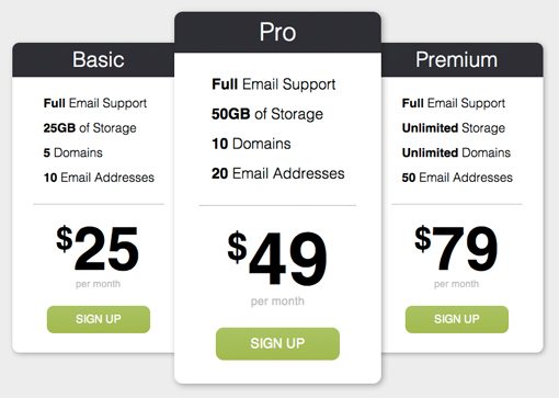
Now we have three pricing tables in a row, which is exactly what we want. However, remember that the center one should be larger than the other two, this is not yet the case.
Instead of manually going through and adjusting each little set of dimensions throughout the center pricing table, we can target the unique class that we gave it and apply a CSS transformation to enlarge it. Since all of our content is pure code (no images), the scaled up version should look just fine.
.featured {
	-webkit-transform: scale(1.2, 1.2);
	-moz-transform: scale(1.2, 1.2);
	-o-transform: scale(1.2, 1.2);
	-ms-transform: scale(1.2, 1.2);
	transform: scale(1.2, 1.2);
}
All Finished!
With that, our CSS pricing tables are complete. The last transformation gave us exactly the effect that we wanted with the center table larger and floating over the other two. Check out the live demo versions below.
Demo: Click here to launch demo
Code: See and tweak the source code at Dabblet
Conclusion
I hope you enjoyed building these pricing tables and will get some good use out of them. Use them however you wish and be sure to download the PSD and vector versions from Design Curate.