Gridpak Revisited: A Closer Look at the Responsive Grid Generator
One of the most interesting and useful responsive grid generators around is a tool called Gridpak, which allows you to use a simple and fun UI to create fluid, media-query driven grids. We reviewed Gridpak around a year ago and came to the conclusion that, although useful, it came up short in the area of user friendliness when it came to implementing the code.
The developers have made some progress in this area and I think it’s about time we took another look. Join us as we dive into how Gridpak has improved its code offering and structure to provide a better, more streamlined experience for users.
Meet Gridpak
Gridpak has been featured in quite a few responsive web design tool roundups, so you’ve probably come across it a time or two. Here’s a screenshot to jog your memory:
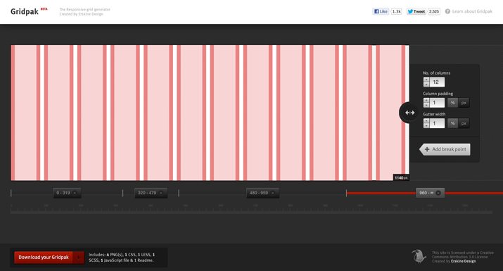
In case you didn’t read our last article, what you’re seeing here is a visual representation of your grid. The main graphic in the center shows the columns, padding and gutter based on your input and currently selected range. Let’s briefly go over how this tool works.
Adding Breakpoints
To get started, grab the big circle on the right that contains two arrows and drag it left or right. You’ll see the entire grid squish and expand as you do this. On the bottom, you’ll find an indicator that tells you the current width. Once you get this to a spot where you want to insert a new breakpoint, hit the “Add break point” button.
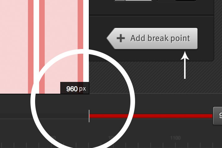
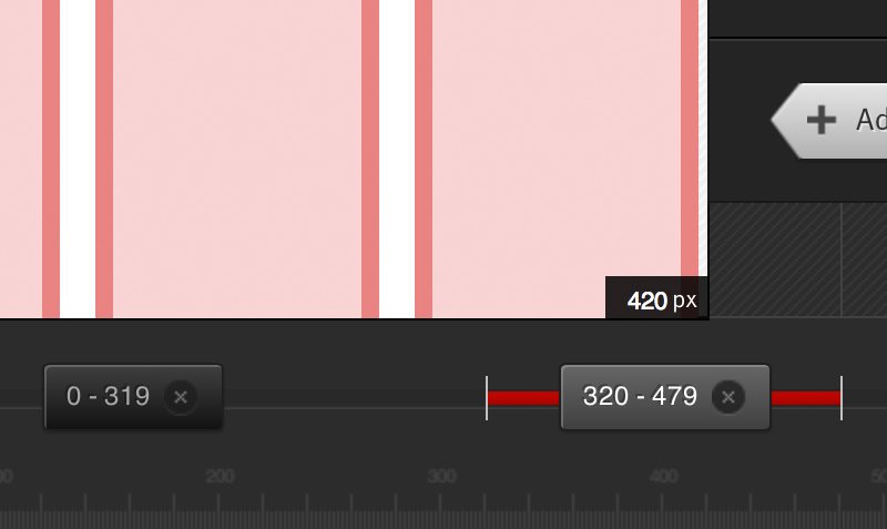
As you go along setting up breakpoints, the bottom part of the UI will split into different sections, which serve as ranges of viewport widths. In the screenshot below you can see that my first range goes from 0 to 319px, at which point there’s a breakpoint, creating a new section that stretches from 320px to 479px. We continue this process until all of your design’s media queries are accounted for.
Tweaking The Grid
Notice in the previous screenshot that, when my current width is within a given range, that range is highlighted in red along the bottom. This means that I can go in and set the specific grid settings for that range. To do this, I use the simple tools on the far right of the page.
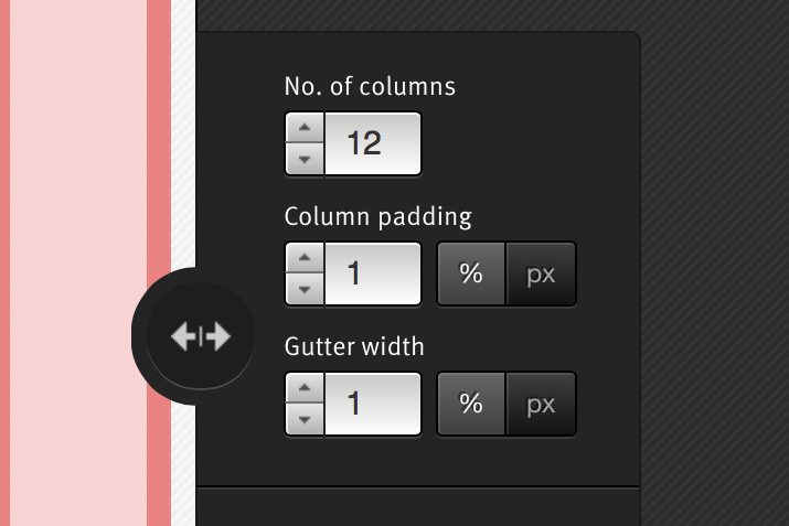
Here we can set the number of columns, padding and gutter width for each section. Simply drag your grid to highlight each section, then set up your grid for that section, making it as different as you’d like from all of the other sections. For instance, your mobile grid might have only one or two columns while your desktop grid has twelve.
The Download
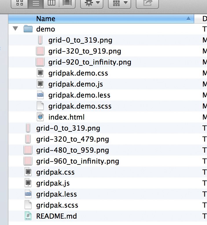
Once you’re all finished setting up your grid in Gridpak, you’re ready to download your files. This time around, you’ll notice that we’ve got a few more files to work with:
As I mentioned above, I previously gave the developers a rough time because, at this point, the fun was over and Gridpak became so dang tricky to use. It seems like they’ve improved the experience though by focusing on three main things:
- A fully functioning demo: This is absolutely key. The last time we looked at Gridpak, there was no demo included, leaving us to figure things out for ourselves. Having this in hand means that we can dig into an example that’s properly set up and learn how things work. I think this is how most developers tend to learn so it provides a much better experience for first time Gridpak users.
- A better “README” file: The “README” file seems to have gotten much better as well. It walks you through each piece of the download and actually sets you on the right track for how to work with the pre-built classes in your CSS file.
- Extensive comments: In addition to the instructions in the “README”, and perhaps even more useful, are the comments that you’ll find scattered throughout the various code files. The developers have taken care to explain each piece of the puzzle as they go so that no matter where you are in a file, there’s a nice description of what’s going on to help you work with what you’ve been given.
In general, the guys behind Gridpak haven’t really changed anything about the way it operates, but the improvements that they’ve made in disseminating useful information and instruction to the user make the entire tool much more approachable and user friendly.
Using The Code
Last time, I only briefly touched on how the Gridpak system works. Armed with more informational support than ever, I’d like to delve a little deeper so that you can be confident that you know exactly how it all works and can actually use this in a project fairly quickly.
The Pieces
Included in your download will be a series of CSS files (CSS, LESS, and SCSS) as well as a handful of images and a JavaScript file. The demo also has an HTML file for reference.
The images and JavaScript file are merely for creating a grid overlay so that you can see how your columns work. Every grid system has one of these and I frankly never use them, so I’ll toss these out and focus on the actual pieces that you’ll use for your development workflow.
The HTML
The first thing that you’re going to want to do is set up your own HTML file. Code up your head section like normal, then start the markup like this:
<body>
  <div class="page">
  </div>
</body>
Everything you create will be tossed inside of this “page” div, which essentially just serves as a wrapper that centers the content on the page.
Next, you’ll divide all of your content into rows. To do this, each element on the page will be tossed into a div with a class of “row”. You’ll have several of these:
<body>
  <div class="page">
    <div class="row"></div>
    <div class="row"></div>
    <div class="row"></div>
    <div class="row"></div>
  </div>
</body>
Inside of the row, you can place your normal content, just like always. Make sure to use the “col” class on every chunk of content, which essentially applies the global column styles.
Semantic Class Names
After applying the “col” class, you’re free to apply a semantic class name. There’s no need to use funny class names like “1-3-6” or “m1”, use something descriptive that communicates exactly what that section is and does. Here’s an example with a header:
<body>
  <div class="page">
    <div class="row">
      <div class="header col">Header Content Here</div>
    </div>
  </div>
</body>
If we expand this a little to include a few different sections, here’s what our code would look like. Notice the clear, descriptive class names and the inclusion of “col” on each div.
<body>
  <div class="page">
    <div class="row">
      <div class="header col">Header Content</div>
      <div class="featured col">Featured Content</div>
      <div class="maincontent col">Main Content</div>
    </div>
  </div>
</body>
SCSS
Last time we looked at Gridpak, we dove into the plain CSS. To switch things up, let’s look at the SCSS file this time, because Sass is awesome and you should probably just give in and use it already.
Three Mixins
To fully understand what’s happening in the SCSS file, you have to wrap your mind around three included mixins: col, span and span_first.
col
The first mixin that we come across is “col”, which we’ll use to help define those “col” classes that we saw in the HTML above.
@mixin col {
  border:0px solid rgba(0,0,0,0);
  float:left;

  -webkit-box-sizing:border-box;
     -moz-box-sizing:border-box;
          box-sizing:border-box;

  -webkit-background-clip:padding-box !important;
     -moz-background-clip:padding-box !important;
          background-clip:padding-box !important;
}
I’ve split this up into three sections so you can easily see what’s going on. The first part floats the columns and adds a transparent border to each. Next, we set box-sizing and background-clip. These help manipulate the box model into something a little more friendly as far as math is concerned.
This mixin is implemented easily enough, it’s just tossed right into the “col” class. You’ll also place any extra column styles that you wish to apply yourself here.
.col {
   @include col;
}
span
Next up is the “span” mixin. This is where all of the fancy math is done to figure out the different possible widths.
@mixin span($num, $gutter_pc, $gutter_px, $padding, $max_columns) {
  $one_col: (100% - ($gutter_pc * ($max_columns - 1))) / $max_columns;
  width:($one_col * $num) + ($gutter_pc * ($num - 1));
  border-left-width:$gutter_px;
  padding:$padding;
  margin-left:$gutter_pc;
}
This chunk of code can be super confusing due to the variables, so let’s take a look at each of these and see what it does.
- $num: When we implement this later, it will tell the mixin which column we’re on. If we’re setting up the first of three columns, this would be set to 1.
- $gutter_pc: The gutter, expressed as a percentage.
- $gutter_px: The gutter, expressed as a pixel value.
- $padding: The padding, expressed as either a pixel value or percentage.
- $max_columns: The number of columns in our currently active grid set. It might be set to 1 for the mobile grid and 12 for the desktop.
- $one_col: The width of a single column, calculated automatically.
This may sound like an awful lot of work, setting these variables each time you create a new media query, but remember that this task is actually already finished. The settings that we input on the UI in the first steps above will define the settings for these variables at each breakpoint or range.
span_first
This is applied to the first span in every range. It clears the left margin on the first column.
@mixin span_first {
    margin-left:0;
}
Using Your Grids
Straight out of Gridpak, you’ll find a section of your CSS or SCSS dedicated to each of the ranges that you established. Each section is very well commented to let you know what’s going on. Here’s one of my ranges, with no additional code added by me:
/* 1. 2 Column Grid 0px - 319px
-----------------------------------------------------------------------------

Span 1:    48.0%
Span 2:    100%

----------------------------------------------------------------------------- */

@media screen and (min-width: 0px) and (max-width: 319px) {

    .col {
        margin-left:4%;
        padding:0 2%;
    }

    /* --- Gridpak variables ---*/
    $max_columns: 2;
    $padding: 0 2%;
    $gutter_px: 0;
    $gutter_pc: 4%;


    .row .col:first-child {
        @include span_first;
    }


    /*
    Add your semantic classnames in alongside their corresponding spans here. e.g.

    .span_3,
    .my_semantic_class_name {
        ...
    }

    */
    .span_1 {
        @include span(1, $gutter_pc, $gutter_px, $padding, $max_columns);
    }
    .span_2 {
        @include span_first;
        width:100%;
    }
}
As you can see, the section is topped with a comment that tells us the range we’re looking at (0-319px), as well as the spans that we’ll find in this range. It looks like this is our mobile range, so we’ll find two spans, one at 48% and one at 100%. The 48% span covers one column and the 100% span covers all of the columns.
The appropriate margins and padding are applied to our “col” class, then variables for our span mixin are set. Again, these values are inserted automatically based on what you did in the web app. Here we can see the result of this process:
/* --- Gridpak variables ---*/
    $max_columns: 2;
    $padding: 0 2%;
    $gutter_px: 0;
    $gutter_pc: 4%;
Next, the first column is given our “span_first” mixing to strip away that left margin.
.row .col:first-child {
  @include span_first;
}
Finally, each of the span widths is set using the “span” mixin with the variables above as the input.
.span_1 {
  @include span(1, $gutter_pc, $gutter_px, $padding, $max_columns);
}

.span_2 {
  @include span_first;
  width:100%;
}
Now, this is the part where we actually have some manual input to do. In order to set the widths for the various pieces in our HTML, we simply add the class names in with the appropriate span.
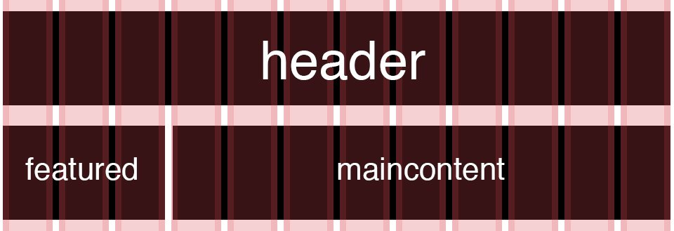
For instance, if we want our featured and main content to each take up a single column that’s around half the page, we’d add their class names in with “span_1”. We’ll want our header stretched all the way across the page, so we’ll toss it in with “span_2”, which stretches all the way across the page.
.span_1, .featured, .maincontent {
  @include span(1, $gutter_pc, $gutter_px, $padding, $max_columns);
}

.span_2, .header {
  @include span_first;
  width:100%;
}
That’s really all there is to it! All you have to do is repeat this quick process of adding classes for each of the ranges that we set up in the web app.
For instance, let’s say we jump to our desktop section and it contains twelve possible spans. Here we want the header to take up 100% width, the featured content to take up a third of the width and the main content to take up 2/3 of the width. We’ll add the “header” class to “span_12”, the “maincontent” class to “span_9” and the “featured” class to “span_3”.
.span_1 {
    @include span(1, $gutter_pc, $gutter_px, $padding, $max_columns);
}
.span_2 {
    @include span(2, $gutter_pc, $gutter_px, $padding, $max_columns);
}
.span_3, .featured {
    @include span(3, $gutter_pc, $gutter_px, $padding, $max_columns);
}
.span_4 {
    @include span(4, $gutter_pc, $gutter_px, $padding, $max_columns);
}
.span_5 {
    @include span(5, $gutter_pc, $gutter_px, $padding, $max_columns);
}
.span_6 {
    @include span(6, $gutter_pc, $gutter_px, $padding, $max_columns);
}
.span_7 {
    @include span(7, $gutter_pc, $gutter_px, $padding, $max_columns);
}
.span_8 {
    @include span(8, $gutter_pc, $gutter_px, $padding, $max_columns);
}
.span_9, .maincontent {
    @include span(9, $gutter_pc, $gutter_px, $padding, $max_columns);
}
.span_10 {
    @include span(10, $gutter_pc, $gutter_px, $padding, $max_columns);
}
.span_11 {
    @include span(11, $gutter_pc, $gutter_px, $padding, $max_columns);
}
.span_12, .header {
    @include span_first;
    width:100%;
}
Here’s a look at the widths that this code would apply to each of these sections. With very little effort, we have a nice little grid of content:
Just continue setting up each range, then resize your window and you’ll see your content automatically adapt. If you’d like to see it in action, check out the demo page that comes included with every Gridpak download.
Conclusion
Having spent some time with Gridpak since my first review, I thought it was necessary to revisit this tool and say that I do in fact think that it’s quite useful as a launching off point for responsive design. The current documentation and commenting should walk you through everything you need to know, bringing the learning curve down considerably.
If you’re going to use the SCSS version like I did above, you’ll have a pretty concise and flexible framework to start from and you’ll need very little effort to get your content adhering to the various breakpoints. Setting these up with the web UI is definitely easier than hand-coding them all.
I still have an issue with the idea of starting with media queries and inserting content as opposed to building media queries as the content leads, but as long as you begin with the right HTML structure, you could still conceivably work this way while still leveraging Gridpak.
Leave a comment below and let me know what you think of Gridpak. Would you consider using it as a starting point for your next responsive design project? What other useful RWD tools have you come across recently?