How to Build a Responsive Thumbnail Gallery
Recently I set out to build a responsive thumbnail gallery. I expected it to take me a few minutes, but in reality it took me a few hours to work through. We’ll walk through a similar process today to help you get your mind wrapped around how it works.
One major component of mastering responsive design is to figure out how to approach specific tasks and adjust to problems as they arise within the context of larger projects. One day you’ll be working on a project and will need a responsive gallery and you’ll remember this post on that very topic.
Sneak Peek
Before we get started, take a quick look at what we’re building. Be sure to resize your browser window page to get a glimpse of just how well the page responds to different viewport sizes.
Demo: Click here to launch the demo.

Initial HTML
Let’s jump into this project with some basic HTML. Instead of using plain old images in our gallery, we’ll go for something that’s much more versatile. For any given entry, you might want an image, title and brief description. Wrap all of this into a repeatable element and throw it all into a container div. It should look something like this:
<div class="container">
	<div class="galleryItem">
		<a href="#"><img src="..." alt="" /></a>
		<h3>Title</h3>
		<p>Lorem ipsum dolor sit amet...</p>
	</div>

	<div class="galleryItem">
		<a href="#"><img src="..." alt="" /></a>
		<h3>Title</h3>
		<p>Lorem ipsum dolor sit amet...</p>
	</div>
</div>
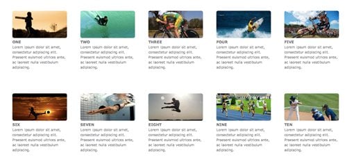
To add items to the gallery, simply copy and paste the galleryItem div (our example will use ten of these). From here we can see what we’ll need to target in our CSS. We have two classes: container and galleryItem. We also have some images, h3 tags and paragraphs. For the images, I’ll be using photos from LoremPixel.
Container Styles
To begin our CSS, let’s set a width to the container and center it on the page. This gives us a nice, wide area to work in for our gallery.
.container {
	width: 80%;
	margin: 30px auto;
	overflow: hidden;
}
Notice that I’ve set the width with a percent. This how we make sure the whole page is nice and fluid. We don’t want the design to merely look good for a few preset breakpoints, instead we to make sure that it can continually adapt to whatever viewport is being used.
Basic Gallery Styles
Now let’s attack the galleryItem class basic styles. We’ll set the text color and font-size and float the items to the left.
.galleryItem {
	color: #797478;
	font: 10px/1.5 Verdana, Helvetica, sans-serif;
	float: left;
}

.galleryItem h3 {
	text-transform: uppercase;
}

.galleryItem img {
	max-width: 100%;
	-webkit-border-radius: 5px;
	-moz-border-radius: 5px;
	border-radius: 5px;
}
I also added some image styling here. By setting the max-width of the images to 100%, I’ve ensured that, as the page gets narrower, the images will follow suit. I finished off by slightly rounding off the corner of each image.
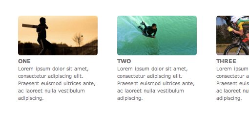
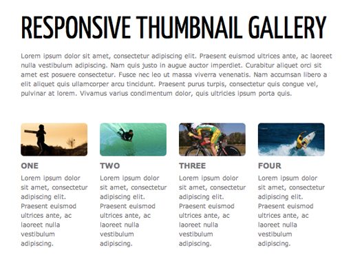
We’ll add the column widths in the next step but for now I wanted to give you a preview of what the text and image styles will look like once we get all that worked out. If you’re following along, you should only have on wide column at this point but your text should look like this:
Flowing the Columns
This is the trickiest part. We need to figure out our width and margin for each of the elements in the gallery. As with the container as a whole, each of these will need to use a percentage so they adapt to changes in the viewport size.
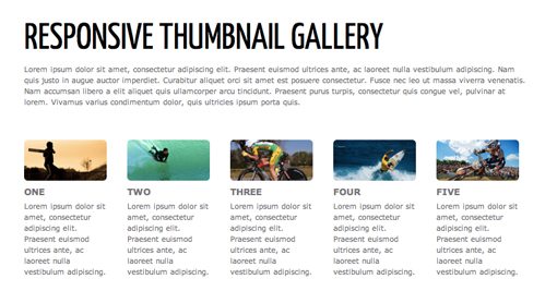
As a starting point, I’d like to use a five column design. To figure out the math necessary to pull this off, it’s easiest to start with the margins. I want a four percent margin between each column, so multiply that by five columns and we know that twenty percent of our width will be eaten up by margins, which leaves eighty percent for content. Eighty percent divided by five equals a sixteen percent width for each column.
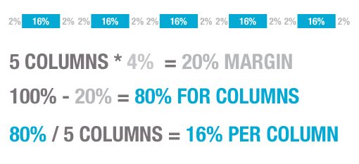
Now we can add these values to the CSS that we’ve already established. Each .galleryItem class represents one column, so each will have a width of 16% and a margin of 2% on each side for a combined total of 4% per item.
.galleryItem {
	color: #797478;
	font: 10px/1.5 Verdana, Helvetica, sans-serif;
	float: left;

	width: 16%;
	margin:  2% 2% 50px 2%;
}
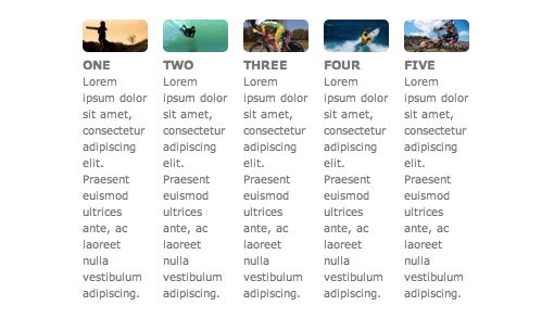
This gives us a perfect five column layout that looks great on screens that are 13-inches or larger.
Where It Gets Ugly
Unfortunately, this layout really starts to suck as we reduce out page size. By the time we’re under 500px wide it has completely lost its readability and usefulness.
To address this problem, we’ll use media queries to insert some breakpoints that will reflow the columns to a more appropriate size.
Deciding On Breakpoints
There’s been a lot of discussion lately on which breakpoints you should aim for in your design. The market is saturated with different devices all at different sizes, and it’s not easy to account for all of these specifically.
To simplify this task, let’s scrap our thoughts about what size screen the most popular devices have and let our design itself decide where the breakpoints are. If we analyze the points where our layout breaks down, we can fix those specific areas, thereby making our design look good on every conceivable device (our fluid grid takes care of the in-between).
Where Does It Break?
The best way to test this is just to open our live preview in a browser and start reducing the window size. Technically, our layout will never break because it’s built to scale. However, at around 940px, the columns of text start to become far too narrow for my liking:
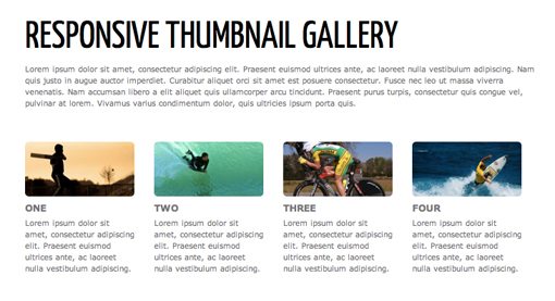
To account for this, I need to bring the column count down to four instead of five at that point. By reducing our column width to 21%, we can do this very thing. Since I’m using both “max-width” and “max-device-width” here, the design will reflow on both desktop browser windows (at this size and lower) as well as any devices with physical screen sizes under this width.
@media only screen and (max-width : 940px),
only screen and (max-device-width : 940px){
	.galleryItem {width: 21%;}
}
Adding in these styles fixes this problem up nicely. Our five column design now works perfectly from full size down to 940px, at which point it turns into a four column design.
Lather, Rinse and Repeat
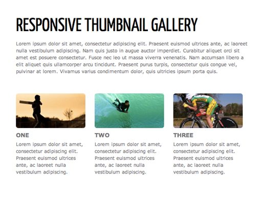
At this point, you just repeat this same process over and over. Keep reducing the window size and watching for a point where the design no longer functions well. I quickly find another problematic area around 720px:
This time we want to bring the design down to a two column design, which is done with a column width of around 29.33%.
@media only screen and (max-width : 720px),
only screen and (max-device-width : 720px){
	.galleryItem {width: 29.33333%;}
}
I continued this process all the way down the the point where I only had one column right around the size of the iPhone. Here’s the full set of media queries.
/* MEDIA QUERIES*/
@media only screen and (max-width : 940px),
only screen and (max-device-width : 940px){
	.galleryItem {width: 21%;}
}

@media only screen and (max-width : 720px),
only screen and (max-device-width : 720px){
	.galleryItem {width: 29.33333%;}
}

@media only screen and (max-width : 530px),
only screen and (max-device-width : 530px){
	.galleryItem {width: 46%;}
}

@media only screen and (max-width : 320px),
only screen and (max-device-width : 320px){
	.galleryItem {width: 96%;}
	.galleryItem img {width: 96%;}
	.galleryItem h3 {font-size: 18px;}
	.galleryItem p, {font-size: 18px;}
}
Conclusion
There we have it. You should now have a nicely formatted responsive thumbnail gallery that looks great on just about every device and browser window size.
Instead of thinking about which media queries are the most popular, we instead analyzed the points where our specific design ceased being functional and reduced the number of columns at that point to make for a better reading experience. The result is a design that excels in the in-between.