Mastering CSS Reflections in Webkit
The box-reflect property is just one of many awesome new CSS3 effects that Webkit brings to the table. Unfortunately, it’s not the easiest to use. There’s a lot of syntax that can be confusing and today we’re going to sift through it and explain it in detail so you can get the hang of it.
It’s important to note that, at this point, box-reflect is only supported by Webkit browsers. It’s a superfluous visual effect so you can use it as long as you accept that it’s not going to render in anything but Chrome and Safari.
Basic Syntax: Direction is All You Need
Despite the fact that, in practice, it’s so complex, -webkit-box-reflect starts off extremely easy to use. All you need to do to add a reflection to an element is declare the property and set the direction value.
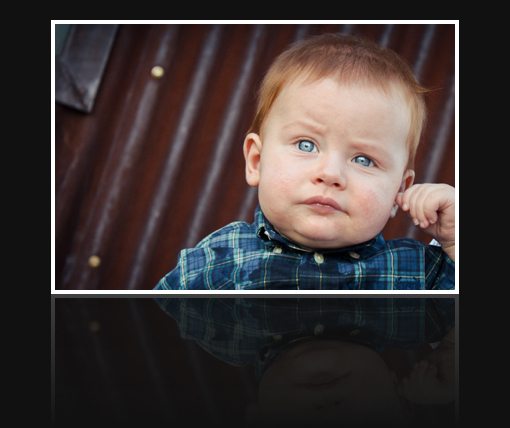
-webkit-box-reflect: below;
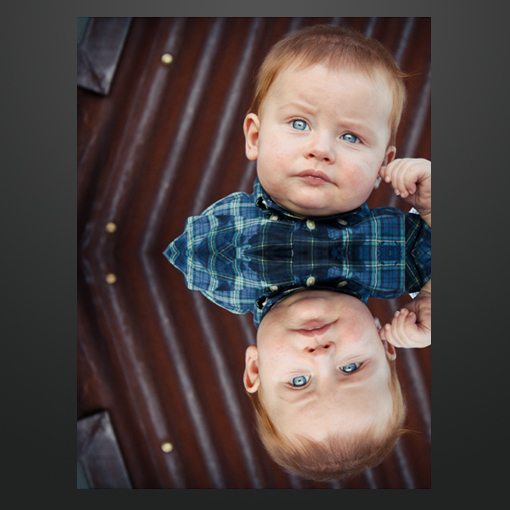
In the example above I set the direction value to below. Fully 98% of the time or more, this is the only value you’ll need. But just in case you’re really getting creative, you can actually declare a reflection in any of four directions:
-webkit-box-reflect: above;
-webkit-box-reflect: below;
-webkit-box-reflect: left;
-webkit-box-reflect: right;
Which ever direction you choose, the browser will choose that as an anchor point and flip the image. So for instance, if you changed our original example to a value of right, you’d get the following.

Offset
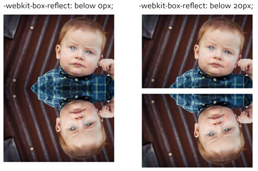
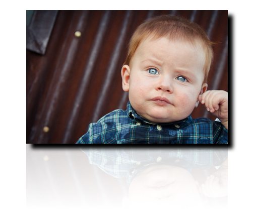
After the direction value, you can optionally set an offset value. This is pretty basic and simply puts distance between the image and its reflection, almost as if the image were hovering over a glass surface. Here’s how it works:
-webkit-box-reflect: below 20px;
Here’s a preview of what the difference is between a value of “0” and a value of “20px”.
Interestingly enough, you’re not limited to pixels as a measurement. Here are a few other values that work as well:
-webkit-box-reflect: below 20px;
-webkit-box-reflect: below 1.5em;
-webkit-box-reflect: below 10%;
Webkit Gradients
Why are we talking about webkit gradients, isn’t this an article about reflections? The answer is that the third value, mask-box-image, utilizes various complicated tools to achieve some advanced effects, the primary being -webkit-gradient. You simply can’t understand how CSS reflections work without first understanding gradients.
There are several types of gradients and browsers differ in their syntax, but for the purposes of this article, we’ll stick to Webkit linear gradients. Let’s jump right in and look at the code for a basic Webkit gradient.
background-image: -webkit-gradient(linear, center top, center bottom, from(white), to(black));
This code results in the following gradient:
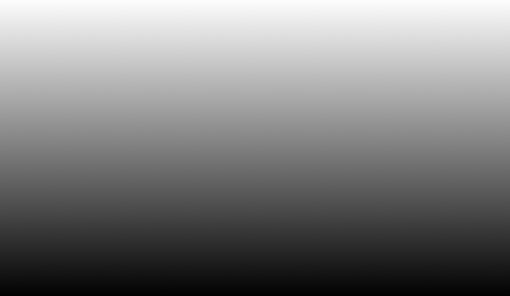
This code can be confusing so let’s break it down. There are three main portions: type, starting/stopping point and from/to color. There are a couple of different types but we don’t need to get into anything but linear gradients so this value will remain the same.
The starting and stopping points enable you to angle your gradient in the direction that you use. In the example above, we started in the center top and finished in the center bottom, resulting in a perfectly vertical graduation of color. However, if we start playing with these, we can achieve different results.
background-image: -webkit-gradient(linear, left top, right bottom, from(white), to(black));
This time we started at the left top and finished at the right bottom, which results in an angled gradient like the one below.

Likewise, the from and to values allow you to set the color at the beginning and end of the gradient. In the examples above we went from black to white but you can use any colors you want in any of the CSS color format you want.
Here’s another example that creates a nice red gradient.
background-image: -webkit-gradient(linear, center top, center bottom, from(#fc0000), to(#770000));

Color Stops
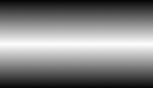
In addition to the starting and stopping points, you can also declare various color stops along the way. Basically, what you’re doing is telling the browser, at point “x”, make the gradient this color.
Here’s an example of a gradient that goes from black to black, which would normally result in a solid color. However, we’ve thrown in a color stop at 50% and set it to white, which results in a gradient that starts at black, fades to white half way through, then fades back to black.
background-image: -webkit-gradient(linear, center top, center bottom, from(black), color-stop(50%, white), to(#black));
Masking the Reflection
Now that we know how gradients work we have the third piece in our Webkit reflection puzzle. After declaring the direction and offset values, your reflection is still looking pretty boring but through the use of a gradient mask we suddenly have much more control.
Let’s throw in the gradient syntax and see what we come up with:
-webkit-box-reflect: below 0px -webkit-gradient(linear, left top, left bottom, from(transparent), to(white));
As you can see, here we went from top to bottom and threw a curve ball in by declaring the from color as transparent. Since we’re essentially building a mask, the transparent color will allow the gradient to fade out over any background. Likewise, the white of the gradient simply represents full opacity for the reflection at that point.
This code results in the following image:
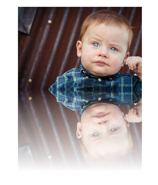
As you can see, fading out the reflection with gradient allows a certain dynamic level that gives a hint more realism that we were previously achieving. One of the most confusing things here is that, even though we declared transparent at the top of the gradient and fully opaque at the bottom, what we really get is the exact opposite! This is because our reflection is an upside down version of the image, so everything is flipped.
If this confuses you, all you have to do is flip all of the gradient values. The following code will result in the same gradient and may be easier for some to understand because it starts at white and ends at transparent, just like the result above.
-webkit-box-reflect: below 0px -webkit-gradient(linear, left bottom, left top, from(white), to(transparent));
Shortening the Reflection
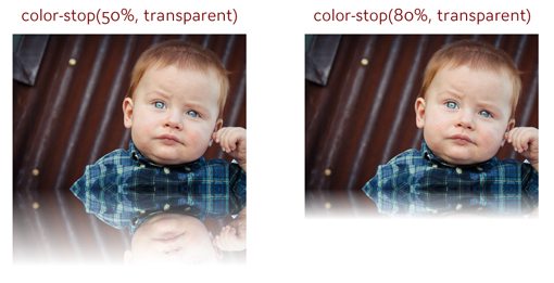
At this point, you may have noticed that our reflection is quite long. In cases where you’re working with a large image like we are, you’ll probably want to shorten that gradient a bit so that it fades to transparent sooner.
So how does this work you ask? This is where those color-stops come into play. What we’ll want to do is create a gradient from transparent to white, then insert a transparent color-stop somewhere along the way, which will effectively fade out the reflection sooner. Let’s take a look at the code.
-webkit-box-reflect: below 0px -webkit-gradient(linear, left top, left bottom, from(transparent), color-stop(50%, transparent), to(white));
Reducing the Reflection’s Opacity
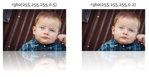
Every discussion I’ve ever seen for box-reflect stops there. Unfortunately, I think our gradient still isn’t very believable. Whenever I create reflections in Photoshop, I always reduce the opacity of the reflection layer. Rarely would you see a real reflection that’s as stark as the object it’s reflecting!
So, at this point our reflection looks silly and we need a way to reduce its opacity. The obvious solution that I first thought to give a try turned out to be the correct one: rgba. Since the colors we declare in the gradient are really just defining the transparency of the gradient, using rgba instead of pure white allows us to bring down the opacity and create a much more believable result.
In the code below, I simply swapped out the word “white” for its rgba equivalent at 20% (0.2).
-webkit-box-reflect: below 0px -webkit-gradient(linear, left top, left bottom, from(transparent), color-stop(50%, transparent), to(rgba(255,255,255,0.2)));
Here are two different results with only the alpha value of the rgba property being manipulated. As you can see, the result is much better than we were getting with solid white!
Using an Image Mask
Here’s a little trick I learned from Peter Gasston in The Book of CSS3. Instead of building your mask using CSS gradients, you can actually just use an image. Using this method, you can come up with some pretty crazy results.
All you do is declare a source url just as if you were setting a background-image on an element. Despite the downside of being forced to load in an image, the code is actually much cleaner.
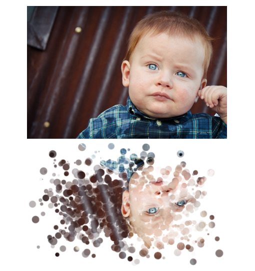
-webkit-box-reflect: below 0px url(shape.png);
To test this out, I created and saved out two separate PNG files with transparent backgrounds. One contains only solid black while the other uses a radial gradient.
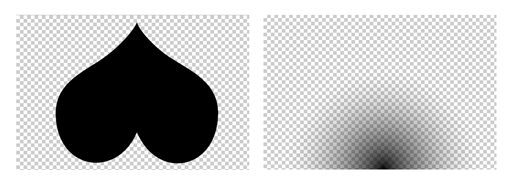
When we use the snippet above to apply these images to our reflection, here’s what we get:
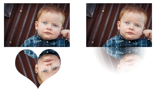
I can’t for the life of me think of a practical use for this technique, but if you put some creative thought into it the possibilities are endless.
Layout Implications
When you’re using -webkit-box-reflect, it’s important to understand how the reflection will interact with your layout. Interestingly enough, it doesn’t!
The reflection is more of a a background image than an element that affects the flow of the document. To see how this works, here are two examples, the first with a reflection and the second without.
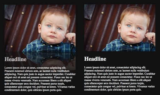
As an odd and unexpected side effect, notice that, even though the the reflection on the left isn’t changing the page layout, it is somehow messing with the color of the text.
Combining with Other CSS Effects
One final note about reflections: you can combine them with other pure CSS effects with great results. For instance, here’s an example of an image with rounded corners and another with a border applied. Both effects are perfectly represented in the reflection.
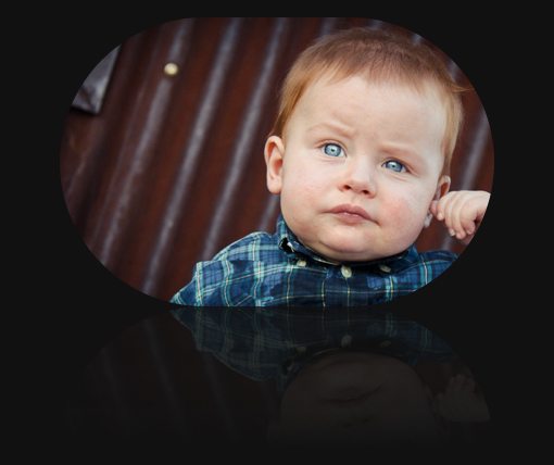
However, it’s not the case that all CSS effects are reproduced in the reflection. For instance, here’s what happens if you throw in a box-shadow. Notice how it only appears on the original image and not in the reflection.
Conclusion
To sum up, all you really need to create a working reflection is a direction value. However, by utilizing direction, offset and a gradient together, you can achieve much better results and effectively fade out the gradient.
The effect is greatly improved if you use rgba to reduce the overall opacity of the reflection. You can then apply borders, rounded corners and various other effects and they will automatically be applied to the reflection.
Finally, if you want to get really crazy, you can use an image to mask the reflection. The image is used only to apply transparency so where there is a solid color, your reflection will be opaque and where there is transparency, your reflection will be transparent.