The Lowdown on :before and :after in CSS
We previously took a look at :active, an extremely handy pseudo-class selector that can be used to create some awesome mouse-down effects. Today we’re going to take a step back and explore some other “pseudo” items, this time we’ll be looking at the pseudo-elements :before and :after.
You’re probably beginning to see these used all over the web in advanced CSS examples so you might as well jump in and learn to use them yourself.
What is a pseudo-element and how does it differ from a pseud-class? Why do pseudo-elements sometimes have one colon and sometimes have two?
How are :before and :after implemented in CSS? What are some ways that developers all over the web are using these tools to perform amazing feats of modern coding?
Read on to find out.
Pseudo-Classes vs. Pseudo-Elements
This is a super confusing little piece of semantics that lots of people seem to be mixed up about (myself included before diving into the research). If you run a quick Google search to find the difference between the two, you’ll find longwinded and overly technical responses mixed in with simple, uninformed statements that the two are in fact different, with no discussion as to how or why.
Some sources, such as W3Schools, seem to use the terms interchangeably, which often results in incorrect usage. The answer though is pretty simple if you break it down.
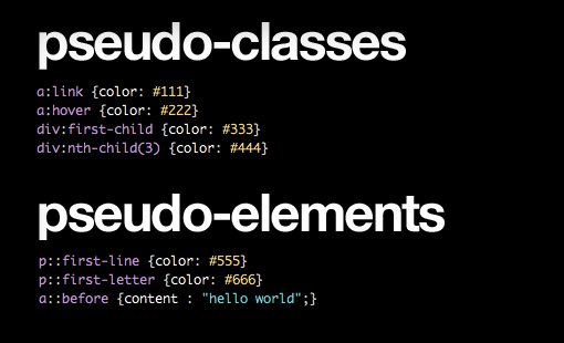
Pseudo-Classes: Target Whole Elements
First, let’s look at pseudo-classes, which target complete elements or element states.
a:link {color: #111}
a:hover {color: #222}
div:first-child {color: #333}
div:nth-child(3) {color: #444}
As you can see, though these conditions aren’t necessarily based on the DOM, the resulting selection is a complete element in every case. What is ultimately styled is an entire link element, paragraph, div, etc.
Pseudo-Elements: Target Element Sub-Parts
Pseudo-elements, on the other hand, select sub-parts of an element. This is an important distinction, here are some examples:
p::first-line {color: #555}
p::first-letter {color: #666}
a::before {content : "hello world";}
As you can see, all of these target only a part of an element: the first line or letter of a paragraph for instance. These also have the amazing ability to target and even add to things that aren’t even specified in your HTML, which is exactly what :before and :after, the topic of today’s discussion, do for us.
To read more about the differences between pseudo-classes and pseudo selectors, I highly recommend that you check out UMD for a nice and thorough explanation with plenty of examples.
:before vs. ::before
Before we jump into what :before and :after actually do in CSS and how you can use them to accomplish some cool stuff, let’s clear up one more major point of confusion. If you look around the web for examples of :before and :after in use, you’ll find two different syntaxes.
Sometimes developers will use a single colon, other times they’ll use two. Do the two perform different functions? Not at all, it turns out they’re exactly the same from a functional perspective, meaning both will achieve the same result and are used for the same purpose. So why the difference? Here’s an example:
/*CSS2*/
.example:before {}
.example:after {}
.example:first-child {}

/*CSS3*/
.example::before {}
.example::after {}
.example:first-child {}
As you can see, in CSS2, we used a single colon to represent both pseudo-classes and pseudo-elements. However, to help differentiate between the two, CSS3 includes a second colon only on pseudo-elements.
IE Ruins Everything, Again
So why do we still see both syntaxes in modern examples and tutorials? Are some developers just ignorant of the change? That might be the case, but the likely answer for most of these inconsistencies lies with our old friend Internet Explorer, destroyer of all things new and good in the world of web development.
It turns out that all modern browsers accept the double colon syntax, but sadly, IE8 does not. For this reason, when coding with ::before and ::after, most developers opt for compatibility over convention and simply use the CSS2 single colon syntax. To keep things simple and consistent, we’ll stick with this more widely compatible syntax for the rest of this discussion.
What Are :before and :after?
That was a lot of groundwork but it’s all necessary to know when you’re going into a discussion on using :before and :after in CSS. Now we can finally jump in and see how these things work.
The concept here is actually really simple. Both :before and :after allow you to actually add to your HTML elements from your CSS without cluttering your presentational markup. This opens up a lot of possibilities for adding little decorative elements that don’t necessarily merit extra markup.
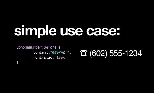
For instance, let’s say you have a few phone numbers throughout your site and would like to place the ☎ icon in front of them. You can use the :before pseudo element to do just that:
.phoneNumber:before {
	content:"☎";
	font-size: 15px;
}
This code will actually insert the little icon before every element marked with the .phoneNumber class. The :after code works exactly the same way only, as you can guess, it will place the icon after the phone number.
.phoneNumber:after {
	content:"☎";
	font-size: 15px;
}
A Brief Example

One reason that :before and :after have become so incredibly popular lately is for their ability to dramatically increase the complexity of pure CSS design elements. Without any additional markup, we can use these pseudo elements to add in additional style-able elements and layers.
To see how this works, let’s style a simple button. These are the basic styles that style the .button class to be round with a red gradient:
.button {
  height: 100px;
  width: 100px;
  position: relative;
  margin: 50px;
  color: white;
  text-align: center;
  line-height: 100px;

  /*Rounded Corners and Shadows*/
  -webkit-border-radius: 100px;
  -moz-border-radius: 100px;
  border-radius: 100px;
  -webkit-box-shadow: 2px 2px 4px rgba(0,0,0,0.4);
  -moz-box-shadow: 2px 2px 4px rgba(0,0,0,0.4);
  box-shadow: 2px 2px 4px rgba(0,0,0,0.4);

  /*Ridiculous Gradient Syntax*/
  background: #e51d16; /* Old browsers */
  background: -moz-linear-gradient(top,  #e51d16 0%, #b21203 100%); /* FF3.6+ */
  background: -webkit-gradient(linear, left top, left bottom, color-stop(0%,#e51d16), color-stop(100%,#b21203)); /* Chrome,Safari4+ */
  background: -webkit-linear-gradient(top,  #e51d16 0%,#b21203 100%); /* Chrome10+,Safari5.1+ */
  background: -o-linear-gradient(top,  #e51d16 0%,#b21203 100%); /* Opera 11.10+ */
  background: -ms-linear-gradient(top,  #e51d16 0%,#b21203 100%); /* IE10+ */
  background: linear-gradient(top,  #e51d16 0%,#b21203 100%); /* W3C */
  filter: progid:DXImageTransform.Microsoft.gradient( startColorstr='#e51d16', endColorstr='#b21203',GradientType=0 ); /* IE6-9 */
}
Amazingly enough, all of this work will result in a fairly plain looking circle button:

Now, let’s say we want to add a slightly darker area outside the button and give it an inner shadow so the whole thing looks slightly inset. Rather than adding extra markup, we can simply use an empty pseudo-element.
.button:before {
  content:"";
}
Now we can style this to add the desired effect. This is the basis for many of the fancy, difficult to wrap your mind around CSS styling tutorials you see on the web today.
.button:before {
  content:"";
  width: 100%;
  height: 100%;
  display: block;
  z-index: -1;
  position: relative;
  padding: 15px;
  background: #ddd;
  left: -15px;
  top: -15px;
  -webkit-border-radius: 100px;
  -moz-border-radius: 100px;
  border-radius: 100px;
  -webkit-box-shadow: inset 2px 2px 4px rgba(0,0,0,0.4);
  -moz-box-shadow: inset 2px 2px 4px rgba(0,0,0,0.4);
  box-shadow: inset 2px 2px 4px rgba(0,0,0,0.4);
}
Now our button has a little bit more dimensionality to it. The :before pseudo-element is evident in the outer ring. We gave it a z-index of -1 to drop it behind the button and used absolute positioning to nudge it into place.

Now let’s say we wanted to do the same thing one more time. This go around we can access the :after pseudo-element and repeat the process.
.button:after {
  content:"";
  width: 100%;
  height: 100%;
  display: block;
  z-index: -2;
  position: relative;
  padding: 25px;
  background: #eee;
  position: absolute;
  left: -25px;
  top: -25px;
  -webkit-border-radius: 100px;
  -moz-border-radius: 100px;
  border-radius: 100px;
  -webkit-box-shadow: inset 2px 2px 4px rgba(0,0,0,0.4);
  -moz-box-shadow: inset 2px 2px 4px rgba(0,0,0,0.4);
  box-shadow: inset 2px 2px 4px rgba(0,0,0,0.4);
}
This simply adds in another layer. Now our button appears to have a double inset from the top canvas:
What Else Can You Do With :before and :after?
By now you should know quite a bit about :before and :after and how they are being used in modern web design. It turns out though that the rabbit hole goes deeper still, these pseudo-elements are being used for all kinds of crazy stuff. Here are a couple of popular uses that you should know about:
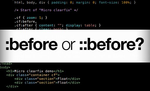
Micro Clearfix
Who doesn’t love a good clearfix? CSS floats can be a real pain (they break the fifth commandment and aren’t nice to their parent elements) and developers everywhere are constantly looking for a better way to clear them.
Nicolas Gallagher came up with what appears to be the current favorite clearfix hack, which utilizes :before and :after in a creative way.
/* For modern browsers */
.cf:before,
.cf:after {
    content:"";
    display:table;
}

.cf:after {
    clear:both;
}

/* For IE 6/7 (trigger hasLayout) */
.cf {
    zoom:1;
}
Here the :before pseudo-element prevents top-margin collapse and the :after pseudo-element is used to clear the floats. It’s a pretty nifty solution that uses a lot less code than other notable cross-browser friendly attempts.
Before you run off and leave a comment, I both know about and use the overflow: hidden method. This is simply an alternative that’s particularly helpful when the overflow trick isn’t appropriate.
CSS Shapes
Another really interesting use of :before and :after is to create complex shapes using pure CSS instead of images. This is accomplished through some really clever manipulation of borders along with some pseudo-element magic.
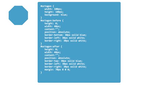
CSS3Shapes.com has some awesome examples of basic shapes that you can build using this method. For instance, here’s the code for an octagon.
#octagon {
   width: 100px;
   height: 100px;
   background: blue;
}

#octagon:before {
   height: 0;
   width: 40px;
   content:"";
   position: absolute;
   border-bottom: 30px solid blue;
   border-left: 30px solid white;
   border-right: 30px solid white;
}

#octagon:after {
   height: 0;
   width: 40px;
   content:"";
   position: absolute;
   border-top: 30px solid blue;
   border-left: 30px solid white;
   border-right: 30px solid white;
   margin: 70px 0 0 0;
}
As you can see, :before and :after are called, positioned and then given borders. This combines various simple shapes into complex ones. Pretty spiffy!
Even More Pseudo-Element Goodness
If you’re looking for even more crazy stuff to do with pseudo-elements, Chris Coyier has an awesome roundup of possible applications on his site CSS-Tricks.
Conclusion
By now you should pretty much be an expert on :before and :after in CSS. You should know the difference between pseudo-classes and pseudo-elements and why the latter is often seen with either a double or single colon. You should also know how :before and :after work on a basic level and have a good idea for how to use them to create some impressively advanced CSS voodoo.
Leave a comment below and let us know if you learned anything. What other great tricks have you seen performed with pseudo-elements?