10 Design Lessons From HTML Email Templates That Actually Sell
In the past we and several other blogs have outlined some useful technical information for how to code and structure your HTML emails from a developer point of view. But much less discussion has been given to how to actually undertake the design component of email newsletters.
Today we’ll take a look at some of the top-selling email templates from Themeforest and see if we can decipher what their designers did right so you can mimic these basic principles in your own designs.
#1 Keep it Narrow
Email clients vary considerably not only with the way that they interpret code but simply with the way that they display messages. Consider the difference between viewing a message in Apple Mail on a 20″ monitor as opposed to Gmail on a 13″ monitor.
Obviously, the width of your design becomes a major issue. While you can flood the background with a color through a 100% width table, most standards recommend that you use a content width of somewhere between 500-620 pixels.
A narrow design looks great and will work perfectly across the majority of devices and clients.
#2 Options Are Everything
One major key to creating templates that sell is remembering that a one size fits all approach won’t work. Customers purchasing a design template don’t just want strong design, they want value. They see value in the options you make available.
If your template has one layout and one or two color schemes, you’re not really providing a ton of variety. This locks the purchaser into a fairly limited number of options, which doesn’t make the purchase a wise decision in the long term.
However, if your template allows them to choose from several different layouts and color options, potential customers will appreciate the opportunity to choose from so many different email newsletter variables on a weekly basis, allowing them to switch things up and see what works best for their unique customer base.
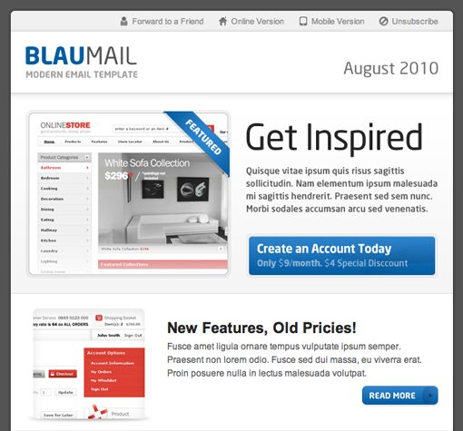
As an example of strong variety, consider the BlauMail template shown below. First, you choose from a number of different color and template options (rounded or square corners).
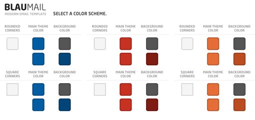
Next, you choose from one of three unique layouts.
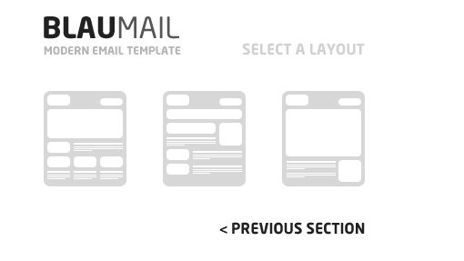
This takes you to the template with the options you selected. To account for all of the variables, BlauMail comes with a whopping 60 HTML files!
#3 Create Clearly Defined Sections
Companies use HTML emails as a point of continual contact with their customers and, whether or not it’s the best thing to do from a strategy point of view, they like to put quite a bit of content in them.
Businesses want to let their customers know about sales, promotions and updates in a variety of different areas and need to be able to do so in a non-cluttered space. So rather than creating an email with only one big content area, consider breaking it up into a number of different sections.
The Fresh Email Template below takes this idea to an extreme and physically separates the different sections onto different backgrounds, creating a modular look.
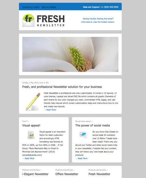
This template has 750 purchases to date, putting it at the top of the list on ThemeForest. So if you’re going to take lessons from any template, it should probably be this one!
#4 Simple Sells
While some template designers go all out with creative themes, bold colors and stunning graphics, others can sell twice as many templates using strong layouts and simple but attractive graphics.
#5 Shoot For a Niche
As we saw above, creating a basic layout and a generic design goes a long way because of the huge audience that it appeals to. However, using this technique can make it hard for you to stand out among the competition.
If an all-purpose strategy isn’t working out for you, try to target a sizable niche of consumers looking for something specific.
#6 Make It Easy to Brand
Remember that buying a template is often a compromise for many businesses because the product isn’t being built from the ground up to showcase their brand.
You can help overcome this hurdle to purchasing by providing potential buyers with plenty of places throughout the design to insert their company name, logo, slogan, a personal photo/profile, etc. This simple technique will help customers see that they can really make the template their own not have to give up personalization for affordability.
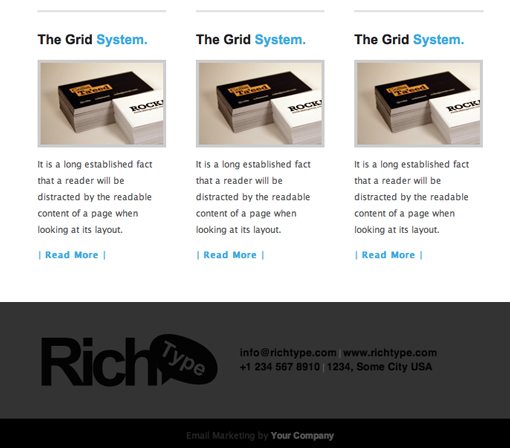
The Rich Typography email template below has inserted a large logo area in the footer in addition to various contact information and another logo in the header.
#7 Curl The Corners
As much as I hate to offer advice that follows design clichés, this popular trend seems to be effective with customers. Curling up the corners of the content area helps create a paper illusion, which of course ties in nicely with the concept of a newsletter.
Notice in the Elegance Template below that this technique is used not just on the edges of the content area but on the images within the newsletter as well.
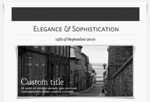
Essentially all that you’re doing here is providing a sense of depth to a flat image and making it more three dimensional. Whatever unique tricks you can use to this same end will be even better.
#8 Try a Simple, Repeating Background
All but one of the examples we’ve looked at so far share one common design trait: solid backgrounds. Simple, solid color backgrounds are definitely a design trend with HTML emails. Thought it’s wise for loading times to cut down on images, none of these templates seem shy about using images in any other context.
#9 Don’t Forget The Social Media Integration
Many business owners can’t begin to describe what Twitter is, but they’re on it. Overzealous marketers have convinced businesses that social media is a gold mine that will bring immense Internet fame.
On a practical level, this means that just about everyone you sell a template to will have an interest in social media and that you should therefore not be shy about working various popular sites into your design.
#10 Use Web Screenshots In Your Design
One final trend that I noticed in several top-selling templates was the tendency to use website screenshots as a primary element in the design. Since many businesses use email newsletters primarily as a way to drive traffic to their site, it makes sense that they want to feature shots of their site in the email.
By incorporating sample web shots into the design, you’re helping potential buyers see the your template meets their goals perfectly. In all honestly they could use any template with an image area to accomplish the same goal, but it helps to see the idea realized before you attempt it.
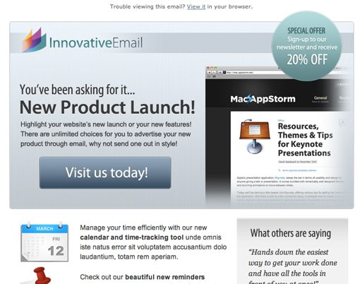
Check out the Innovative – Product Tour template and how it creatively incorporates a basic Safari browser chrome with a sample web page.
Closing Thoughts
As always, I encourage you to use these samples of inspiration not as something to ripoff but merely as examples of successful design that you can learn from and use to spark your own original design ideas.
Leave a comment below and let us know what you think of the templates above. Also be sure to share any tricks or tips that you have found to be particularly useful when creating email templates for clients.