10 Tips for Designing Better Infographics
Infographics have been around for ages but in recent years they’ve really come into the spotlight as an almost irresistible way to communicate complex scenarios and information. We can’t help it, when we see a link for an infographic, we almost have to check it out!
If you’re at all interested in infographic design, read along as we take a look at some of our favorite examples and discuss some important do’s and don’ts for creating compelling and effective graphics.
Create One Strong Focal Point
Infographics too often turn into a complicated mess of graphics and text. As a designer, it’s very easy to get carried away and ultimately come away with something that’s more overwhelming than helpful.
One way to reign this tendency is to rely heavily on one central graphic that strongly communicates your overall theme or message:
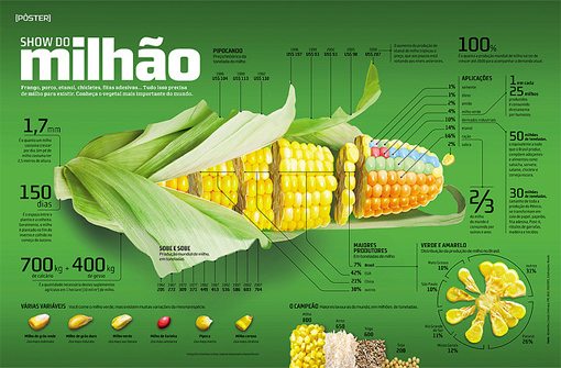
As you can see, the main corn graphic here is by no means the only attractive visual on the page, but it does eat up most of the available space. This helps pull you in and gives you the sense that you can easily digest the information depicted.
Once the main graphic has pulled you in, you can then choose to move your attention to the flanking information, graphics and textual information.
Can You Read it at a Glance?
Remember that, just like any design, an infographic should have a set of underlying goals that it is meant to accomplish. Typically, the point of an infographic is to take complex information and make it easier to take in through graphical reinforcement. Your goal then is to create something that can be consumed as quickly as possible. Not every little scrap of information needs to be communicated in an instant, but the overall gist of the data should at least be perceivable in under a few seconds.
If you don’t keep your eye closely on this goal, it’s easy to miss the mark. The result is something might be a small improvement over raw text, but fails to truly present the data in an engaging and easily consumable manner.
I can’t help but think that this infographic is unnecessarily difficult to sort through. As you design, think about the number of eye movements it takes to take in a data point. In the example above, you’re eyes are darting all over the place to decipher the layout on the horizontal point on the grid, the vertical point on the grid, the colors and how they all tie in together. Simply put, it’s too much work!
Use Applicable Metaphors
Some of the most engaging infographics take boring, complex information and apply a graphical metaphor that’s so perfect that even laymen can almost instantly understand what is being stated. The infographic below serves as an excellent example.
The designers were tasked with communicating fifty quarters of comparative positive economic growth among 14 countries. In a plain old chart, this is enough to put any high school student to sleep. However, with the race metaphor, it’s an entertaining, conversation starting graphic that even an elementary school student can grasp on a basic level.

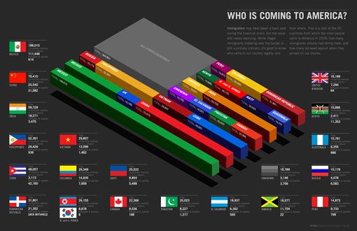
As another example, take a look at the graphic below. Here the influx of immigrants into the United States is depicted as a series of bar charts that make up the American flag. It’s a quick read that’s made that much more engaging by the familiarization of the data’s shape.
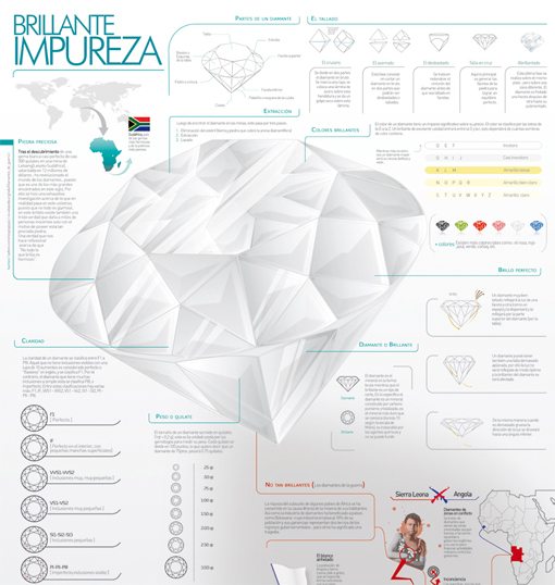
Take a Slice
Sometimes infographics aren’t merely used to jazz up raw data points but to communicate a real world situation. Under these circumstances, one popular go-to strategy is to illustrate a scene using three dimensional graphics that almost look like a scientific sample has been taken from the world similar to how a scientist would sample a tree.
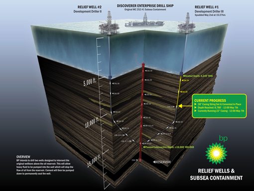
As you can see, the result of this technique is a remarkably interesting illustration that very quickly relates the issue. What would typically take several paragraphs or even pages to explain is condensed down to one helpful graphic.
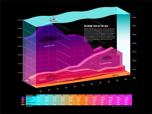
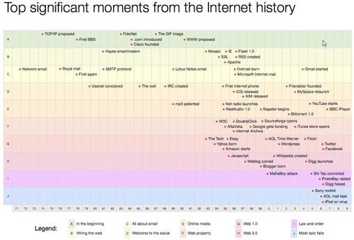
Data Can Be Beautiful
Sometimes infographics take a handful of data points and put them together for a quicker read, other times the point is to visualize a huge mound of data. In these situations, it’s simply not always a realistic or even desirable to make each individual point an area of interest.
Instead, the big picture is the primary focus: What can we learn from taking a step back to take in the data all at once? In these circumstances, designers often creatively plot the data in such a way that a beautiful piece of art results!
If you follow the link and take a close look at this chart, you see that there are simply too many pieces of information to attempt to take in. However, the infographic is still an excellent resource as it has turned painfully dull information into something truly remarkable that clearly depicts certain trends.
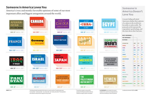
Rethink the Bar Graph
The designer who taught me most of what I know told me something that has always stuck with me: “Your first idea is probably your most generic.” In design, it’s likely the case that the first thing that pops into your head is the first thing that would pop into another designer’s head as well, which isn’t always bad but can lead to a lot of unoriginal work.
In infographics this concept frequently takes the form of a bar graph. Sure, it’s an incredibly useful tool that genuinely improves data visualization, but it’s also a bit generic and unimaginative from a design perspective.
The next time you start to create a bar chart, think about how you can put your own unique spin on it. The infographic below is a perfect example. Here the designer used 3D stacks of cards to depict Americans’ opinions of their allies. The higher the stack, the more favorable the opinion. At heart, it’s just a bar graph but in practice it made for a much more interesting graphic.
Use Repetition
Repetition is one of your core design tools and should be used in just about everything you create. This tool is especially useful and appropriate for infographics where the same data points are often shown repeatedly in different contexts.
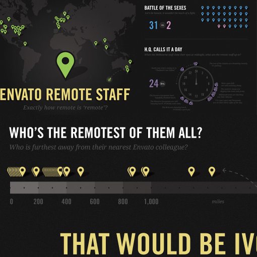
Below I chopped up the Envato Remote Staff Infographic to show how the designer repeatedly used the little Google Maps markers to represent staff members. Since the charts are all about location, this is a perfect metaphor and the repetition makes for a familiar schema that we instantly pick up on mentally and don’t have to reinterpret with each new section.
Tell a Visual Story
This tip has the same basic concept behind it as number two above. Since the goal of an infographic is to make for a quick read, your design should tell a story in an instant. Infographics should be very visual experiences that don’t necessarily rely too heavily on the text. It should be there for those that want to take the time to read it, but your pictures should carry the burden of communication fairly well on their own.
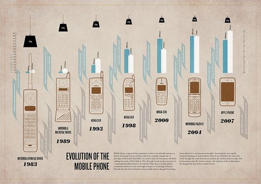
In the infographic below, I get a ton of information without reading a single word. Instantly I know that the point is to show cell phones over the years and I really get a feel for that evolution from the pictures. My eyes drift up from the phone pictures and I see hanging weights, a clear indication of how the physical weight of phones has progressed over the years.
Once you’ve got a working design in place for your infographic, try stripping out all of the text and showing it to someone who hasn’t seen it before. Can they tell roughly what’s going on? Is there anything you can do to improve that visual communication?
Carefully Visualize Comparisons
This is pretty much infographic design 101 but it’s an important point that you should give a lot of thought to. One major aspect of infographics is not only the representation of data but more importantly the comparison of data. Typographic art is quite popular at the moment but simply typing out big numbers in a nice font doesn’t really convey a sense of scale or reference. For this reason, designers turn to charts, graphs, illustrations and whatever else they can think of to convey the story being told.
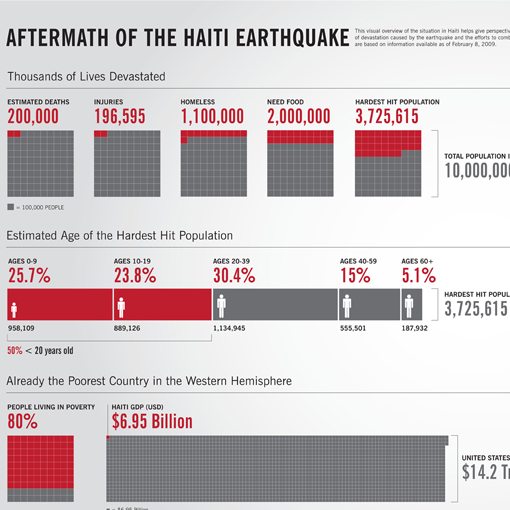
I mentioned above that you should consider rethinking any bar graphs that you use, here I extend this idea to any data visualization you employ. Your job is to show someone what 14.2 trillion looks like compared to 6.95 billion, how are you going to accomplish that? What tools and tricks can you use to take that unimaginable scale and bring it down to something that we can comprehend in two seconds?
Pour on the Visual Hints
Let’s say you do resort to using a plain old bar graph, which is perfectly acceptable. Your job then is to consider how you can make it even more readable, even to the point of redundancy.
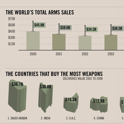
Consider the little flags on the bar chart below. Now, since I am capable of reading a bar chart on my own, I don’t really need those little flags on top of each bar depicting the value. However, this trick does add some visual interest to the design while reducing the amount of work necessary to interpret the data. This one little touch could’ve easily been left off, but the designer took the extra time to make doubly sure the information could be read quickly.
More Infographics
Can’t get enough infographics? Check out the links below for more awesome design examples.
Conclusion
You probably noticed that many of the tips above boil down to a single point: make data user friendly. As designers, we love to talk about the “pretty” aspect of infographic design and the art that is involved, but the prize to keep our eyes on is user satisfaction.
Infographics are one of the purest examples of graphic design that you’ll ever come across. We see here that design is so much more than fonts and colors, design is the creative organization, styling and presentation of information with the goal of increasing interest, readability and comprehension beyond that of pure text.
Leave a comment below and let us know your thoughts on the infographics shown above. Which are your favorites and why?