5 Quick and Easy Photoshop Textures You Can Make From Scratch
The web is full of free texture resources. Unfortunately, we’ve all used them before and hate all the inherent restrictions that come as a result of using borrowed art. For your next project, why not just use textures that you make yourself from scratch? You skip the restrictions and the end product is much more unique because you’re not using the same resources used by everyone else.
Today we’re going to get you started by teaching you how to use a couple of basic Photoshop filters to create five completely different textures. Each texture should only take you anywhere from one to three minutes to bust out and can therefore be quickly applied without eating up your crucial design time. Let’s get started!
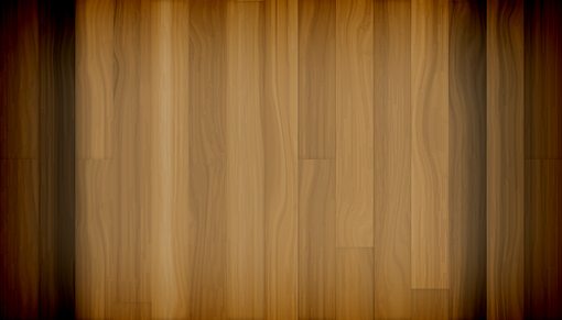
Wood Texture

The problem with realistic wooden textures is that the they’re so organic. It’s easy to make a uniform pattern in Photoshop but elements with lots of subtle detail are much more difficult. Fortunately, through clever application of a few filters, Photoshop can do all the heavy lifting for us. The trick we’ll see below is a mixture of Andrew Houle’s techniques and my own.
Step 1: Create the Woodgrain
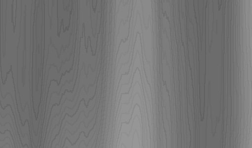
To get started, create a document and fill it with a cloud layer. Now apply a maximum-intensity vertical motion blur to this layer and you should come up with something like the effect below.

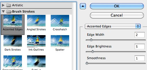
Now go into the Filter Gallery dialog and turn on Accented Edges. I like to use fairly low values across the board here as I think it gives it the best effect.
After applying the settings above, you should see some really nice woodgrain effects begin to take shape. This is typically the difficult part that we mentioned earlier, see how incredibly easy it was if you know the right tricks?
In addition to Accented Edges, you can optionally apply some Film Grain as well if you want to go for that gritty look in your texture.
Step 2: Colorize
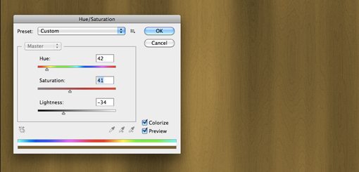
Now go to Image>Adjustments>Hue/Saturation and play around with some different color variations for your texture. Make sure you have “Colorize” turned on or this step won’t work properly! I went with 42, 41 and -34 for the sliders but feel free to come up with your own solution.
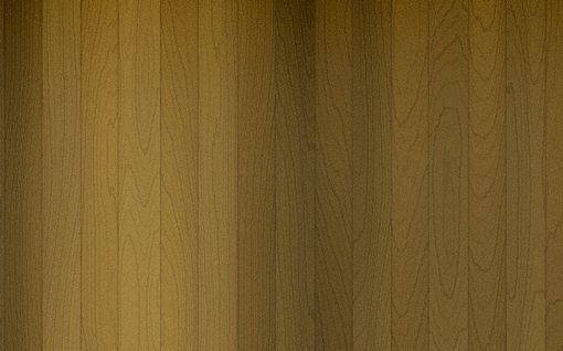
At this point you’ll either have a nice, wavy woodgrain or something that still looks too uniform and straight. If it’s the latter, use the liquify tool to go in and add some waves (I didn’t use this step this time, but it’s often needed). Finally, sharpen the whole thing a bit to add some definition.
Step 3: Create Panels
If you want your texture to look a little more man-made, try adding in a panel effect. To accomplish this, space out a bunch of vertical black stripes over the top of your texture.

Next, turn off the stripes layer and command click on it to turn the stripes into an active selection. Now click on your wooden texture layer and hit Command-J to make a new layer from the selection. This should give you a layer of wooden stripes, but they won’t stand out from the background at all because they’re essentially just a clone.
To address this, flip the layer vertically and add a slight Inner Shadow. This should give you an awesome and realistic wooden background texture! Top it off with your own Levels Adjustments and shadow effects and you’re read to go.
The key to making good textures is taking creative liberty throughout the process. Alter your technique slightly each time you perform this method and you can come up with some widely varied results!
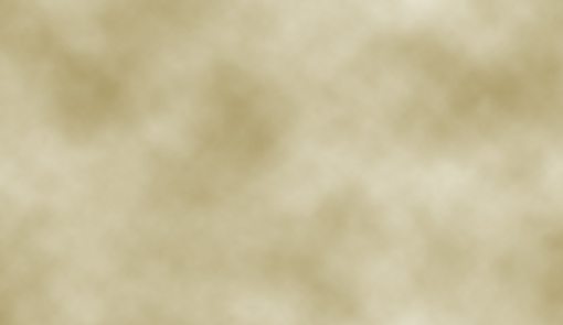
Parchment

For creating parchment I like to use a three layer system: the bottom layer holds the base color, the middle layer holds the clouds and the top layer holds the canvas texture. Let’s see how to build each.
To build the base layer, simply fill your document with a color. Paper textures come in all kinds of crazy colors so just open your palette and choose anything you like (I went with #e7e3d0).

Now create the second layer and render some clouds using your base color in conjunction with a darker shade. Your result should be roughly like the image below.
For the top layer, duplicate your clouds layer and go to Filter Gallery and add both the Texturizer filter and the Paint Daubs filter. Use the Paint Daubs filter to smudge the clouds around a bit and the Texturizer filter to add a canvas texture. Here’s the result:
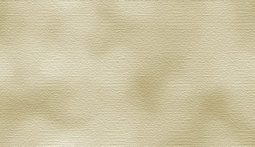
Now take your top two layers and drop them each to around 30-40% opacity. Play around with the numbers until you get a mix that you like. Finally, add an inner shadow set to Color Burn to the whole document and you should come up with the effect seen below. The shadow really finishes off the effect and adds that aged look.

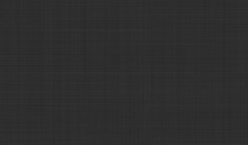
Canvas

I’ve seen this type of texture a lot lately, especially in iPhone app interfaces. It’s an old trick that’s super easy to implement and looks a bit nicer than the default Photoshop canvas effects.
Basically all you do is create two separate noise (Filter>Noise>Add Noise) layers and apply a heavy motion blur to them, one vertically and one horizontally.

Then you set both layers to Multiply to blend them together and let your background show through. Voila! The result is a sort of weaved canvas effect that is perfect for a subtle background that is low on distraction.
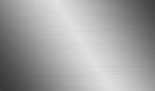
Metal

The brushed metal effect is one of the easiest on this list. You start with a black and white noise layer. Be sure to make it fairly dense so that the final metallic texture effect will be evident.
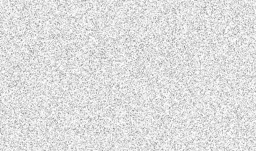
Next, add a perfectly horizontal Motion Blur filter to the noise layer. This will give you the lines for the brushed look. Motion blur has a tendency to bunch up around the edges though so stretch your layer beyond the bounds of the canvas using transform until it looks roughly like the image below.

Now create a new layer and set it to Multiply. On the new layer, stretch a black and white reflected gradient in an angled position. Finally, drop the opacity of the gradient layer until you’re satisfied with the result.
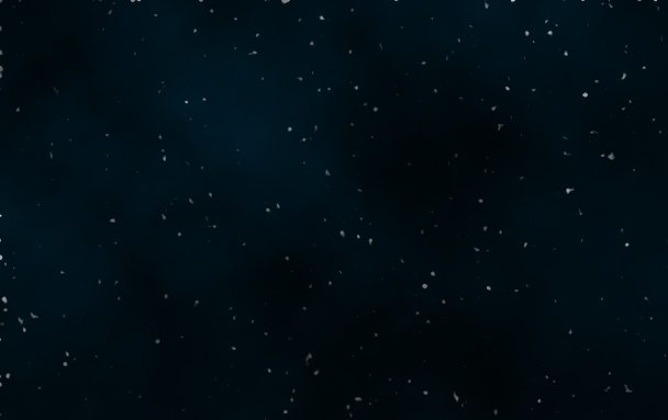
Outer Space
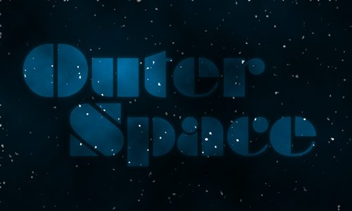
For our final trick, we’re going to create a texture that’s out of this world, literally. Using a noise filter, we can easily generate a random and fairly realistic star field.
To begin, create a new document and add a dark radial gradient similar to the one below. Start with the lighter color in the upper left and fade to the darker color in the lower right.

Now create a new layer, fill it with black and go to Filter>Noise>Add Noise. Adjust these settings however you want, just make sure that black is your primary color and white is your secondary color.
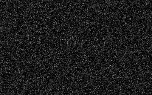
Now add a Gaussian blur of about 1.5-2 pixels to your noise layer. It’s going to look weird at this point but trust me on this.

Once you’ve created the blurry mess shown above, add a Levels Adjustment that brings the black slider to the right (around 40) and the white slider to the left until you have only white smudges. To get the smudges nice and bright, you might have to run the Levels command a few times in a row. Once you’re finished, set this layer’s blending mode to Screen.

Finally, create a new layer and render some black and white clouds (hint: if you hold down the option key, the clouds will be more intense). Now set the clouds layer to multiply and you should have yourself a crazy scene straight from a retro space poster!
Your Turn!
Some of the tricks above might seem complicated, but as soon as you try them you’ll see how easy and flexible they are. Don’t strive to follow the steps exactly but rather use your own insight a creativity to take the same basic idea in a new direction. Bookmark this page on Delicious and refer to it the next time you need a good background for one of your projects.
Now that you’ve seen five of my favorite tricks for creating background textures from scratch, it’s time for you to show me some of your favorite processes. Leave a comment below and briefly describe your background creation tricks.