Design101: Utilizing Strong Alignments
Today we’re going to examine one of the most basic principles in design: alignment. This deceptively simple topic is actually quite complex and is among the most notably lacking proficiencies in designers today.
A strong grasp of how and when to use certain alignments will instantly make you a better designer and will remain a foundational building block for everything you create throughout the rest of your career.
Introduction to Alignment
To many, a discussion on alignment may sound like an arbitrary exercise. Such basic design theory is surely only for individuals who have never designed anything in their life, not for the professional community that frequents sites like these. Right?
I myself would further the argument that such discussion is for beginners by stating that a solid grasp of visual alignment is an unbeatable foundation for all types of design. It is the sort of knowledge that, once grasped, you will use on every single layout you create as a designer.
However, despite the idea that these concepts lie at the very core of what we as designers do, alignment seems to be a primary source of most of the poor design I see on the web today.
Self-trained designers often have an intuitive grasp of how to use alignments but this can and does fail without explicit knowledge to back it up.
Lining Things Up
The essential idea of alignment is mind numbingly simple: to line things up. Outside of organic design, which is a different topic entirely, every element that you place onto a page should be accompanied by a logical thought process as to its positioning.
Again, this is basic stuff right? Everyone already does this… right? Wrong. Consider the following site that was recently submitted to our CSS gallery. I use this not as a mean-spirited example but a teaching instrument. The designer is an awesome guy who is just getting his start. He’s improving his skills daily and is eager to learn.
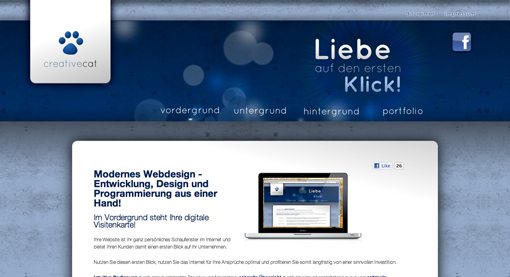
This example is extremely typical and is exactly the kind of thing we see every day in our gallery submissions. The aesthetic value here isn’t bad. The bright colors and interesting textures grab your attention pretty well. However, the alignment here really missed the mark.
The problems here can be hard for many people to spot. For this reason, I always recommend simplifying a design to examine the basic shapes. You’ll see me do this in several of the articles I write on design and you should definitely try it out on a few of your own designs.

Now that we see the graphical objects in a simplified state, we can better analyze the volume of space that they occupy and address any alignment issues.
Notice that suddenly the elements on the page seem scattered. The main content area at the bottom doesn’t line up with either the hanging banner at the top left or the scattered elements at the top right. Further, the Facebook logo seems small and stranded off by itself, and the headline is staggered away from the edge of the navigation, which is staggered away from the content edge.
Although this design felt pretty decent when we were just feeling it out, we now see that it could use a lot of restructuring. From here there are two key things that you need to address: Alignment and negative space.
These concepts are extremely closely tied to each other. Working with the negative space has a lot to do with focusing on the gaps and applying basic symmetry. For more on the proper course of action regarding the negative space, read my Guide to Negative Space over at Six Revisions.
In this article we’ll move on by focusing more on how to use the basic alignments you’re familiar with in complex layouts.
Center Alignment
Centered layouts are the choice method for just about every person on the planet… except designers. For some reason, centering items on the page just seems like what you’re supposed to do. Surely a designer’s principal job is to simply center items!
I ran into this problem a few years ago when I handed off a design that I had created to a developer to code. When he showed me the finished version, everything had been moved from left aligned to center aligned! He explained simply that he had always preferred center-aligning everything “so it looks nice.”
The reality is, centering every item is the weakest alignment choice you can make.
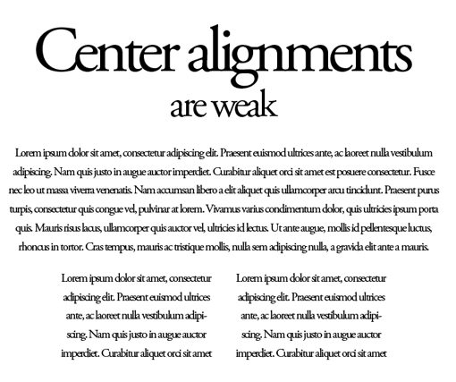
There are no hard edges to follow so your eyes have to do a lot more work to both take in the overall layout and absorb the specific content.
When to Use
This is not at all to say that center-alignments should always be avoided. I myself have used them on demos for this very site. The key is to know when to use them.
I find that the best possible scenario for a center-alignment is when there is very little on a page. The more complicated the layout, the less center alignments work. If a given page doesn’t have a lot going on, center alignments can make a powerful statement.

Left Alignment
Left alignments, though arguably boring, are rock solid and should be your default, go-to alignment for much of the work you do.
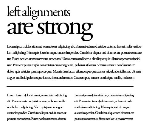
We’re used to seeing content organized in a left-aligned manner. Crack open a book or newspaper and you’ll find lots of left alignments. Browse through the ads in your junk mail, again, lots of left alignments. You’ll see them on Facebook, Google search results, Twitter streams and every other major website.
Left alignments rule the world, or at least those societies that read from left to right. You shouldn’t completely depend on a left alignment for everything, just know that it’s the safe route.
When to Use
Use in all kinds of situations, but especially when there is a lot of text. Just take a look at the page you’re reading now. If this were center-aligned it would be a nightmare.
Note that, especially on the web, left-aligning something doesn’t mean you can’t center it. For instance, an HTML div often contains a bunch of left-aligned paragraphs and images but is then centered on the page using CSS.
Right Alignment
Right alignments are probably the rarest. Since we read from left to right, it just feels strange for something to cling to the right edge.
However, it’s a perfectly strong alignment that can be used thoroughly in your designs, especially in print (it tends to be even more unexpected online).

When to Use
Often, though not always, a right alignment will convey a sense of uniqueness. If you’re designing something that needs to stand out and feel different, a right alignment is a great place to start.

Justifying Alignments on the Web
The alignment we left out is obviously justified. This comes into play strongly when you tie a whole site together as a conceptual element.
The interesting thing about designing for the web is that it often involves a mixture of alignments. You’ve probably heard designers suggest to never mix alignments, but this advice just doesn’t work in the real world.
Instead you have to make decisions for both the elements within a page as well as the page elements as a whole. Notice how I started this discussion by looking at an example of viewing the alignment of a site as a whole but then proceeded with discussing individual item alignments.
Once you’ve settled on an alignment for the text and images on your page, putting it all together often involves throwing everything on the page into a justified alignment. Though you can have a ragged edge, justifying everything can add that finishing tidying touch that was lacking in the original example.
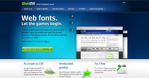
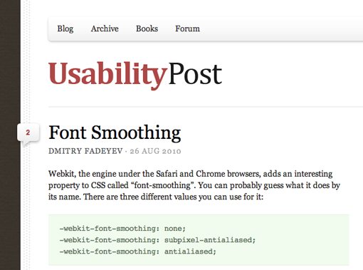
Notice how in the site above there is a strong left alignment, but everything on the right side has been lined up as well to create a cohesive justified look. The tiny login button lines up with the browser images, which line up with the right side of the calendar icon.
This is clean, professional design. It may not appropriate for all projects, but I can often see designers trying to reach it and failing and I wanted to address some of the likely causes.
This is one of the reasons grid systems are so popular. Throwing everything onto a grid assures that your alignments are stout and easy to follow.
Conclusion
To sum up, when possible, use strong alignments that make it easy for your eye to follow the flow of information. Center alignments are acceptable, but become more difficult to implement properly as the content on a page increases.
Remember that alignment refers to specific items on a page as well as the arrangement of the objects as a whole. Spent time on every design making sure all your elements line up properly with everything on the page. This applies vertically and horizontally along all edges of the design.