Everything You Need to Know About HD Design
If you haven’t already taken note, the web is going high def. From images to backgrounds to user interface elements, high definition is the new normal.
It started with some of the retina and high-resolution screens, but access to faster connections has also emphasized this phenomenon, providing greater access to HD websites from any device. Are you thinking about and designing in high definition? Here are a few things to consider.
What is HD, Really?
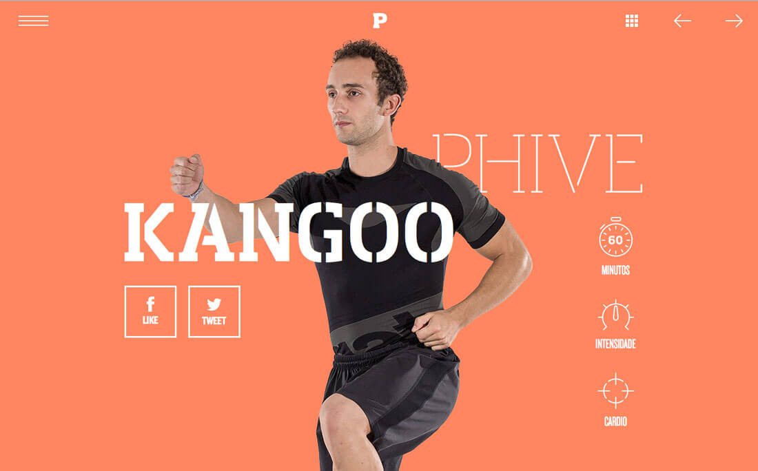
The most common cue for HD is the term retina display. Made popular by Apple devices the term has come synonymous with high definition screens. This relates to some pretty specific technology for devices.
Paula Borowska for Designmodo has one of the easiest to understand descriptions:
- Device pixel is the smallest physical unit displayed.
- Pixel density is the number of pixels displayed in a given space.
- Resolution is the number of pixels across the entire width or height of the viewable space.
- Pixels per inch, known as ppi or dpi, refers to the number of pixels you get when you divide the physical width of the display by the number of horizontal pixels displayed.
- High DPI is a display density of 200 pixels per inch or greater.
Most of the devices you are buying today from mobile phones to tablets to laptops likely have a high definition display. (And the reality is that even if you have a device without an HD display, having a high definition website won’t hurt.)
Images
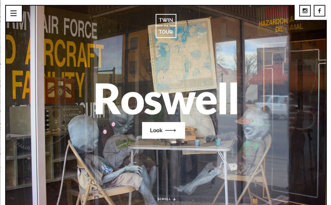
The place where you might first want to think about high definition is when it comes to images. The days of saving every image at 600 pixels wide at 72 ppi is over. That just won’t cut it on today’s screens.
The base standard for HD is 200 ppi. That’s more than double what you might have been saving at previously. Add in the fact that screens are getting larger with 1920 by 1080 growing at a rapid pace. According to W3Schools.com, the most common screens are 1024 by 768 pixels or higher, with more than 30 percent of users working on a high definition screen.
The same is true for small screens as well. Popular devices such as the iPhone 6 (401 ppi) and Samsung Galaxy S5 (577 ppi) also boast HD capability.
So when it comes to images, they have to be sharp. You won’t get away with blurry or pixelated images. Saving at the old “standard resolution” will leave your design looking flat, while high resolution images will appear more polished. The downside of using this type of image is speed; higher quality equals longer load times. Save as close to spec as you can and don’t over-upload image files.
Fun trick: Consider using the blurred image trend to your advantage here if you are worried about load times. There is less data to read and you can save a little smaller and still get the desired sharpness from other smaller high-resolution elements.
Video
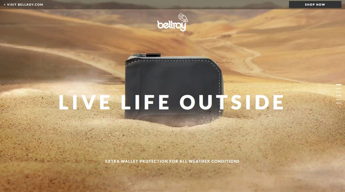
Video is the must-have visual trend of 2016. It seems like everywhere you turn there is moving action on website homepages. Just like with images, it needs to be of high quality.
For most designers and websites, this means sticking to a rather short loop video to prevent loading hiccups. Others are opting for longer videos and distract users from the wait with a loading animation. High quality video requires high quality recording, compression and saving.
It also takes a lot of planning when it comes to how the video will play and look in the site design. A full screen hero video for example, needs to be shot horizontally so that it will fit the screen. For ease of use, simple video editors will help you adjust the frames by aspect ratio; choose 16:9 for a wide-screen feel or 4:3 for the more square look.
Fun trick: Use “still video” for a high drama effect. Here’s the idea: Film something that’s mostly static with just a small bit of movement in the background. You’ll get a cool user experience without weighing your design down.
Illustrations and Backgrounds
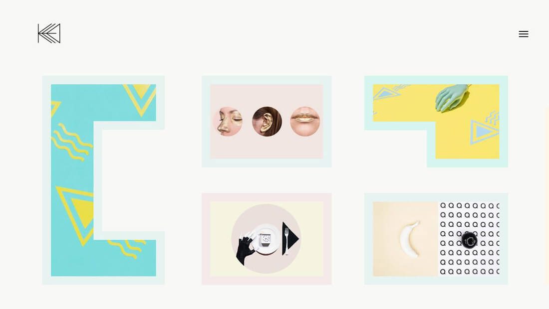
When it comes to illustrations and backgrounds, HD matters here as well. Remember that every detail (or lack thereof) is visible in the high definition space, so you’ll want to make sure every part of the design contributes to the overall aesthetic.
When it comes to illustrations or backgrounds, details are important. Focus on crafting a design that is practically pixel perfect, fits the design and does not fall apart when scaled up or down. The easiest way to do this is to focus on simplicity.
While it can be easy to get pulled in to creating a complicated illustration or textured background, simple is probably a better option. If you want to add more interest, consider making a small animated element part of the design, or spice it up with bolder color options than you might normally use.
And then there’s the technical component: You need to use a scalable image format so that everything does indeed scale as intended and to its full HD potential.
Fun trick: Add a hint of animation to the background on a long loop. Quick browsing visitors might miss it but the little reward is sure to delight repeat users and those who stick around for an extended time period.
Icons and Elements
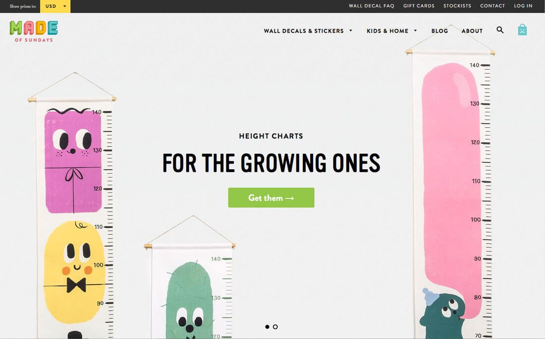
When it comes to all the icons and user interface elements on your website, there are six letters you need to know: SVG and CSS. And all of these elements will likely be classified as one of these two types.
SVG, or scalable vector graphics, is essential vector for the web. You can use SVG to save shapes, icons and plenty of other user interface elements. Images are read by modern browsers – there are some older ones out there that don’t work (we are talking to the few of you that are working on Internet Explorer) – as text and render in very much the same way as HTML. Scott Murray has a pretty great primer on his blog if you want to get into the nitty gritty of SVG.
CSS elements are pure code and will scale and style with the design. (You probably don’t need to draw buttons in Photoshop and paste them into your site.) W3Schools.com has a basic tutorial on how to create and use CSS elements.
Here’s the thing about both SVG and CSS: The elements move with your site. This is what you need in a responsive framework. Nothing will kill your high definition website design faster than a bunch of pixelated buttons.
Fun trick: You don’t have to reinvent the wheel to find some nifty SVG or CSS elements. Check out these SVG buttons from Tympanus or the CSS Button Generator.
Conclusion
High definition will set your website apart from everyone who isn’t doing it. Users are beginning to expect an HD experience on every one of their screens from televisions to computers to phones. Your website needs to meet those expectations.
The good news is you can make small changes on the path to getting there. Pay attention to your images, videos and other user interface elements to ensure that you are showing pixels and every visual is seamless and high quality.