Learn by Example: 6 Lessons for Designing Restaurant & Food Websites
Today’s topic is a delicious one: restaurant and food websites. Small businesses pay the bills for freelance designers and local restaurants can serve as a major source of revenue. If you’re embarking on your first restaurant site design though, there are a few things that you should know.
In this article, we’ll learn by example as we take a look at lots of mouthwatering food and restaurant websites. By examining what these designers got right, you’ll help ensure your own success in this area.
Photography is Everything

Site: The Claw Bar
I realize that this sounds like a blanket statement or perhaps even hyperbole, but I’m quite serious. With restaurant sites, the “garbage in, garbage out” aphorism is quite appropriate. If you’re working with ugly food shots, you’re doomed from the outset.
As a visitor to a restaurant website, my primary interest is very likely going to be food. You have to sell me on the product, and photography is the way to do it. The trick is, food photography is very difficult, so you can’t take the cheap way out here. Poor food photography can do more harm than good.

Source: left photo and right photo
Your job as the designer is to convince the client to really invest in some great photos if they don’t have some already. If you’re also a photographer, this could even earn you a few extra bucks.
Just about every site in this article takes this advice, but here are a few that did particularly well:
Findus Norge

Cappellos
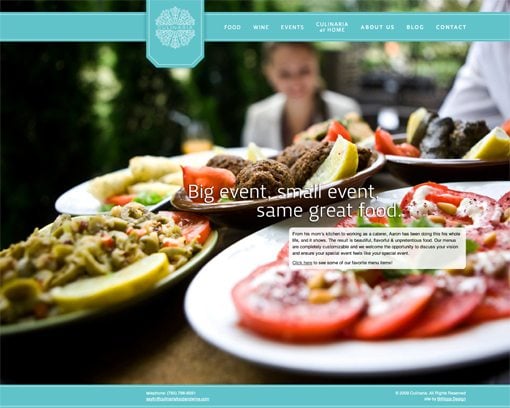
Culinaria
Show Me Atmosphere

Site: Au Petit Panisse
When you think about the visuals for the site, you might be tempted to think purely of food. However, the secondary draw for a restaurant, heck for many people the primary draw for a restaurant, is the atmosphere. I can get a great burger anywhere, but I want to eat a burger in a place that’s awesome!
There’s so much uncertainty involved with trying a new place to eat. If I can really get a feel for the place on the website, then I’ll feel more confident in my decision to eat there. From a practical standpoint, it’s often the case that one photo of the atmosphere and decor gives me a good idea for the general dress code of the place. As an example, would you dress up for the restaurant shown above? How about this one?

Site: Roux at Parliament Square
Leverage Texture & Color Heavily

Site: Gilt Taste
A powerful tool that you have at your disposal when designing any food-related site is texture. Top designers in this niche use tons of realistic textures throughout their sites. Gilt Taste, the site above, is a prime example. The home page is full of different textures, both in standalone photos and as backgrounds for type.
As another example, here’s a small, cropped portion of a restaurant theme from ThemeForest. Notice how many textures you can find in this one small area!
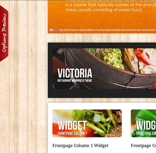
Site: Victoria Restaurant Theme
The choice of colors is extremely important for food websites. Color helps set the mood and enhances the enticement. Don’t be afraid to use bright colors and always pull right from the food when possible to tie everything together nicely.

Site: Goosebumps
Break it Down
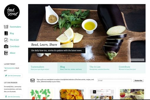
Site: Food Sense
Another solid tip for working with food photography: people are fascinated by the process. The art of taking raw ingredients and turning them into delicious dishes is something that draws all of us in.
Further, merely showing fresh ingredients makes the food feel healthier and more appetizing. No one likes to think that the restaurant shipped that lasagna in on a truck. They want to see tomatoes!

Site: Delicioso

Site: Goosebumps
Build Custom Menus for The Web
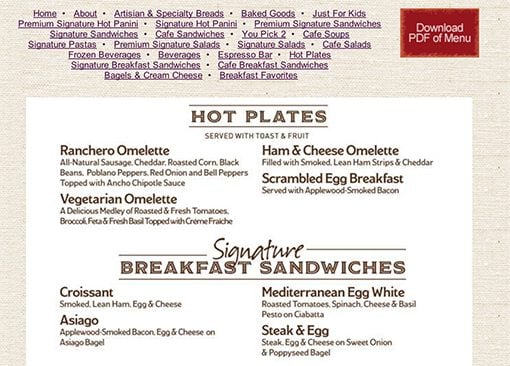
You know what my biggest peeve is with restaurant websites? The menus. More often than not, this portion of the site offers a horrible user experience. I cringe every time I order from Paradise Bakery online:
Site: Paradise Bakery
Instead of going through the trouble of actually building a menu on their website, they just uploaded a million scans of their physical menu that I then have to sift through one freaking page at a time. If you click the option to download the PDF, you literally get the flat PDF artwork that they send to the printer to create their foldable menus. I’m not making this up folks:
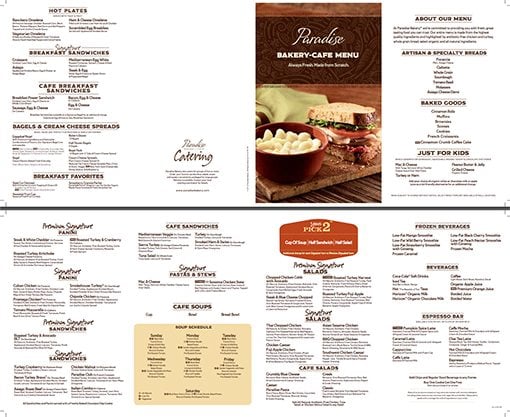
This thing is so big that you have to zoom in on little portions and then pan around until you find what you want. It’s an astoundingly bad way to present a menu to website users.
If you’re thinking about tossing up a PDF of the print menu and calling it a day, stop what you’re doing and give yourself a hard smack in the face. Stop being so lazy and do your job. If you’re looking for a solid example, check out the Kuleto’s menu below:

Site: Kuleto’s
This menu uses an awesome and easy to use three column system to narrow down your choices. First, you choose your meal (breakfast, lunch, dinner, etc.), then a category and you’re presented with the options within that category. At any time, it’s easy to refine your selection or change things up.
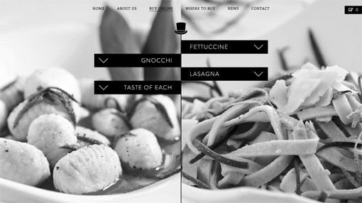
If you want a simpler route, check out The Claw Bar. Their web menu uses the metaphor of a print menu, but it still uses live text and is formatted for the web.

Site: The Claw Bar
Don’t Forget the Basics
It’s pretty easy to get so caught up with all of the advice above that you forget the most basic elements of any web design. Remember that, with any site design, you should always carefully consider the goals of the average user.
For a restaurant, you can pretty much guarantee that the visitors will want a few specific pieces of information:
- What do they serve? (menu and graphics)
- How much does it cost? (menu)
- What is the place like? (graphics and video)
- Where is it?
- Can I order or make a reservation online?
- What’s the phone number?
As you can see, we’ve addressed most of the main goals already in the tips above. However, the basic contact and ordering information is a primary concern that we haven’t touched on. I’m a firm believer that contact and location information is an extremely high priority for a restaurant’s site, so this information should be on the homepage in a prominent location.
In the template below, there’s a large, eye-catching map right in the footer (probably the first place you would think to look). Right next to the map is all the contact information that you need: email, phone number, social links, etc.
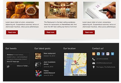
Site: The Restaurant Theme
The lesson here: never make your users hunt for basic information because you’re worried about it messing up your pretty design. Your job is to highlight and present important information in an attractable and usable way, not to make a site that looks good at the expense of its purpose.
Show Us Your Favorites!
Now that you’ve seen our examples of the best food and restaurant sites that we could find, chip in and show us your favorites. Or, even better, show us the restaurants that really miss the mark and toss out ideas for improvement.