Print Design Tips for Web Designers
I started my career in print almost a decade ago and gradually moved over to the web. This whole new medium brought several creative and technical hurdles that I had to learn to deal with and even embrace.
Today’s article is for a new generation of designers making the opposite jump. You’ve been designing for the digital world for some time and are ready to learn print design. We’ll help ease the transition with some dead simple and practical advice.
Print Isn’t Dead
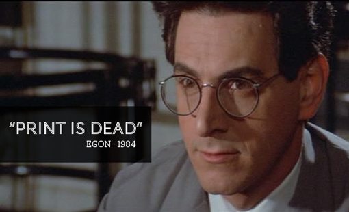
In the original 1984 Ghostbusters movie, upon being asked if he likes to read, Egon boldly proclaims “print is dead.” This statement wasn’t quite true at the time but it was an extremely accurate foreshadowing of the events of the next twenty years, namely the rise of the Internet and personal computing from obscurity to ubiquity.
To be sure, this revolution has, at the very least, taken a baseball bat to the publication industry and consequently the availability of design jobs within them. However, it’s definitely still not the case that all forms of print are dead. In fact, print design can be one of the most valuable and logical skills to add to your repertoire as a web designer.
If you have clients who own small businesses, they need not only websites and logos, but also business cards, stationery, store signage, apparel and maybe even local newspaper ads. Most of them would rather skip the headache of working with multiple designers and find one provider for all of this material. If you can handle both web and print, that could be you!
Resolution
Let’s start with some basic knowledge that you likely already know. In the web world, you have the luxury of working with fairly low resolution imagery. Now, you might see this as a bad thing because the level of detail is so limited, but having worked extensively with both, low-res web work is far easier to deal worth.
One of the primary reasons for this is that you can create 72dpi graphics on almost any computer that was created in the last four or five years. Smaller images aren’t as processor intensive as larger images. If you’re used to print and switch over to designing for the web, Photoshop feels like a completely new application running on a super computer from the future. You may think that sounds like an exaggeration, but just wait until you have 50 layers in an 11″x17″ document at 300dpi. You’ll be drooling over Mac Pros on Apple.com by day’s end.
Inches, Not Pixels
So how are things different for print than web? For starters, print designers don’t speak in pixels. Tell most print-only designers that you want something 1200px wide and they’ll look at you funny (they know what pixels are, but that’s not the typical jargon). That’s because the measurements in their versions of Photoshop have been set to inches.
This is an important distinction because resolution and size are interdependent! 1,200 pixels wide in a 72dpi document is very different than 1,200 pixels wide in a 300dpi document. A 5″x7″ print job though will always print something five inches wide by seven inches tall, only the density of the ink will change.
Not Always 300dpi
You’ve probably been told that print designers build graphics in a 300dpi workspace. This is not always the case though and that assumption can make you look like an amateur when it comes time to print.
Most small format jobs are printed at 300dpi. These items are those that can be closely inspected and held by someone. What about a billboard though? Is it necessary to have such a large resolution print for something you see from hundreds of feet away? It turns out the answer is “no.” Large format jobs such as banners, billboards and the like are almost always built below 300dpi, typically at 150dpi but sometimes even lower depending on the size.
Often, the resolution question can be posed to the real expert on the matter: the printer (the person, not the machine). You won’t look like an idiot for simply asking if it should be a 300 or 150dpi job, these are common questions when starting a project and are essential to get worked out before you actually start.
Should I Build Concepts in Low-Res?
Given the fact that computers can churn out 72dpi graphics much faster than 300dpi graphics, it’s often the practice of designers to go through the first few rounds of design in a low resolution workspace and to essentially rebuild the job in “high-res” near the end of the project.
Among print designers this can be a hotly debated topic. Ultimately, it comes down to preference but, for what it’s worth, I almost never take this route. Unless you’re constantly working with large format jobs, building comps in high-res shouldn’t take that long. If it does, then it probably really is time for a new computer. Building everything in 72dpi only to up-convert to 300dpi by essentially starting over always seems like a hassle to me when it’s perfectly easy to just build my ideas as print-ready.
The one exception to this is stock imagery. I always utilize the fairly low-res comps provided by stock sites when presenting to the client to prevent the unnecessary purchase of multiple expensive images.
Color
Color is a huge topic and merits its own article so we won’t spend too much time on it here. My simple warning is that color in the print world is a whole new ballgame. In web design, we used to worry about “web safe colors” but these days monitors are so amazing that we generally just choose whatever colors we want in Photoshop and accept that there will be a level of variation from screen to screen.
When designing for print, you’re working with ink, not light. To start, this means working in CMYK instead of RGB, but the implications go far beyond that. Things like materials come into play along with a variety of different printing presses and methods. Sometimes the color you see on your screen won’t at all be what comes out on paper. Other times, specific processes like screen printing call for certain accepted practices.
My best advice here is to find out what the method of printing will be and research it as much as possible. A standard four color print job will be the easiest to work with, but occasionally you’ll have to work with only one or two colors to save your client money. In these cases, you have to get creative and learn to create great designs with a much more limited palette than you’re used to working with.
You’ll also frequently have to work with spot colors, which means a dedicated ink mixed to a very specific color rather than something that gets mixed live by applying different colors to the paper. To read more about how to work with spot colors, check out our recent article “An Introduction to Working With Spot Colors.”
Not Just Photoshop
Web designers tend to live solely in Photoshop. They may branch out to Dreamweaver or even Fireworks, but any further exploration of the Adobe Creative Suite is often unnecessary.
However, in print, you generally perform page layout in applications like InDesign and Illustrator. A few sorry souls are still using Quark but I can’t imagine why. The good news here is that being particularly strong in Photoshop makes you much more prepared to pick up InDesign. The bad news is that it’s still a very different application so there’s a ton to learn.
One of the most important concepts to understand is why you’re using multiple applications and how to incorporate them into your workflow in a synergistic fashion. The simple answer here is that Photoshop is for raster graphics, everything else (vector graphics and text) should be handled in your page layout app.
For instance, let’s say you’re creating a magazine cover. You’ll start with a PSD that contains your cover photo. Here you can perform typical color corrections, cloning actions, stylizing and anything else you need to make the photo ready to print. Once you’re finished with that, you can place this PSD into InDesign and overlay the vector graphics (often created in Illustrator) and text that make up the rest of the cover.
Print page layout can be visualized as a puzzle. In this metaphor, InDesign is the tabletop where you construct your puzzle. You create a lot of the pieces in other applications and then bring them all together and shuffle them around in InDesign. By placing the actual work-in-progess pieces into InDesign via the File>Place command, any changes that you make to the placed PSD, EPS, etc. in another app will automatically cause your InDesign file to update.
Doesn’t Photoshop Do Text?
At this point, you might be wondering why text isn’t handled in Photoshop. To be fair, highly stylized text (with bevels, masks, shadows, textures, etc.) is often kept in the PSD portion of the file. However, plain text is much easier to work with in InDesign. The text engine is far superior and not only renders text better, but allows for much more advanced manipulation such as automatic column distribution and even spell checking.
Another major related concern is that you generally don’t send off one file to the printer (print-ready PDFs are an exception), instead you gather all the pieces of your puzzle into a folder. This includes your various placed PSD and EPS files, your InDesign file and even your fonts. Working in InDesign gives you the luxury of an automatic “Collect for Output” command that automatically gathers all of the resources associated with the current file.
Bleed & Trim
One of the biggest rookie mistakes you can make in print design is failing to design with a bleed. Print vendors require certain specs from designers, not because they’re picky or incompetent but because it’s genuinely how the process works and without these the whole print job is compromised.
Designing with a bleed is easy and it allows for perfect borderless professional printing every time. By inserting a bleed, you’re allowing for a print to be made that’s larger than the size of the final job. That way, when the excess is cut off, everything looks perfect and goes right to the edge regardless of minor paper shifts that might have occurred during printing.
In web design you’re familiar with the CSS box model, well in print design we have something that looks similar that basically defines how almost every print job should be constructed. Here’s a quick look at how it works:
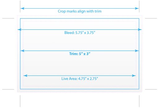
There are three main areas to this model: the bleed, the trim and the live area. The trim is the easiest to understand. This is the final desired size of the printed document; where the paper is “trimmed” to. In the example above our client has ordered a design that is five inches wide by three inches tall. From here, we need to create two more areas: one that is larger than the trim and one that is smaller.
The larger area is the bleed. As we just explained, this allows ink to go right off the edge of the page. The job above has a gradient background, but that background is stretched beyond the 5″x3″ bounds to an area of 5.75″x3.75″. By adding 0.25″ to the overall size, the result is a 1/8th inch bleed all the way around the page, which is standard in the United States (typically 2-5mm in the UK). Anything you place in the document that should “bleed” off the page, be it a photo or a textured fill, should stretch to this larger area while keeping in mind that it will be cut down to somewhere around the trim line.
The smaller area that I created in the example above is the “live area,” which is a very important piece that you might not know about as a web designer. Generally, it’s a bad practice to place non-bleeding text and graphics too close to the edge of the page. You want to give them plenty of visual breathing room and also be assured that they won’t get trimmed off. Therefore, the live area is created as a sort of safe zone for you to place this type of content into. For example, if you want a huge headline, stretch it from one end of the live area to the other, but no further.
Live area sizes aren’t standardized and vary considerably from job to job. As a rule of thumb, I inset my live area 1/8″ all the way around so it matches the bleed. However, different magazines and newspapers have their own set requirements that you must follow. Also, for large jobs, a 1/8″ inset isn’t near enough and will result in graphics that still look as if they go right up to the edge without any breathing room. In this case, you’ll have to eyeball it and decide on an acceptable bumper of space.
Fortunately, both Illustrator and InDesign can handle much of the work of creating documents for you with these kinds of specs built-in, but it’s still important to understand the concepts. Also, be sure to consult with your print vendor as they likely have pre-built templates that save a lot of trouble for everyone involved.
Design Trends
To finish off our discussion, let’s briefly discuss how to approach a print design from a creative perspective. First of all, you’ll quickly learn that print is a very different medium than you’re used to with the web. In web design, you’re limited only by your imagination. With print, you have a physical page size that must be conformed to; scrolling isn’t possible! This means when you’re client gives you a ton of text, you have to figure out how to make it fit in a readable and attractive way.
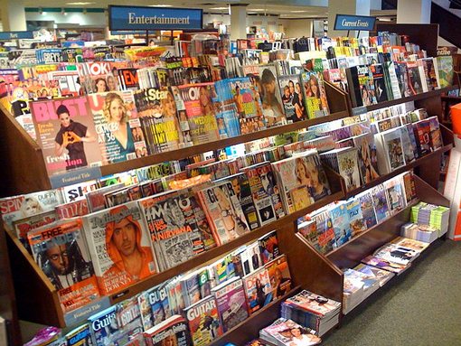
Also, keep in mind that your particular design style and tendencies might or might not lend themselves well to print. Just as you do with web design, it’s important to have a look around and take note of current trends in print. Take a trip to the book store and browse some magazines (don’t skip the ads, they’re the best part) or look through that junk mail before it hits the recycle bin.
Becoming aware of trends doesn’t have to make you a conformist, instead it helps you keep in touch with what people are used to seeing. If the last time you paid attention to print design was 1995, you could be prone to produce something that looks ugly and outdated to today’s consumers.
Likewise, if all you’re aware of is the state of modern web design, you could have a lot of trouble translating these ideas to a printed page in a way that is both meaningful and engaging to the viewer. jQuery animations are no good here, you have to grab someone’s focus through purely static aesthetic appeal.
It takes time and practice but a goo designer will flourish in both print and web design.
Conclusion
In all honesty, if you’re currently a web designer looking to enter into print, you’re in a good position. In many ways, you’re reverting to a simpler way of thinking. Making the opposite journey requires a lot of new technical learning, especially if code comes into the picture.
This article was meant to show you though that you can’t just pop open Photoshop and decide you’re going to be a print designer one day. Your knowledge as a web designer helps but there is still a lot of industry specific learning that must be done. Everything from template creation to design finalization is a very specific process in print and if you don’t know your stuff you could be held financially liable for any errors. Taking a little time to go through the information presented about could save you a lot of trouble and headaches.
Leave a comment below and let us know what print-specific tips you have for web designers making the transition!
Photo Credits: Corey Holms, Alain Bachellier, Nate Hofer, Katy Beck and Steve Garfield.