The Illusive Click: Structuring Designs to Influence Behavior
Click. That sound means you’ve done your job. The user has viewed your page and taken the action that you wanted them to.
How is this achieved? Should you be thinking about this goal more as you structure your designs? What mistakes should you be careful about avoiding? Read on to find out.
Ends and Means
Earning the click, is there a more lofty goal in web design? It seems so simple right? “Hey user, just click here!” In practice however, a single point of action can serve as the very purpose for an entire design. Everything you’ve strived for weeks to build comes down to one button press, you either convince the user or they move along.
So much time, effort and thought is put into earning clicks. It’s a game of psychology, you’re trying to influence another person’s thoughts to actually make them perform the way you want. It’s also a profound design puzzle, “Which colors, shapes, layout and messaging are more conducive to click behavior?” A/B tests are run, studies are performed, thousands of dollars are spent, all with the end goal of getting that little cursor where you want it to go.
Clicks mean customers, contacts, sales leads, email registrations, sponsor satisfaction, increased page views; clicks mean paychecks to countless individuals all over the world.
As a web designer, clicks are often the end that justify you, the means. One very important aspect of your career is learning to earn this holy grail of digital behavior. Let’s discuss some strategies for how to do it.
Bar Camp
I always prefer to teach by example so you can get a real-world picture of how the knowledge can be applied. Our first example comes from the gorgeously designed page for Barcamp Omaha.
Now, one of the biggest mistakes we can make when talking about earning clicks is limiting our focus to this:
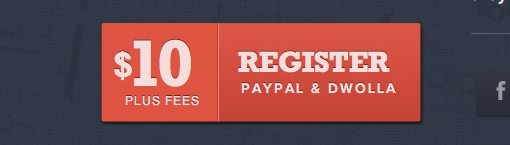
This is indeed a beautiful button. It contrasts well with the background color, the typography is attractive and the layout is perfect. However, this is not the only part of the page seeking to earn the click. Indeed, the primary focus of the entire page could be said to be aimed at this goal. Consequently, let’s take a step back and analyze the content of the page as it relates to this crucial element.
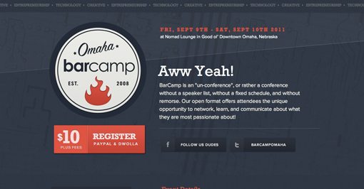
Now we can gain a lot more insight into how the flow of communication works and directs you to make a decision. The first thing I notice on the page is the use of red: the date, the logo and the button really stand out because they use this pop of color on an otherwise very blue page. Notice how the social media buttons almost blend in with the background by comparison.
The size of the button in relation to the other element also plays a big role. Sure, your eyes might catch that tiny red date for a second but you can’t look at this page for more than a second without being drawn to that huge button.
One of the most important things you’ll ever learn as a designer is how to structure a hierarchy of communication. Designers don’t merely add beauty to a boring page, they create order from chaos and make logical and intentional flows of information.
This hierarchy is crucial to the goal of directing user behavior. A properly designed page is one that makes users look where you want them to, when you want them to and subsequently to do what you want when you want. The craziest part is that this has to be perfectly balanced with meeting the goals of the user: what does the user want, what actions does the user want to take? If you can find a way to make the goals of your client and the goals of your users one and the same, you’ve done your job well.
Communication That Reinforces Action
Another important aspect of guiding user action is the actual verbal communication on the page. The Barcamp site has a very interesting lesson to teach us in this area:
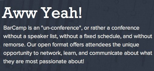
Forget what the paragraph says for a moment, one in six visitors will read it anyway, let’s focus on the headline: “Awww Yeah!” This is silly, unprofessional, improper and a whole bunch of other negative adjectives. However, it’s also brilliant and exactly what the page needed.
Classic sales theory teaches the following lesson: make people feel good about their purchase. People buy two types of things: what they want and what they need. The former of these brings a lot more satisfaction, but can also be a harder sell because people can easily talk themselves out of the purchase, something you can’t do with water and electricity. Your job as a salesman is to eliminate purchase hesitation by making the action seem perfectly pleasurable. Make me forget that I’m going into debt for $25,000 by distracting me with how great I’m going to feel behind the wheel of that new car.
Like it or not, we use similar tactics in web design and copywriting (haven’t you always wanted to be a sleazy car salesman?). The action the Barcamp designers are going for is getting you to spend $10 (plus fees of course) on their product. They could tell you about the wonderful career advancement that will result, but that sounds an awful like a boring old needs-based argument and it’s not always easy to convince people that they need something. Instead, they went with “Aww Yeah!”. Suddenly, I can’t help but feel that this transaction is something that is actually rewarding. That $10 isn’t buying a conference ticket, it’s buying me something that I deserve: a good time.
There’s a lot of complex psychology wrapped up in that one simple headline. Communicating this concept in a straightforward and professional manner would take at least fifty words. Slang provides an easy, quick and widely understood way to simplify the message.
Tripfab
Here’s another example of a fairly simple page with a primary goal. However, this time the designer isn’t convincing you to buy anything, just to put your name in a little field.
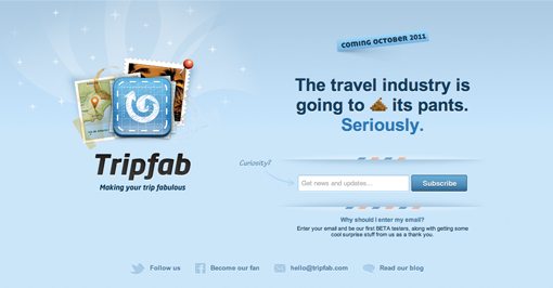
Like the previous example, this one uses attractive design and a light, humorous message to get you interested. Notice how there’s a large indent surrounding the button and field, which helps draw your attention to that area. However, designers often back up something like this with something much less subtle:
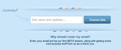
Let’s just draw an arrow pointing where we want the user to look! It sounds ridiculous doesn’t it? However, in practice it works great. If you make an arrow, my eyes are going to follow it.
Reaffirming Action
When you’re dealing with an action that you want the user to take, remember that you can’t be vague about it. Notice how this designer broke a typical convention with the text field. Instead of making the default value of the field an example or set of instructions for what to fill it with, you’re reminded what you’re doing by taking that action: “get news and updates.”
Below that, there’s a message about why you should take this action. Words are capitalized, promises are made, it’s a convincing design. This idea of reaffirming the simple call to action button with a reminder of what you’ll be doing by pressing it is a really common practice.
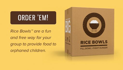
Here we see another example of the same strategy. The button serves as the call to action and is reinforced by a message about why you should be getting a Rice Bowl. The next time you create a simple button, think twice about how you can help the user hovering over it follow through and make that click.
More Than a Button
The simple message of this post is to engage in goal-focused design. Slapping a “buy now” button on an already designed page is the easy way out, but it’s not what you’ve been hired to do.
Instead, before you open Photoshop or make a single wireframe, think about what you’re trying to achieve. If it’s just an aesthetic exercise, great, your job is easy. However, if you’re trying to get users to buy a product, start a download, fill out a form or perform any other action, you should start your design there and create all of the rest of the content on the page with that end in mind. Carefully craft the user experience to guide visitors down the path that you want them to go.
Conclusion
In an industry where clicks equal paychecks, it’s time to put a little more thought into how to create designs that truly influence action.
Aesthetic appeal is a big part of the equation but it’s only part of your job. Make sure you’re keeping your eye on the prize and implementing layouts, fonts, colors and messages that all help accomplish that ever illusive goal of earning a click where it matters most.