Build an iPad-Themed Image Slider With jQuery
If you’re not a seasoned web developer, it can be quite intimidating to approach a project where your client is looking for something trendy and interactive such as an Apple-centric slideshow.
Today we’ll teach you how you can create just such a project in mere minutes using some awesome free resources from around the web. We’ll walk you through ten super simple steps so even if you have little to no web experience, this project should be a breeze!
What We’re Building
The purpose of this tutorial is to show you how easy it is to build an awesomely animated, interactive webpage using completely free resources and very little effort to throw them all together. We’ll be using jQuery, a free iPad image and a free image slider plugin to accomplish the following effect.

Step 1: Start the HTML
The first thing we want to do is get a basic structure for our HTML. Just paste in your typical HTML starter document. I used HTML5 below but you can use something older if you feel that it’s appropriate.
<!DOCTYPE html>
<html>
<head>
<meta charset=utf-8 />
<meta name="description" content="description">
<title>Page Title</title>
<link rel="stylesheet" media="screen" href="style.css" />
<script src="http://ajax.googleapis.com/ajax/libs/jquery/1.4.2/jquery.min.js" type="text/javascript"></script>
<!--[if IE]>
<script src="http://html5shiv.googlecode.com/svn/trunk/html5.js"></script>
<![endif]-->
</head>
<body>
<div id="container">
</div>
</body>
</html>
Notice that at this point I’ve included two links: one to a stylesheet and one to jQuery. Make sure you include both of these. Many developers also recommend including a local version of jQuery in case the linked version fails for some reason.
The only real markup we have at this point is a container div. We’ll add more later but for now this is perfect.
Step 2: Download the iPad
Obviously, we’ll need an iPad image. The iPad is simple enough that you could probably create your own fairly quickly, but we’ll just grab a pre-built version to speed up the process.
If you Google “iPad PSD,” the first option that pops up is an amazing free file from Teehan+Lax with not only the iPad itself, but a bunch of UI elements as well.
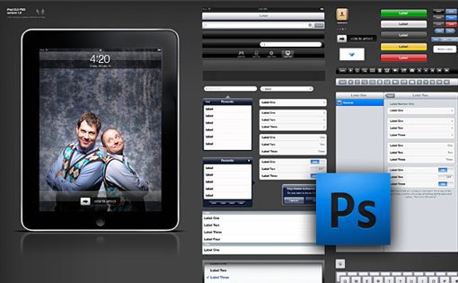
Download this iPad image and throw it into Photoshop to prepare for the next step.
Step 3: Prepare the PSD
Grab the layers containing only the blank iPad and throw them into a new document with the dimensions set at 883px by 535px. Set the background color to #1b1a1b and size the iPad so that the screen is approximately 460px wide.

To add some visual interest I threw in a shadow and reflection as well. Notice that the reflection fades out before hitting the screen portion. This simplifies things a great deal by canceling the need for a live reflection that updates with every slide.
Step 4: Start the CSS
Now that we’ve got our iPad background image, start a style.css file and set the iPad image as the background.
* {
	margin: 0; padding: 0;
}

body {
	background-color: #1b1a1b;
}

#container {
	width: 883px;
	height: 535px;
	background-image: url(images/ipad.jpg);
	overflow: hidden;
	margin: 30px auto;
}
As always, I’ve thrown in a basic CSS reset to make sure all the browsers are on the same page with margins and padding. I’ve also set the background color to the same color we had in our PSD. Finally, I threw in the iPad image and centered it on the page by setting a width and using “auto” for the margins.
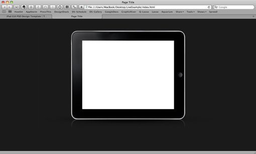
Progress Preview
At this point your live preview should look something like the image below. As of yet there is only a centered iPad on a solid background but it’s already starting to look quite nice!
Step 5: Add an Image
Before we import the actual slideshow, we’ll want to get our positioning worked out with a single static image. Doing this now just makes things easier on us so we don’t have to position an active item that may or may not be working properly.
First you’ll obviously want to create or grab an image from somewhere. I just used a pic of my ugly mug set to 460 x 345. Throw your image into a “slider” div inside the container.
<div id="container">
	<div id="slider">
		<img src="images/slide-a.jpg" alt="" />
	</div>
</div>
Next, scoot the image into place with the following CSS. If your images are sized differently than mine you’ll have to tweak the margins to make everything line up properly.
#slider {
	width: 460px;
	height: 345px;
	margin-left: 212px;
	margin-top: 79px;
}
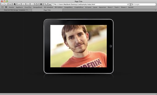
Progress Preview
With that little bit of coding your page should really start to take shape. My iPad looks much livelier with a full-color image thrown over the top of it.
Step 6: Download the Nivo Slider
jQuery makes building custom image sliders a breeze, but prebuilt jQuery plugins like Nivo Slider really strip down the amount of necessary work to around zilch and can often provide a beautiful and professional final result.
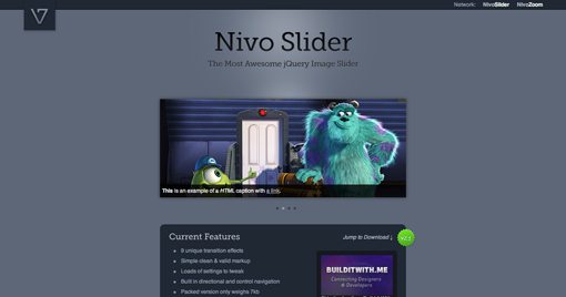
Go download a free copy of Nivo Slider. This easy to implement slider has nine transition options, supports captions and links, and is fully customizable. It’s a perfect example of the kind of quality freebies you can find on the web if you know where to look.
Grab the following two files from the download and throw them into the root directory of your page:
- jquery.nivo.slider.pack.js
- nivo-slider.css
Remember to link to these files in the head portion of your HTML. You should now have four linked files as in the code below:
<link rel="stylesheet" media="screen" href="style.css" />
<link rel="stylesheet" media="screen" href="nivo-slider.css" />
<script src="http://ajax.googleapis.com/ajax/libs/jquery/1.4.2/jquery.min.js" type="text/javascript"></script>
<script src="jquery.nivo.slider.pack.js" type="text/javascript"></script>
Step 7: Add More Images
Now that we have our slideshow, we’ll want to toss in a few more images. Nivo will automatically grab any images contained in your slider div so we don’t have to do anything special here but drop them in.
<div id="container">
	<div id="slider">
		<img src="images/slide-a.jpg" alt="" />
		<img src="images/slide-b.jpg" alt="" />
		<img src="images/slide-c.jpg" alt="" />
		<img src="images/slide-d.jpg" alt="" />
		<img src="images/slide-e.jpg" alt="" />
	</div>
</div>
Adding these will make your preview look all messed up but fret not, the next step will resolve this problem.
Step 8: Paste in the JavaScript
The Nivo Slider has a number of different settings that you can customize. To get a good feel for what these are, I recommend inserting the expanded example from the download page that includes all the available options.
This action equates to throwing the following code into your HTML.
<script type="text/javascript">
$(window).load(function() {
	$('#slider').nivoSlider({
		effect:'random', //Specify sets like: 'fold,fade,sliceDown'
		slices:15,
		animSpeed:500, //Slide transition speed
		pauseTime:3000,
		startSlide:0, //Set starting Slide (0 index)
		directionNav:true, //Next & Prev
		directionNavHide:true, //Only show on hover
		controlNav:true, //1,2,3...
		controlNavThumbs:false, //Use thumbnails for Control Nav
		controlNavThumbsFromRel:false, //Use image rel for thumbs
		controlNavThumbsSearch: '.jpg', //Replace this with...
		controlNavThumbsReplace: '_thumb.jpg', //...this in thumb Image src
		keyboardNav:true, //Use left & right arrows
		pauseOnHover:true, //Stop animation while hovering
		manualAdvance:false, //Force manual transitions
		captionOpacity:0.8, //Universal caption opacity
		beforeChange: function(){},
		afterChange: function(){},
		slideshowEnd: function(){} //Triggers after all slides have been shown
	});
});
</script>
As you can see, there are options for setting the speed, transitions, hover controls, thumbnail previews and more. For our purposes, the settings above will work perfectly. Notice that the script has been set to run when the window loads up.
Progress Preview
At this point you should have a functioning slideshow inside of your iPad! This is awesome but there are still a few things we need to address. Namely, when we hover over the iPad we get some ugly text controls that would be much nicer as images. We’ll address these in the next step.

Step 9: Styling the Controls
Technically, we should probably create all these styles ourselves because the good folks providing the Nivo slider encourage us to do so. However, to wrap up this tutorial quickly, we’ll just use the sample stylesheet that they provide here.
Included in the download is a few images and yet another stylesheet to include in your HTML titled “custom-nivo-slider.css.” Rather than linking to a million different stylesheets, in practice it would probably be a good idea to combine these to avoid overlap.
The key thing you’ll need to do with this stylesheet is ditch the very first section of styles that appear as they will interfere with the positioning that we’ve already implemented. Below you can see how I commented out everything but the background color and loading graphic.
#slider {
/*	position:relative;
	margin:30px 30px 60px 30px;*/
	background:#1b1a1b url(loading.gif) no-repeat 50% 50%;
	/*-moz-box-shadow:0px 0px 10px #333;
	-webkit-box-shadow:0px 0px 10px #333;
	box-shadow:0px 0px 10px #333;*/
}
Step 10: Check Out The Final Product!
As you can see below, that final set of styles really finished off the slideshow nicely. We now have arrows that take us forward and backward as well as a horizontal list of bullets to navigate and track the progress of the slideshow.

Be sure to check out the live demo to see it in action. Also spend some time on the Nivo Slider site and browse the various enhancements that are available.
What Else Would You Like to See?
This tutorial sprouted from me finding some great resources on the web and wanting to share them with our readers. Leave a comment below and let me know if there are any other jQuery plugins or web freebies that you’d like to see demonstrated here and I’ll see if I can whip up a quick tutorial to get you going.
Wanna share the article? Here’s a handy shortened URL that you can paste into Twitter or Facebook: http://ow.ly/2xtcZ