7 Website Design Mistakes That Drive Me Nuts
Sometimes websites make me grouchy. I click with anticipation and then… design disaster. Admit it, you have grumbled at the screen more than a few times, too.
From poor type to missing links to usability issues, I am going to share the mistakes that just drive me absolutely bonkers. Take heed! These are things to address and fix on your own site, before someone else comes across them!
1. Lack of Contrast
The text and images on your website need to be readable. The easiest way to accomplish that is through contrast. But too many designers forget this simple fact.
The biggest problem is often in lack of contrast between text and the background, rendering lettering unreadable. (Isn’t that the whole point of content?)
It is important to ensure that every placement contains enough contrast with surrounding elements to set it apart so that elements stand on their own. Remember some of the basics of design when thinking about contrast – color, space and size. Using these elements will help you set elements apart from one another.
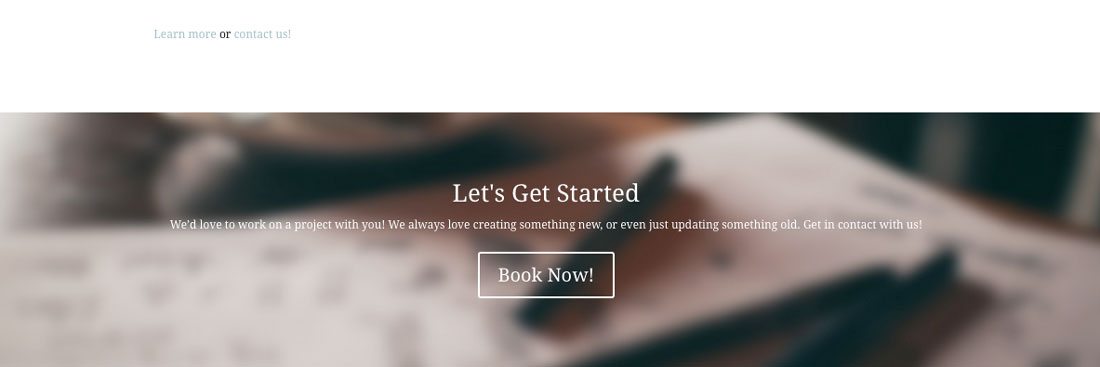
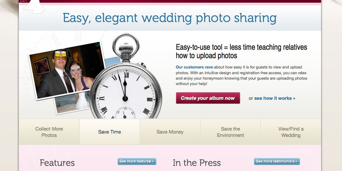
The image above contains two contrast issues with text. Look at the color of the links against the background. The text is quite difficult to read. Then look at the size of text compared to the scale of the images on the screen. It’s way too small and white lettering against a light background compounds the problem.
2. Poor Navigation and Flow
From the moment I land on your site, I should know what you expect me to do next. Click patterns and information flow should be rather obvious. (This is one reason navigation and menus are often at the top of the page.)
Navigation tricks and effects should be clearly labeled and work intuitively. This is for all of you experimenting with left to right scrolling or other unusual animated effects – give users some type of cue as to how it works. Frustrating users with over complicated design tricks will cause them to abandon your site.
3. Poor Photo Use or Treatment
There’s nothing worse than a great image obscured by other design elements. If you are taking the time to use great images on your site, use them without too many overlaid effects. Add a simple line of text and stop. (Hence the popularity of ghost buttons.)
While there are a lot of ways this can happen, the trap is often happening when designers try to be “too trendy.” Hero headers are fun. Sliders are great. But when you pair these elements with text they can get dangerous. Every image in the set needs to work with the text so that every word is readable and that all important elements in the photo are visible.
Don’t cover the important parts of an image with text or buttons. If you feel this happening in your design, maybe it would be better to opt for a simple background and use photos elsewhere.
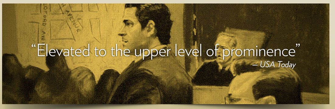
At first glance, the image above grabs you because it is in the legal sketch style. But look closer, faces are obscured by text and it all gets a little jumbled using a testimonial that does not need to cover the image.
4. Not Using a Grid
There is a certain amount of happy chaos in web design; asymmetry is one such element. Lack of a grid is not.
Using a grid is one of those professional polishes that sets the good design apart from the bad. Grids add clarity and organization, help create adequate and consistent spacing between elements and help give you an idea of where and how to place elements. The grid can help focus decision-making for element sizing, text size and space, and designing within proportions that are weighted appropriately.
5. Not Using Responsive Design
Please, for goodness sakes, use a responsive framework for your websites. Your site needs to work on a mobile phone. Period. Conversely, it also needs to work just as well on my desktop.
I continue to come across sites that render as full webpages on my phone. Websites that are not responsive, or are without a mobile version at the very least, are missing out on traffic and conversions every day. (While more uncommon, sites that only offer mobile versions are equally frustrating.)
And many other users are probably like me, if I try your site on my phone and it does not work, I don’t come back or try it on my desktop either.
6. Missing Links
Broken links are one of the biggest frustrations of the web. Get in the habit of performing an annual link audit for your site. This is something you can do manually or with the help of a tool such as Website Link Checker.
The other thing that just bugs me? When the logo is not a link back to home page from every page. There should always be a “home” function. (And while you are at it, don’t disable the back button.)
When it comes to links, think about usability. Make sure links, especially those in-text, are visible and large enough to click or tap without getting a neighboring link by mistake. Don’t include too many in-text links for this reason because it can get tough to tap the correct link, especially on smaller devices.
7. Auto-Play Sound

Sound on your website can be fun. Sound that plays without prompting is not.
You should always give users a sound on/off toggle option and default to off. Sound can be startling to users, might not be safe for work environments and is generally annoying. Most users want to feel in control of the website viewing experience and auto-play sound takes some of this control away. I am much more likely to engage with the sound and play it if I am given the option; auto-play often causes me to leave the site without looking for a place to silence it.
There are some places where this can be tricky – advertising, for example. If you have something that contains sound that must play, consider a pop-up style box with a large mute button. Users are more “trained” to accept a few seconds of ad play to view content. It’s still not an ideal situation, but can be a better solution.
Look at the image from the site above. It plays sounds automatically – they are supposed to be tranquil – but see if you can spot the sound toggle at a glance. The button is rather small, especially compared to the scale of other elements.
7 More Pet Peeves
Sadly, there are plenty of other small things that can drive me crazy when navigating the web as well. Try not to fall victim to any of these careless mistakes.
- No search
- Grammar errors or misspellings
- No call to action
- Too many links in the copy
- Hyphenated text
- Super-small buttons
- Poor typography and readability
Conclusion
Falling into some of these design traps is too easy and can happen to anyone. (You’ll even find some of these mistakes lurking in sites with overall great design.)
So take care and focus on the details throughout the design process and launch so you can avoid many of these issues. You don’t want to make me grumpy, do you?