Asymmetrical Design: Creating Beautiful, Balanced Layouts
How do you feel about asymmetrical design? That simple question can sometimes spark a lot of debate among designers. Asymmetrical design can be one of the more complicated techniques to pull off, but when done well results in beautiful and eye-catching designs.
While the definition of asymmetry is the lack of symmetry or equality between two halves; it is not a lack of balance as some wrongly assume. Designers can use asymmetry to create balance and harmony even though two sides of the design do not mirror one another. Here’s how to get started.
Why Asymmetry?

Asymmetry can be one of the most impactful concepts in your design toolkit. It is an attention-grabbing technique that is interesting and thought-provoking.
It can be tricky to use, which is why some designers stay away from completely asymmetrical projects. But you don’t have to. Using asymmetry is something every designer can do; it just takes planning.
The best place to start is by mix and matching symmetrical and asymmetrical concepts within a design project. If you break the design into smaller sections there will be parts that contain different types of balance. (Think of panels in parallax scrolling sites or the design of an image within the canvas.)
Think about why you are using asymmetry as well. Knowing what you want to accomplish with the visuals will help determine how to best use techniques to accomplish it. Asymmetry is active and grabs attention; it can be heavy but natural. And once you have something on the canvas, trust your gut. Does it look right or does it feel “off?”
Achieving balance is that magic in-between. Good asymmetrical design includes balance so that no one part of the project is too heavy for the rest. You can create balance by offsetting elements with space, creating emphasis with motion, understanding weight, adding focus with color and using a grid for alignment and organization.
Using Space
One of the places asymmetry is really beginning to bloom is in the minimalism design trend. With designers using so much space, it is easy to balance a simple object or image against a larger white or dark background.
The balancing act between white, or negative space, and elements in the design should create contrast. This will direct the movement of the eye across the design.
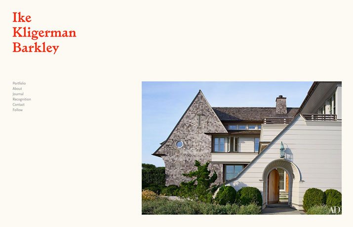
Example: Ike Kligerman Barkley uses high-drama balance to pull users in. The directional pull of the image at the bottom corner of the screen against the name and navigation in the opposite corner pull the eye between elements, almost daring you not to look. The image gives you an idea of why you have found the website and the minimal framework encourages clicking through the links.
Emphasize Motion
Think of a tire rolling down a hill. You can immediately sense the motion. The same happens when you design this motion in an asymmetrical way.
- The eye will naturally move from the larger, heavier part of the screen to the lighter part.
- The eye will follow directional cues such as an arrow or shape that seems to point in a particular direction.
- The eye will follow the path of eyes in the screen image, so that a user looks in the same direction and the person in the design.
- The directional flow will skew left to right, unless there is a powerful pull toward another direction.
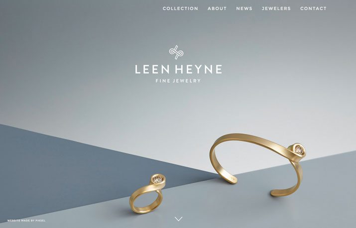
Example: Leen Heyne Fine Jewelry uses motion to draw the eye into the featured product. Geometric shapes literally point the eye in the right direction, while creating a feel that the bracelet (or ring) could just naturally roll across the canvas. This directional influence does something else as well – it points the use to the navigational arrows to move to the next page.
Add Focus with Color
Asymmetrical color patterns are usually high in contrast and color combinations. Think bright hues against black or a toned photograph that has bold white typography on top. High color contrast will being focus and visual weight to specific parts of the design.
Asymmetrical color combinations can be created using the color wheel. Opt for color pairings and combinations that fall outside traditional color rules for a feeling of asymmetry. Consider colors that are rarely used for impact. Use color to highlight and emphasize other elements in the asymmetrical outline. Color works very well with elements such as geometric shapes, typography or even in the background to serves as a secondary focal point to achieve balance.
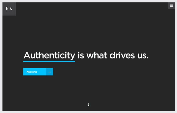
Example: HLK Agency uses color to take a design that is almost symmetrical and make you think again. The blue underline and button create a simple focus with asymmetry that balances against the subtle hamburger menu and branding icons in the top corners.
Don’t Forget the Grid
While you are not using a grid to create mirror images, it is still a vital part of the design process. Using a grid to create asymmetry will help you achieve balance and organization.
Consider each element on the grid as you would with any other project. Do things rest in a certain manner horizontally and vertically? Is there offsetting weight on either side of the canvas – left to right and top to bottom.
Think of the grid as a scale – for every element you add to one side, something on the other side needs to offset it. To create immediate asymmetry, consider a column grid with an odd number of columns; on one side of the grid create elements that are equal to a column width, on the other double it.
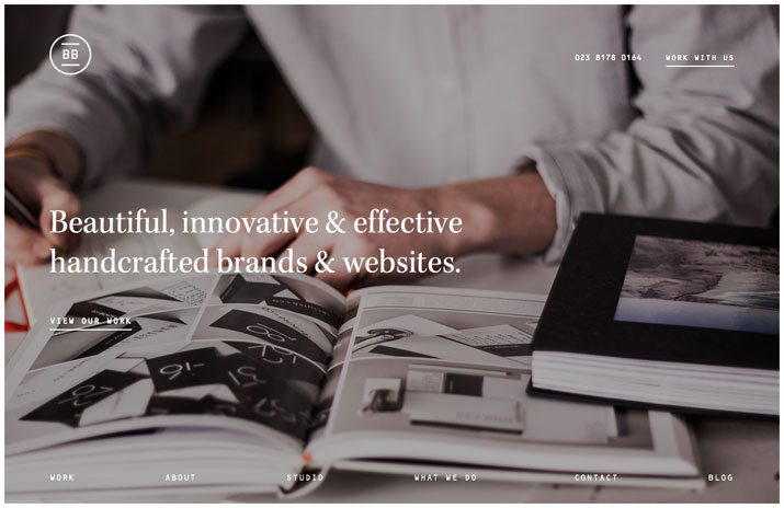
Example: BrightByte Studio uses a create columnar grid that keeps elements aligned and organized in a mix of symmetrical and asymmetrical elements. (But the first one you see is likely the left-aligned text in the middle of the screen. This use of a grid creates an innate balance between elements. Note how the downpage navigation and top-of-page links fall in line as well as the space occupied by the main text and the navigational elements.
Create Weight
Asymmetry is rooted in the idea that something is so “heavy” that you will be drawn to it first. Determine what part of your image will carry that visual weight. It can be an image or typography or even whitespace.
Balance the heavy element with contrast – a lighter element, something that grabs the users’ attention in a different way. Weight works best when combined with the other techniques above so that the weighted item does not overpower the design and carries you through it.
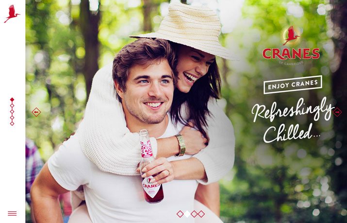
Example: Cranes of Cambridge uses an engaging photo as the “weight” of the design. It is balanced by two elements – one that you might not even notice at first. The lighter text and logo is significantly “lighter” than the people in the image, making you look from the people to the text (also following the implied movement of their eyes). It is also offset by a think columnar navigation that helps pull you across the screen.
Conclusion
Asymmetry can be a beautiful and harmonious design technique. While design trends have focused on a lot of symmetry recently, there is likely to be a shift back toward some of this “imbalanced” balanced design. It is visually intriguing and helps direct users through a design with subtlety.
Asymmetry also has impact and works especially well as a concept that is used with symmetry in the scope of a complete project. Experiment with asymmetry and fall in love with this dynamic design technique.