How to Use the 2020 Pantone Color of the Year in Design Projects
It might be one of the best public relations moves in the design world. Pantone releases an annual color of the year that sets the tone for color trends for a 12-month cycle.
This year’s selection – Classic Blue – is a color that’s highly usable, stable, and instills confidence. A color close to this is likely part of a brand palette that you are familiar with.
Here’s a look at Classic Blue and how the color – and similar colors – as inspiration for using the color (or not) in design projects this year.
2 Million+ Digital Assets, With Unlimited Downloads
Get unlimited downloads of 2 million+ design resources, themes, templates, photos, graphics and more. Envato Elements starts at $16 per month, and is the best creative subscription we've ever seen.


Classic Blue: Pantone 19-4052
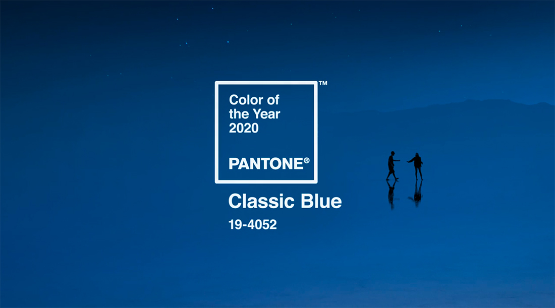
Classic Blue is just that – classic. The deep, dark hue is one that we’re all familiar with and was picked by Pantone as the color to usher us into a new decade. It’s described as a color that “highlights our desire for a dependable and stable foundation.”
The color is simple and elegant. What’s most significant for designers is that it is so highly usable.
Here’s what Leatrice Eiseman, executive director of the Pantone Color Institute, has to say about the color selection:
“We are living in a time the requires trust and faith. It is this kind of constancy and confidence that is expressed by Pantone 19-4052 Classic Blue, a slid and dependable blue hue we can always rely on. … Classic Blue encourages us to look beyond the obvious to expand our thinking; challenging us to think more deeply, increase our perspective and open the flow of communication.”
Color Swatches
- Pantone: 19-4052
- RGB: 0-70-128
- CMYK: 100-65-0-27
- HEX: 004680
Pantone made Adobe files available for download using Classic Blue.
Color Meaning and Associations
Much of the meaning behind Classic Blue is outlined in the description by Pantone. This definition is in alignment with what one would normally think about blue and it’s color meaning and associations.
Blue is a color that is connected to confidence, trust, peace, and even a corporate nature. Blue is one of those colors that can absorb the meaning of things around it and can have a bright, light feel or more of a melancholy, serious tone.
Blue is associated with design with nature (the sky and sea), freedom, imagination, calm, and stability. Darker blues tend to have greater emotional associations than lighter hues, which are seen as more harmonious.
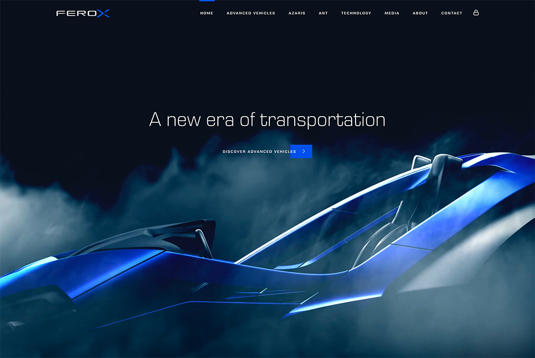
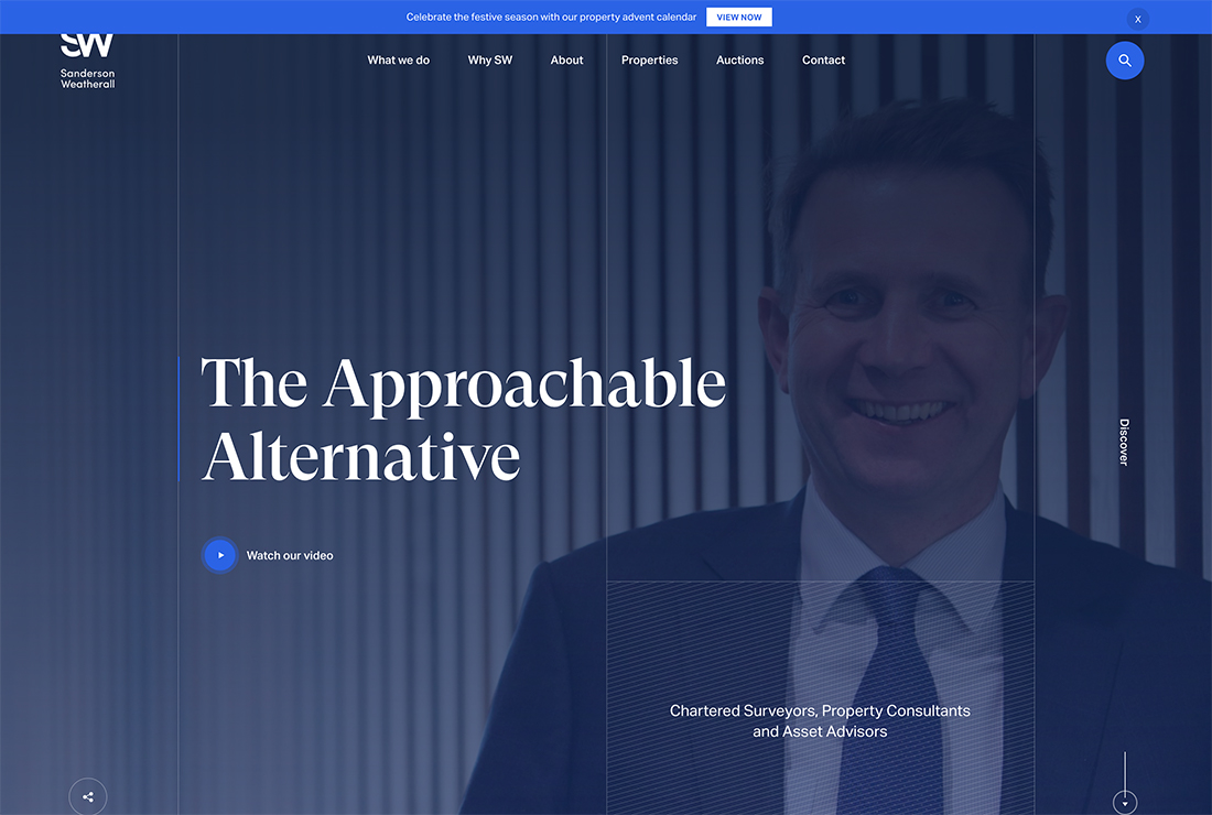
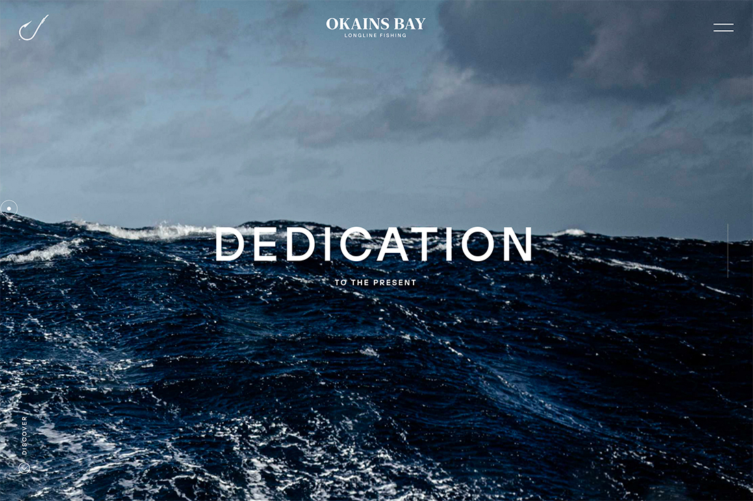
Deeper blues, such as Classic blue, can be dynamic in design projects when used for backgrounds, as a strong color in photos, or even for text elements. With the right accents and surrounding elements, this color an elicit excitement; on the other hand, it can be paired with more drab elements for a moodier feel.
In the instance of Pantone’s selection, the color is intended to be used in a way that feels rather neutral:
“Non-aggressive and easily relatable, the trusted PANTONE 19-4052 Classic Blue lends itself to relaxed interaction. Associated with the return of another day, this universal favorite is comfortably embraced.”
Best Uses for Classic Blue
One of the most notable things about this color choice at first glance is that designers won’t have to do a lot of work to incorporate Classic Blue (or a closely related hue) to projects. This color is already everywhere.


Best practices for using, or adding Pantone 19-4052 to a project include:
- Use it with other trending colors, such as brights or gradients, for a modern palette
- Opt for a monotone color scheme to maximize the color’s emotional effect
- Use Classic Blue accents with a palette that doesn’t include a blue hue
- Consider blue as a dominant color element in photography or illustrations
- Consider it for new projects as a brand color in a logo or part of a secondary palette
- Classic blue can make a great color overlay
- Tints and tones of Classic Blue can be particularly nice; consider these if the fully-saturated option doesn’t work with your design
Inspiration from the Design Shack Gallery

2019 Color of the Year: Living Coral
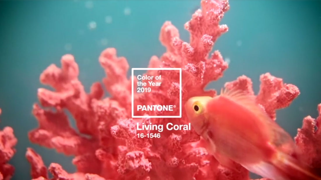
Pantone calls Living Coral an “animating and life-affirming coral hue with a golden undertone that energizes and enlivens with a softer edge.”
What’s nice about the selection is that it tends to fall in line with many current color trends and will blend well in gradients, as a bright background (that’s something other than blue) or as an accent color. While it has a somewhat feminine feel, this color can be a rather versatile option that’s just a bit softer than red or orange, but more vibrant than pink.
Here’s what Leatrice Eiseman, executive director of the Pantone Color Institute, has to say about the color selection: “Color is an equalizing lends through which we experience our natural and digital realities and this is particularly true for Living Coral. With consumers craving human interaction and social connection, the humanizing and heartening qualities displayed by the convivial Pantone Living Coral hits a responsive chord.”
In essence, the color is a simple, visual representation of the state of our design and marketing universe. Everything Eiseman says echoes that fact.
Color Swatches
- Pantone: 16-1546
- RGB: 255-109-112
- CMYK: 0-59-50-0
- HEX: ff6d70
Pantone made Adobe files available for download using Living Coral.
Color Meanings
When it comes to color meanings and associations coral can be connected to orange or pink hues. It’s a little of both.
Coral is a pink-orange that feels fresh and invigorating. It’s rather dynamic and can pull from colors around it. Most often you’ll find coral with bright white or an oceanic blue for a lighter tone.
To pull back the vibrancy and lightness of the color (and keep it from feeling quite as feminine), it can be paired with gray or neutral palettes.
Color meanings include:
- Light, bright, vibrant, feminine (especially light or muted corals)
- More orange corals: Soothing, trendy, energetic
- More pink corals: Compassion, playful, sweet
How to Use Living Coral in Print and Web Design Projects
Examples of this color being used in action:
While Living Coral is associated with a natural element, it’s not a hue that creates an immediate connection with nature. But it is the color of coral in the sea (where it gets its name) and mimics the color of a “red” sky at dusk and dawn.
What’s nice about this tie to nature is that it’s a color that blends with other hues exceptionally well.
Use Living Coral with other bright colors or contrast it with a deep blue or green. It’s more versatile than you might think and renders nicely on printed and screen-based elements.
Best uses of coral:
- As one color in a gradient background
- In images, particularly of the sky or with ocean scenes to show the natural use
- As a text or user interface accent
- For a call to action button
- As a color overlay on an image or for text elements
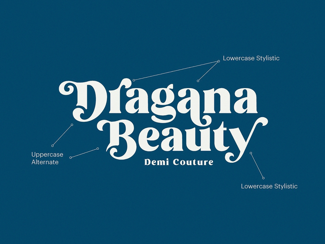
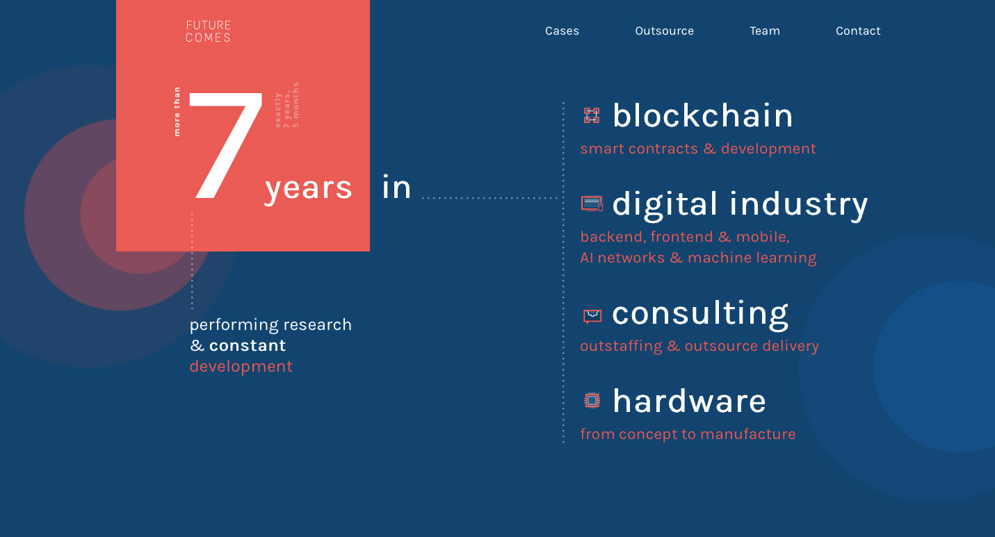
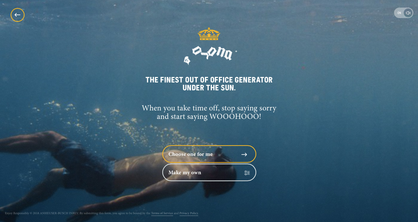
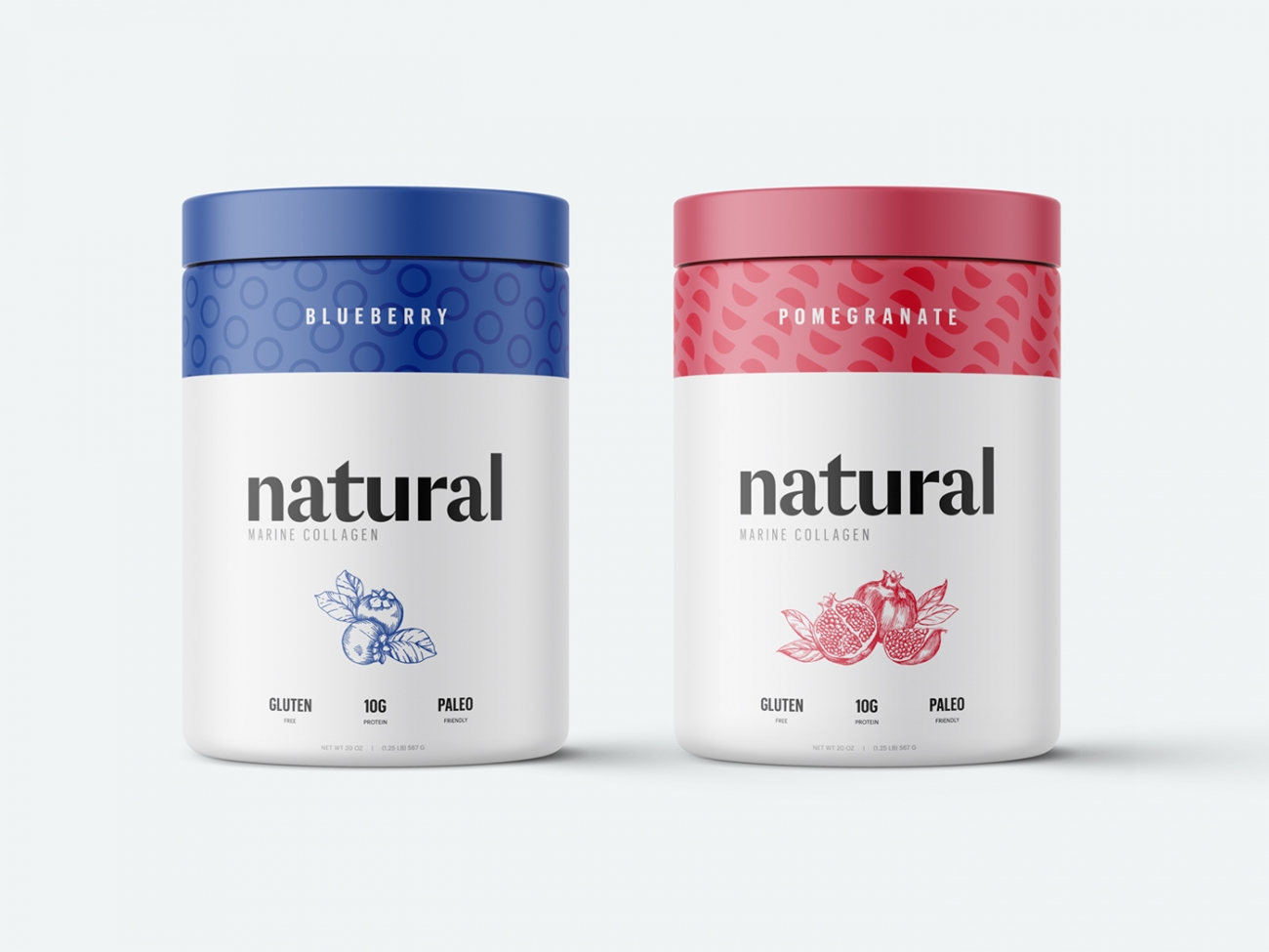
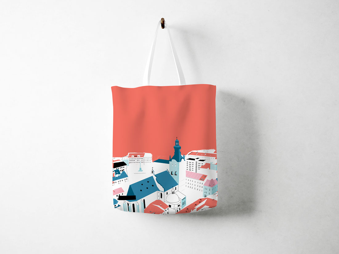
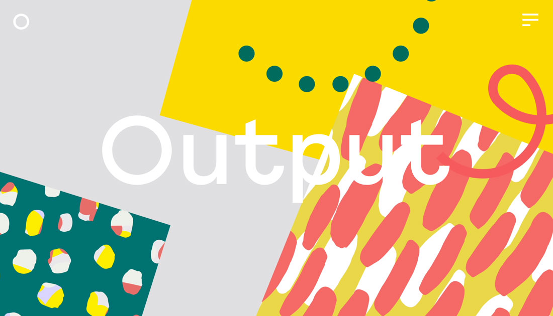
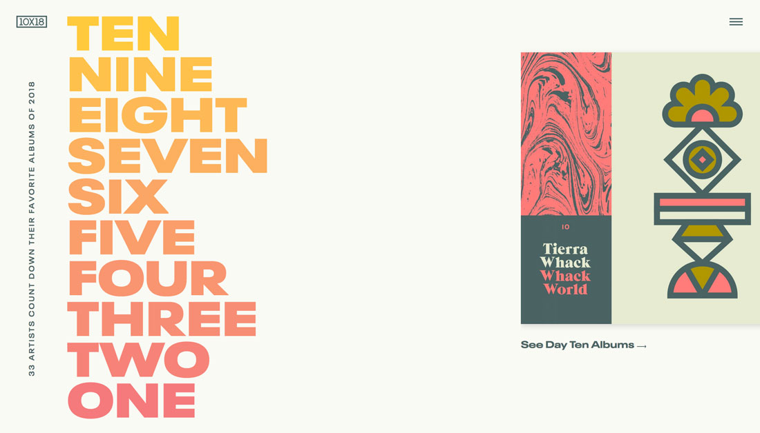
Inspiration from the Design Shack Gallery
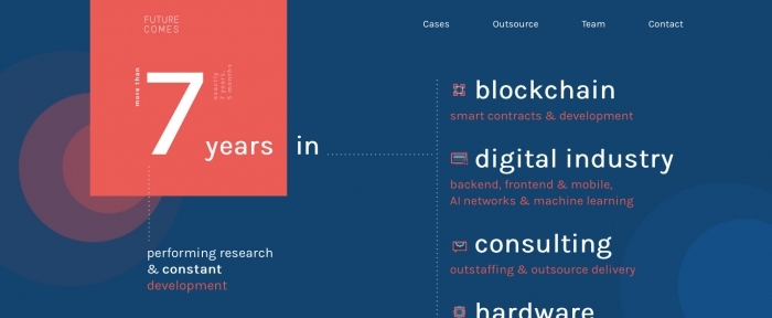
Future Comes
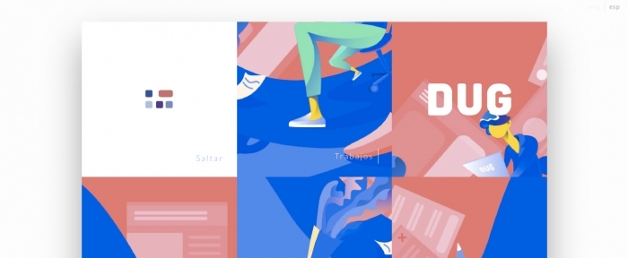
Dug
Ester Digital
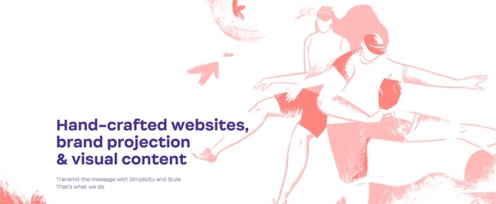
Sister Agency
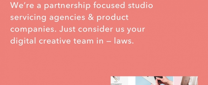
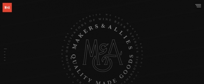
Makers and Allies
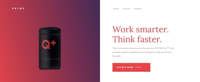
Prymd
Last 5 Colors of the Year
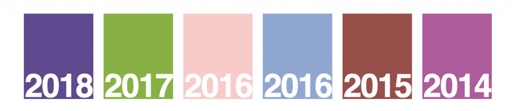
- 2018: Ultra Violet, 18-3838
- 2017: Greenery, 15-0343
- 2016, Rose Quartz, 13-1520, and Serenity, 15-3919
- 2015: Marsala, 18-1438
- 2014: Radiant Orchid, 18-3224