5 Alternatives to Drop-Down Hover Menus
Is the era of drop-down hover menus over? It might well be. This design pattern doesn’t work for today’s users. The concept is clunky and doesn’t always translate well to smaller screens.
Users want menus and navigation options that are easier to use, simple to understand and don’t come with more options than they can think about in a few seconds. Navigation menus should be device-agnostic and work in the same way, creating a single experience, across device types. So what can you do to say goodbye to those drop down menus? We have five alternatives.
1. Scrolling Panels
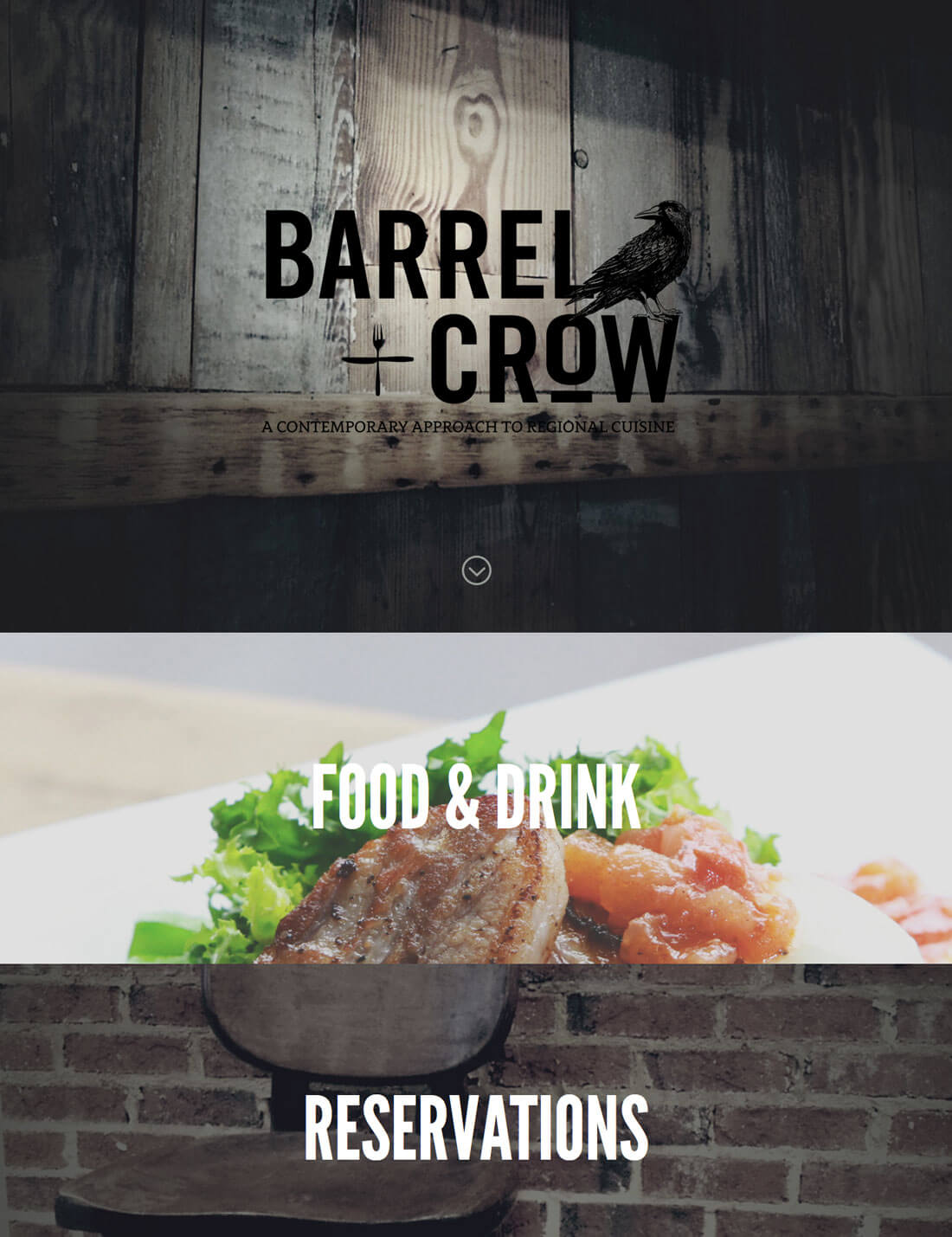
No matter how you like your scroll, using scrolling effects such as parallax or panels to lead users to a different part of the site is an effective navigation style. While many of us (myself included) gave the scroll up for dead a few years ago, smaller screen have help scrolling patterns re-emerge as a highly-usable feature across all device types.
Users aren’t afraid to move down the page, so you don’t have to cram every link or bit of information on that first screen. Use HTML5 to your advantage and build a site that makes navigation part of an immersive user experience. (So immersive in fact that users might not even recognize the navigation for what it is.)
To make it work, you have to do more than just create a long page with a bunch of links. The design has to come with impact. Cue users in to what you are doing. Create visual separation with color between “screens” and include large clickable areas that tell users exactly where they will go next.
If you have concerns that some users might need that more traditional site map-style menu, consider tucking it away in the footer. You’ll end up with a more streamlined design and still keep those linkable items in a single location for old-school users.
2. Hidden Hamburgers
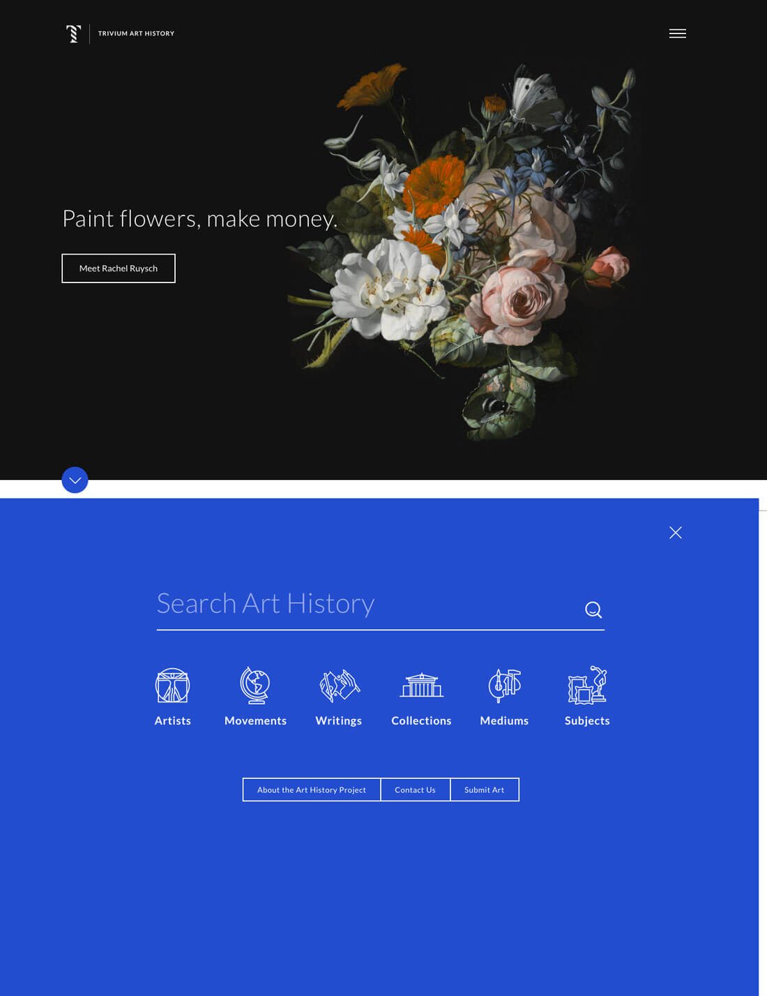
Before you jump into the “I hate hamburger icons” rant, think about it for a moment. Like it or not, this has tiny icon has morphed into a symbol of a pop out, swing down or otherwise hidden menu. Users seem to understand it. And while many designers seem to loathe it, you’ll probably end up using it anyway.
So quit fighting it.
Instead, work to develop better ways to incorporate the icon into your overall navigation patter. I am totally digging hamburger icons that open into minimalist full-screen menus right now, such as Trivium Art History, above.
The trick here is the simplicity. The menu is bold, provides users with just a few choices and is easy to use on any device. Who needs dozens of menu options anymore, anyway? A significant portion of users will land on your website from a search engine on an interior page; the number of users typing in your URL directly and then moving through on-site navigation is shrinking all the time.
3. Card-Style Navigation
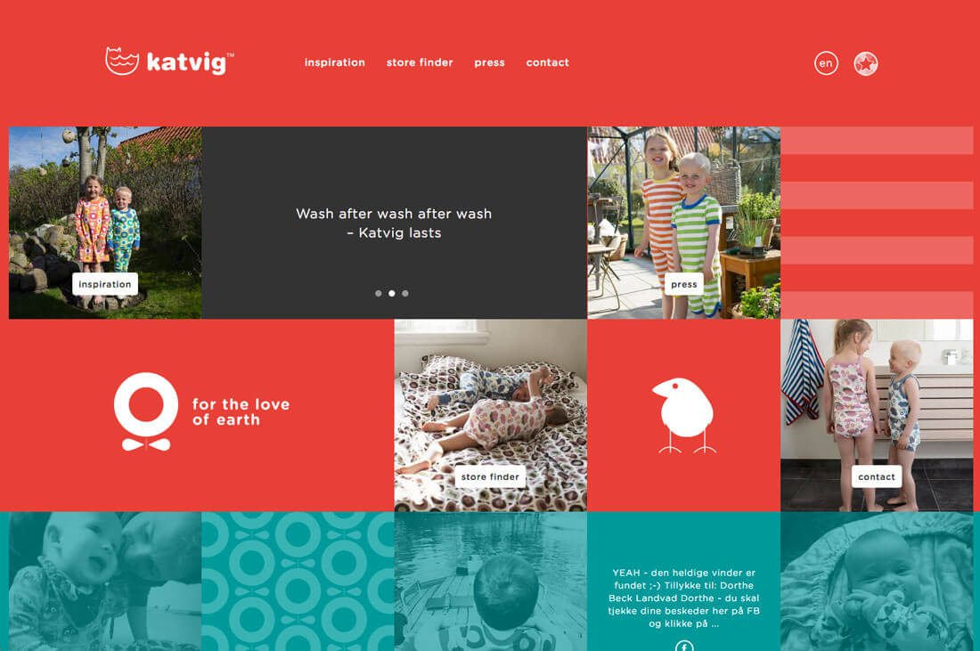
Cards, cards and more cards. It seems like designers (and users) can get enough of them. So why not make cards your preferred navigation/menu option?
Start with a card pattern on the homepage that is a full-screen experience. Each card then takes users to a different part of the site. The idea is so simple and intuitive that any user should be able to navigate the flow and find what they are looking for with ease.
As an added bonus, responsive cards then “fall into place” on mobile device screens so that the experience is similar across platforms. (Users will love you for this.)
To mix up the design, think outside of the box with your card-style interface. Mix different card styles – text, images, video – so that users are drawn to look across the screen and interact with multiple elements. Katvig, above, does a nice job of incorporating multiple card styles, color and simple animation to draw attention to specific elements.
4. Sticky Menus

Simple and usable. Sticky menus are an easy way to help users move through your site. Create a simple menu structure with just a few important elements and ensure that the sticky element finds, and locks to a specific position on the screen.
Most of the time these menu bars are large and then collapse into a smaller version that the top of the screen on every page. (It’s hard to get more user-friendly than this.)
The Bloomberg Mayors Challenge site does a great job with its sticky menu. The position of the menu moves from mid-screen to the top of the homepage (and on all top-level menu pages), providing visual interest and sticks with every other page on the site. Further, the menu gives you a few other things that users might want such as social media icons for quick access and a quick change selector for language.
This simple solution is one of the most user-friendly things you can do. This is why sticky menus are a popular selling feature for many “boxed” website themes. (It’s somewhat surprising that more sites don’t use them.)
5. Vertical Side Menu
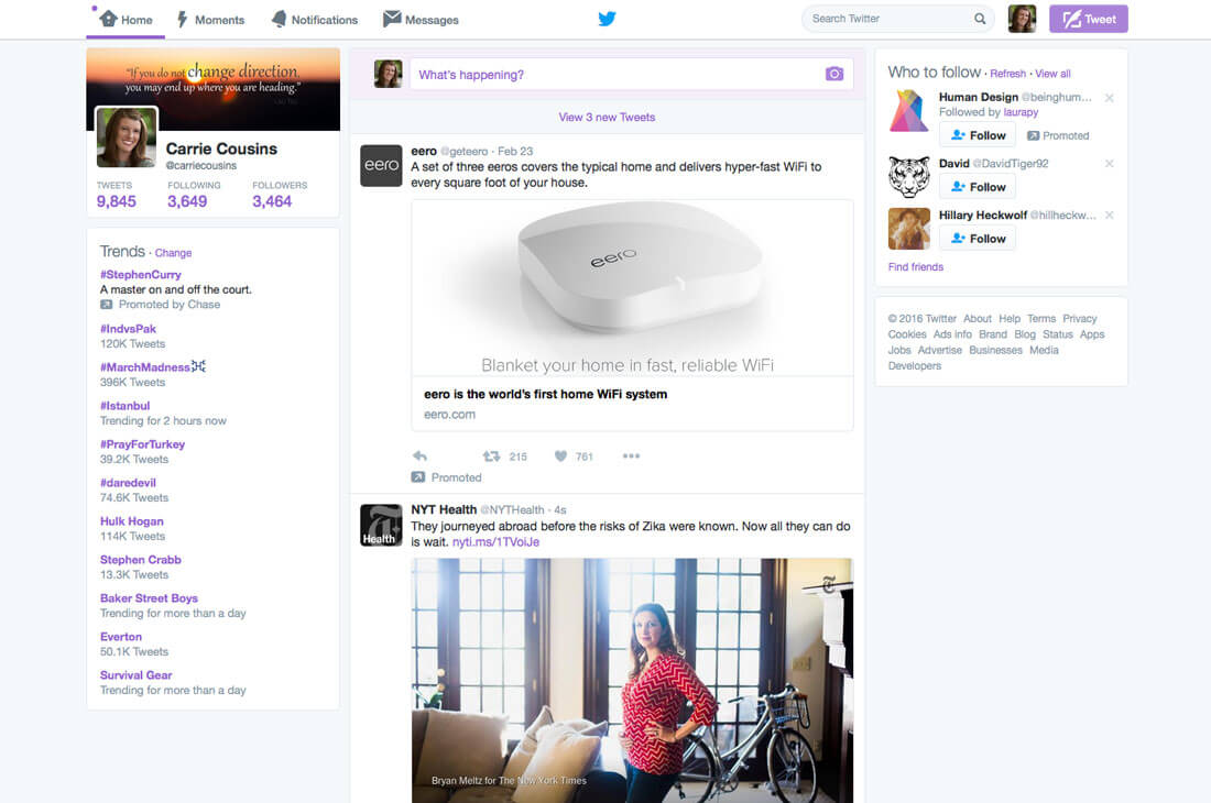
It’s a popular feature for two of the most popular sites in the world – Twitter and Facebook – but not many other websites take advantage of vertical side menu navigation. Maybe it’s time to start.
Both social media sites tuck important elements into sidebar-esque navigational elements. The thin vertical column is great for holding a lot of simple text information and making things easy to see at a glance.
Whether you opt for a menu on the left or right side of the screen is up to you. (There are pros and cons with either option.) I would think about it in terms of how the navigation works with other imagery. Does the rest of the site have a directional pull to one side or the other? Could the dominant imagery lead the user to look at the navigation? Think of the elements together in a big picture way to create pieces that work together for a singular, unified feel.
5 Awesome Resources
- Web UI Design Best Practices ebook
- CSS Snippets: Simple Horizontal Navigation
- ”Dropdowns Should be the UI of Last Resort” and how to create better forms
- NavNav Responsive Navigation Examples
- ”10 Stunning HTML Menu Templates to Download”
Conclusion
Navigation patterns and menu styles are an evolving part of website design, but many of the trends are slower to develop than in other place. This could be due to the complexity in designing different styles for this essential element or caution from designers who are holding back to see what results in more accepted user patterns.
The lesson here is this: Simple navigation is better. If you are using clunky, overwhelming drop-downs, it’s time for a change. Go for it.