Create Five Awesome Hover Effects Using CSS Multiple Backgrounds
Today we’re going to have all kinds of fun with the CSS multiple backgrounds feature. You’ll learn how to use multiple backgrounds in a simple way and how to go much further by combining the technique with hover actions and CSS transitions to create some really cool effects.
Follow along as we code five different applications of this idea that you can copy and paste to create your own awesome hovers.
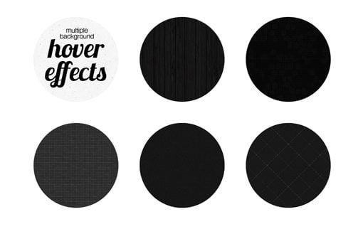
What We’re Building
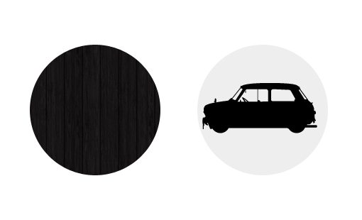
Here’s a sneak peak of what we’ll be creating today. Hover over the circles and think about how you would accomplish these effects with pure CSS.
Demo: Click here to launch the demo.
Multiple Backgrounds
Until recently, I had never really played with using multiple background images in my CSS. I knew the feature existed but I hadn’t really come up with a unique way to use it. Parallax cloudy skies are awesome, but everyone is doing those and I didn’t want to simply follow the crowd.
The solution that I came up with was to figure out some great hover effects that would utilize multiple backgrounds to create a sort of opening animation. It’s a super easy trick but I haven’t seen it done before so I thought I’d show you how it works.
There are a million different ways to run with it, today we’ll build five different versions so you really get a feel for what’s possible.
The Concept
Your typical CSS hover animation are pretty basic: one image slides away to reveal another, something rotates or bounces, colors fade and plus; you get the idea.
When we throw multiple backgrounds into the scenario though we suddenly have quite a few variables to work with. With very little setup, we can create some seemingly complex animations using only CSS transitions, which for now still have better browser support than keyframe animations.
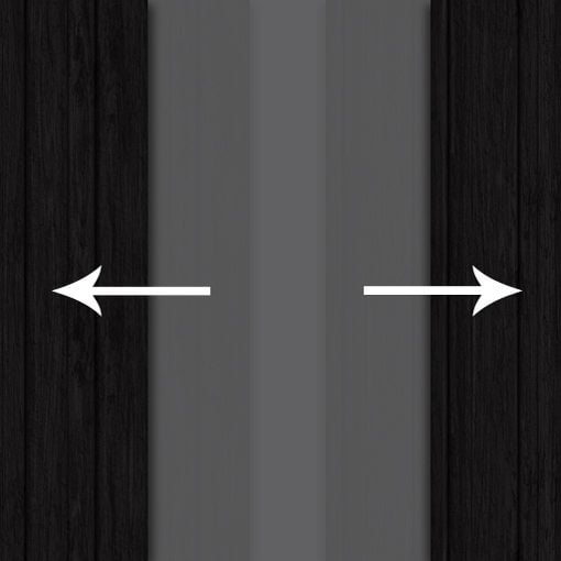
For instance, let’s say we want to have an opening doors effect. We can animate two background images in different directions and accomplish this illusion with ease:
Now that we have the explanation out of the way. Let’s get to the fun part and start building our hover effects.
Sliding Doors: Horizontal
Let’s take the hypothetical example from above and see if we can build something that uses this effect. To start, we need two background images.
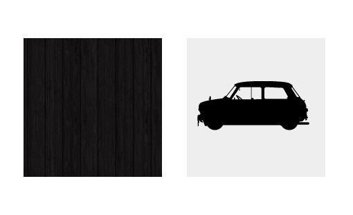
Since we’re just showing off an idea it doesn’t matter what images you use, just make sure that one of them is a texture that will tile. I’ll be using the Dark Wood texture from Subtle Patterns and a pictogram from the free WC Sold Out A Bta.
Base CSS
Create an empty div in HTML and apply a class that uses some basic styling. We’ll apply this class to every one of the examples that we build today.
I’ll be throwing a bunch of these into one document so I’ve got a few layout styles, but most important here is the border radius set to half the height/width, which will give us a nice circle.
.circles {
	float: left;
	height: 200px; width: 200px;
	background-color: #eee;
	margin: 0 50px 50px 0;

	/*Make it a circle*/
	-webkit-border-radius: 100px;
	-moz-border-radius: 100px;
	border-radius: 100px;
}
Our background images will be stacked, but here they are spread out with the border-radius applied.
Applying Multiple Background Images
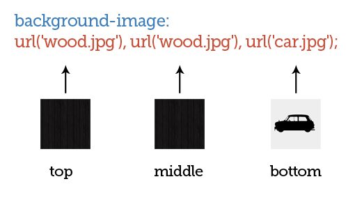
The first thing we’re going to do is apply both background images, but as a curve ball we’re going to use the wood texture twice for a total of three background image applications.
Applying multiple background images in CSS is as easy as it gets, just apply one like normal, then throw in a comma and apply another.
#slidingDoors {
	/*Applying Multiple Background Images*/
	background-image: url('wood.jpg'), url('wood.jpg'), url('car.jpg');
}
These images will have a natural stacking order that correlates to the order in which you list them: the first being the top image and the last being the bottom.
You can position the backgrounds with shorthand, but for this example I think it’s best to keep things separate to make things easy for readers. With this in mind, we toss in the background-position property so we can move our images into place.
/*Applying Multiple Background Images*/
#slidingDoors {
	background-image: url('wood.jpg'), url('wood.jpg'), url('car.jpg');
	background-repeat: no-repeat;

	/*Positioning the Background Images*/
	background-position: -100px 0px, 100px 0px, 0px 0px;
}
Obviously, each set of positioning values correlates to one of the images that we’ve applied. The first value in each set moves the picture right (positive value) and left (negative value) and the second value moves it up (positive value) and down (negative value).
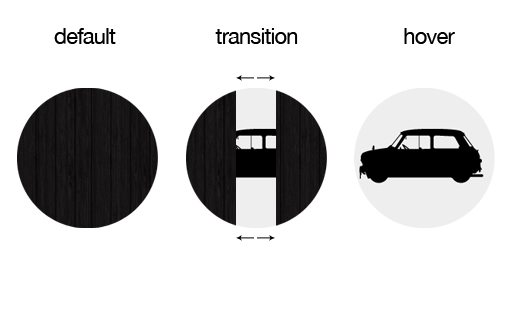
As you can see, I’ve split the circle right down the middle so that one version of the wood image is on the left and one is on the right with the car image sitting right in the center.
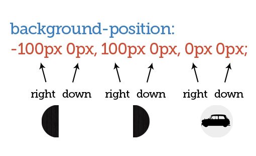
It seems crazy to position the wood images like this because you could just use one, but this will allow us to make a nice animation.
Animating the Images
Now, since we can move each of these background images independently, we can come up with some pretty cool results if we apply transitions.
To set this up, we throw in all of the various browser prefixes and create a simple transition that lasts one second or less. Then, we set up a hover selector that moves the left wood background further left and the right wood background further right.
#slidingDoors {

	/*Applying the Background Images*/
	background-image: url('wood.jpg'), url('wood.jpg'), url('car.jpg');
	background-repeat: no-repeat;

	/*Positioning the Background Images*/
	background-position: -100px 0px, 100px 0px, 0px 0px;

	/*Transition Parameters*/
	-webkit-transition: all 1s ease-in-out;
	-moz-transition: all 1s ease-in-out;
	-o-transition: all 1s ease-in-out;
	-ms-transition: all 1s ease-in-out;
	transition: all 1s ease-in-out;
}

#slidingDoors:hover {
	background-position: -200px 0px, 200px 0px, 0px 0px;
}
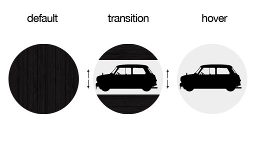
With that, we’re finished with the first example. Now when you hover over the wooden circle, the doors will slide open to reveal the image underneath.
Sliding Doors: Vertical
Now that we’ve gotten through one example, changing this effect is a breeze. Here we use the same CSS transitions and background images, the only thing that changes is the positioning of the two wood texture images. This time we stack them on top of each other and move them up and down as the user hovers.
#slidingDoorsVert {

	/*Applying the Background Images*/
	background-image: url('wood.jpg'), url('wood.jpg'), url('car.jpg');
	background-repeat: no-repeat;

	/*Positioning the Background Images*/
	background-position: 0px -100px, 0px 100px, 0px 0px;

	/*Transition Parameters*/
	-webkit-transition: all 0.7s ease-in-out;
	-moz-transition: all 0.7s ease-in-out;
	-o-transition: all 0.7s ease-in-out;
	-ms-transition: all 0.7s ease-in-out;
	transition: all 0.7s ease-in-out;
}

#slidingDoorsVert:hover {
	background-position: 0px -200px, 0px 200px, 0px 0px;
}
Break Apart: Squared
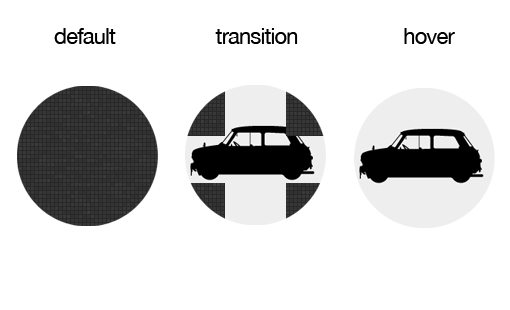
Let’s step things up a little bit and use a total of five images for the transition. Basically, when you hover over the circle, the image will break apart into four pieces and fly out of view.
We align the top four images so that the meet vertically and horizontally right in the center of the circle. Then on hover we move each up and out.
#breakApart {
	background-image: url('squares.jpg'), url('squares.jpg'), url('squares.jpg'), url('squares.jpg'), url('car.jpg');
	background-repeat: no-repeat;
	background-position: -100px -100px, 100px 100px, -100px 100px, 100px -100px, 0px 0px;

	/*Transition*/
	-webkit-transition: all 1s ease-in-out;
	-moz-transition: all 1s ease-in-out;
	-o-transition: all 1s ease-in-out;
	-ms-transition: all 1s ease-in-out;
	transition: all 1s ease-in-out;
}

#breakApart:hover {
	background-position: -200px -200px, 200px 200px, -200px 200px, 200px -200px, 0px 0px;
}
Break Apart: Rounded
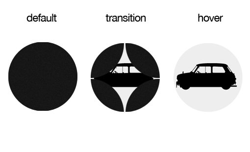
Repeating these effects with a rounded image is a little trickier because one, you have to use transparent PNGs and two, because you have to make the images overlap in the default state. The latter causes complicated issues with creating textures, but if you use something like a simple noise texture then it’s pretty easy.
#breakApartRounded {
	background-image: url('circle.png'), url('circle.png'), url('circle.png'), url('circle.png'), url('car.jpg');
	background-repeat: no-repeat;
	background-position: -50px -50px, 50px 50px, -50px 50px, 50px -50px, 0px 0px; /*right down*/

	/*Transition*/
	-webkit-transition: all 1s ease;
	-moz-transition: all 1s ease;
	-o-transition: all 1s ease;
	-ms-transition: all 1s ease;
	transition: all 1s ease;

}

#breakApartRounded:hover {
	background-position: -200px -200px, 200px 200px, -200px 200px, 200px -200px,  0px 0px;
}
Twist and Shout
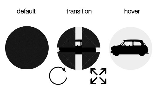
This one is hard to get the gist of from the picture above. Basically, it is the same as the break apart transition above, only I’ve added the extra element of a rotation that occurs before the images break apart and reveal what’s underneath.
This involves a few quirks. The problem with the rotation is that it rotates all of the background images, including the car underneath. To account for this, I rotated the car beforehand so that the transition rotation actually puts it right into place. You catch glimpses of the car during the rotation, but it just adds to the effect.
Another interesting thing is the timing of the transitions. Notice that I actually put different durations on the rotate and moving transitions. This shows just how incredibly complex you can get with this idea.
#twistAndShout {
	background-image: url('crisscross.jpg'), url('crisscross.jpg'), url('crisscross.jpg'), url('crisscross.jpg'), url('car.jpg');
	background-repeat: no-repeat;
	background-position: -100px -100px, 100px 100px, -100px 100px, 100px -100px, 0px 0px;

	/*Rotate*/
	-webkit-transform:rotate(-90deg);
	-moz-transform:rotate(-90deg);
	-o-transform:rotate(-90deg);
	-ms-transform:rotate(-90deg);
	transform:rotate(-90deg);

	/*Transition*/
	-webkit-transition: background-position .6s ease-in-out, -webkit-transform .3s ease;
	-moz-transition: background-position .6s ease-in-out, -moz-transform .3s ease;
	-o-transition: background-position .6s ease-in-out, -o-transform .3s ease;
	-ms-transition: background-position .6s ease-in-out, -ms-transform .3s ease;
	transition: background-position .6s ease-in-out, transform .3s ease;
}

#twistAndShout:hover {
	background-position: -200px -200px, 200px 200px, -200px 200px, 200px -200px, 0px 0px;

	/*Rotate*/
	-webkit-transform:rotate(0deg);
	-moz-transform:rotate(0deg);
	-o-transform:rotate(0deg);
	-ms-transform:rotate(0deg);
	transform:rotate(0deg);
}
Take Another Look
Now that you’ve seen the code, take another look at the demo to see these techniques in action.
Demo: Click here to launch the demo.
Conclusion
The point of this article was to get you thinking beyond parallax effects for how to apply multiple backgrounds in an interesting way.
Leave a comment and let us know what you think of the examples above. Have you done anything with multiple background images? We want to see it!