Above the Scroll: Does It Matter Anymore?
There is an ever-growing argument in the design community about whether designing for the scroll on your website is necessary. The arguments for producing stellar design concepts for the first part of the website a viewer will see and those against are wide ranging and are greatly affected by changes in technology.
Where the scroll lands on the screen is even changing with wider monitors and great variances in the size viewers open their web browsers. How can a designer account for all of it?
Like the article? Be sure to subscribe to our RSS feed and follow us on Twitter to stay up on recent content.
History Lesson
The term “above the scroll” actually comes from the land of print design. The “above the fold” concept still employed by newspapers today is the basis for the theory that you have to interest readers with the first thing they can see. Newspapers put stories, photos and text above the fold – or on the top half of the page which is visible when papers are sold – to entice buyers. Above the scroll works on that same theory – designers should put their best stuff on the top part of a website so users do not have to use the mouse, or scroll, to view content.
But getting your content above the scroll is becoming trickier all the time. Not only are websites viewed on varying screen sizes and at different browser widths, they are also commonly accessed by mobile and tablet devices. Many designers are currently working on an above the scroll model of no more than 500-600 pixels deep. According to Google Labs, 90 percent of users can see all of the content up to 500 pixels deep, that number drops to 60 percent at 600 pixels and falls to 30 percent at 700 pixels.
Design Above the Scroll

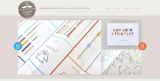
Web designers have been building pages for above the scroll since the first days of the Internet. In the 1990s, people were not used to scrolling and the concept helped users get all the relevant information from a website without moving the mouse. This is just not the case anymore.
Above the scroll design has evolved into more of an open display space for many designers and is used almost like a book cover on some of the most visually enticing web pages. With a few clicks or a scroll, users can access other content on the site.
Above the scroll design is all about getting attention for your site. The above the scroll presentation is the first impression you leave on a user and will help them determine whether to stay with your site or move on. The visuals you present and the message you convey is important.
There is an art to creating an effective above-the-scroll design. With the limited space, designers must be conscious of overcrowding or trying to do too many things all at once. Keep the above-the-scroll design simple and aim to include key elements: Company or personal logo or branding information; a dominant image or block of text; and navigational tools, including links to other parts of the site or cues that the site scrolls or even slides from left to right.
Design for the Scroll
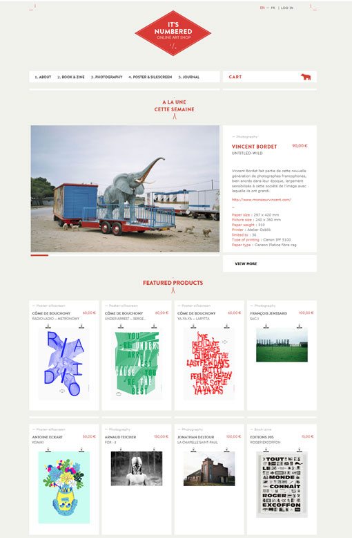
More designers are creating sites and visuals for the scroll. Allowing yourself the vertical space to create a different shape of visual can open up new options. It can also be complicated because you want to still make sure what’s above the fold will make people stop on your site.
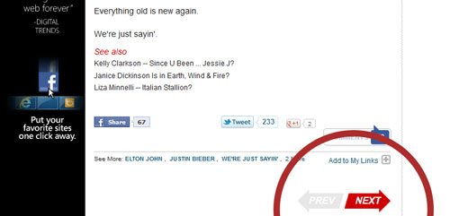
Research dating to 2007, suggests that most readers do follow a page, scrolling through content. A ClickTale study found a whopping 76 percent of users scrolled on websites and a significant numbers of those people scrolled all the way to the bottom of the page regardless of depth, according to Milissa Tarquini of BoxesandArrows.com. Further, Tarquini’s own research suggests that the most clicked part of the TMZ website is actually a link at the bottom of the page sending users to the next page.
The best design-for-the-scroll pages start with a sharp, clean “first-impression design.” I like this theory better than above the scroll because your striking concept may only be 300 pixels deep and uses tools to encourage users to continue down the page. After you produce the top of the page for a first impression, continue thematic elements down the scroll. Use consistent color schemes and fonts. Continue to use sharp images and strong text.
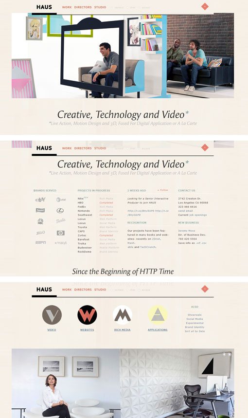
Some pages are designed using a panel theory so that each new scroll has a full “page” to view. Note the different pages that appear with each full screen scroll on the Haus site.
When you are designing for the scroll, keep a couple of key design elements in mind. Try to position your logo or banner so that it is always visible. Try to do the same with navigational tools. Anchor necessary elements at the top, bottom or along the side of the page to make getting around the site easier for your users. If you are designing a site with a very deep scroll, consider incorporating buttons or links that will pop you back to previous elements or the top of the page.
Evolving Concept
Mobile and tablets are making the scroll concept even more murky. Users are getting more used to varying screen sizes, from desktop computers to laptops, to smartphones, iPads and wide-screen televisions with web capability. All this variance in screen size also makes the exact location of the scroll rather unclear.
The key above-the-scroll concept for these broadening web design specifications is usability. Try to keep important functional buttons at the top of the screen so they are easily accessible while users wait for other content to download. Moreover, test your site and mobile site on a variety of devices and evaluate how you feel about how things look and how easy they are to use. Keep up with trends and changing technology, because the look and landscape of web design is changing everyday.
Conclusion
Although many may argue that designing for an above-the-scroll presentation may be out of date, it is a valid design concept. Use the above the scroll theory to engage users and get them interested in your site. Then design for the scroll to keep users on the site.
Let your content drive the type of presentation you choose, but consider combining scroll design theories to establish a clean, readable, visually appealing website.