Design for Everyone: Considering Accessibility in Visual Projects
Because design is such a visual concept, we don’t always stop to think about how design can impact users with certain disabilities. From vision to hearing or even touch impairments, how you design a website, brochure or even package can look or work a different way to different people.
And while you can’t design so that every element is perfect in every condition for every user, there are some things you can do and think about to make your design projects more accessible to a larger number of people. Simple techniques such as color choice, texture, shading and sound effects can make a difference to users.
Things to Consider
While there are a number of things that can contribute to design accessibility, the most common factors include impaired vision or color blindness, the ability to hear certain sounds and even a sense of touch. Each of these things can greatly impact how something you create is received and it is important to understand that in some cases, significant numbers of people can be impacted by these factors.
Impaired Vision
A significant portion of the world population has some type of visual impairment. Think of all the people you know that wear glasses or contact lenses. This includes 285 million people and of those 39 million are blind, according to the World Health Organization.
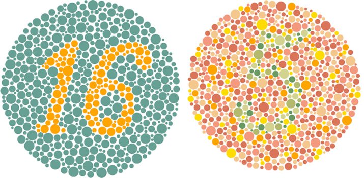
Color Blindness
One of the most common problems a designer can face when it comes to accessibility is color blindness. There are several variations of color blindness – which range from seeing little color in certain hues (commonly red, green or blue) to seeing no real color at all. Color blindness can start at birth or develop over time.
Approximately 1 in 12 men and 1 in 200 women are color blind, according to Color Blind Awareness. In Britain alone, there are about 2.7 people who have some degree of color blindness. You can test your color vision online in just a few steps.
Hearing Ability
While hearing loss is not a visual issue for designers, it can impact website and user interface design which often include sound cues. While hearing loss is most commonly associated with older individuals, it does impact a large number of people. About 20 percent of adults in the United States have some degree of hearing loss, according to the Hearing Loss Association of America. Most of those people are likely part of your company’s target demographic with 60 percent of those with hearing loss actively in the work force or educational settings.
Sense of Touch
While not extremely common, sense of touch and nimbleness of fingers is a growing concern when it comes to accessibility and design for those who design apps and websites. Because these elements work with “taps” or “finger swipes,” touch is important. Users with neuropathy, a nerve disorder that results in a loss of the sense of touch, or arthritis can have difficulty with these types of design applications.
Working with Color
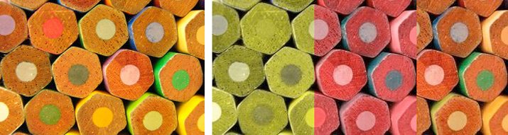
The most common form of color-blindness is red-green and in some cases blue-yellow. With this condition those colors tend to blend together with little distinction between the hues. This makes working with color especially important.
A color palette that uses lots of red and green in concert with one another will be difficult to see for individuals with this condition. Think of elements such as bar charts or graphs that use red and green bars; they may be indistinguishable.
A better option is to use colors that aren’t paired in terms of common vision patters (red-green and blue-yellow). By pairing different kinds of colors, you can make information easier to see.
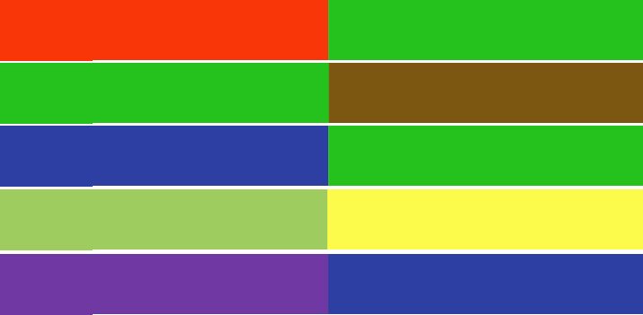
Color combinations that can be difficult to see:
- Red and green
- Green and brown
- Green and blue
- Green and grey
- Green and black
- Light green and yellow
- Blue and purple
- Blue and grey
That’s not to say you can’t use these combinations of colors. There are ways to use these combinations and still create a design framework that is highly accessible.
Think about buttons in a web interface. If the rest state is red and the hover state is green, the result is not a fully accessible button. But simple changes, such as additional shading for the hover state or using an outline around the hover state box can make a major difference.
Another option is to use a monochromatic color palette. Different shades of the same hue are often easy to discern. This can be a fun and simple (not to mention trendy) way to make sure information is easy to see.
Importance of Texture
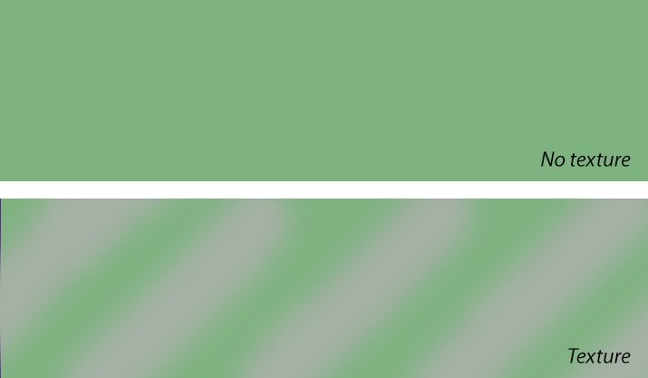
In addition to changes in color, think about adding texture to elements. This works for printed items and online.
In printed elements, texture can help distinguish a product. From raised inks to paper type, the medium you use can help identify you and your product. In digital elements, using simple textures such as lines or shading within a colored box can make variations easier to see. In terms of touch, adding some feel — such as a bump or buzz — when you swipe or tap the correct location can make these elements easier to use as well.
Contrast and Size
We often talk about the importance of size and contrast, and in terms of vision this is vital. The larger and more contrast you create between elements, they more likely they are to be seen and understood properly.
Use combinations of high and low color saturation to create distinction between design elements. Make sure that elements have enough space around them to be “read” clearly. Finally use size to your advantage. Type should be easily readable by the average person at a distance of several feet.
Sound Effects
In terms of hearing, sound effects need to be simple, clear and not too high or low. Midrange sounds are often the easiest for the largest number of people to hear with ease.
Make sure sound is professionally mixed and edited for clarity. Sounds with too many things happening in the background can be difficult for anyone to hear and provide even larger obstacles for anyone with hearing loss.
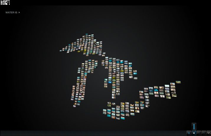
On websites or apps where sounds auto-play, include functionality for key audio components to be repeated or allow for the volume to be increased. (Note how the site above does this in a simple way.) Consider including visual cues with sound information as well, such as full text or captioning.
Conclusion
It may not always be possible to design for every possible scenario. And most companies and clients would not expect it, but you should think about your audience and potential accessibility concerns.
Try to consider ways to work in elements that make your design more user friendly for everyone. Color choice, text size, texture and the types of sounds used might not always make a big difference in your overall design, but can often have a significant impact on users.