Big Design in Small Spaces
It’s easy to get caught up in the big picture sometimes – what your whole site looks like or the message it conveys. Just as important though, are the small spaces. The look of your banner, sidebars and even the dreaded-in-some-circles above the scroll presentation can bring people into or turn people away from your site.
Effective design in restricted, and even constricted spaces can be the key to adding just the right flair to your site. Simple design tools such as cropping, color, text display and contrast can make all the difference when planning the design for the boxed-in spaces of your next project.
Like the article? Be sure to subscribe to our RSS feed and follow us on Twitter to stay up on recent content.
Cropping
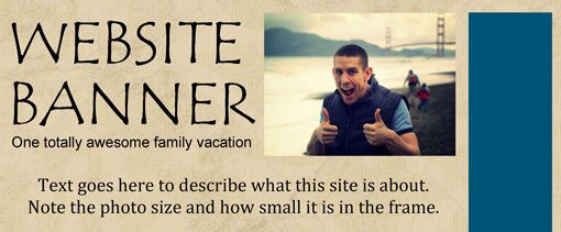
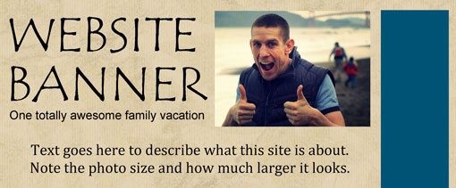
A tight crop can give a small image the feeling of being much larger than it is. In small spaces, it is best to stay away from wide angle images where faces are unidentifiable. People like to see other people in photos, so crop your images so that faces are clearly visible and identifiable.
Keep the same idea in mind when using images of objects. Can you tell what you are looking at from a distance? Take a few steps back from the monitor or zoom out. Does the image still make sense? If not, it might be time to reconsider the crop or pick out a new image.
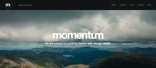
Consider the shape of your space when you crop the image as well. A vertical image in a very horizontal space (or vice versa) may get lost; consider a square shape which will have a little more weight to it. Also look at strong crops that complement your space. Try a strong horizontal as the main image above the scroll, such as the site for Momentum Studios, or a very vertical image in a sidebar or rail.
Color
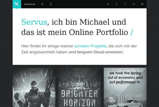
Think about the color scheme of your site and add something unexpected to the mix. It is not by mistake that designers often use a splash of red (or another bright color) with stark black and white designs. The addition of color immediately draws the eye. Use it to emphasize words, such as in headers, or to bring out a certain graphic element, such as a colored logo.
Avoid too many colors in restricted spaces. Try to keep the palette simple when working above the scroll, with banners or with even smaller elements. Mixing too many colors and images without a lot of breathing room can create a sense of chaos in the design, making it hard for readers to navigate through the page.
Text

Use a font with personality to bring out design. But, use it sparingly. Think of this word as an art element more than as type.
Select a font that will not be used elsewhere in the design, but maintains the feel and message you are representing. Experiment with your words, filling all of the space you have available (even if 350 points seems terrifying) and then back off the size until it seems to work with the other design elements. Always go big to start, you can always back off. But if you never try a super-sized font, you will never know what possibilities you might have missed out on.
A contrasting technique is to go small. A tiny bit of type can have as much impact as something much larger. Just make sure to consider the message you are sending and ensure that the small point size is readable.
Finally, play with limited effects with bits of type in small spaces. (Warning: Some of these effects can come off cheesy if you are not careful and should be used with few letters – think one word only.) Consider things like an arcing text or tilting it. When you are going for a big look, novelty typefaces can also be an effective tool.
Contrast
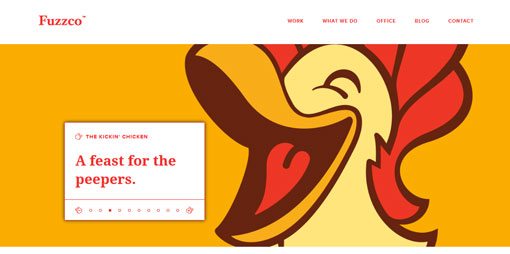
Black on white, masses of white space with a single image and rows of photos, large and small words, yin and yang – think about contrasting elements. If everything matches perfectly, it is possible that nothing will stand out. Put together elements that have contrasting properties while complementing one another.
The philosophy of contrasting elements is why black and white is such a popular background and text combination. But contrast can some from other things as well. Play with colors from opposing sides of the color wheel or mix black and white and color images.
Think about contrasting type properties as well. Consider font sizes that vary greatly in size and weight or mixing serifs and sans serifs on your site. Try using colored text for headers and black text for the rest of the site’s body. Another option for creating contrast is to pair a large image with small type (or big type with a small image).
Establishing contrast can also add emphasis to photos. Weigh borderless frames against frames with thick, classic black or white frames for photos and other images. (You might even like a combination of the two, for example, black 1 point frames around photos while all other images are borderless.)
Content
The absolute best design for any space starts with the content. Good content will help drive your design and keep people interested in the site.
Plan your content accordingly. Try to keep ideas simple and relevant. Keep the site fresh and updated. More than anything else, these things will keep people coming back.
Think about content changes as well. What parts of the site are updated frequently? Often these updates happen in small corners of other content. Keep these areas fresh with strong design tools, rather than tricks, such as flashing text, spinning photos or streaming videos and sounds.
When changing your primary content (or even just the image representing that content) above the scroll, make sure that images are different enough that they will grab the attention of web surfers. If your primary image today is of a man in scuba gear, switch to a woman with the next change. Consider changing between black and white and color photos or making sure that back-to-back images feature distinctly different colors or even changing the color of the big words on the page.
Mix and Match
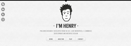

Finally, use multiple techniques to get the desired outcome. You can mix color and contrast, or any of the above methods to get the most bang on your site. Just be careful of trying too many different things at once. Opt for elements that are simple and don’t have a lot of frills when experimenting with new techniques.
Consider a dramatic crop with a large color word, such as Sasquatch in a novelty font, or go the minimalist route and use a small, tightly cropped image surrounded by dead space, such as Henry, to create dramatic emphasis.
Don’t forget the big picture either when working on individual elements. Each small piece of the page should mash with the rest of the design, not work against it. Don’t be afraid to try something and let it go; just because a new banner looks great standing alone, does not mean it will fit your site. Save these “misfit” parts for future projects.
Conclusion
You can add an extra bit of flair and professional feel to design projects by using the proper scale and proportion in the smallest spaces on a website. Think about the shape of your space and corresponding parts when planning how to design within a certain set of size boundaries.
Keep in mind cropping, color, contrast, content and text when developing the design. Mix and match components to get the best possible result, remembering to keep it simple. Too many effects and elements in a small space can feel crowded, overwhelming and be difficult to comprehend.
What is your favorite trick for making the most of small design spaces? Share them with us.
Image Source: CarbonNYC.