10 Digital Design Terms You Need to Know
Design jargon is everywhere. And you need to be able to speak the language. Working on digital projects has its own set of terminology. From dither to color values to fluid or fixed layouts, there are a few terms every designer needs to have a grasp of.
So we’ve made it easy for you, and put together a list of digital design terms you need to know. This list started as a top 10, but we added some bonus jargon for comparative purposes. How many of these terms are you already familiar with?
1. RGB and HEX

Both RGB and HEX refer to numerical color values. Every color in the light spectrum, yes screen color is created with light, can be made by combing three primary hues.
- R = Red
- G = Green
- B = Blue
RGB values are expressed using a set of three numbers, where each number ranges from 0 (no use of a color) to 255 (full color value). On screen, even black and white are made by combining these values. Black uses no color value for red, green and blue while white uses 100 percent values for each.
HEX values use a slightly more complex formula of letters and numbers. Every HEX value has a corresponding RGB value. HEX codes are used in HTML to code color into websites. These values are represented by three sets of character pairs that include both letters and numbers.
HEX values always begin with a # sign. The lowest value is 00, while the highest value is FF.
2. Mouseover
A mouseover is a JavaScript element that results in a change to an element on the screen once the mouse pointer reaches it.
These changes often relate to graphic elements such as photos. Often you see something simple like a hyperlink, but mouseover states can be complex as well. Some more complex mouseover effects include hidden navigation menus or changes to photo states or scrolling lists.
3. Dither
A process used in digital audio and image editing, dither helps prevent color banding or random noise. The process actually includes a complex mathematical formula that adds intentional noise (visual or audio).
This addition of noise can especially affect the way images look in relation to images in a limited color palette. By dithering, the designer can create an illusion of color that may not be there because with added noise, pixels will begin to take on some of the color properties of nearby pixels.
4. CSS
Cascading Style Sheets are a set of rules that define how things look on a website, using a set of defied styles for HTML elements.
Commonly called CSS, these definitions can save designers a lot of time, help search engines read your site and make it easy to put together a site that has consistent visuals. With a single change to the CSS, all of the text or color attributes can be changed in one step.
It works be defining specs for elements such as body copy or headers, where a font, size, color, alignment and other values are applied each time the corresponding HTML tag is used.
5. Metadata and Meta Tags

Metadata and meta tags are interrelated terms. Meta tags relay metadata. Metadata is information about data – as confusing as that may sound – specifically providing information about the content of an item in a digital file. The most commonly-recognized metadata include the camera information you see on digital photo files.
Metadata is also used to describe the content of a website for search engines, and this information is added to the back end of a site using meta tags. Common tags include description of the content on a page, keywords, author information, photo information and day, time and location stamps.
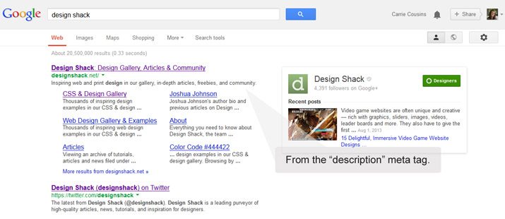
Want to see meta tags in action? Google almost anything. That short description that comes up after the page name and link is usually from the “description” meta tag, making it a highly visible and important item in your digital design toolbox. (Note: If you leave that tag blank, search engines will “fill” it for you with the first bit of content on your page.)
6. Favicon
This tiny icon – typically 16 by 16 pixels – is the image located at the top of each browser tab or window. Every website can have its own favicon, which is short for favorite icon. The small icon will also appear in search histories, next to bookmarks and on browser tabs and desktop icons.
Favicons must be saved and stored properly to work on a website. While many browsers support GIF and PNG formats, Internet Explorer prefers an ICO file.
You can create your own favicon using software such as Adobe Photoshop or use an online tool such as Favicon Generator.
7. Fixed-Width vs. Fluid vs. Responsive Layout

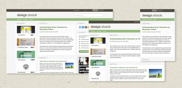
There are so many terms floating around these days that describe how your website functions within a browser or mobile interface. Before choosing a type of design concept or grid, consider fixed, fluid and responsive layout options.
Fixed-width layout: A fixed-width layout works exactly as the name implies. A site is built based on a set of size specifications and it maintains those specs, regardless of device or browser size. While these sites can be designed quickly, they can be cumbersome to view on smaller devices.
Fluid layout: Fluid layouts are built using a system of proportions relative to the design and screen size to render a site. Each element in the design is assigned a percentage width as it relates to the screen size. For example, the main column of text may encompass 60 percent of the screen while the sidebar fills the remaining 40 percent. While using a fluid layout resolved some of the issues associated with fixed-width design, the end result can sometimes be hard to determine on the back end. Fluid layouts can work well with different desktop browser environments, but tend to get a little clunky on small, mobile-size devices.
Responsive layout: Responsive is the big trend of 2013 and is taking over the way we think about web design. Because responsive design adapts to the device it is viewed on, responsive design works almost universally. Each element is sized based on percentages, including images and text, and media queries allow for responsive sites to be built using different CSS styles. Responsive design is not just a smaller view of a site, it can actually include its own customized version of the full desktop site, as elements might be stacked differently or include features just for mobile, such as tapping a phone number on the screen to dial it. On the flip side, it can take longer to develop and design.
8. Resolution
When it comes to images, resolution is a term you will hear frequently. And screen resolution is especially important for optimizing images for quick display on the web. The resolution of a screen is the viewable size of the display, such as a browser displaying one “screen” or scroll of a website at 1,366 pixels wide by 768 pixels high.
The resolution of an image is measured in the same way. But you must also consider pixels per inch when saving images. For the best results online, save at 72 ppi unless recommended otherwise. The width and height of images should be scaled to the largest size they will be used online, although many designers are opting for a minimum width of 600 pixels – the optimum size for pinning on Pinterest.
9. UI vs.UX
UI and UX refer to the back- and front-ends of digital design. You can’t have one without the other.
- UI (user interface) — is all the components and working that goes into creating a website. UI is making it all work, from all the the components used to build a site design to how each part works.
- UX (user experience) – is how the design works for actual users. What experience or emotion or reaction does the final product create? What can be tricky is that a good user interface is what typically creates an excellent user experience.
Get an in-depth lesson on these terms in a previous Design Shack article.
10. Skeuomorphism vs. Flat

Almost everyone has had some type of experience with skeuomorphism or flat design in recent months thanks to an abundance of site designers going “flat”.
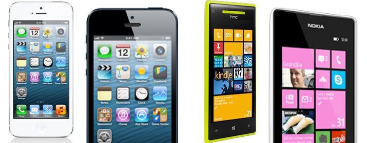
Skeuomorphic design includes elements and design tricks to make a user interface look or operate in a realistic way. From drop shadows to bevels or knobs that “turn” with a mouse click or scroll, skeuomorphism embodies a sense of “false realism.” The most-known example of skeuomorphic design is Apple’s iOS interface, which features gradients, textures and shadows.
Flat design, on the other hand, is without embellishment or “realism”. The style is super simple and does not include any elements that would give it a three-dimensional feel. The best-known example of flat design is the Windows interface, including that of the Windows Phone, featuring block styling.
Conclusion
Now that you know the lingo, go out and start creating. Don’t forget to check out the Design Shack guide to 10 Print Design Terms You Need to Know as well, so that you have a good understanding across both areas!
Image Source: Robert Scoble.