5 Rules for Designing an Effective Ad Campaign
Designers have to wear a lot of hats these days. You might create a website one day, a brochure the next, and an ad campaign for print or social media after that.
And while many of these projects all rely on the same theories of design and an eye for what looks good, there are some differences that can impact the success of certain projects. Designing ad campaigns can be tricky if you haven’t done a lot of it. The canvas is often small and doesn’t give you a lot of room for error. You get just one chance to hook a user with design and information. Here’s how to do it.
1. Write a Killer Headline

Draw users into your ad with a killer headline. No matter what size spacing you are working with – from a Facebook ad all the way to a billboard – a few key words or phrases to grab attention are vital.
Strong headlines will make or break a connection between your ad design and users. The best headlines are short, simple and lead users to complete some type of action.
Pantene, a shampoo company, has a catchy headline that starts with “don’t wash your hair,” leaving users scratching their heads until they read the message following it. The headline grabs users from the start.
The headline should match the rest of the design in use of typography and graphic composition as well as the tone of visuals. It can be powerful and firm, soft and empathetic or questioning and thought-provoking. At the very least, it should be somewhat memorable and establish a logical connection with your brand and the content in ad.
When thinking about headlines and the ad campaign as a whole, the same headline can be used throughout a campaign with different visuals or multiple headlines can be used. But they should all have the same aesthetic vibe so that there’s continuity between ads. (Many people have to interact with a brand as many as 20 times before they even remember or recognize it.)
2. Establish a Visual Story

An ad campaign should tell a story. It can happen all at once with multiple ads at one time or over a specified time frame with a series of ads that are released one by one.
You want to flood users with the story on multiple channels with a consistent presence and unified message. Hydroflask is doing with that with a bright color campaign showing their products.
The visual story should include a consistent color and typography palette throughout the ad campaign as well as visual treatment of images, video or illustrations. Think of an ad campaign as a design project with multiple parts that are all pieces of the same puzzle.
Keep your story on point and to scale. A common mistake is to cram in too much information. Even with large-scale designs, there isn’t a lot of room to work with if you want users to see your information at a glance. Images and text need to be understood in just a couple seconds. You aren’t writing a novel, you are telling a short story. Simple and sweet.
3. Show the Unexpected

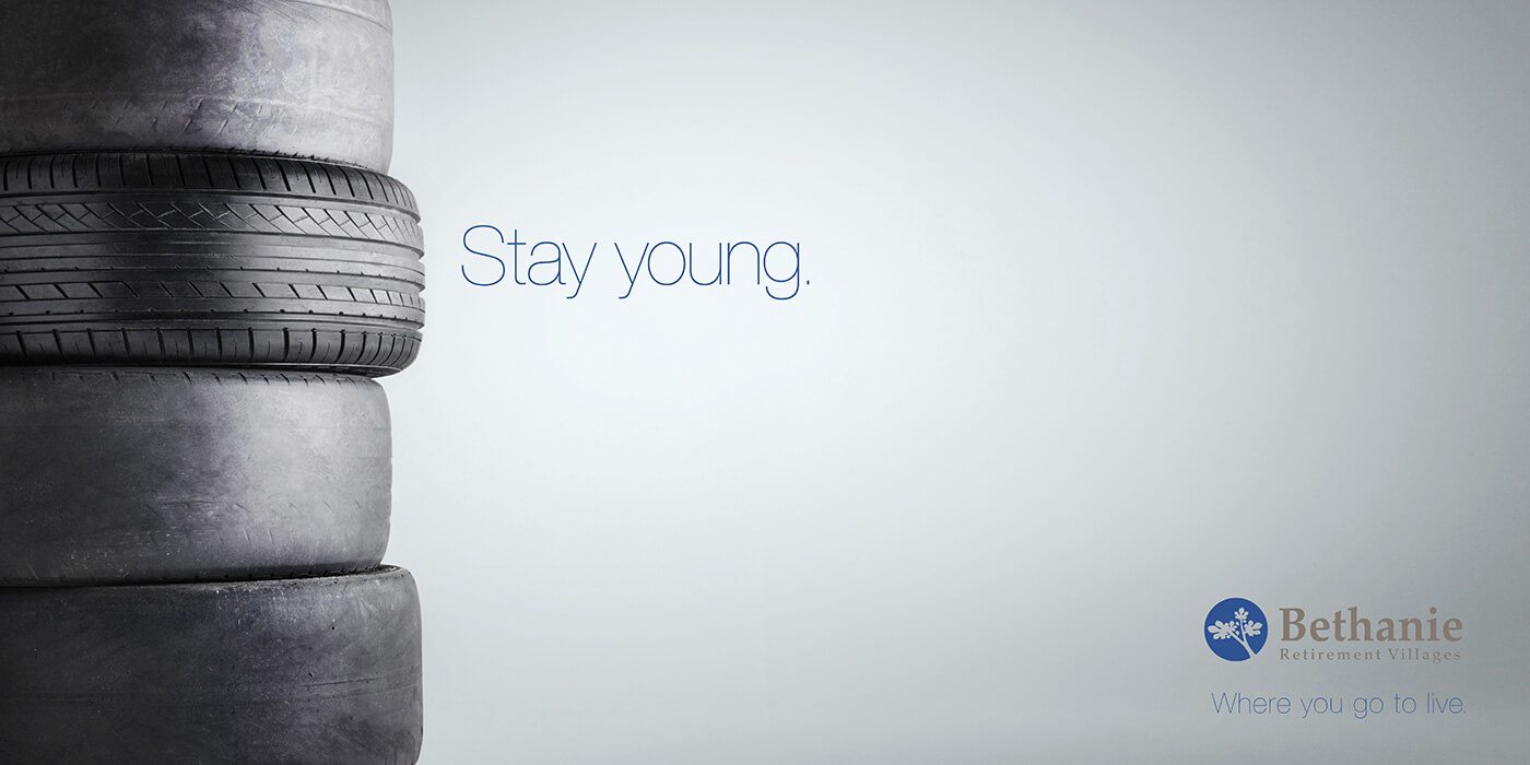
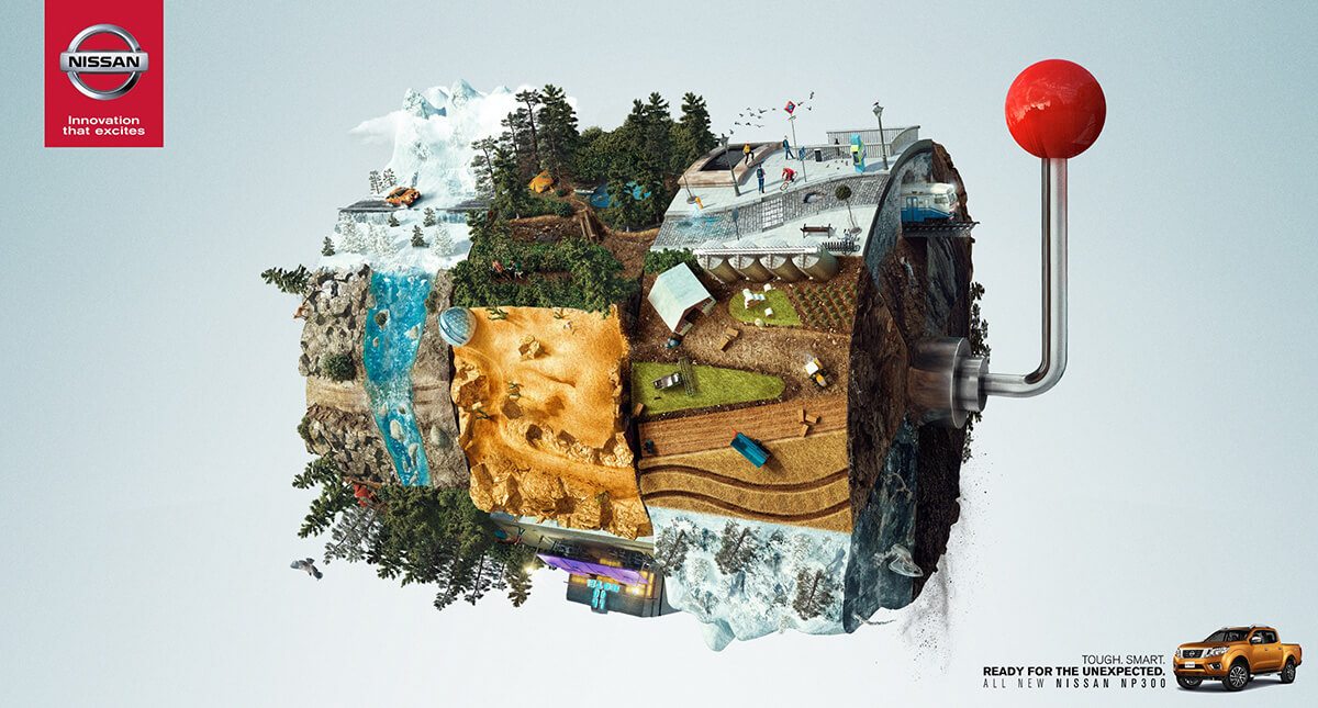
The best ads do something that users don’t expect to see. It can be in the form of an interesting or surprising visual, text or text treatment or combination of elements.
It should be clever, but relate to your end goal, whether that is getting users to click a link, but a product or call for information.
What’s different about your business or brand? Or what’s very much the same about it, but something you can present in a different way? The best way to find a solution is to start with an open brainstorming session where nothing is off limits; see what ideas come out of it and go from there.
4. Create an Immersive Experience
The digital ad format, in particular, gives designs a lot of freedom to create campaigns that seem less like ads and more like experiences. And users like it that way.
Engage the senses with strong visuals, sound, motion and plenty of imagery that creates an emotional connection. Consider social media: The visual platform is a prime example of how this works. The most engaging posts are those that help users do something, from sharing hashtags to clicking “like.” An ad campaign can work in the same manner to spark engagement.
Give users something to do. Show them that lots of other people are doing it. Make your experience something that people feel like they must be a part of.
5. Leave Users Wanting More

A good ad leaves users wanting to know more or feel the need to act. The action can be in the form of making a purchase or supporting a cause or even visiting your website.
A campaign is good for as long as this holds true. Consider Flo, the Progressive spokesperson. She’s been a long-standing character for the insurance carrier with a line of ads built around her. (Flo even has her own Twitter account.) She’s still being used because users like the character and want to see more of her; when this changes, the company is likely to go in another direction.
Part of the philosophy behind leaving users wanting more is that you don’t have a lot of room or time to capture someone with an ad. It should be quick, interesting and indicate and action to take. That last part is important. With online ads in particular, users expect to click for more information, but sometimes you still need to tell them “click here to learn more” or “click for 10% off.”
Conclusion
Here’s what might be the biggest design secret when it comes to ad campaigns – they don’t have to be ugly. For so long there was an almost formulaic approach to ad design, wherein the designer crammed as much information as possible into the space.
Today’s approach is the same as if you are designing any other content. Use whitespace well, tell a story and let the content dictate the design. The big difference is in ensuring that users are left with something to do to conclude the ad interaction experience.
If you are new to building ads, approach them like the above-the-scroll section of a homepage. It’s the same concept. You have a limited amount of space to sell the user on something and get him or her to complete an action. Ads don’t really have to look different than other types of content; they should be well-designed and easy on the eyes.