Addictive UX: Why Pinterest Is So Dang Amazing
Today we’re going to examine a very specific example of good design and discuss what makes it so successful. Along the way we’ll discover the importance of good design and how to structure experiences that turn users into addicts.
We’ll hone our sights in on Pinterest and perform a seriously in-depth analysis to see why this seemingly generic idea seems to stand so far out from the competition. The ultimate conclusions will equip you to design experiences that your users will absolute love.
A Lame Idea
Imagine that I came to you in 2010 with what I thought was a brilliant idea. I was confident that I could make it work and needed only some investors to help get things off the ground.
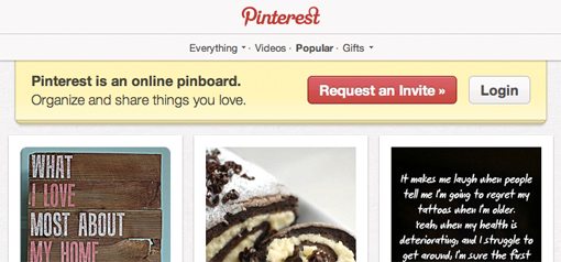
Being the cautious spender that you are, you ask about my idea. What is it? How does it work? My answer: a social bookmarking site. I’m going to create a website where people can sign up and save links. Cue patronizing letdown. You would no doubt inform me that this idea is anything but unique and is sure to flop. How could I possibly take on Delicious and the other bookmarking giants?
I’ve got a big idea though: I’m going to use images. Users will be able to grab any image from any webpage, save it to their account and share it with others.
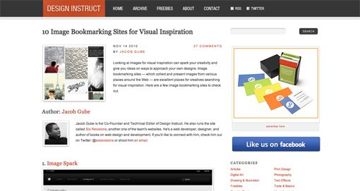
Once again, in your best slightly derogatory tone you would inform me to do a Google search for “image bookmarking” and take note of the countless sites such as FFFFOUND! and Ember that already populate this market. You might even direct my attention to a list of 10 popular image bookmarking services, published in 2010, as further proof that my idea was completely unoriginal.
The Not So Lame Success Story
At its core, Pinterest is nearly identical to the concept of the sites in the list above: a simple visual bookmarking service with a strong emphasis on sharing. I can’t help but look at the climate of competition under which Pinterest was born and marvel at how it came to stand out as a clear leader in the category.
So why has Pinterest caught fire lately? If it’s one of countless image bookmarking services, how in the world did it draw over 1.5 million users during a “private” beta? How could it possibly be snagging tens of millions of page views per week and have an estimated company worth of around $200 million?
Why Did It Work?
The secret to Pinterest’s success is incredibly important. In a time where social media is a multibillion dollar industry, a truly successful formula is the holy grail.
There are no doubt several pieces to the Pinterest success puzzle but the one we’re going to focus on today is design. How did Pinterest not only set itself apart with design, but actually surpass what everyone else was doing and create something that engaged users on an entirely new level?
Solving Layout With Diverse Image Sizes
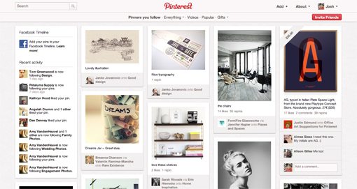
One of the primary aspects that set Pinterest apart from other social image bookmarking services is that they completely rethought how the images should be presented to the user.
The goal is a simple one, you ideally want your users to be able to browse through hundreds or even thousands of images with relative ease. If this action requires too much effort on the user’s part, you lose their interest. If it’s effortless, you keep their attention focused on the content.
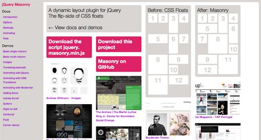
One important step in this battle was “masonry” style layout, a fairly recent trend in web development named after the jQuery Masonry plugin. Pinterest uses its own scripts for this, but the concept is the same.
Basically, masonry style layout creates the most efficient utilization of space possible given varying image heights. It overcomes past layout hurdles and takes vertical height into account when laying out the images, thereby creating a super tight, puzzle piece flow of images on the page.
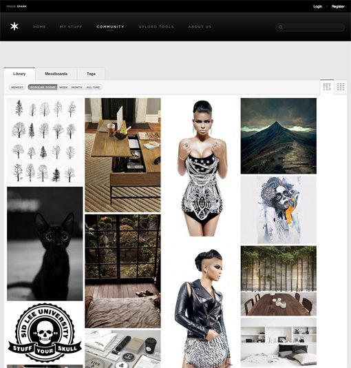
Pinterest wasn’t the only image bookmarking service to try this layout though. Competitors such as Image Spark had also integrated masonry layouts. Obviously, there has to be more to this puzzle.
The Pagination Conundrum
In addition to maximizing layout efficiency without sacrificing image quality from uniform cropping, the Pinterest team was able to identify another underlying problem with existing image gallery formats: pagination is a pain.
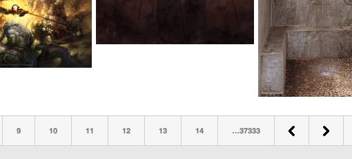
Websites love pagination because it increases their page views (more views = more money), but as a user it sucks: scroll down, click the “next” button, wait for new page to load, scroll down and click the button again… then at some point you realize you want to go back and find a specific image or page and you’re left hitting that back button a million times until you find it.
To solve this problem, the Pinterest team looked to infinite scrolling, a neat little trick that automatically loads more content as the user hits this bottom of the page, thus allowing for a fairly uninterrupted browsing process.
Way back in 2008, Paul Irish was creating and distributing infinite scroll plugins. The advice on that site says to use infinite scrolling when:
- Retaining the user is important and clicking “Next Page” is a usability barrier.
- The full content available is too large to show on initial load.
- The content is available in paged chunks: search results, blog posts, product listings and portfolio features.
This perfectly describes the circumstances of a social image bookmarking service, making Pinterest prime territory to implement this technique.
Masonry + Infinite Scrolling = Magic
Masonry style layout and infinite scrolling have melded into a single idea in our head, but they started as two separate technologies. Putting them together, it turns out, creates a truly addicting experience.
If you doubt this for a second, stop by Pinterest and start scrolling. What follows is some strange form of time travel where you stop by the site for a quick peek and out of no where a solid hour has gone by. In this time you forget about user interfaces and controls, you simply absorb the content as thousands of beautiful pictures slide by, controlled by a single flick of your finger.
It’s a truly engaging experience that simply blows away many past user interaction models. It’s interesting to note that the Facebook News Feed, the epitome of website addiction, uses infinite scrolling. Further, the new Timeline pages now combine this technique with a two column masonry style layout. It’s catching on folks, expect to see a lot more of these two techniques in the next year.

Unbeatable Content
Fancy interaction models don’t mean a thing unless you have the content to back them up. In order for Pinterest to really take off, two conditions had to be met: the content had to be great, and there had to be a ton of it.
These two goals are actually conflicting. The best way to get lots of content is to open your site to the public, which is also the best way to ensure that your site is full of crap.
Pinterest chose to stay in private beta for quite an extended period of time, carefully controlling invites. I honestly have no idea how they pulled it off, but the core group of early adopter pinners really set the stage for Pinterest’s identity and quality expectations.
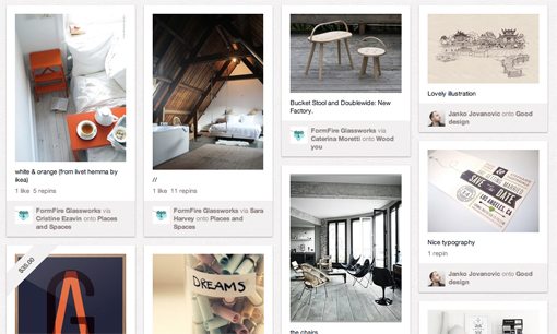
In the early days especially, you couldn’t deny the strong, unique personality that the Pinterest community seemed to have. It seemed that every image on the site was oozing with style. Instead of sifting through piles of garbage to find the gems, you were presented with wave after wave of gorgeous interior design ideas, DIY projects and the like. Which brings me to my next point: a targeted user base.
A Woman’s Touch
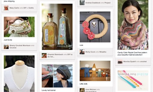
Social bookmarking services, for whatever reason, have traditionally been quite nerdy. The visual nature of the service attracts two kinds of people: designers and guys who want to save images of girls that tend to be of a particular variety. Consequently, these services are typically filled with an odd mix of beautiful examples of design and erotic photography. Don’t believe me? Spend twenty minutes on FFFFOUND! and you’ll be a believer.
Pinterest on the other hand, has actually found an audience largely with females. As the user base expands at a rapid pace, people of all types are flocking to Pinterest and “pinning” all manner of content, but the initial base of content was largely Etsy-style material that exuded a feminine style simply not found in other similar services.
Women found Pinterest and used it to save recipes, collect outfits ideas and create lists of home decor products. Pinterest targeted and leveraged this vast potential user base and used it as a foundation for its personality. I talked to a non-techy friend yesterday who is admittedly still “creeped out” when a male user follows her on Pinterest because she sees it as a largely female network.
In the end, this proved to be a very powerful strategy that has paid off with content that no one else can come close to matching. Again though, the folks at Pinterest will have to keep a close watch on their audience and evolve with their user base. Their growth is already taking them from a very specific offering to one that is more general and broad reaching.
A Solid Metaphor That Encourages Sharing
The final thing I want to discuss regarding Pinterest’s success is a little deeper into the interaction model than the surface layout and scrolling techniques. The way that they’ve structured the service’s collection process and social layer is yet another stroke of genius that helps make the service strong.
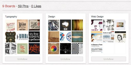
The metaphor behind Pinterest is instantly understandable and quite catchy to discuss. The idea is that Pinterest is your “virtual pinboard.” You create various “boards” and assign them categories, then use a bookmarklet or the main feed to “pin” items to your boards. Other users can then follow boards from users they like and receive a custom stream of content tailored to their specific tastes.
What people pin has become a hot discussion topic that promises new insight even into the minds of those you already know well. For example, I used my wife’s Pinterest account for gift ideas at Christmas time. It also helps with those you’d like to know better. When inviting another couple over for dinner, my wife checks the other girl’s Pinterest account to see what types of food the couple enjoys.
Making It Easy
We already discussed how Pinterest has created an awesome source for finding inspiration, but in order to get people to actually use your digital content collection service, you have to make the act of collecting and sharing content a nearly effortless task.
One of the ways that they’ve done this (in addition to the bookmarklet) is to pick up the “Retweet” idea from Twitter. Every item in a given stream of pins can be liked, commented on, and most importantly, repinned.
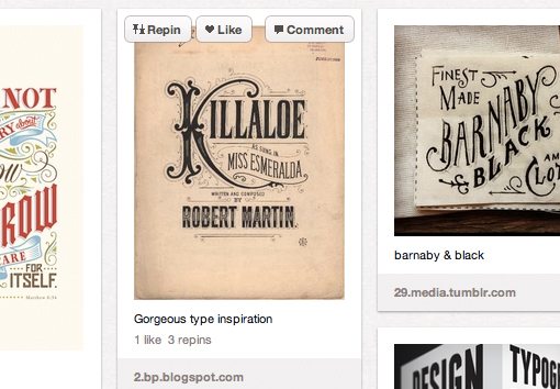
This creates a system where collection is super easy and encourages lots and lots of pinning. There’s even a page describing Pin Etiquette so everyone can learn to play nicely together.
Conclusion
Looking around the web, we encounter countless examples of fantastic ideas that are ruined by poor execution. Pinterest turns this on its head by presenting a fairly generic idea that works extremely well because of its amazing execution.
Pinterest succeeds on several layers of interaction. First, they maximize their content presentation with a masonry like layout and keep you interested for hours on end with infinite scrolling. Next, they carefully targeted and crafted a very specific user base that was both a huge potential source of users and a fairly untapped market in this space. This led to a solid foundation of daily content that defined Pinterest’s very identity. Finally, underneath it all is an instantly understandable metaphor and sharing platform that is wickedly viral and incredibly easy to pick up and use.
All of these factors together create a winning formula for an undeniably addictive user experience. Whether you personally love it or hate it is irrelevant, the truth is that Pinterest is turning heads and dramatically increasing in corporate value. It therefore serves as an important lesson that you as a designer simply shouldn’t ignore.
