Design Techniques to Imply Scarcity
How can you use design techniques to make things feel scarce? It’s an important concept, particularly in terms of creating a sense of urgency for e-commerce or clicking a call to action before it is too late.
Flash sales, limited editions, “only 2 remaining” – these are all triggers of scarcity that make a user feel the need to complete a call to action immediately. If not, the purchase or offer might not be available later. Designing for scarcity is an important concept in design, particularly for e-commerce and even in-person sales.
Psychology of Scarcity

The fear of loss is strong for most people, whether they consciously know it or not. This idea, known as loss aversion, has been around for quite some time and is well-documented in psychology circles.
So it’s naturally human for users to feel the need to click right now on something in a website design that is of a limited nature. This is particularly important to think about when it comes to leading users to different types of calls to action or converting shoppers into buyers on an e-commerce website.
There are two circumstances when using scarcity can positively impact the design:
- When you want to make the user complete a desired action faster
- When you want the user to think the item has a higher value than what is offered
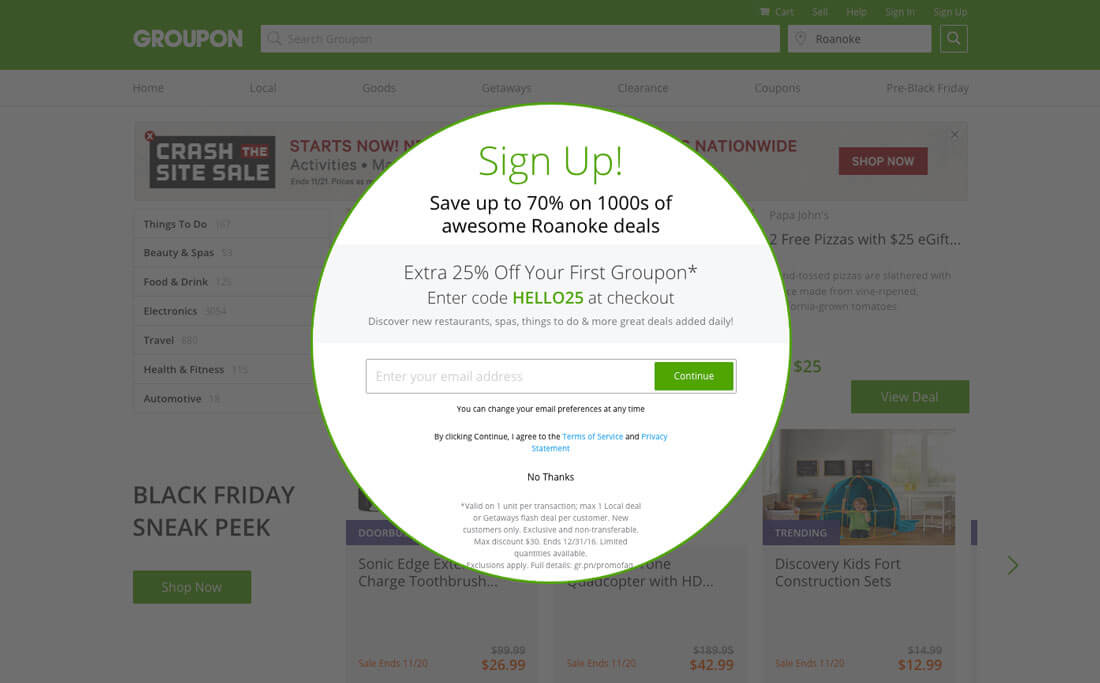
You know these actions. You come across them all the time when browsing online. Particularly in the form of small pop-ups that ask for your email in exchange for a discount code or a clock on the cart warning you that a ticket will only be held in your name for so long before the seats will be offered to someone else.
Limited Time or Quantity
Most often used as a text cue, limited time or quantity for an item is one of the most common ways to encourage users to do something now.
Many new web services will offer a limited number of beta invitations to get users to sign up for a service or download an app.
Retailer Groupon shows users how long an item will remain for sale and that a certain number have already been purchased (another psychological principle that makes user worry about feeling left out).
Inclusion in a Club
Users want to be a part of something, limited access or inclusion in a limited group or club can encourage participation. Dribbble does a good job of managing users and making the site feel exclusive by allowing users to invite other users, but not allowing just anyone to sign up. The site feels more limited, or scarce, and getting access includes the user in a special group.
Limited Information
Users like to have information first. Think of how many companies you have given your email to so that you will know as soon as a sale starts. Limiting information to specific groups makes it seem more important and gives them access to something that might not otherwise exist. It plays off the limited nature of products, information or goods.
Show Limits

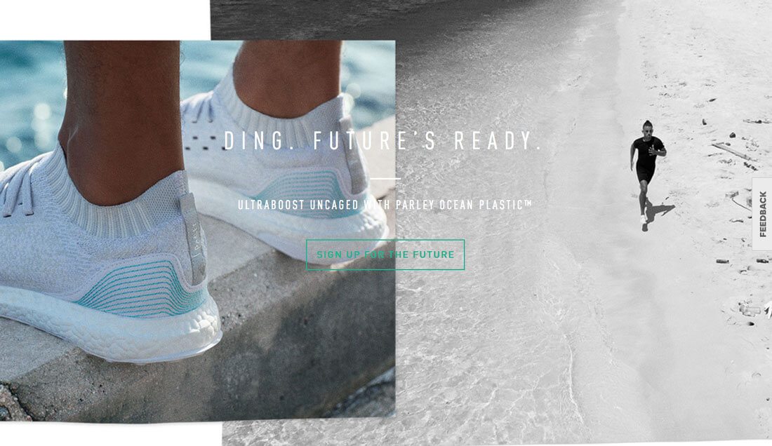
Adidas recently launched the Parley, a shoe made from recycled materials. The hype surrounding the shoe was seemingly everywhere. And the company made a point to note that only a certain number of pairs would be made.
Further, only members of their email list were told exactly when the shoe – which sold out – went on sale.
By showing limits, the company created a lot of excitement and hype for a product that sold well. The website implies that this is the first in a line of Parley products and users who visit the site now can “sign up for the future” to get access to future products.
But here’s the visual trick: In all of the marketing and promotion for the shoe, there’s never more than one pair of shoes shown. Unlike some other campaigns where lots of people are wearing similar shoes to make the buyer feel included, this imagery makes the item look special because there is only one. Buying the product will put you in exclusive company, right?
Other ways to show limited availability include:
- Using seasonal photos that relate to a specific (and close) time of year or event.
- Group many items, but include one that is different.
- Include text that tells users that sales are limited. (“Only 3 remain!”)
Text Cues


Flash sales, lightning deals, items of the day – these are all messages that are designed to make you need to buy something now. And it can be an effective sales tool.
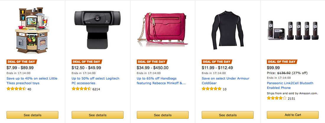
Amazon has mastered the art of scarcity for these “deals.” Look at the information on the deals page, above. Every item is noted as a “deal of the day” with a counter showing that it will not be available much longer. There’s also a percent discount cue – making users think that this type of sale won’t be available again – and a stellar rating for each item.
Do you feel the need to click on these items? The retailer is betting on it. They are using the clock and the deal itself to entice clicks based on the limited availability of products.
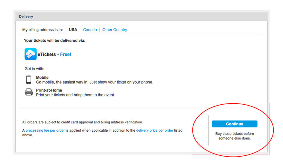
Ticketmaster does this equally well. Add tickets to the cart and a countdown starts. If you don’t make a purchase quickly, your seats will be made available to someone else. Every step in the process of the sale reminds you to buy the ticket now … before someone else does.
Another text cue is showing a full price and a discounted price for items. This is often done with a full price shown in strikethrough with the actual price in bigger, bolder lettering. (The text often includes how much you will save by making the purchase as well.) This makes users feel good. And like the discount is so special that they must take advantage of it now because it might not be there later.
Red Implies Urgency

Our brains have been programmed to think red “sale” signs mean there is a limited deal. Retailers have been doing this in stores for years, and the same concept applies to the web.
Use red to alert users that their attention is needed and then encourage clicks with limited availability. (It’s one of the oldest tricks in the book.)
Conclusion
Designing scarcity links back to the concepts of persuasion in design. Smashing Magazine does a wonderful job of explaining all seven concepts: reciprocation, commitment, social proof, authority, framing, salience and scarcity.
Each of the techniques can help users commit and stick to your website. Scarcity is unique because it helps create the desired conversion to ensure your success.
Image Source: allispossible.org.uk.