7 Tips for Sending Better Email Newsletters
Email marketing is one of the top ways to communicate with an audience. You can inform users with stories and information, send discounts and coupons to encourage shopping, and help direct traffic back to your website.
But not every email newsletter is created equally. My inbox is just as full of poorly designed messages as ones that I’ll actually read. With so much inbox clutter, designing an email that will stand out—and is easy to read—increases your chances of success. (Open rates hover in the teens to 20 percent range for many industries, so you have to work hard.)
Starting with a well-designed email newsletter is the start. Here are seven tips for sending better emails, that more users (hopefully) will look forward to opening.
1. Design for Mobile Readers
You probably know that most users will open email newsletters on mobile devices. (Just think about your own habits.)
But are you designing emails for these users? Or are you just hoping for the best?
Formatting is the key element to consider when it comes to mobile email readability. Emails that aren’t easy to read will be deleted quicker than you can make an argument against making a single change.
Even with a responsive email template, you need to pay special attention to these elements:
- Text size and breaks: Short paragraphs with spacing in between are important, and make sure the text elements aren’t tiny on mobile devices
- Image size and placement: Don’t put text on images and ensure that images scale responsively so that users can actually see them when they open emails.
- Multiple column layouts: Even with a responsive email template, columns might not stack the way you want and content can get jumbled. Test the design before sending.
- Button and click elements: Buttons and links need to be large enough to click/tap with a thumb. Use obvious buttons rather than in-line links.
2. Personalize, But Don’t Make It Creepy
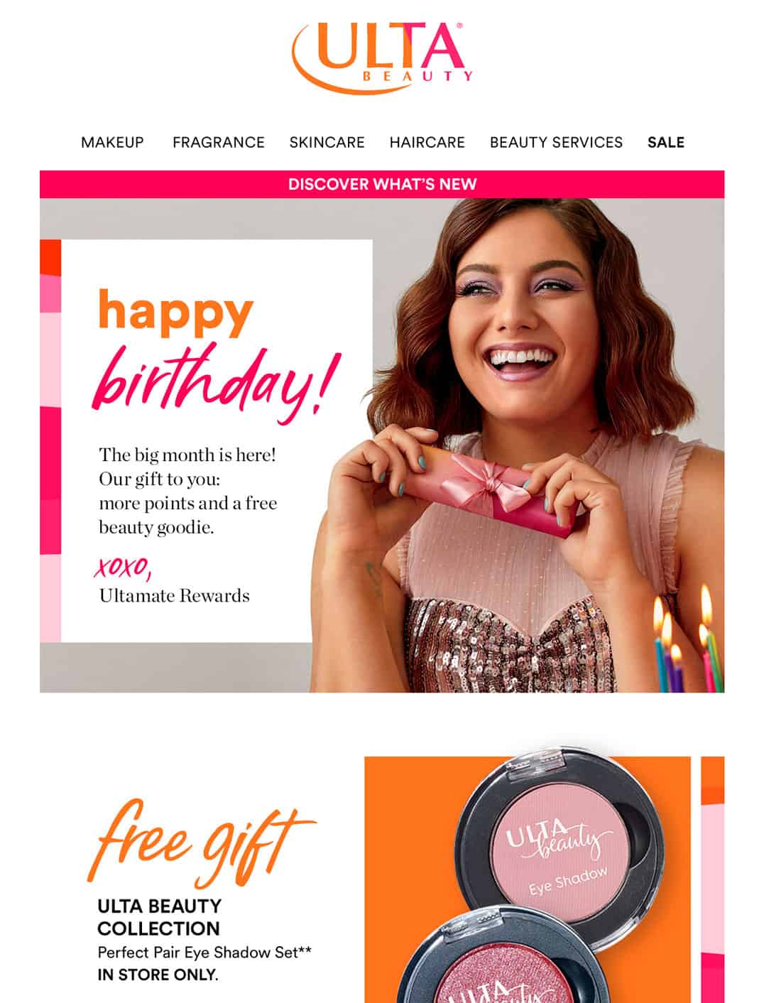
I admit that seeing my name in a subject line or in the preview pane of an email makes me stop to look. Vendors that know my name – and the correct spelling – are companies that I have done business with or opted into communications from. When they use my name, that’s a gentle reminder of our relationship.
I immediately put more value on that message. Other users will as well, whether they know it subconsciously or not.
But there’s a fine line between personalization and being creepy. Keep these elements to a minimum and stick to information that’s not too personal – a name, birthday or anniversary personalization is nice. A shopping history or Facebook stalking for a child’s name is not.
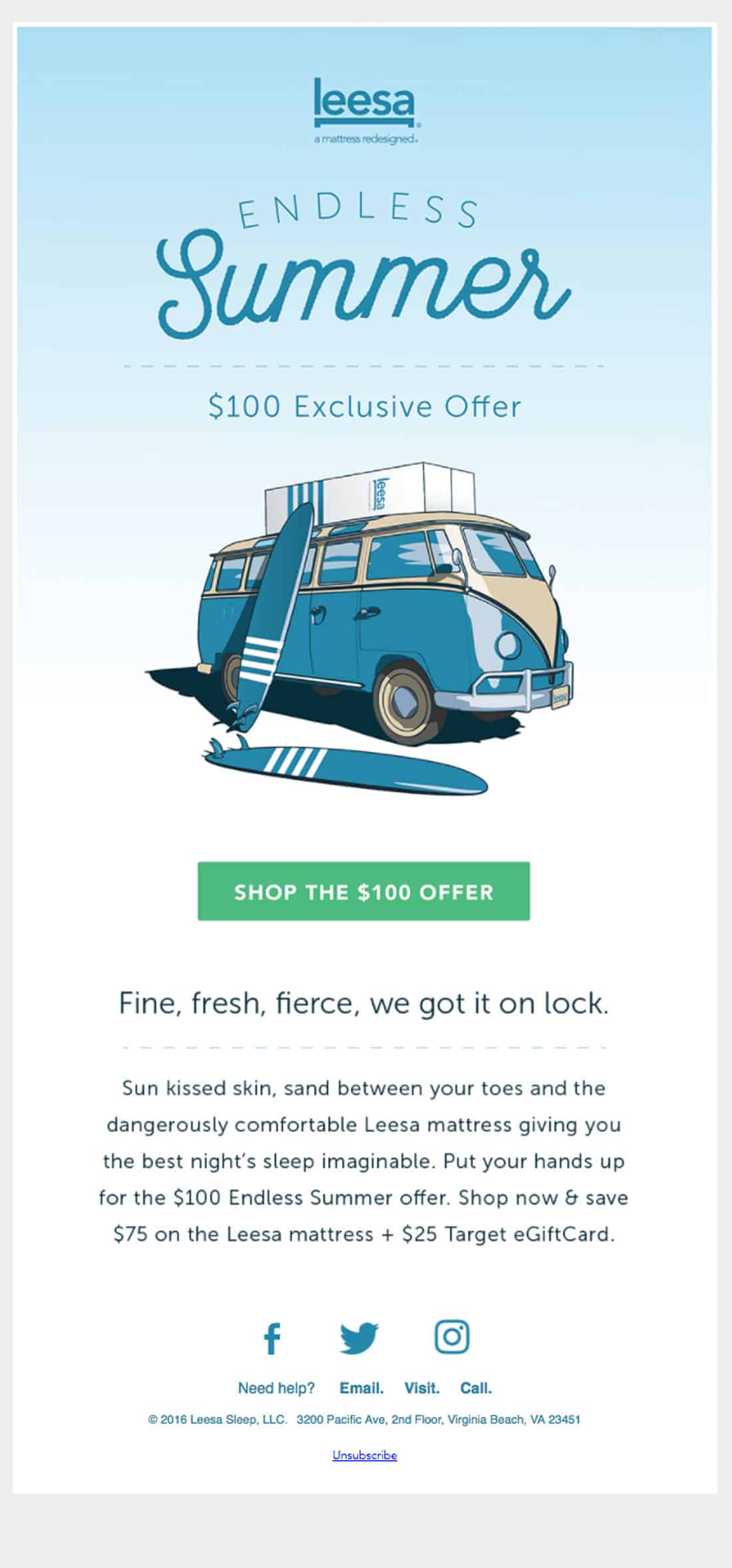
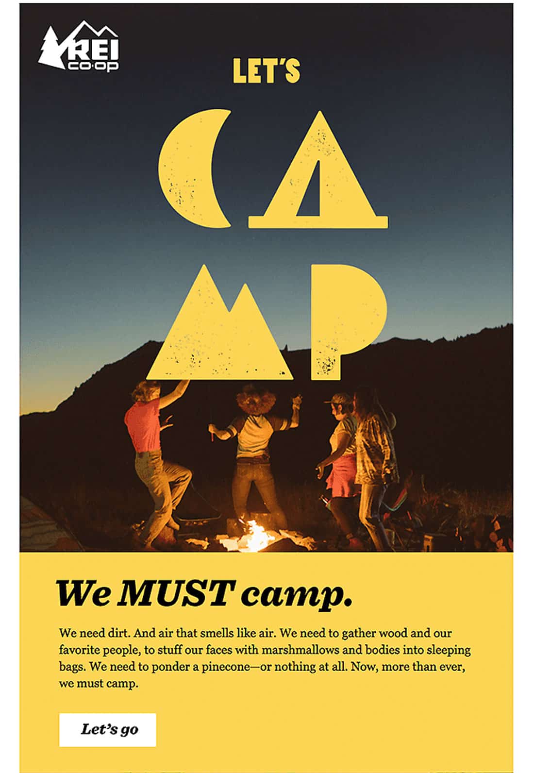
3. Tell a Good Story
Use the same principles of storytelling from your website design in email newsletters.
Don’t send an email because you “need to.” Send an email because you have a story to tell. Make each email special with an engaging offer, bit of information or announcement. Help subscribers feel special by sending them new things first. (If you publish a new blog post, send it to email subscribers a day before starting that social media blitz.)
One of the reasons people sign up for email newsletters is to be a part of something exclusive. A one-time coupon will encourage signups, but it won’t keep users engaging with the email months later.
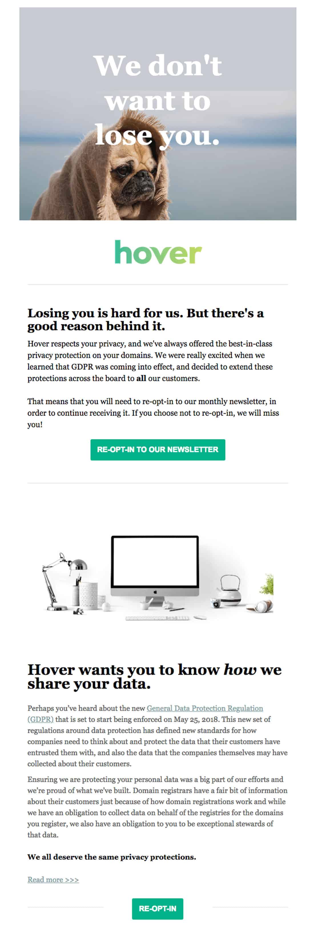
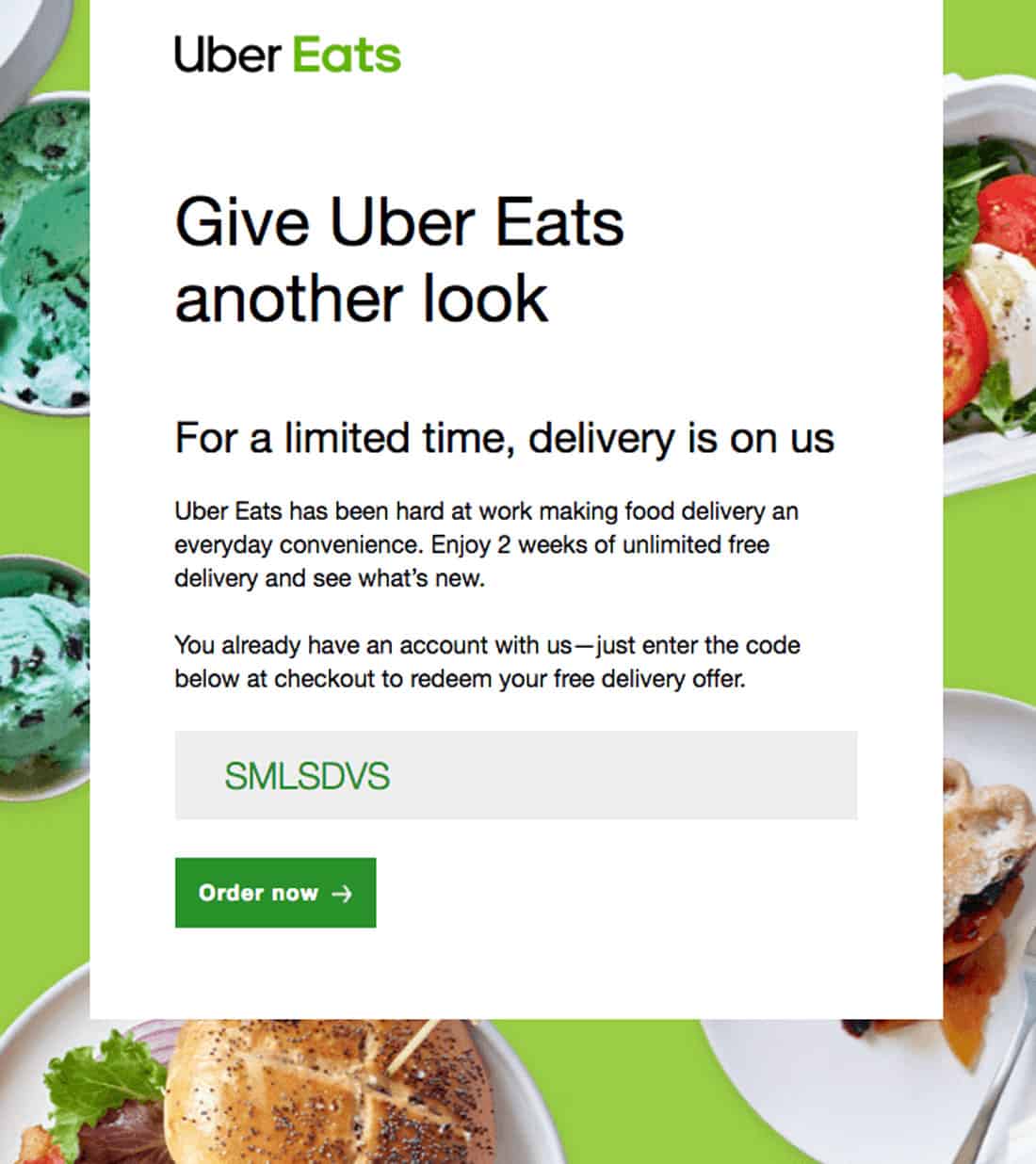
4. Include an Obvious CTA
What do you want users to do with each email you send?
Don’t send communications packed with dozens of links and click elements. Ask users to do one thing with the email, using an obvious call to action.
There’s another bonus to this way of thinking about and designing your email newsletter: It can help you streamline and focus content. Mobile users will probably only spend a few seconds with an email, if there’s one obvious thing to do the chances of it happening increase. Don’t make users guess or choose from a bunch of options.
Email calls to action should be a binary choice – click/tap the button or delete the email. It’s quick and easy. Just what mobile users want and need.
5. Segment Audiences
Not every person in your subscriber list will want every email you have to send.
Segment audiences based on location, time or other preselected preferences so that you get the right email in the hands of the right people. If you sell men’s and women’s shoes, for example, segment the audience by gender, providing a shoe image and style appropriate for each segmented audience before sending.
This can take a little more work on the front end but can result in more email opens and higher engagement. (Your motto should be “give the people what they want in email.”)
Most of the biggest email marketing services make segmentation easy and have plenty of options to help you create groups that will hit your targets better. Learn more about five of the most popular email marketing services and pick the one that’s best for your newsletters.
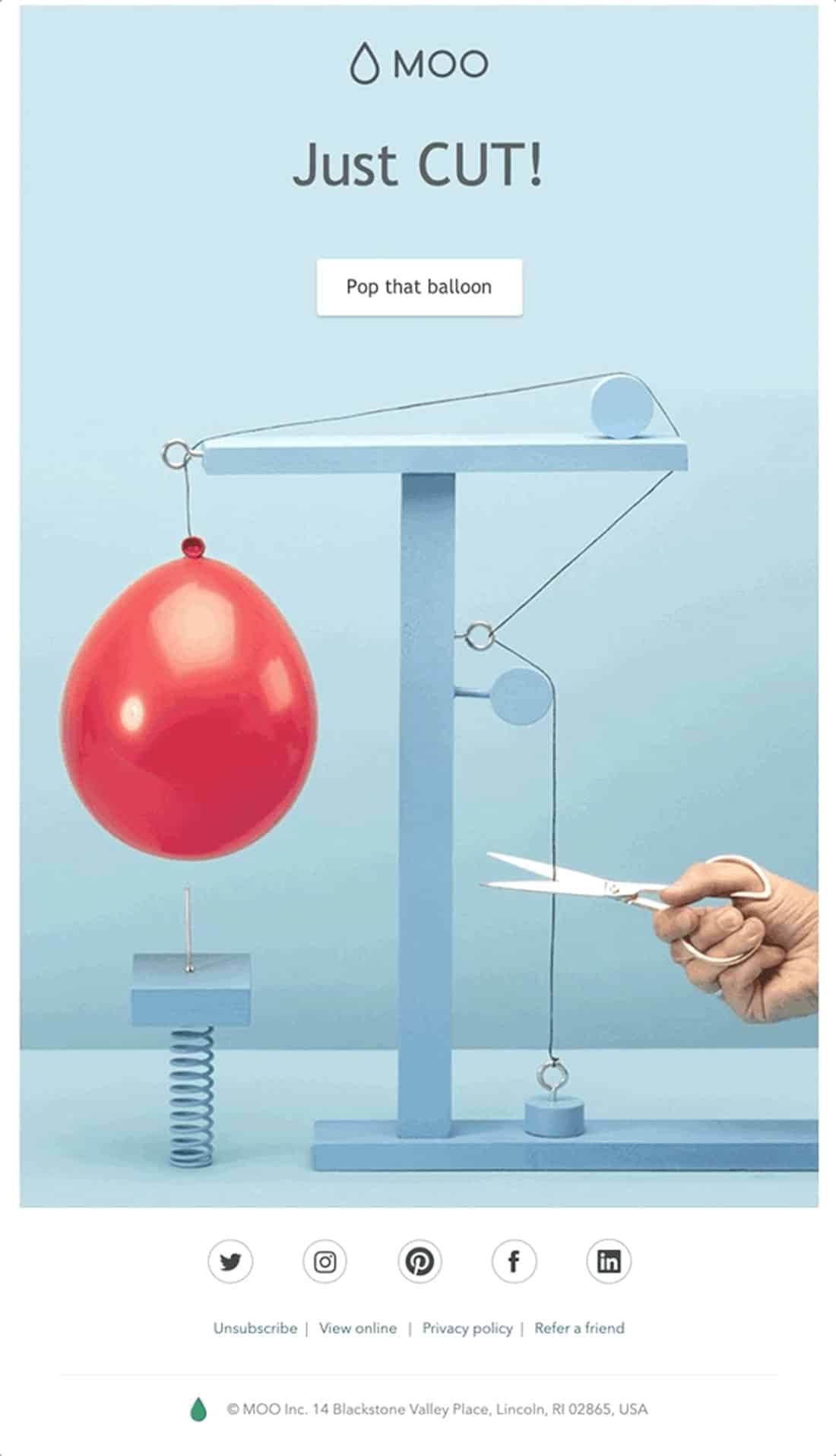
6. Use a Strong Image + Alt Text
This is a tiny technical thing, but users that don’t have images enabled (or those that are blocked by email viewers – Outlook does this on plenty of corporate servers by default): Make sure images have alt text.
A strong image with alt text can make everything about the message more interesting. (Good alt text can help users with images not showing enable images and even add you to the address book or safe senders list).
Use a simple description as alt text for each image – 50 percent off coupon, new shoe style, etc. This is just one more bit of content to entice readers to engage.
7. Keep the Subject Line Short
Short subject lines sell. Why? Because you can see all of the information at a glance. Aim for somewhere around 50 characters or less and make sure the most important or active parts of the subject are at the beginning.
Stay away from clichés or phrases that don’t really mean anything. (What are users supposed to take away from that?) The subject line can provide important information, even if the email isn’t opened; play to your strengths there.
It is OK to use an emoji in the subject line. Just make sure when you paste in that unicode character that you know how it will render across devices – emojis can look different by operating system. And make sure to pick from a common set so that no user ends up with emoji gibberish. Everything you need to know about emoji usage is available in the Emojipedia.
Conclusion
Speaking of email newsletters… you can get weekly news from Design Shack delivered to your inbox. Subscribe in the “Become a Member” box on this post. We’d love to have you join our community!