Glossary of Design Jargon – New & Old (Part 2)
While some design jargon is fairly new, other terms date hundreds of years. While meanings may not have changed that much, some applications have. In order for designers and clients to communicate effectively everyone needs to understand the lingo.
We are going to break down some of the terminology, by design type, in hopes of making it easier for both designers and clients to communicate more effectively. Here’s a guide to what it all means with 12 terms each in the categories of print design and type design. Go back and read Part 1 for terms related to general design and web design.
Print Design
While many of the terms used to talk about print design have been around for a long time, they can be unfamiliar for those who do not use them everyday. Many of the words noted here have to do with processing, packaging and getting your design ready to publish.
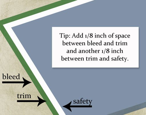
Bleed: An element that goes to and extends beyond the printable margin. A bleed will ensure that the final printed item will include the design all the way to the edge.
DPI (dots per inch): Dots are the smallest unit of measurement when printing images. DPI refers to the resolution of a printed digital object.
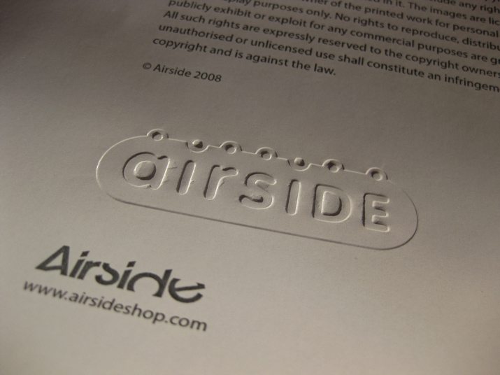
Embossing: The molding or pressing of paper to make text of images something you can actually feel. The raised paper surface can be created using heat or pressure.
Folio: A set of running page numbers and information such as publication name printed outside the normal mage margins. A folio is typically placed at the top of a page and is set flush left on left-hand pages and flush-right on right-hand pages. A folio at the bottom of the page is called a drop folio.
Hickey: The mark left by dust, debris or dried ink stuck to a printing plate and transferred to the printed product. These often appear in the shape of small splotches or dots.
Image area: The part of a printing plate that includes ink and can transfer to paper. The image area can be equal to or smaller than the paper size.
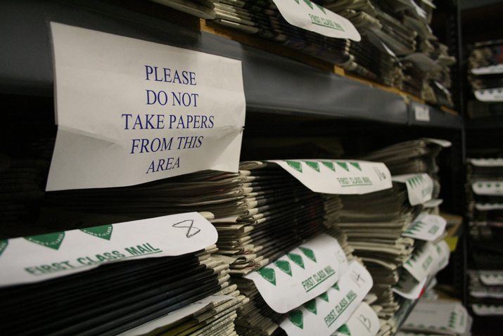
Morgue: A collection of final printed materials, such as one copy of every flier or brochure made by a company or one copy of every edition of a newspaper or magazine. This historical record also serves as reference material.
Package: When you are preparing a print job to hand off to a third party, you gather all of the relevant files – images, fonts, colors and package report – into a folder where everything links to the document to be printed. This files helps to ensure that all elements will render and print properly with the contracted vendor. (Adobe publishing software has a “Package” option for creating this file with just a few clicks.)

Process printing: A system where a color image is separated into different color values — cyan, magenta, yellow and black (CMYK) — by the use of filters and screens or digitally with software and then transferred to printing plates, reproducing the original color.
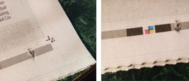
Registration (register marks): The alignment of printed plates to each other. Good registration happens when everything prints without shadowing; poor registration results in visible color shifts. Register marks are small crossmarks or dots that printers use to keep color plates aligned properly.
Spread: Facing pages designed together and intended to print as a unit. A spread consists of an even-numbered left-hand page and odd-numbered right-hand page.
Tear sheet: A single-page copy of something as it ran in print. Tear sheets are used to prove publication and are often requested by ad or design agencies after something is published.
Type Design
Type is an important part of just about any design project. It can also be something designed on its own. Understanding how type is used, the basic parts of a letter and how words come together in display are the basic concepts behind much type jargon.
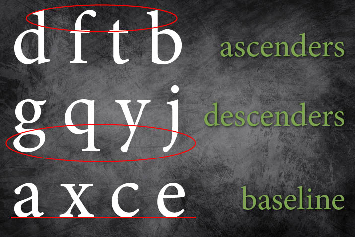
Ascender: The part of a letter that extends above the x-height (size of a lowercase x in any type family). Think about the strokes of the letters d, f, h and t.
Baseline: The often imaginary line that most letters of a type family sit on to create a straight line of text. Without a baseline, letters are jagged and often difficult to read. Default underlining options often rest on the baseline as well.
Body text (body copy): The main text content of a document. Body text is most often group in paragraphs and is a common size throughout a document. Body text is not always the smallest text in a design project but is one of the smaller sizes.
Call out: Any words or lettering that are not designed like the main body text but contain words from that text. Common call outs include quotes or phrases used as art elements in the design.
Descender: The part of a letter that extends below the x-height (size of a lowercase x in any type family). Think about the strokes of the letters g, j, q and y.
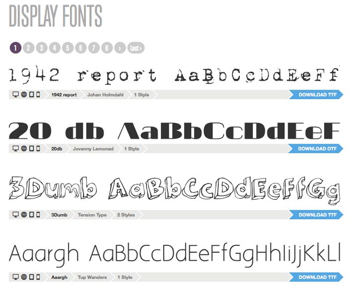
Display font: A font that has been designed to look good at large point sizes, often for use in headlines. “Typically such a font is not as readable at smaller sizes for large amounts of text,” according to Adobe. “If a serif font with optical sizes, it will likely have lighter weight main stems and much lighter weight serifs and crossbars than a text-size version of the same typeface.”
Furniture: Any text used in the design that is not than the main body text. This includes headlines, captions, quotes and other call outs, and navigational elements.
Ligature: Two or more letters that overlap to form a single letterform result in a ligature. Some typefaces allow for ligatures to be turned off or on. Common ligatures are formed using sequences of fl and fi. While some designers like the look of ligatures, the shape can be awkward in many uses.
River: An optical path of white space that sometimes occurs when word spaces in successive lines of type occur immediately below each other and continue for several lines. This effect can be distracting for readers, making readability a concern.
Serif: The small stroke at the end of any letterform. Serif describes the stroke itself and any type style that uses serifs. Common typefaces such as Times and Georgia are serifs. Letterforms that do not contain these additional strokes are called sans serifs and include popular typefaces such as Arial and Helvetica.
Widow (orphan) : A very short line at the end of a paragraph or column of type is called a widow. Typically a widow is a single word or part of a hyphenated word and should be avoided. An orphan is a single word or very short bit of type at the top of a column or page. Widows and orphans can make text difficult to read and should be avoided and corrected with copyfitting or an edit.
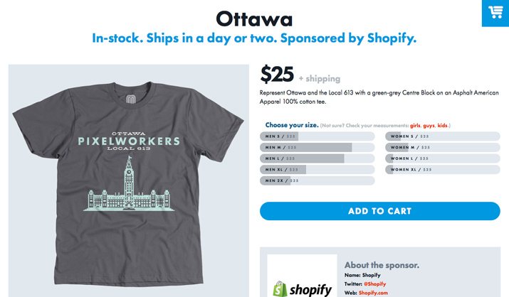
Wrap (runaround) : The space between text (or other elements) in the design. Wrap should be distant enough so that text is easily discernable from other elements, but not so far away that the elements do not connect visually. Wrap specs should be used in a consistent way throughout a design project.
What Did He Say?
It is important to remember audience and context as well when we are talking about design jargon. Here are four terms that may make you rethink what you might have heard.
Bastard grid: Any work that is done of the standard grid for a project. Columns and elements are still one a grid of sorts, but not the document grid.

Dingbat: Any typeface that uses symbols rather than letters and numbers.
Muted: Any color that is softened or made less vivid, often with the addition of white, loses saturation and is muted.
Ragged (or rag): Type that does not stretch from edge-to-edge in a column is ragged. Left-aligned type is ragged right and right-aligned type is ragged left.
Conclusion
Every industry has a set of terminology that can sometimes make if hard for those who don’t know the lingo. As a designer, you should try to use less jargon when speaking with clients, and if they look lost stop and explain what you mean to them in a simpler way.
As a client, stop and ask the designer if you are not sure what he or she is talking about. Understanding every aspect of a project will make it easier for you to get what you are looking for.
Hopefully this primer helped you understand the lingo of design a little more. What other words are you hearing more often these days? Do you know what they mean? Share with us in the comments.
Image Sources: With Associates and Lindsey Turner.