Pitch Deck Design: 10 Tips to Stand Out
A good pitch deck is designed for specifically one thing – to help your startup get funding from investors. But how do you stand out from the crowd, and make a memorable impression?
There’s a delicate balance to creating a deck with just enough slides to entice potential funders, without providing so much information that they are overwhelmed.
Most pitch decks contain less than 20 slides. So how do you create a pitch deck design that stands out? Here are our ten tips to help you get started.
1. Pick a Template or Palette
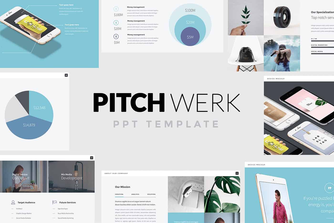
Whether you are designing a pitch deck from scratch or starting with a template, you need to stick to a visual theme. Slides should have a consistent color and type palette as well as design elements, such as page number or a header/footer.
Streamline your deck to a handful of slide types that fit your content so that the design is consistent from the first to the final slide.
In most cases, a simple pitch deck template is the best option. Look for something with darker text on a light or white background. This color combination is easy to read on screens or in darker rooms when projected onto a wall. (It also makes for easy printing if you want to provide a handout copy to meeting participants.)
2. Use Your Branding

By the time you are ready to talk with investors, you should have a simple brand established. This includes a logo or wordmark and basic color palette. It should also include a list of keywords that you use to talk about your business.
Use all of this in your pitch deck. As you create a slide design, make sure the template incorporates your colors and branding.
These visual elements can make a lasting impression. Make it count.
And don’t make this mistake. Too often, pitch decks “save” the branding as a surprise for the end of the presentation. Don’t. Use your brand throughout so that it starts to stick with the people you are talking to. Give them more opportunity to fall in love with your idea, brand, and company.
3. Include Charts to Simplify Content
Pitch decks are packed with heavy content, including plenty of numbers.
Use charts to simplify this content. Are you experiencing revenue growth? Chart it. A chart is an easy way to see and understand that information quickly. Plus, bar and pie charts are easy to create. (Just make sure to label everything clearly.)
Bonus tip: You can also use pie charts to highlight statistics, again making a text element more visual and understandable.
4. Use Stellar Images
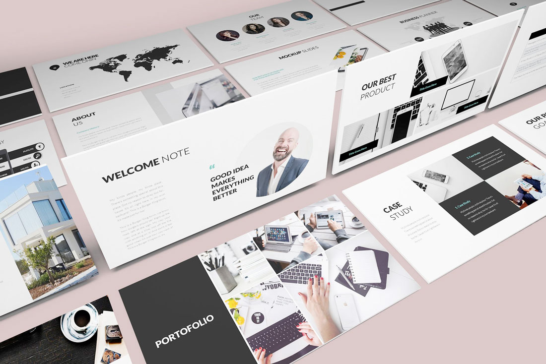
Put forth the effort to get some great images for your pitch deck. Not stock images. Actual photos of your team, product or service.
You know that people are more likely to engage with an image than text and that goes for memory as well. A good image will stand out in someone’s memory longer than a slide full of words.
The challenge is that not everyone has a visual product or service. That’s where you’ll have to be a little more creative, show the team in action or create a diagram or illustration.
Don’t feel like you have to have an image on every slide if they get repetitive. Get a few images that best represent what you are selling with the pitch deck and stick to those. Scatter them strategically throughout the pitch deck.
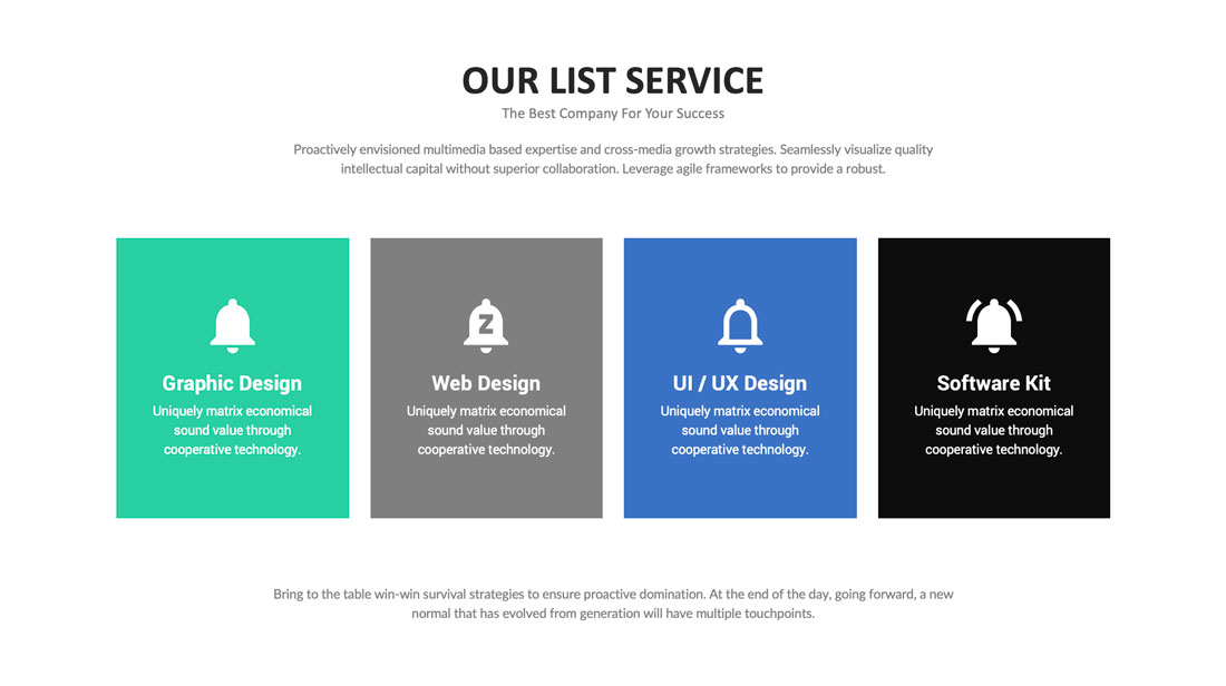
5. Organize with Icons
Another visual element to consider is icons. These small illustrations can help organize complex ideas and provide visual flow throughout a single slide or the entire design.
Pick an icon set that matches your visual theme and use them to break up the copy, create a grouping, and keep the visual flow moving.
6. Try Tiled Layouts for Complex Information
When it comes to presenting complex information, consider a modular tiled layout style. Titles can help you break down information into smaller, more digestible parts.
These bite-sized bits can eliminate the need for using multiple slides for a handful of facts or figures as well.
Design tiles with color blocks or use icons in each to establish different pieces of content visually.
7. Use Professional Headshots for Team Members

If you plan to include images of your team in the pitch deck (many companies do), invest in professional headshots so that photos are consistent and represent your startup brand well.
This isn’t to say they have to be boring. Photos with personality are acceptable, but all team headshots should be in the same style with similar coloring and backgrounds.
Think about the type of investor you are trying to get money from, what type of photo would appeal to them? Consider that for the style of your team headshots or group photo.
8. Create a Type Hierarchy

Just like with any other type of design, create a hierarchy for text elements.
- Title
- Header
- Secondary header or subhead
- Main body text
- Bulleted text
- Captions
- Infographic text
- Footer text
9. Design with Contrast in Mind

Every element in your pitch deck should include plenty of contrast against the background and other elements. Avoid the temptation to use a template where everything has a similar color or contrast, while these might look great on a screen, they can present readability issues and don’t often render well when projected or printed.
It’s important to balance modern design with readability. It is vital that potential investors understand everything about your startup company when they view the pitch deck. Don’t let “overdesigned” slides get in the way.
10. Get Creative with Text-Heavy Slides
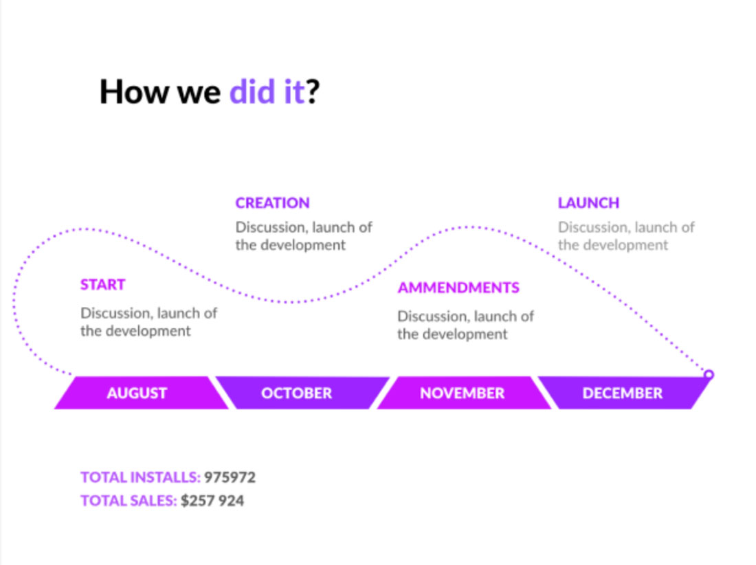
There are some content types and information that will just seem heavy.
The history of your company or business trends, lists or SWOT analyses can get a little overwhelming on a slide. Use more visual formats with less focus on every actual work to communicate this information.
Try slides that use word cloud, timeline formats or XY graphs to present text-heavy or complex information in a more visual way. Even though these slides will still be somewhat thick, they’ll be easier to visually digest.
Conclusion
When creating your pitch deck, remember to keep your business goals in mind. Everything about the deck shows potential investors that you understand your company and business.
The design of your presentation communicates this as well. A professional, easy to understand deck is just one tool in the path of growing your startup.