Simple Tips for Designing a Newsletter Template That Stands Out
Almost every business has an email newsletter these days. From retailers promoting sales, to organizations showcasing information and events, the email newsletter is one of the most popular marketing tools out there. And for it to really be effective, it must look good.
An almost unlimited number of free email templates can make it easy to just download something and send out an email, but you should really take the time to create a custom template for communications that represents your business and who you are. Your newsletter represents your work just as much as a website or printed product. Although getting started can be intimidating, it’s fairly easy to create a newsletter template, choose software for distribution and send your first group email. It is important to keep in mind that most people get a lot of email every day, so you must work to make your newsletter stand out.
Getting Started
The first step in the design process is to actually figure out what your newsletter should do. Is it designed to sell products? Or maybe provide information that drives traffic back to a specific website? What action do you want newsletter subscribers to take when they see the email?
After you make this decision, it is a little easier to get started. You’ll want to consider overall branding in the design as well. Your newsletter should match your website, printed materials and brand in look and tone. You want subscribers to know who the email is from as soon as they open it. This can help encourage people to open and read it as well as establish a link back to your company.
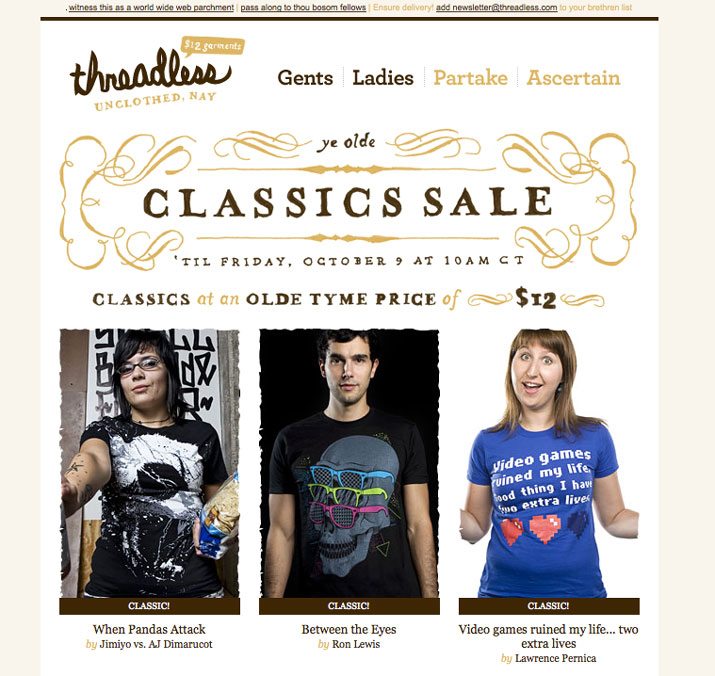
Consider the tone and frequency of your newsletter messages. The number of words (and catchiness of the subject line) are as important as the visuals when it comes to sending out something people will look at. Invest some time into crafting the message and writing before each individual newsletter is sent.
What you don’t want is to send a newsletter that looks exactly like something else in a client’s inbox.
Think about the overall feel of the newsletter as well. You should try to avoid the “newsletter template look”. There are a lot of templates and packaged options out there. Some of them are good; many of them are not. What you don’t want is to send a newsletter that looks exactly like something else in a client’s inbox. Take the time to develop a custom template using your color and type palettes as well as overall voice.
Remember that a newsletter does not have to be text heavy and long. Sometimes the most effective newsletters are a simple coupon or promo asking the user to take another step.
Go Big with Images
It is hard to overlook a great image. Use a striking visual at the top of each email newsletter as a way to draw people in.
Try to place images — including photos, illustrations or infographics — in the top half of the newsletter so that the key part of the visual is above the scroll. Go for images that are sharp and in-sync with your message. (You would not send a photo of a snowy mountain to people when you are trying to sell a sailboat.)
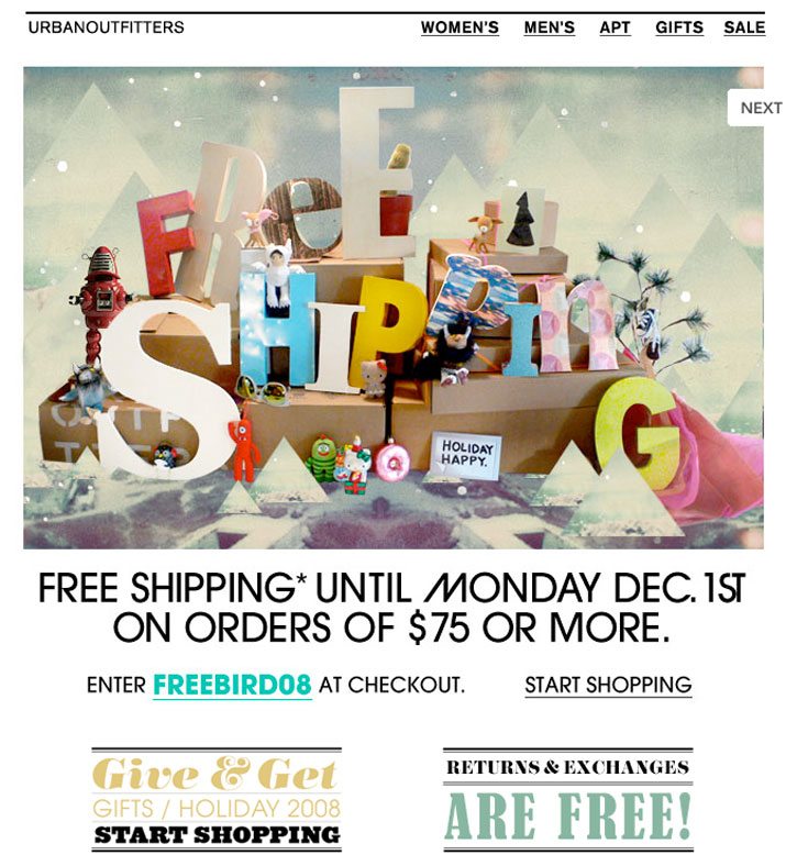
Mix it up when it comes to shape, colors and the size of images. Use photos that are different so that each edition of the newsletter feels unique and new. You don’t want subscribers to see the email and think they have already seen the message.
Consider experimenting with color as well — from the use of full color images to black and white to even something more artistic. Also remember that just because your newsletter is 800 pixels wide, you don’t have to use a full width photo. Create visual interest by using different shapes and changing the aspect ratios of photos.
Use Great Color
In addition to great images, color can create a distinct visual interest. Use color to both establish your brand – make sure to use the same RGB or HEX color mixes in the newsletter as in other brand materials. Don’t just go for a close match from a newsletter software color picker. The color palette should match that of complementary components, such as a website, or other printed materials.
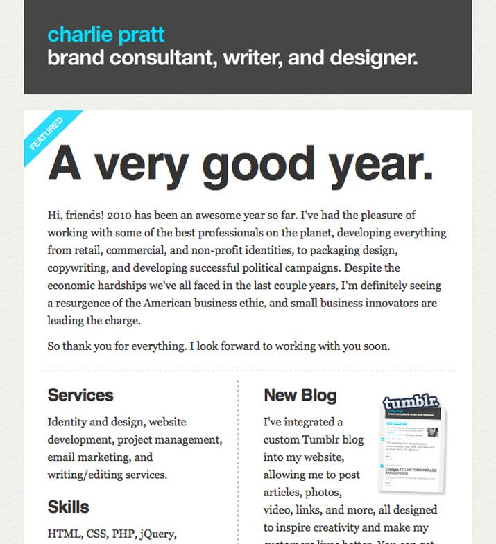
If you don’t have a distinct brand color palette, look to your logo for inspiration. Use colors from the logo to help draw attention from the company name to other parts of the newsletter. Consider using color to highlight certain types of text to add emphasis. Words like “sale,” “free” and “new” might be great as bold and colored words to help establish calls to action.
Develop styles for those colors throughout the newsletter. Use one of your brand’s primary hues for headlines in the newsletter or for links. If you use very little color for your overall brand, consider adding an accent color for the newsletter, but you should establish a consistent palette and stick to it.
Create a Style Palette
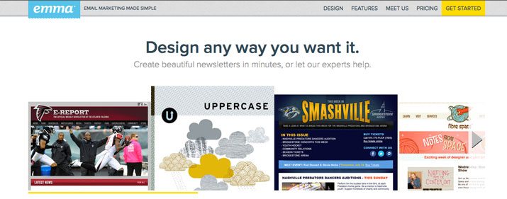
As with other types of design projects, there should be a hierarchy to the newsletter so that the visuals help guide readers through it. Use several different type styles — headlines, subheads or other larger text, body copy, links and captions. Those styles should vary in size and weight, with the most important items being the largest and having the boldest color (if you opt for colored text).
The best way to create a consistent hierarchy is through a style palette. After creating a custom template using your brand’s color and great text and images, most email newsletter providers (such as Emma, MailChimp and Constant Contact) will upload your template and create text styles for you to use. Many of these clients also allow you to upload your own HTML if that is more of your style.
By creating a style sheet, you can change attributes with a single click and don’t have to worry about remembering color mixes, font specifications or image border styles. This is highly recommended if multiple people will be working on the newsletter.
Don’t Forget
Email newsletters should include some basic information that allows users to identify you as the sender and opt out (or in) to newsletters. Make sure to check the legal issues surrounding where you live because some information, such as opt-out links or a postal address and identifying company information, is required in certain countries. Here’s the basic checklist:
- Company information, including who you are and how to contact you
- Unsubscribe link
- Link to view email as plain text or in a web browser
- Link to website
- Social and sharing links
- Call to action – tell subscribers what to do with the newsletter
- Opt-in reminder – remind subscribers how they got on your list
A Few Things to Keep in Mind
When you are creating the template, think about how people read emails in the design process.
Consider the preview pane. A large number of people look at email without actually opening it. Ideally the body of the email should be less than 600 pixels wide, so that it is viewable as a preview without losing information.
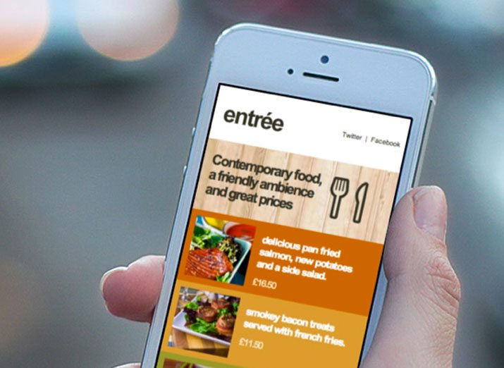
Make it compatible with mobile devices. A significant percentage of readers will view the email on a phone or tablet, so make sure your email works in these environments.
Stay away from busy backgrounds and background images. Some email clients, such as the popular Microsoft Outlook, don’t render them at all and others will not render them properly. Keep the message as clean and neat as possible.
Resize your images. Stick to 72 dpi for images and size them to fit the email. Smaller images will load faster; you don’t want to lose users because of long download times.
Test, test, test. Different email programs will render emails newsletters in different ways. Test the template in a variety of common email clients – Microsoft Outlook, Google Mail and Yahoo Mail, for starters. Also make sure to send yourself a test edition of every message before you send it to the entire subscriber list to ensure that the email looks (and reads) as you intended.
Conclusion
When designing your email newsletter, really think about ways to make it stand out from the pack. Focus on branding as well as the use of great images and color. Finally, test it to ensure that your newsletter is compatible on a variety of devices and across multiple email clients.
Image Sources: Missy Higgins, Serious EatsThreadless, Urban Outfitters, Charlie Pratt, Lole, Native News, Smithsonian, Entree and Anstob.