This Week in Design: March 28, 2014
It’s that time of year when there is something fresh and fun and clean in the air. And this week in design mirrors that feeling. From a short film about type, to 60 years of iconic logos to dirty designer phrases, this week is all about fun.
Every week, we plan to a look at major product releases and upgrades, tools and tricks and even some of the most popular things you are talking about on social media. And we’d love to hear what’s going on in your world as well. Have we missed anything? Drop me a line at [email protected].
A Beautiful Look at Letterpress
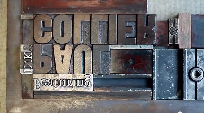
With much of our design and typography work being done digitally, Danny Cooke’s short film “Upside Down, Left to Right: A Letterpress Film” is a great lesson and primer on the history of printing.
The film, which runs less than 8 minutes, features on of the few movable-type print shops in the United Kingdom at Plymouth University. It is worth every minute of viewing time.
The film is a great reminder of how easy we have it (in terms of digital printing) and the work and care involved in “old school” letterpress. It is a must-watch for anyone who loves design and typography. (And make sure to stick around for the credits.)
You can learn more about the freelance filmmaker and see other works in his portfolio.
Responsive Design Continues to Evolve
The terms “responsive design” and “rwd” are pretty new. But one of the people who helped coin the term says it might be time to evolve.
Jeffrey Zeldman posted “Evolving Responsive Web Design” on his blog earlier this month, saying that because of responsive design the design community thinks about things like “responsible” responsive design, adaptive content and a standard approach to responsive images.
He explains the root of the terminology and how it has evolved. It is amazing to look back and see just how far web design and responsive web design has coming in a few very short years.
While the term wasn’t necessarily inclusive at first, it is now. You would be hard pressed to find a designer or developer who could not tell you about the merits of responsive design. It’ll be even more interesting to see where we are three years from now.
What Makes a Great Late-Night Logo?
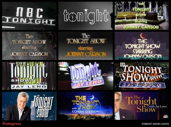
After more than 60 years of late-night television (and more logos that you can count), Emily Oberman of Pentagram studied all of the variations to come up with the best and worst of the wee hours. (Pentagram is the firm that designed the current logo for “The Tonight Show Starring Jimmy Fallon.”)
Each of the logo variations showed some fun design things: Popular styling when they were used, the personalities of the hosts and a variety of effects and colors.
But the fun part of Oberman’s study is her litmus test of whether a logo is good or not: Can you imagine the president of the United States going on the show with that logo? Could you envision his name in that styling? Typically, if the answer is yes, then the logo is solid.
The final piece of advice from the study was something every designer can use: Keep it simple. The best logos were simple and classy and were able to stand up over time.
New Social Media Sites Emerging
While it seems like the social media landscape has been pretty solid for the last few years – dominated by Facebook and Twitter – things could be about to change. There are a handful of new social media sites that are starting to get more of a foothold.
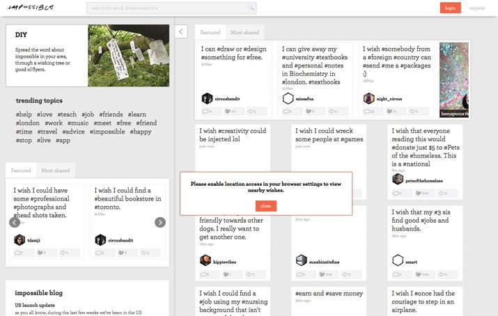
Medium, Nextdoor, Sportlobster, Impossible and We Heart It are at the top of Creative Market’s “2014 Social Media Sites You Need to Know About.”
Any one of these sites could be the next place that you need to showcase and even sell your work. Impossible seems to have the most potential when you think about designers and freelancers. The site is designed to help people who need work and those with the skills meet. It works by making a request for work and then people with those skills can respond.
Reasons To Think About 3D Design
It seems like everyone is talking about three-dimensional design. With the emergence of 3D printers and tools such as 3D printing capabilities in Adobe Photoshop.
But is this something usable in your design work? Will you get on board with 3D design and printing?
In a recent article for Creative Bloq, writer Lance Evans says yes. Not only is 3D something to consider, but he offers 15 reasons why you should learn it in 2014.
And 3D applications are more widespread than you might guess. There are practical applications for illustrations, animation, multimedia, video game design, broadcast design and much more. The options are almost limitless. Plus, it’s really cool.
Can you see yourself branching out into the world of 3D design? How would you use it? Share your ideas in the comments.
Just for Fun
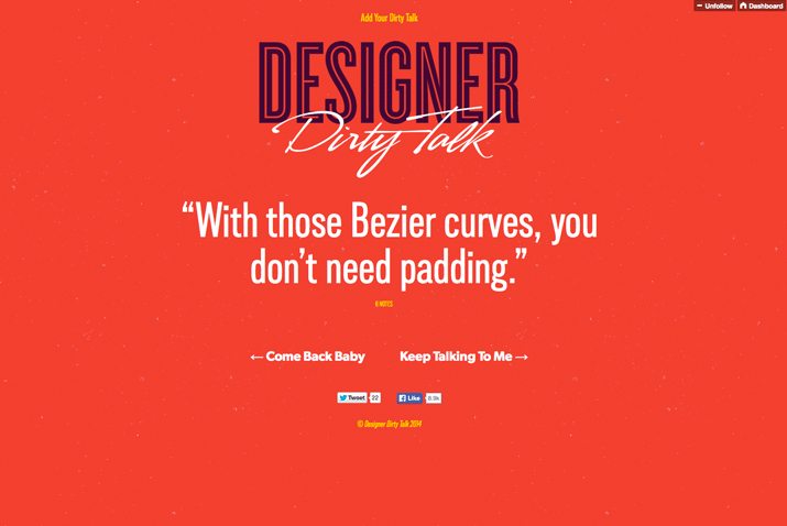
We already know that some designers sometimes have, um … well, dirty minds. It comes with the job. You have to know what words and visuals might make people inappropriately giggle or make your client look silly.
Enter “Designer Dirty Talk.” This might be my new favorite Tumblr ever.
The simple page, which also has a pretty fun design, features phrases that we utter all the time. And that can be “taken the wrong way.” Plus, you can add phrases of your own.
Some of the featured talk includes:
- ”It ain’t gonna kern itself.”
- ”I want to click your mouse.”
- ”Can apply my personal settings to your toolbox?”
- ”Let’s hit those stylesheets.”
- ”I know HTML (How to Meet Ladies).”