What Needs to Be in Your Style Guide? (And How Do You Enforce It?)
Everyone with a website needs a style guide. It’s that simple. If you’re wanting to instil more consistency in your project, and get everyone on the same page, your style guide will become invaluable.
Now that we have that out of the way, what exactly do you put in that guide? And how do you make sure other people on the team follow the rules so that your visual presence maintains consistency? That’s a little more complicated. Let’s dive into the topic today.
Brand Overview
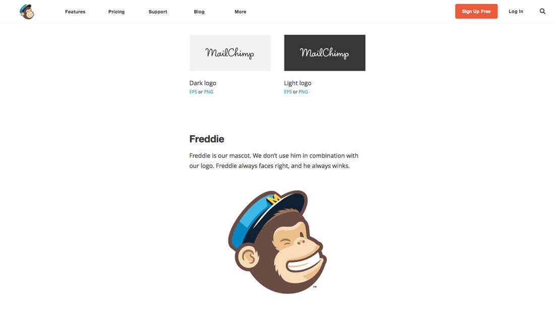
Creating a style guide from scratch can be pretty intimidating if you’ve never done it before. First timers can benefit from finding a guide they like — MailChimp has one of the best ones out there and makes it available under a Creative Commons license — and using it as a model for how to get started.
Most style guides have two parts:
- Copywriting guidelines
- Visual guidelines
Each set of guidelines is equally important and should be part of your overall style guide. Putting the elements together will establish an overall identity. Every brand or business or website it a little different as well. Pick a tone and style that work well in terms of copy and visuals, but that also relate to you and your audience as a whole.
Consider users and stakeholders when establishing an identity, is the brand what they want and expect? Can they relate to it? Do they want to interact with it?
Voice and Tone
We’re going to focus mostly on the visual aspects of your style guide, but voice and tone is important. Part of your identity is in the way you “talk” to users. Is that style formal or casual? Is it verbose or more succinct?
Write your style guide in the same fashion as the copy on your website. This will help cue in your team on what is expected and how the language should contribute to brand identity.
This voice and tone should be used in every bit of communication from you. Go back to the outlines from MailChimp for a comprehensive look at building brand voice. Note the way the company talks about its mascot, for example: “Freddie is our mascot. We don’t use him in combination with our logo. Freddie always faces right, and he always winks.”
“Rules” and Usage
Your style guide should be your design “playbook.” (Doesn’t that sound friendlier than “rules?”)
It should outline how and when to use type, color and all other types of design elements in a way that’s easy to understand. Here’s a checklist of things to include:
- Color palette, including values and acceptable tints
- Typography palette, with all acceptable weights, sizes, leading and usage
- Logo, including guidelines for size and location
- Icon or element styles (this includes treatment for elements from buttons to social media sharing icons)
- Spelling, word choice and copy style (What editorial guidelines should you follow? APA, AP, something else?)
- Photography guidelines, including color, cropping and visual presence
- SEO information such as alt tags and keywords
- Grid standards (for web and print)
- Spacing considerations (if the design is loose or tight)
- Point of contact (where team members can go with questions or for clarification)
Simple and Specific Concepts

Now here’s the hard part. You need to take all the information above and boil it down into simple, specific, actionable concepts.
- Don’t go overboard with the content when it comes to your style guide. This is a visual reference; design it that way.
- Group related items into pages for quick reference: a page for color, another page for typography, a page for photography, etc.
- Show examples of what things should look like. Don’t explain things in writing when an image will suffice.
- Provide specifics that are usable. Color swatches, for example, should include RGB (or HEX) and CMYK mixes so that color is consistent in all uses.
- Break out parts of the design to showcase how elements should be used.
Snippets and Examples

Whether your style guide is printed or a digital or web-based document, it should be packed with usable tools. One of the elements that can be incredibly useful are examples of brand do’s as well as don’ts. It can be an easy to to put emphasis on what you want to see with the brand visually.
Then, create a catalog of parts that are easily accessible. Create libraries (or a set of common elements, depending on your software usage) for all team members. Save the files in a common location that is readily accessible and so that changes are relatively easy to make.
Provide a list of tools for cloud-based software for everyone involved in the project. (This includes links, usernames and other basic information.) Make sure all font packages, logos and image files are in a common location and all users know where they are. (Keep a backup somewhere else as well just in case someone crops and saves the original.)
Create a master list for code snippets that are easy to copy and paste into projects. There’s no point in having to create and recreate everything new each time. Common elements should live in a shared location that everyone has access to.
The last part of this is to remember to evolve. Things will change — and they should. Smashing Magazine has a wonderful case study that outlines a “living style guide.”
Enforce the Style Guide
Finally, the biggest question is “how do you get people to follow the rules?” You’re already a good way there if you have designed the guide following some of the outline above, particularly the section on using simple and specific concepts.
The guide should be easy to follow and usable (just like your website). The language should be simple and not micromanage-y, so that people will want to follow the guidelines.
It should be a guidebook that leaves plenty of room for flexibility and actual design. Designing within a set of constraints can help team members unleash their creativity while creating something that looks like your brand. The style guide should have an owner as well. This is the person who approves updates and changes and can answer questions about design decisions. The “owner” can be an individual or team, depending on the size of your organisation.
Conclusion
Do you already have a style guide or is it time for a new one? This is a project you should tackle annually, so that the guide is up-to-date at all times. (You can’t fault a team member if you have old standards floating around out there.)
Do you have or have you seen some excellent style guides? I am a total geek for these things and would love to see them. You can hit me up on Twitter or drop me an email.