20 Amazing Examples of Using Media Queries for Responsive Web Design
Responsive web design is one of the hottest topics among designers and developers right now. If you’re not quite sure what it’s all about, we’ll walk you through what it is, how it works and how CSS media queries are something you need to start incorporating into your own designs.
To top it all off, we’ll finish with twenty seriously impressive of responsive designs that use media queries to present experiences specifically catered to different visitors.
#
What Are Media Queries?
CSS3 has brought about a ton of fancy visual effects such as shadows and animations, but what about practical improvements? Is there anything about CSS3 that actually improves the way you can build websites from a usability standpoint?
The answer is a resounding “yes” and is due largely to the inclusion of media queries. Media queries are incredibly useful because they solve a huge problem that arose quite suddenly in web design: the need to design for vastly different screen sizes.
User screen sizes have always differed but for the most part this difference was limited to a few inches and you could bet on a huge majority of your audience fitting within parameters that were fairly easy to design around. These days though you have some users on a 27″ Apple cinema display and others on a 3.5″ smartphone.
That’s a huge difference and there are plenty of stops along the way. The ever-growing number of devices that are web friendly make it increasingly difficult for designers to present one static solution that caters to everyone’s needs.
This need has given birth to the idea of responsive web design, which goes far beyond fluid page widths and actually dramatically changes the layout of a page as the size of the browser window or device screen size changes. Media queries are one of the most powerful tools for meeting this goal because they allow the designer to set special CSS according to certain pre-established rules.
Owltastic: An Excellent Example of Responsive Web Design
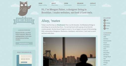
The information above is a bit abstract, so let’s see how this works in the real world by looking at an example from the talented designer and developer Meagan Fisher. Here’s what her site looks like in my 13″ MacBook’s browser window at full screen.
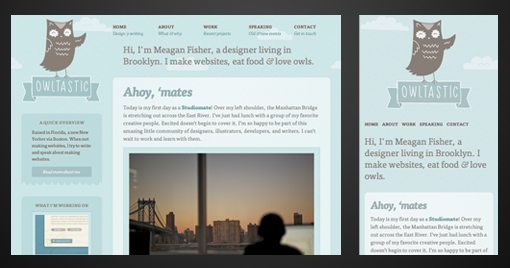
Now, if I adjust that window size, a lot starts to happen. Columns adjust their width, the layout shifts to be more vertical and non-essential items disappear completely. Here is a screenshot with two more page widths, check out how much the design adapts to different situations.
Notice that we started with a three column layout, which then morphed into a two column layout and finally landed on a single column layout with my browser window as small as it would go. This is more than just one designer showing off to others, this represents a seriously impressive attempt to make the site not only usable, but specifically optimized to the broad range of devices that are likely to see it.
How It Works
This may seem like it’s going to be a ton of extra work, and I’d be lying if I said that it’s a painless process, but the good news is that CSS and media queries do a lot of the heavy lifting for you. Let’s jump into Owltastic’s code a little to see how this all works.
For starters, you’re going to see a lot of expert use of floats and percentages used for sizing. Notice in the snippet below Meagan used percentages for both the width of the element and the margin. She’s also meticulous about telling you where these percentages come from in the form of a comment with some quick math.
This definitely makes layout a little trickier, but it sets a good foundation for flexible page widths even before she gets to the media queries. However, the properties shown above are, for the most part, what you see being manipulated further within the media queries.
Here we can see that Meagan has targeted a maximum screen width of 800px and then defined a series of styles that apply directly to devices meeting that specification. From here, floats, margins, padding, display and even images are tweaked for optimum layout at that size.
A total of five different media queries are setup for different circumstances: max-width: 960px, 800px, 640px, 540px and 480px. Each of these is quite thorough in outlining specific behaviors for that screen size. Here is the section for max-width: 480px.
One interesting trick here that you should pay special attention to is the use of fluid images. By setting the width of an image to 100%, it will fit into the width of its container and resize as the browser window changes. Ethan Marcotte explains this technique in-depth on his site Unstoppable Robot Ninja. Be sure to resize your browser window on his site and watch the header images respond.
More Live Examples
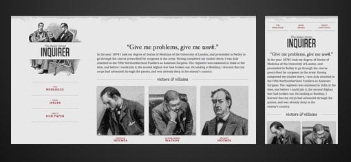
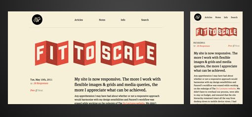
The best way to study responsive web design and media queries is to get a glimpse of them in action. Here’s a brief list containing some sites that I found impressive. With each site, don’t just look at the design, test it by resizing your browser window. Also, dig into the CSS to see how the sites work and think about how you can implement these techniques in your own designs.
A List Apart: Article Example
Trent Walton
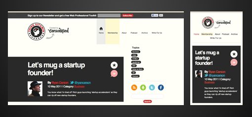
Think Vitamin
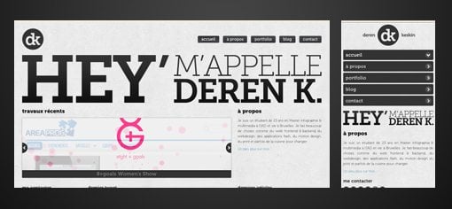
Deren K.
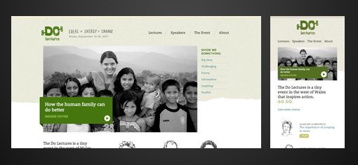
Do Lectures
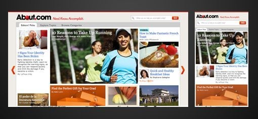
About.com
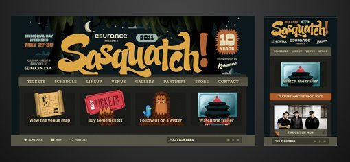
Sasquatch Festival
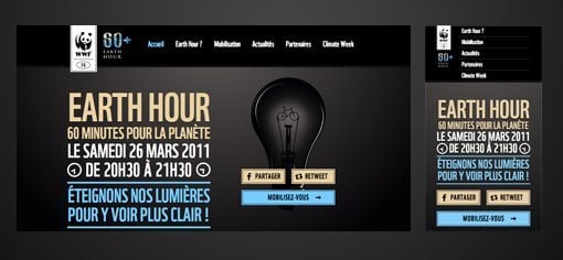
Earth Hour
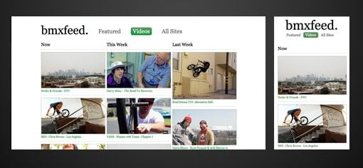
BMX Feed
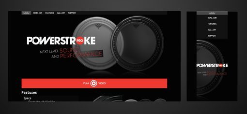
Remo – Powerstroke Pro
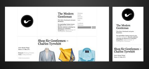
The Modern Gentlemen
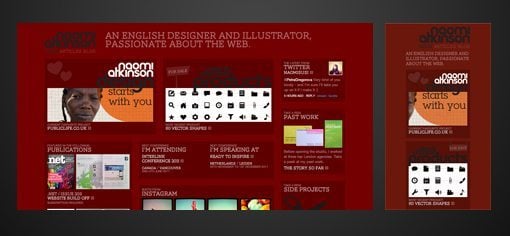
Naomi Atkinson
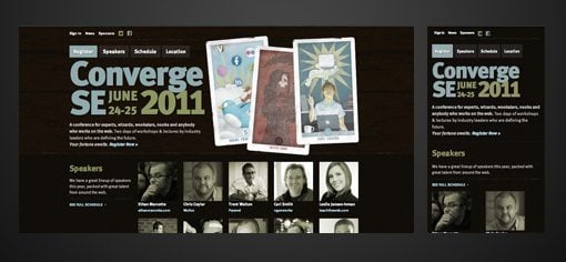
Converge SE
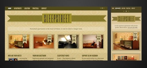
Sleepstreet
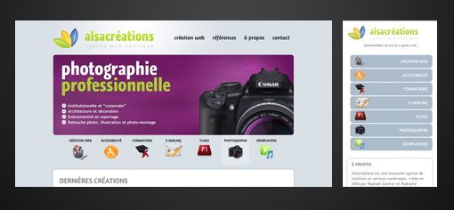
Alsacreations
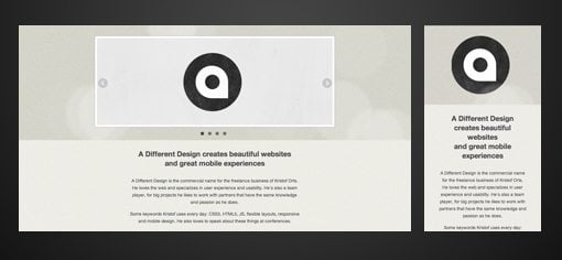
A Different Design
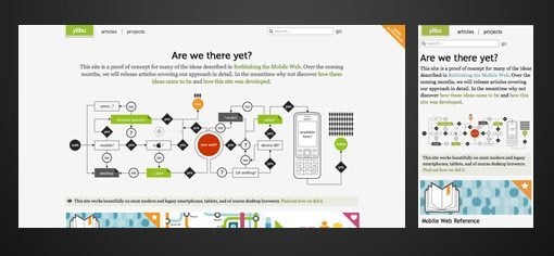
Yiibu
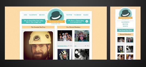
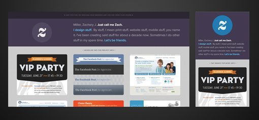
Sweet Hat Club
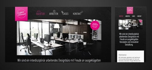
Laufbild Werkstatt
Lapse
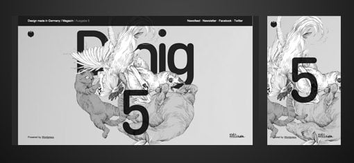
Dmig 5
Conclusion
To sum up, the plethora of devices accessing the web these days makes it necessary to create website designs that are adaptable to a lot of different screen sizes and CSS media queries provide an easy way to do exactly that.
To be honest, when I first heard about media queries I rolled my eyes, thinking that it would add simply yet another layer of work to all of the steps that we already have to go through to make our designs pass as usable. However, the more I learn about and experiment with them the more that I’m convinced that this is how web design should be approached in what Steve Jobs calls “a post-PC era”.
