3 Free Apps for Testing Your Responsive Designs Online
Responsive design has brought about a whole new list of challenges for web designers who have decided to take the plunge and leave static design behind. Creating a layout that works well at not one but several, or even all, possible widths requires patience, creativity and of course, lots of testing.
Nothing replaces checking out your design on the actual devices that you’re targeting, but as you’re building, it’s nice to be able to get a quick peek of the layout at various widths right on your computer. You could resize your browser window manually, but this gets ridiculously tedious if you’re shooting for precise pixel dimensions. Fortunately, several talented developers have already built some great tools to aid you in this process. Join us today as we take a look at three of them.
Wait, Why Do I Need These?

If you’re new to the concept of responsive web design, then you might be confused about why the following utilities are helpful. Basically, the goal behind responsive design is to build one site that adapts and evolves to different viewport sizes. So rather than building one site that works well on desktops, another for mobile and a third for tablets, you create a single layout that responds well to all of those scenarios.
To pull this off, you of course need to be able to see your layout at several different widths. I personally recommend designing for every possible width instead of merely targeting popular device widths, but it’s definitely still a good idea to attempt to get a feel for the layout that users of particular devices will see. The following tools will help you simplify that endeavor.
The Responsinator
The Responsinator is probably the easiest way to get a quick look at your layout on popular device widths. It’s fast, it’s simple and the experience has been designed so that anyone can immediately tell what’s going on. This is an important concept that we haven’t touched on yet. Sometimes you need to show off your responsive design to your client, and tools like this dramatically simplify that process.
The reason this site communicates the concept of responsive design so well is that it utilizes silhouettes of popular devices, within which the site of your choosing will be displayed.
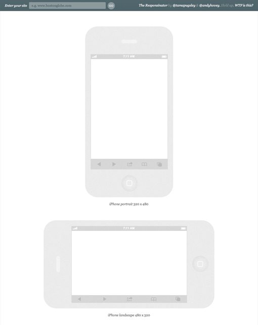
To get started, all you have to do is type in the URL of a website that you’d like to test. It doesn’t have to be a site that you own, so this also serves as a great way to investigate what other designers have done. For this example, I threw in the United Pixel Workers website.

From here you simply scroll down the page and see previews of the layout in all of the available devices. These previews are live and can be scrolled, clicked, etc. The range of previews here is pretty impressive, not only have they included major devices such as iPads, they’ve also tossed in common widths used across multiple devices such as the “crappy Android” example below.

The Responsinator is the only tool like this that I’ve seen that actually takes software UI into account. For instance, rather than displaying your site at the full 1024 x 768 for a horizontal iPad, they actually reserve the top 125 pixels or so for the mobile Safari browser chrome.

Before we move on to the next tool, here’s a quick rundown of the pros and cons of this app.
Responsinator Pros
- Nearly effortless, just paste in a link and scroll
- Lots of different device previews
- Nice visual representation that clients will understand
- Software UI dimensions are clearly accounted for
Responsinator Cons
- Has to load several instances of each site
- No way to explore sizes that are not listed
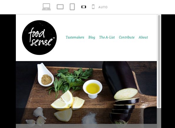
Responsive.is
The next tool on the list is Responsive.is. The concept here is the same as before, the site provides a quick way to view your layout at multiple different widths. However, the approach is drastically different.
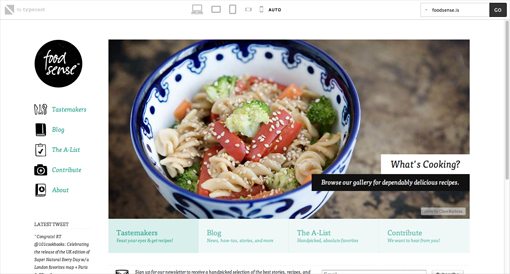
For starters, there aren’t any device silhouettes. There’s a small toolbar at the top of the screen but the rest is reserved for a single site preview that changes according to your selected device. This is a bit more convenient as it eliminates the seemingly endless scrolling as well as the loading of multiple previews, but some of the obviousness of what’s going on is lost in the process. The minimal interface is really nice though, something I appreciated after spending a lot of time with the bulky silhouettes of The Responsinator.
Responsive.is actually comes with a menu that contains built-in responsive sites to test drive so you can get a feel for how the service works (I used Food Sense). If you want to test another site, simply enter it into the box.

The toolbar at the top gives you six different options for viewport sizes, each of which is represented by a small icon: Desktop, tablet landscape, tablet vertical, smartphone landscape, smartphone vertical and auto.

As you would expect, clicking on a device gives you the preview of the site at that width. I really like how the preview has been handled here. The full site is shown at the specified width, but anything outside of the visible portion of the viewport is darkened.
My biggest peeve here is that the actual device widths aren’t really specified. Instead of pixel dimensions you’re left only with generic icons. Given that this is the case, this site is definitely more for generalized tests than specific circumstances (though you could measure the various sizes yourself).
Responsive.is Pros
- Clean, minimal interface that focuses on the content
- Only one instance of the test site is loaded
- No need to scroll, simply click on an icon to change the viewport
- Built in testing options
Responsive.is Cons
- You’re limited to six generic viewports
- No specific dimensions listed
- May be trickier for clients to figure out than The Responsinator
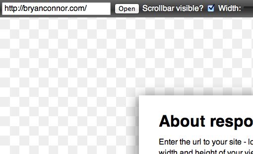
Responsivepx
Thus far, all of the tools that we have seen force you into preset dimensions for testing. If you don’t like the test sizes or simply want to add another, tough! There’s no way to do it. So where do you turn if you want to precisely dictate the dimensions for the test? The answer is a site called Responsivepx.
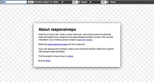
Here we have a simple welcome screen with some instructions and a link to a tutorial video. To start off, simply enter a URL in the box at the top right. Responsivepx is awesome in that it allows you to even test local sites that reside on your computer and are currently being worked on. We’ll use Bryan Connor’s site as an example for this test.
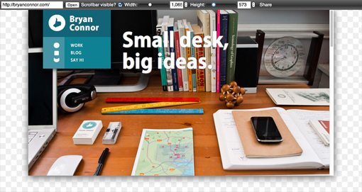
Once you have a site entered in, it’s time to tweak the dimensions via the tools at the top of the screen. As you can see in the shot below, there aren’t any preset sizes this time. You completely control the dimensions of the preview by either entering in a number or using the sliders.

As you change tweak the settings, the site preview updates to reflect those changes. It’s shown on a transparency grid similar to that of Photoshop.
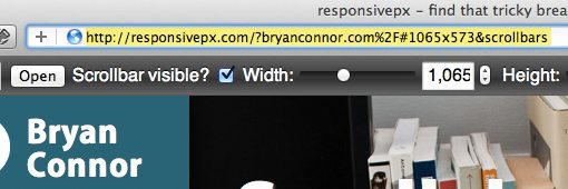
In my opinion, Responsivepx is by far the most useful option for developers working on their own responsive site. There are a number of reasons for this. First, it’s specifically created to help you find breakpoints based on your unique design. You can load up a design, move the width to a point where the layout no longer works, then grab the specific pixel values listed to insert into your media query. Once you’ve accounted for the changes, save your file, refresh the preview and you’re ready to attack your next breakpoint. Again, the fact that it works with local files really comes in handy here.
Further, as you enter test cases and change settings, the address in your browser’s URL bar will update to reflect those changes, which makes it super easy to share a specific test case with colleagues.
Given that this app is such a great way to decide on potential breakpoints, I’d love to see a button included that generates a media query based on the current viewport size. This would really make Responsivepx a killer tool for responsive designers.
Responsivepx Pros
- You decide the preview dimensions
- Perfect for finding breakpoints
- Remote and local testing
- Easy to share specific test cases
Responsivepx Cons
- Mostly for developers, use a different option for clients
- The toolbar UI could use some work
Conclusion
You now have three new weapons in your responsive web design arsenal. All of these sites have their particular strengths and are worth bookmarking for later. The Responsinator allows you to quickly and easily simulate lots of different devices and can be great for helping clients wrap their minds around what you’re trying to achieve. Responsive.is is a decent way to get a general feel for how a responsive layout performs on different genres of devices. It’s not the best for specific testing purposes, but it can be useful for a quick test. Finally, Responsivepx is the ultimate tool for finding ideal breakpoints for your design. You take control over the exact pixel dimensions and can test local files that you’re currently working on.
Have you tried any of the tools above? What do you think of them? How could they be improved? Also be sure to let us know about any other similar tools that you’ve found.
Stock images provided by: Bigstock.