3 Things You Never Thought to Do With Media Queries
You already know how to use media queries to create a responsive design, but have you tried to use them for anything else? Is it possible that media queries can be used natively to improve your workflow?
Follow along as we completely break from tradition and hijack media queries to help us test and tweak a design. You’ve never seen media queries like this before!
Beyond Responsive Design
With the rise of responsive design techniques, media queries have been thrust into the limelight as the savior of modern web design. They provide an unbelievably easy and practical method for creating one site that works across a plethora of screen and browser window sizes.
All that is nice, but I wanted to shake things up a bit. I began to ask myself an interesting question: What else can I use media queries for?
This question leads to some interesting brainstorming. Here we have a technology that essentially allows me to change my CSS in a basic boolean sort of way: If my browser window is x size, do y. This immediately brings to mind implications for improving my workflow. Beyond using media queries in my final product to provide a better user experience, maybe I can use media queries in a local testing environment to help out with some basic tasks.
Running with this line of thought, let’s see what we can come up with!
Debugging Your CSS and Visualizing the DOM
CSS layout can be a tricky beast. Whether you’re a brand new developer or a seasoned veteran, there are times when the position of something in your live preview doesn’t quite match what you were going for in your code.
In these circumstances, it really helps to be able to visualize just what’s happening in the DOM. When you get a visual picture of the parent/child/sibling relationship along with a decent picture of what your margins and padding are doing, you’d be surprised at just how many problems you can immediately spot the answer to.
Chris Page posted a solution way back in 2006 that is quite useful for just such a purpose. It uses the universal selector to apply colored outlines to different layers of the DOM tree so you can easily get a feel for how the content is structured:
* { outline: 2px dotted red}
  * * { outline: 2px dotted green}
  * * * { outline: 2px dotted orange}
  * * * * { outline: 2px dotted blue}
  * * * * * { outline: 1px solid red}
  * * * * * * { outline: 1px solid green}
  * * * * * * * { outline: 1px solid orange}
  * * * * * * * * { outline: 1px solid blue}
I took this snippet and took it a step further by adding some helpful background colors and then wrapped it all up in a media query:
@media (max-width: 1100px) {
	* { outline: 2px dotted red;}
	* * { outline: 2px dotted green; background: white}
	* * * { outline: 2px dotted orange; background: #888}
	* * * * { outline: 2px dotted blue; background: #666}
	* * * * * { outline: 1px solid red; background: #444}
	* * * * * * { outline: 1px solid green; background: #333}
	* * * * * * * { outline: 1px solid orange; background: #222}
	* * * * * * * * { outline: 1px solid blue; background: #111}
}
Why Would You Do This?
I know this seems crazy, but it’s actually fairly useful. When you’re using the snippet above to troubleshoot your CSS, it can be a pain to comment it in and out so you can see your layout as it’s meant to be. With the media query, you can quickly and easily switch between the two views by changing the size of your browser window.
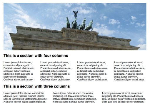
Here’s a sample page as it normally appears in full width in my browser:
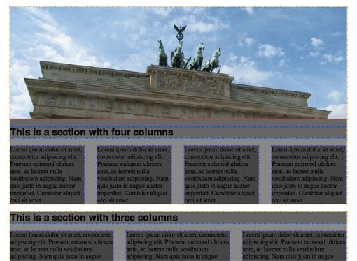
Now when I pull the side of the browser window in a little, I see my layout helpers. Notice that as we get deeper into the DOM, the background color gets darker.
Now I can tweak my code as I view the results in the debug mode, then pop into my normal view with a quick drag of the window.
See It In Action
Now that we’ve seen the code, it’s time to launch the demo. Be sure to resize the browser window and watch how the debug helpers pop up when you get around 1,100 pixels wide.
Demo: Click here to launch.
Must be viewed on a desktop or notebook.
Tweak Your Design
Another way you could use media queries is to help make decisions between subtle differences in a design. For instance, say you’re not quite happy with the line-height of your body copy and would like to test out a few options. You could set up a few different media queries, each with its own line height:
@media (max-width: 1500px) {
	p {line-height: 1;}
}

@media (max-width: 1200px) {
	p {line-height: 1.5;}
}

@media (max-width: 1000px) {
	p {line-height: 2;}
}
Now when you’re looking at your design in the browser, you can view the different iterations by dragging your browser window in and out. This will help you to quickly compare your line-height options and choose which you like best.
You could use this same technique for background colors, fonts, and anything else you can think of.
See It In Action
This time around as you resize the browser, watch how it affects the line-height. This would definitely make for a decent way to quickly compare the three options.
Demo: Click here to launch.
Must be viewed on a desktop or notebook.
Compare Browser Design with Photoshop Mockup
If you frequently build websites from Photoshop comps, it helps to be able to compare your live version with the mockup that you’re trying to emulate.
Once again, a media query provides us with an easy way to swap between the two versions. Here what I’ve done is set all my content to a 40% opacity, then I brought in my original comp as the background to the body. This creates a sort of overlay effect that helps me spot any major differences.
@media (max-width: 1200px) {
	#container, #header, #footer {opacity: 0.4;}
	body {background: url('photoshopcomp.jpg') no-repeat center top;}
}
See It In Action
For this last demo, a browser resize will drop the opacity of all the content on the page and bring up a full opacity image of the Photoshop mockup so that you can compare the two.
Demo: Click here to launch.
Must be viewed on a desktop or notebook.
Conclusion
The purpose of this article is more exploratory than educational. The intention is to start a discussion about whether or not media queries hold potential for purposes other than responsive design.
All three of my experiments above lean toward local design testing, so we don’t really even need to worry about semantics, browser compatibility and other hassles that typically come with this type of conversation. Instead it’s all about coming up with helpful tricks that improve your own personal workflow.
Can you think of anything fun or helpful to do with media queries? Let us know your thoughts in the comment section below.