6 Useful CSS Button Recipes You Can Copy & Paste
CSS3 is completely changing the game for creating buttons on the web. Techniques that were once only possible with images are now easily executable with just a few lines of code. For this post we custom built six attractively styled CSS buttons for you to copy and paste right into your projects, zero attribution required.
As with anything good in CSS3, the buttons below work great in Webkit and Mozilla browsers, but various versions of IE will fall short.
2 Million+ Digital Assets, With Unlimited Downloads
Get unlimited downloads of 2 million+ design resources, themes, templates, photos, graphics and more. Envato Elements starts at $16 per month, and is the best creative subscription we've ever seen.
A Quick Note About Semantics
The examples below are a bit heavy on HTML markup and many of them could easily be leaner. I structured them like this so that I could keep the CSS nice and separate for various parts of the button. This is so you can mix and match different portions of each of the examples below. If you implement any of these, be sure to take a close look at both the CSS and HTML to see if you can trim any fat.
Rounded Button: Two Lines
Sometimes a single line of text just doesn’t cut it. Use this button when you have a lot to say and want to cram it into a small space. For styling, I used a gradient from #99CF00 to #6DB700 and a few simple border treatments.
HTML
1 2 3 4 |
<div class="button"> <h3>Sign Up Now Free!</h3> <p>30 day risk free trial.</p> </div> |
CSS
1 2 3 4 5 6 7 8 9 10 11 12 13 14 15 16 17 18 19 20 21 22 23 24 25 26 27 28 29 30 31 32 33 34 35 36 37 38 39 40 41 42 43 44 |
.button { /*basic styles*/ width: 250px; height: 50px; color: white; background-color: #99CF00; text-align: center; font-size: 30px; line-height: 50px; /*gradient styles*/ background: -webkit-gradient(linear, 0% 0%, 0% 100%, from(#99CF00), to(#6DB700)); background: -moz-linear-gradient(19% 75% 90deg,#6DB700, #99CF00); /*border styles*/ border-left: solid 1px #c3f83a; border-top: solid 1px #c3f83a; border-right: solid 1px #82a528; border-bottom: solid 1px #58701b; -moz-border-radius: 10px; -webkit-border-radius: 10px; border-radius: 10px; -webkit-gradient(linear, 0% 0%, 0% 100%, from(#99CF00), to(#6DB700)) } .button h3 { font-size: 20px; line-height: 35px; font-family: helvetica, sans-serif; } .button p { font-size: 12px; line-height: 4px; font-family: helvetica, sans-serif; } a { text-decoration: none; color: fff; } .button:hover { background: -webkit-gradient(linear, 0% 0%, 0% 100%, from(#6DB700), to(#99CF00)); background: -moz-linear-gradient(19% 75% 90deg,#99CF00, #6DB700); } |
Red Pill
This simple but attractive red button uses heavily rounded corners to give it a pill-like shape. You’ll find a background gradient from #d46d45 to #b1432a and some slight border effects on the top and bottom. Once again, the hover effect is simply an inverse effect.
HTML
1 2 3 |
<div class="button"> <p>Press Me!</p> </div> |
CSS
1 2 3 4 5 6 7 8 9 10 11 12 13 14 15 16 17 18 19 20 21 22 23 24 25 26 27 28 29 30 31 32 33 34 35 36 37 38 39 40 |
.button { /*basic styles*/ width: 250px; height: 50px; color: white; background-color: #d46d45; text-align: center; font-size: 30px; line-height: 50px; /*gradient styles*/ background: -webkit-gradient(linear, 0% 0%, 0% 100%, from(#d46d45), to(#b1432a)); background: -moz-linear-gradient(19% 75% 90deg,#b1432a, #d46d45); /*border styles*/ border-top: solid 2px #e28d79; border-bottom: solid 1px #51281f; border-right: solid 1px #d46d45; border-left: solid 1px #d46d45; -moz-border-radius: 30px; -webkit-border-radius: 30px; border-radius: 30px; } .button p { font-size: 25px; line-height: 50px; font-family: 'Trebuchet MS', sans-serif; } a { text-decoration: none; color: fff; } .button:hover { background: -webkit-gradient(linear, 0% 0%, 0% 100%, from(#b1432a), to(#d46d45)); background: -moz-linear-gradient(19% 75% 90deg,#d46d45, #b1432a); border-top: solid 2px #b1432a; border-bottom: solid 1px #e28d79; } |
Dark Letterpress
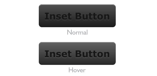
Here I used a letterpress technique to achieve an inset look on the text. Basically all you do is make the text darker than the background and then give it a light-colored shadow. For the hover effect I just lightened up the colors a bit.
HTML
1 2 3 |
<div class="button"> <p>Inset Button</p> </div> |
CSS
1 2 3 4 5 6 7 8 9 10 11 12 13 14 15 16 17 18 19 20 21 22 23 24 25 26 27 28 29 30 31 32 33 34 35 36 37 38 39 40 41 42 43 44 45 46 47 |
.button { /*basic styles*/ width: 250px; height: 70px; color: #171717; background-color: #4f4f4f; text-align: center; font-size: 30px; line-height: 50px; /*gradient styles*/ background: -webkit-gradient(linear, 0% 0%, 0% 100%, from(#4f4f4f), to(#1d1d1d)); background: -moz-linear-gradient(19% 75% 90deg,#1d1d1d, #4f4f4f); /*border styles*/ border-top: solid 2px #8f8f8f; border-bottom: solid 2px #1a1a1a; border-left: solid 2px #4f4f4f; border-right: solid 2px #4f4f4f; -moz-border-radius: 10px; -webkit-border-radius: 10px; border-radius: 10px; } .button p { font-size: 30px; line-height: 70px; font-family: verdana, sans-serif; font-weight: bold; text-shadow: 0px 2px 3px #444; } a { text-decoration: none; color: fff; } .button:hover { background: -webkit-gradient(linear, 0% 0%, 0% 100%, from(#616161), to(#292929)); background: -moz-linear-gradient(19% 75% 90deg,#292929, #616161); border-top: solid 2px #8f8f8f; border-bottom: solid 2px #282828; } .button p:hover{ text-shadow: 0px 2px 3px #555; } |
Black Beauty
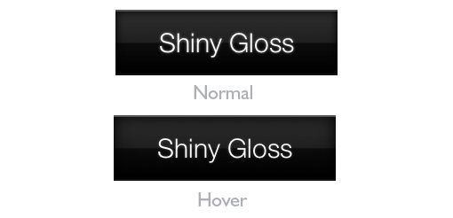
For this button, I really wanted to create something slick and classy. To accomplish this, I implemented three tricks. First, I applied some stopped gradients to give it that glossy look. Next, I applied an inner shadow, which is a great trick for adding depth and lighting effects. Finally, I applied a slight glow through the use of a text shadow. On hover, I reduce the glow and intensify the shadow.
HTML
1 2 3 |
<div class="button"> <p>Shiny Gloss</p> </div> |
CSS
1 2 3 4 5 6 7 8 9 10 11 12 13 14 15 16 17 18 19 20 21 22 23 24 25 26 27 28 29 30 31 32 33 34 35 36 37 38 39 40 41 42 43 44 |
.button { /*basic styles*/ width: 250px; height: 70px; color: #fff; background-color: #000; text-align: center; font-size: 30px; line-height: 50px; /*gradient styles*/ background: -webkit-gradient(linear, left top, left bottom, color-stop(0, #2f2f2f), color-stop(.5, #1e1f1f), color-stop(.51, #0c0c0c), to(#000)); background: -moz-linear-gradient(top, #2f2f2f, #1e1f1f 50%, #0c0c0c 51%, #000); /*border styles*/ border-top: solid 2px #555; border-bottom: solid 2px #111; -moz-box-shadow:inset 0 0 15px #000000; -webkit-box-shadow:inset 0 0 15px #000000; box-shadow:inset 0 0 15px #000000; } .button p { font-size: 30px; line-height: 70px; font-family: "HelveticaNeue-Light", "Helvetica Neue Light", "Helvetica Neue", Helvetica, Arial, "Lucida Grande", sans-serif; font-weight: 300; text-shadow: 0px 0px 3px #888; } a { text-decoration: none; color: fff; } .button:hover { -moz-box-shadow:inset 0 0 50px #000000; -webkit-box-shadow:inset 0 0 50px #000000; box-shadow:inset 0 0 50px #000000; } .button p:hover { text-shadow: 0px 0px 3px #444; } |
Blue Pill with Icon
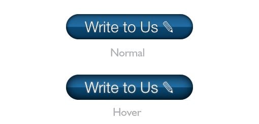
The blue pill button combines the glossy stylings of the previous button with the shape of the red pill from above. Again I used some glossy gradients and in inner shadow, but to make things interesting I added an icon: a little pencil. The great thing about this icon is that it doesn’t require any special fonts, just HTML! It’s a neat little addition that can really jazz up a contact button with zero effort.
HTML
1 2 3 |
<div class="button"> <p>Write to Us ✎ </p> </div> |
CSS
1 2 3 4 5 6 7 8 9 10 11 12 13 14 15 16 17 18 19 20 21 22 23 24 25 26 27 28 29 30 31 32 33 34 35 36 37 38 39 40 41 42 43 44 45 |
.button { /*basic styles*/ width: 250px; height: 50px; color: #fff; background-color: #125182; text-align: center; font-size: 30px; line-height: 50px; /*gradient styles*/ background: -webkit-gradient(linear, left top, left bottom, color-stop(0, #125182), color-stop(.5, #1269ab), color-stop(.51, #004375), to(#00345b)); background: -moz-linear-gradient(top, #125182, #1269ab 50%, #004375 51%, #00345b); /*border styles*/ -moz-border-radius: 30px; -webkit-border-radius: 30px; border-radius: 30px; -moz-box-shadow:inset 0 0 10px #000000; -webkit-box-shadow:inset 0 0 10px #000000; box-shadow:inset 0 0 10px #000000; } .button p { font-size: 30px; line-height: 50px; font-family: "HelveticaNeue-Light", "Helvetica Neue Light", "Helvetica Neue", Helvetica, Arial, "Lucida Grande", sans-serif; font-weight: 300; text-shadow: 0px 0px 3px #555; } a { text-decoration: none; color: fff; } .button:hover { -moz-box-shadow:inset 0 0 50px #000000; -webkit-box-shadow:inset 0 0 50px #000000; box-shadow:inset 0 0 50px #000000; } .button p:hover { text-shadow: 0px 0px 3px #888; } |
Like/Don’t Like Buttons
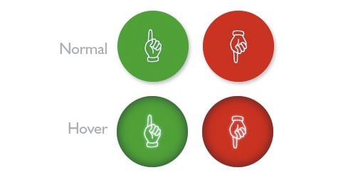
Here I created two circular buttons meant for implementing a simple rating system. The green button signifies a positive vote and the red a negative vote. As with the last button, the icons here are purely HTML and don’t require any @font-face tricks.
HTML
1 2 3 4 5 6 7 |
<div class="button green"> <p>☝</p> </div> <div class="button red"> <p>☟</p> </div> |
CSS
1 2 3 4 5 6 7 8 9 10 11 12 13 14 15 16 17 18 19 20 21 22 23 24 25 26 27 28 29 30 31 32 33 34 35 36 37 38 39 40 41 42 43 44 45 46 47 48 49 50 51 52 |
.green { background-color: #00ab26; } .red { background-color: #d90004; } .button { /*basic styles*/ width: 100px; height: 100px; color: #fff; text-align: center; font-size: 30px; line-height: 50px; float: left; margin-right: 20px; /*gradient styles*/ /*border styles*/ -moz-border-radius: 50px; -webkit-border-radius: 50px; border-radius: 50px; /*shadow styles*/ -moz-box-shadow: 2px 3px 5px #bfbfbf; -webkit-box-shadow: 2px 3px 5px #bfbfbf; box-shadow: 2px 3px 5px #bfbfbf; } .button p { font-size: 50px; line-height: 100px; font-family: "HelveticaNeue-Light", "Helvetica Neue Light", "Helvetica Neue", Helvetica, Arial, "Lucida Grande", sans-serif; font-weight: 300; text-shadow: 0px 0px 3px #888; } a { text-decoration: none; color: fff; } .button:hover { -moz-box-shadow:inset 0 0 30px #444; -webkit-box-shadow:inset 0 0 30px #444; box-shadow:inset 0 0 30px #444; } .button p:hover { text-shadow: 0px 0px 4px #fff; } |
Conclusion
I hope these buttons prove useful to you. Even if browser limitations cause some of these to be not quite implementation ready, they still provide great learning examples for some of the awesome new features of CSS3.
Leave a comment and let us know what you think!