Beating Borders: The Bane of Responsive Layout
Responsive design often requires setting your widths using percentages. This is easy enough to accomplish, that is until you start throwing borders into the mix. If your columns and total width are set using percentages, a static border size wreaks havoc on your layout.
Today we’re going to look at a couple of different ways to beat this problem. You’ll learn how to create a completely fluid layout that doesn’t mind extra borders or padding one bit.
Responsive Design Is Easy… In Theory
Responsive design is currently our best answer for serving up optimized content to the wealth of different devices and screen sizes that access the web today. With a few basic media queries we can quickly and easily take a static design and turn it into something that evolves based on the user’s unique needs. How amazing is that?
In theory, this looks nice and simple to me. I’ve spent a lot of time both reading and writing about responsive design, so I know both the theory and the practices well enough that I should never encounter any major hurdles. However, real world coding has a way of surprising you. No matter how prepared you think you are, when it comes time to actually bring your project to life, some major hurdles are bound to present themselves. Especially when you’re approaching complex layouts in CSS.
There are a million issues that arise in situations like this but today I want to focus on one that specifically threw me a curve ball: borders. When designing responsive layouts these seemingly innocent touches can have the effect of ruining everything!
Responsive Math
When coding a full on responsive site, one highly recommended practice is to use percentage based widths on your content. Sure, you can combine media queries with static widths, but then your layout isn’t nearly as adaptive as it could be. If that’s the ultimate goal, why not go all the way?
Combining multiple column layouts with percentage based widths involves a little bit of math, but it’s actually super basic and can be handled by anyone with basic addition and multiplication skills (we performed this next bit in our responsive thumbnail gallery tutorial).
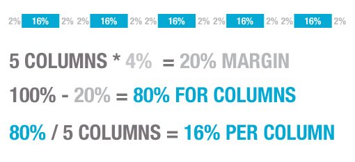
Let’s say we want a five column layout. The first thing I like to do is think about margins. If we want 4% margins between our columns, 4% times 5 columns equals 20% of our width being reserved for margins. Then we subtract 20% from the total width (100%) to come up with 80% left for the actual columns. 80% divided by five columns equals a 16% width on each column. Here’s a graphic to make everything a little clearer:
Putting this math to good use in our CSS would look something like the following. Pretty easy right?
.column {
	width: 16%;
	margin: 0 2% 0 2%;  /*2% right +2% left = 4% margin*/
}
The Border Problem
Not so fast. Let’s say we want to add a border to our design. How do we do that? Normally we would simply add a border to the column class, but we’ve already accounted for 100% of the width in the layout above. Adding border completely screws up our layout. Here we have five columns distributed via the CSS above:

And here’s what happens when we add a border of say, 2px to a column:

The solution of course would be to account for the border in our previous math, but how do we go about this? It turns out, we can’t set the border size as a percent, only a static value. This is problematic because if we use percents for everything else, the amount of space that we leave for the border will be a varying value, meaning it will change as the page width changes. This makes it nigh upon impossible to decide on a width for our borders! So what do we do? Should we give up and scrap the border idea?
CSS Outline to The Rescue
Obviously, what we need is a way to apply a border to a column without screwing with its width. As any good CSS trickster knows, there is in fact a property that does just that: outline. Using the following code, we can leave our math exactly as we figured before and still come away a border-like effect that doesn’t break our layout.
.column {
	width: 16%;
	float: left;
	margin: 0 2% 0 2%;
	background: #03a8d2;
	outline: 2px solid black;
}
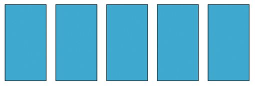
This works great for our test, the columns flow nicely and fit perfectly in the space provided despite the outline:
Headaches
We found our solution, let’s pat ourselves on the back and call it a day! Unfortunately, there’s always a caveat. In this case, there are several.
Browser Compatibility
The first issue that arises with using the CSS outline property is of course browser compatibility. To be fair, the situation here could be worse. We’ve got great support across the board in modern browsers: Safari, Chrome, Opera, even IE! Unfortunately, IE support only goes back to IE8 with IE6 and 7 having zero support.
Many developers have only recently decided that they can scrap IE6 support so I know many won’t be willing to do the same for IE7 just yet. However, the good news is that this is purely a subtle aesthetic touch and it’s definitely not going to ruin my day if everyone sees the outline except IE7 users.
Firefox Box-Shadow Problem
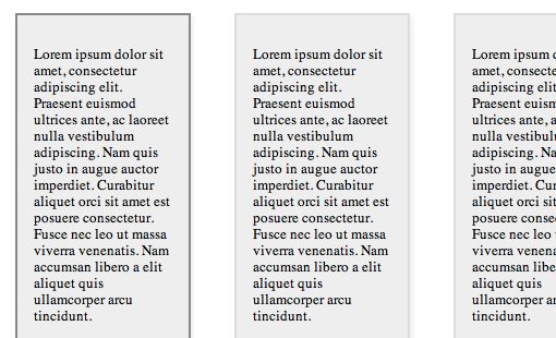
Even though Firefox fully supports the CSS outline property, you have to be really careful how you use it. Specifically, you’ll run into problems if you combine an outline with a box-shadow. To see what I mean by this, here’s an outline and a box-shadow rendered in Safari (the good way):

Now here’s the exact same code rendered in Firefox (the messed up way):

As you can see, for some crazy reason, Firefox places the outline outside of the shadow rather than on the true edge of our column. This results in unacceptable ugliness!
All Or Nothing
One final thing to remember about CSS outlines: you can’t apply them selectively. With borders, you can use border-right, border-top, etc. but with an outline you’re forced to accept the idea that it will be uniform all the way around the edge of your object.
Another Solution: box-sizing
The CSS outline has a lot of baggage! It solves our problem but comes with a pretty hefty set of instructions that you might not care for. If only there a way to use the far superior border property but adjust the CSS box model to our own devices. Well you’re in luck, because there is in fact just such a property: box-sizing.
This magical property allows us to tweak that ever confusing box model. The default value of box sizing is “content-box”, which is essentially the box model that we know and love. The width and height values determine the size of the content and any padding or borders are drawn outside of that and therefore add to the width. So a 200px wide div with a 2px border technically eats up 204px of space.
border-box
The other possible value for box-sizing is “border-box”, which actually places any padding and borders inside of the specified height and width. This means that a 200px wide div with a 2px border is still only 200px! Here’s what this looks like if we apply it to our columns:
.column {
	width: 16%;
	float: left;
	margin: 0 2% 0 2%;
	background: #03a8d2;
	border: 2px solid black;
	-webkit-box-sizing: border-box;
	-moz-box-sizing: border-box;
	box-sizing: border-box;
}
With this code, our columns are flowing perfectly despite having borders applied:

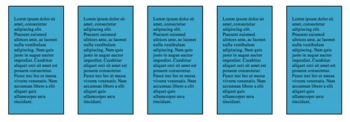
We can even take this a step further and add some padding to the equation without screwing anything up. As long as you have the box-sizing property set to border-box, no additional math is necessary. Add all of the borders and padding that you like and everything still works:
.column {
	width: 16%;
	float: left;
	margin: 0 2% 0 2%;
	background: #03a8d2;
	border: 2px solid black;
	padding: 15px;
	font-size: 13px;
	-webkit-box-sizing: border-box;
	-moz-box-sizing: border-box;
	box-sizing: border-box;
}
Browser Compatibility
Interestingly enough, browser compatibility here is the same as with outline, meaning this works on pretty much everything but IE6 and IE7. Your main concern here though is that, unlike with outline, the layout will in fact fail in browsers that don’t support this property.
Which Method Is Best?
The outline property is definitely the simpler fix, it works in a lot of situations and if it fails, nothing bad happens to your layout. However, I think that the box-sizing method just feels so much better. I can combine it with a shadow without any serious problems, browser support is actually not bad and I can still enjoy all the goodness of borders. The fact that padding can also be thrown into the mix is icing on the cake and brings this way ahead of the competition in my mind. If you’re worried about IE7, you can always whip up a quick conditional stylesheet that solves the problem.
Demo
If you want to see box-sizing in action, cruise over to Dabblet to see the live demo of the example above.
Conclusion
Outline and box-sizing represent two possible solutions to our problem of combining borders with percent based widths in CSS layouts. Neither solution is perfect, but as long as you know what you’re doing, both can be used to successfully solve your layout woes.
Now that you’ve seen my solutions for this problem, it’s time for you to chime in. How do you handle the problem of borders in responsive layouts? Do you have a different solution not listed above?
