Build a Fun Photo Swap Animation With CSS Keyframes
CSS keyframe animations open up a vast range of possibilities for what can be accomplished with CSS. Much more than simple, one-step transitions, keyframes can be used to achieve complex, multi-step animations that are quite impressive.
In today’s project, we’re going to start from scratch and build a stack of two photos that spread out and swap their stacking order when you hover over them. Along the way we’ll learn all about how to wield keyframes like a pro and juggle all of those head-spinning prefixes!
What We’re Building
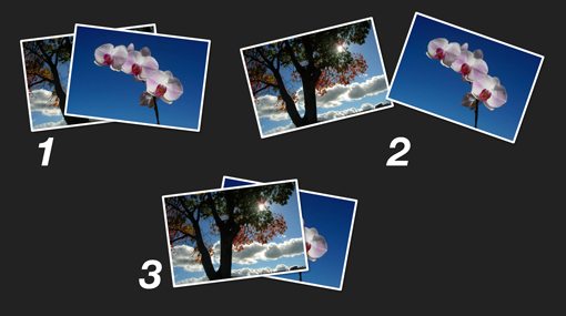
The concept for this project is pretty simple. Imagine two photos, randomly rotated and stacked on top of each other as if you had thrown them on a desk. The problem is, you can only really see the photo on the top!
To help that bottom photo get the attention that it deserves, we’re going to create a hover event that first separates the two photos, then slides the top photo in behind the bottom photo, effectively changing the stacking order.
Odds are, if you read this blog, you’re a visual thinker, so here’s what this looks like in pictures:
Keyframe Animations vs. Transitions
CSS currently has two primary options for animating an element: transitions and keyframes. Each time you want to animate something, you have to analyze the situation and decide which method is appropriate. Fortunately, deciding between the two is really easy.
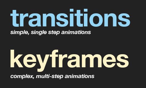
Any time you have a simple animation with only a single step, a transition is the perfect solution. For instance, if you want something to rotate slightly when you hover over it, you’d probably pull off the effect with a transition. You simply set the original state, then the rotated state, and transition between the two.
Now, imagine that you wanted to take this idea further and create an animated dial like you’d see to crack a safe. You’d probably want it to spin clockwise for a second, then counterclockwise, then maybe clockwise again, you get the idea. For this scenario, you’d definitely want to go with a keyframe animation.
Which Should We Use?
Above, we outlined the animation that we want to achieve. Obviously, it’s going to be pretty complex. Multiple items will be moving back and forth, rotating and swapping their stacking order. Given this complexity, keyframe animations are the natural choice.
Browser Support
It’s good to keep in mind that both keyframes and transitions now have pretty decent support on the major browsers… except of course for IE. As far as I can tell, neither transitions nor animations will be supported until IE10, so you obviously don’t want to rely on them for any major functionality.

Source: CanIUse.com
Step 1. The HTML
Enough build up, let’s jump into building this sucker. The first thing to do is lay out the project in HTML. This is of course extremely easy. All we need is a container with two images.
<div class="container">
  <img class="picone" src="http://lorempixum.com/300/200/nature/8" alt="">
  <img class="pictwo" src="http://lorempixum.com/300/200/nature/7" alt="">
</div>
We could scrap the classes and use some fancy selectors to grab each image, but I don’t think this is too markup heavy for what we’re going to accomplish so we’ll stick with this.
Step 2. Basic CSS
Nothing fancy here, just some simple setup to really set the stage nicely for what we’re going to accomplish.
/*BASIC*/
* {margin: 0; padding: 0;}

body {
  background: #222;
}

.container {
  position: relative;
  margin: 30px;
  height: 300px;
  width: 650px;
}
Step 3. Style the Photos
For the most part, we’ll want both of the photos to look the same, but there will be some differences. In this step though, we want to target both images and include only the styles that we want to apply to both images.
This includes height, width, border, border-radius and box-shadow. This code will give each image a slight shadow and a thin white border.
/*PHOTO SHAPE*/
.picone, .pictwo {
  border: 5px solid #fff;
  border-radius: 3px;
  height: 200px;
  margin: 20px;
  position: absolute;
  width: 300px;

  -webkit-box-shadow: 3px 3px 3px rgba(0,0,0,0.3);
          box-shadow: 3px 3px 3px rgba(0,0,0,0.3);
}
Notice that the position here is set to “absolute.” This is so we can easily manipulate the position of each image individually. Since we used relative positioning on the container, the position for these will be defined “relative” to the container bounds.
Progress Check
At this point, your photos should look nice, but since we’ve used absolute positioning, they’ll be stacked on top of each other with only the top image visible.

Step 4. Rotate and Position the Photos
Moving right along, it’s time to help distinguish between the two photos visually. To do this, we want to move “pictwo” to the right and rotate both images using CSS transforms.
We’ll rotate both images by seven degrees, just make sure the first one has a negative value and the second a positive so that they’ll be offset from each other.
/*SPECIFIC PHOTOS*/
.picone {
  -webkit-transform: rotate(-7deg);
     -moz-transform: rotate(-7deg);
       -o-transform: rotate(-7deg);
      -ms-transform: rotate(-7deg);
          transform: rotate(-7deg);
}

.pictwo {
  left: 100px;
  -webkit-transform: rotate(7deg);
     -moz-transform: rotate(7deg);
       -o-transform: rotate(7deg);
      -ms-transform: rotate(7deg);
          transform: rotate(7deg);
}
Progress Check
At this point, all of our base visual styling is finished. You should have a nice little two photo stack that looks something like this:

Step 5. Plan the Animation
Now that we’ve got the photos set up the way that we like, we need to plan out the specifics of how we’re going to make them move. Since there are two photos, we’ll need to plan the specific movements of each.
Pic One
The first picture starts on the bottom of the stack. Most of the movement will take place on the other photo, but I want to make this one look like it’s moving out of the way and making room for the other one, so we’ll rotate it slightly.
Without worrying about actual syntax, let’s plan out each step. Keyframes use percentages to plot out the animation, so that’s what we’ll use here.
- 0%: rotate(-7deg)
- 50%: rotate(-14deg)
- 100%: rotate(-7deg)
As you can see, we start with our default rotation of -7, then transition to a rotation of -14 and finally rotate back to where we started.
Pic Two
The second photo is much more complicated. This time around, we want to move the photo a few hundred pixels to the right while rotating it, swap it to the bottom of the stack, then bring it back in where it began while remaining on the bottom. Here’s what this looks like:
- 0%: left 100px, z-index 1, rotate(7deg)
- 49%: left 350px, z-index 1, rotate(20deg)
- 50%: left 350px, z-index -3,rotate(20deg)
- 100%: left 100px, z-index -3, rotate(7deg)
Notice that the steps at 49% and 50% are identical aside from the z-index value. We don’t want this photo to jump to the bottom of the stack until it’s out of the way of the other one, so we have to move it out before jumping it down.
Code the Animation
Now that we’ve conceptually planned out the animation, it’s time to actually code up the CSS versions. Using the progressions that we just came up with, this turns out to be pretty easy. Remember that this is just defining the animations, we’ll implement them later.
/*KEYFRAME ANIMATIONS*/
@keyframes picone {
  0% {transform: rotate(-7deg)}
  50% {transform: rotate(-14deg)}
  100% {transform: rotate(-7deg)}
}

@keyframes pictwo {
  0% {left: 100px; z-index: 1; transform: rotate(7deg)}
  49% {left: 350px; z-index: 1; transform: rotate(20deg)}
  50% {left: 350px; z-index: -3; transform: rotate(20deg)}
  100% {left: 100px; z-index: -3; transform: rotate(7deg)}
}
Prefix Mayhem
The absolute worst part of using keyframe animations in CSS is the mess of code that you have to use to pull them off across all of the possible browsers. The code that we just wrote is simple enough, but now we have to repeat it with all of the various prefixes.
There’s actually an important lesson in here though, so this is good practice. The tricky part is that we’ve embedded one property that needs prefixing (transform) inside of another (@keyframes). This leads to a big headache. And by big, I mean over two hundred lines of code big.
For the snippet above, we need to expand out all of the rotates so that they have all four major prefixes (webkit, moz, o, and ms). Then we need to repeat the whole thing while adding the appropriate prefixes to the @keyframe line as well, but within each of these, you only need the standard rotate property along with the prefix that matches the parent keyframe prefix. Confused yet? Me too.
Fortunately, Prefixr is here to save the day. Grab the standard syntax from above and drop it in, then out will come all of the various pieces that you need to make this work.
/*PICONE KEYFRAME ANIMATIONS*/

/*standard syntax*/
@keyframes "picone" {
 0% {
    -webkit-transform: rotate(-7deg);
    -moz-transform: rotate(-7deg);
    -o-transform: rotate(-7deg);
    -ms-transform: rotate(-7deg);
    transform: rotate(-7deg);
 }
 50% {
    -webkit-transform: rotate(-14deg);
    -moz-transform: rotate(-14deg);
    -o-transform: rotate(-14deg);
    -ms-transform: rotate(-14deg);
    transform: rotate(-14deg);
 }
 100% {
    -webkit-transform: rotate(-7deg);
    -moz-transform: rotate(-7deg);
    -o-transform: rotate(-7deg);
    -ms-transform: rotate(-7deg);
    transform: rotate(-7deg);
 }

}

/*moz syntax*/
@-moz-keyframes picone {
 0% {
   -moz-transform: rotate(-7deg);
   transform: rotate(-7deg);
 }
 50% {
   -moz-transform: rotate(-14deg);
   transform: rotate(-14deg);
 }
 100% {
   -moz-transform: rotate(-7deg);
   transform: rotate(-7deg);
 }

}

/*webkit syntax*/
@-webkit-keyframes "picone" {
 0% {
   -webkit-transform: rotate(-7deg);
   transform: rotate(-7deg);
 }
 50% {
   -webkit-transform: rotate(-14deg);
   transform: rotate(-14deg);
 }
 100% {
   -webkit-transform: rotate(-7deg);
   transform: rotate(-7deg);
 }

}

/*ms syntax*/
@-ms-keyframes "picone" {
 0% {
   -ms-transform: rotate(-7deg);
   transform: rotate(-7deg);
 }
 50% {
   -ms-transform: rotate(-14deg);
   transform: rotate(-14deg);
 }
 100% {
   -ms-transform: rotate(-7deg);
   transform: rotate(-7deg);
 }

}

/*o syntax*/
@-o-keyframes "picone" {
 0% {
   -o-transform: rotate(-7deg);
   transform: rotate(-7deg);
 }
 50% {
   -o-transform: rotate(-14deg);
   transform: rotate(-14deg);
 }
 100% {
   -o-transform: rotate(-7deg);
   transform: rotate(-7deg);
 }

}

/*PICTWO KEYFRAME ANIMATIONS*/

/*standard syntax*/
@keyframes "pictwo" {
 0% {
    left: 100px;
    z-index: 1;
    -webkit-transform: rotate(7deg);
    -moz-transform: rotate(7deg);
    -o-transform: rotate(7deg);
    -ms-transform: rotate(7deg);
    transform: rotate(7deg);
 }
 49% {
    left: 350px;
    z-index: 1;
    -webkit-transform: rotate(20deg);
    -moz-transform: rotate(20deg);
    -o-transform: rotate(20deg);
    -ms-transform: rotate(20deg);
    transform: rotate(20deg);
 }
 50% {
    left: 350px;
    z-index: -3;
    -webkit-transform: rotate(20deg);
    -moz-transform: rotate(20deg);
    -o-transform: rotate(20deg);
    -ms-transform: rotate(20deg);
    transform: rotate(20deg);
 }
 100% {
    left: 100px;
    z-index: -3;
    -webkit-transform: rotate(7deg);
    -moz-transform: rotate(7deg);
    -o-transform: rotate(7deg);
    -ms-transform: rotate(7deg);
    transform: rotate(7deg);
 }

}

/*moz syntax*/
@-moz-keyframes pictwo {
 0% {
   left: 100px;
   z-index: 1;
   -moz-transform: rotate(7deg);
   transform: rotate(7deg);
 }
 49% {
   left: 350px;
   z-index: 1;
   -moz-transform: rotate(20deg);
   transform: rotate(20deg);
 }
 50% {
   left: 350px;
   z-index: -3;
   -moz-transform: rotate(20deg);
   transform: rotate(20deg);
 }
 100% {
   left: 100px;
   z-index: -3;
   -moz-transform: rotate(7deg);
   transform: rotate(7deg);
 }

}

/*webkit syntax*/
@-webkit-keyframes "pictwo" {
 0% {
   left: 100px;
   z-index: 1;
   -webkit-transform: rotate(7deg);
   transform: rotate(7deg);
 }
 49% {
   left: 350px;
   z-index: 1;
   -webkit-transform: rotate(20deg);
   transform: rotate(20deg);
 }
 50% {
   left: 350px;
   z-index: -3;
   -webkit-transform: rotate(20deg);
   transform: rotate(20deg);
 }
 100% {
   left: 100px;
   z-index: -3;
   -webkit-transform: rotate(7deg);
   transform: rotate(7deg);
 }

}

/*ms syntax*/
@-ms-keyframes "pictwo" {
 0% {
   left: 100px;
   z-index: 1;
   -ms-transform: rotate(7deg);
   transform: rotate(7deg);
 }
 49% {
   left: 350px;
   z-index: 1;
   -ms-transform: rotate(20deg);
   transform: rotate(20deg);
 }
 50% {
   left: 350px;
   z-index: -3;
   -ms-transform: rotate(20deg);
   transform: rotate(20deg);
 }
 100% {
   left: 100px;
   z-index: -3;
   -ms-transform: rotate(7deg);
   transform: rotate(7deg);
 }

}

/*o syntax*/
@-o-keyframes "pictwo" {
 0% {
   left: 100px;
   z-index: 1;
   -o-transform: rotate(7deg);
   transform: rotate(7deg);
 }
 49% {
   left: 350px;
   z-index: 1;
   -o-transform: rotate(20deg);
   transform: rotate(20deg);
 }
 50% {
   left: 350px;
   z-index: -3;
   -o-transform: rotate(20deg);
   transform: rotate(20deg);
 }
 100% {
   left: 100px;
   z-index: -3;
   -o-transform: rotate(7deg);
   transform: rotate(7deg);
 }

}
Are You Kidding Me?
250+ lines of code just to define some simple animations? What am I smoking? Unfortunately, if we want to pull this off with CSS, this is what we’ll need until keyframes become a standard, non-prefixed feature.
The lesson here is to be careful when adding complexity to keyframe animations because it gets insane fast. The second lesson is that jQuery is still often the easiest solution for pulling off simple cross-browser animations!
Activating the Animations
Simply defining keyframe animations doesn’t make anything happen, we need to implement them with the “animation” syntax. To do this, we use the animation syntax.
We want this to happen when we hover over the container, so we use .container:hover, then differentiate based on the class for each of our images.
.container:hover .picone {
  -webkit-animation: picone 1.5s 2 alternate;
     -moz-animation: picone 1.5s 2 alternate;
      -ms-animation: picone 1.5s 2 alternate;
       -o-animation: picone 1.5s 2 alternate;
          animation: picone 1.5s 2 alternate;
}

.container:hover .pictwo {
  -webkit-animation: pictwo 1.5s 2 alternate;
     -moz-animation: pictwo 1.5s 2 alternate;
      -ms-animation: pictwo 1.5s 2 alternate;
       -o-animation: pictwo 1.5s 2 alternate;
          animation: pictwo 1.5s 2 alternate;
}
Here we’ve called the animation using the names we set before, set the length to one and a half seconds, set the iteration to two and then used alternate so that the first iteration runs through the steps in order and the second goes through them backward so we end up where we began.
See it Work!
Good news, we’re all finished. To see the my full code along with a live demo, click on the link below.
Demo: Click here to launch
CSS Keyframes: Still Not Quite There
In concept, pulling off complex animations with CSS is surprisingly easy. The syntax is straightforward, flexible and easy to pick up.
Unfortunately, the browser support is still short of where we’d like it to be and the code necessary for implementation can get downright crazy when you start integrating other prefixed CSS properties into the mix alongside the keyframes.
That being said, this was still a blast to build and if you made it all the way through you’ll no doubt be a real pro when it comes to keyframe syntax!