Build a Fun True or False Quiz With CSS
I’m constantly surprised by what you can achieve using only HTML, CSS and a little ingenuity. I love to think outside the box and attempt creative experiments just to see if I can pull it off.
Today’s random challenge is to create a fun little true/false quiz. Questions will be presented to the user and answers will be revealed only on click. To make the magic happen, we’ll turn to some pretty crazy methods and use features like active, focus and even tabindex! You’re bound to learn some quirky stuff so hit the jump and follow along.
Basic HTML
The first thing that we need to do is figure out the structure of our quiz. It will be comprised of a series of questions (they’re not technically questions, but you get the idea), each of which contains a statement followed by two possible answers: true and false.
For the statement to be evaluated, we’ll use an h2 tag. For true and false, we’ll use paragraph tags. Finally, we’ll wrap the whole unit up into a nice question div. This structure is very modular and will be easily repeatable as we add more questions.
<div class="question">
  <h2>Some statement</h2>
  <p>True</p>
  <p>False</p>
</div>
Remember, we’re going to have the user click on the question to see the solution. We don’t need to get into exactly how this works yet, but we do need to make sure that we have a method for indicating the proper solution. To do this, we can use a “yes” class and a “no” class. For each question, the “yes” class will be applied to the correct solution. Could someone conceivably cheat and look at the source for the answers? You bet, but we’re not setting out to make something that’s hardcore secure so cheaters can have at it.
<div class="question">
  <h2>Some statement</h2>
  <p class="no">True</p>
  <p class="yes">False</p>
</div>
Here we’ve set “false” to the correct answer. Now that we’ve got our basic structure figured out, let’s set up a few sample questions. For today’s experiment, try to keep your statements super short so everything can fit on a single line.
<div class="question">
  <h2>Bats are blind</h2>
  <p class="no">True</p>
  <p class="yes">False</p>
</div>

<div class="question">
  <h2>Crocodiles Cry</h2>
  <p class="yes">True</p>
  <p class="no">False</p>
</div>
Instructions
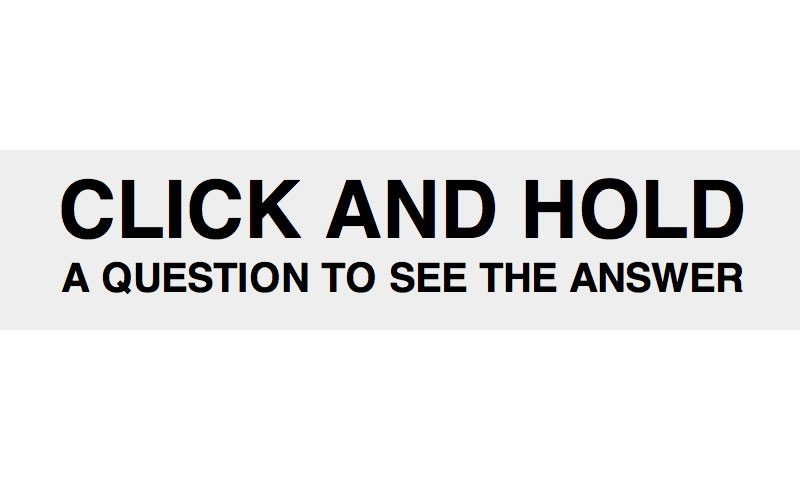
For good measure, we’ll also include some basic directions. This will ensure that the user knows what to do upon loading the page.
<div class="intro">
  <h1>Click and hold</h1>
  <p>a question to see the answer</p>
</div>

<div class="question">
  <h2>Bats are blind</h2>
  <p class="no">True</p>
  <p class="yes">False</p>
</div>

<div class="question">
  <h2>Crocodiles Cry</h2>
  <p class="yes">True</p>
  <p class="no">False</p>
</div>
Starter CSS
Now that we’ve got our basic content figured out, we can jump over and begin some visual styling. We’ll toss in a basic lazy man’s reset to make sure things are lining up properly across browsers, then move onto styling the instructions. Add in some margin and padding, set a background color, center-align the text and transform to uppercase.
Next, simply set the font styles for the instructional text. I’ve used the font shorthand here to make the text bold, set the size/line-height and create a font stack.
* {margin: 0; padding: 0; outline: none;}

.intro {
  margin-top: 50px;
  margin-bottom: 80px;
  padding: 10px;
  background: #eee;
  text-align: center;
  text-transform: uppercase;
}

.intro h1 {
  font: bold 40px/1 Helvetica, sans-serif;
}

.intro p {
  font: bold 20px/1.5 Helvetica, sans-serif;
}
This code should make out instructions at the top look like the text in the screenshot below. Pretty straightforward, let’s move onto the styles for the questions.
Question CSS
The first thing that we need to code here is our question container. Set a height of 100px and a width of 100%. Then set the background color, margin and overflow like you see below.
.question {
  overflow: auto;
  margin: 20px 0;
  width: 100%;
  height: 100px;
  background: #fff;
}
Next up are the h2 tags. First, float these to the left (you’ll see why later), then add some margin, set the color to a dark gray, make the text uppercase and use the font shorthand again to make the text bold, 80px Helvetica. On hover, change the color to a darker gray and make sure the cursor is a pointer.
.question h2 {
  float: left;
  margin: 0 40px;
  color: #808080;
  text-transform: uppercase;
  font: bold 80px/100px Helvetica, sans-serif;
}

.question h2:hover {
  color: #333;
  cursor: pointer;
}
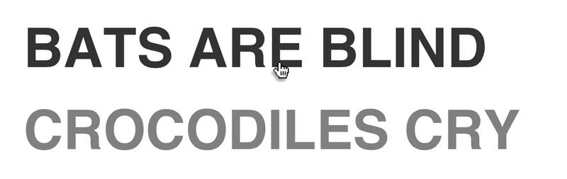
Again, there’s nothing really complicated here. We’re just doing some basic text styling to make things look pretty. Here’s what your questions should look like right now:
Answer CSS
We’ve got each statement styled up so now it’s time to make sure the “true” and “false” look nice and proper. To do this, float them left so they’ll be right in line with the statement. Then add a little margin, set the color and font, and make them uppercase. Notice that I’ve actually set the font-size to 0px. This helps them stay hidden until the user clicks on the question, we’ll make them larger later. Finally, we finish by including a basic color transition so that the solution will gradually fade into view when the user clicks.
.question p {
  float: left;
  margin-right: 40px;
  color: #fff;
  text-transform: uppercase;
  font: bold 0px/100px Helvetica, sans-serif;
  -webkit-transition: color 0.3s ease;
  -moz-transition: color 0.3s ease;
  -ms-transition: color 0.3s ease;
  -o-transition: color 0.3s ease;
  transition: color 0.3s ease;
}
Using :active to Show The Answer
Everything is coded up and in place, but how do we get the browser to show the right answer when the user clicks? This is where things jump to the experimental side. We’re going to hijack the :active pseudo class so that we can track a click event on our h1 tags. Note that IE6 will only work with active states applied to anchors, so if you’re worried about that browser (I’m not), go back and wrap your headings in an anchor.
Here’s how this is going to work:
h2:active ~ .yes {
  color: #ff0000;
  font-size: 50px;
}
What the heck is going on here? It’s a short enough snippet but it can be a bit complicated to unravel. Basically, it tells the browser to change the color and size of any element with a class of “yes” that happens to be a sibling of a currently active (being clicked) h2. What this means is that, when you click a question, the correct answer, as defined by the “yes” class, will appear in red.
Try It Out
With that one little piece of code, this thing is now perfectly functional. Try it out by following the link below.
Demo: Click here to launch

An Alternative Method
Now, let’s say that you don’t like the fact that you have to click and hold the mouse button down to see the answer. Can’t we just have keep the answer up on a single click until the user clicks something else? With a little more trickery, we can.
To pull this off, we’re going to use another weird, experimental trick. By playing around with tests like these, you’ll be able to get a feel for HTML and CSS code that you may one day need to use in a real project.
The first thing you want to do is go into all of your h2 tags in your HTML and add in tab index-“-1”. This allows you to specify the order things are highlighted as the user tabs around the page. If we insert the value -1, we disable the ability of the user to tab to this item.
<div class="question">
  <h2 tabindex="-1">Bats are blind</h2>
  <p class="no">True</p>
  <p class="yes">False</p>
</div>
Now, the interesting thing is that when we combine this with the :focus pseudo class, we can actually make the answer stay up after the user clicks. Let’s add another piece to that CSS snippet from before:
h2:active ~ .yes, h2:focus ~ .yes {
  color: #ff0000;
  font-size: 50px;
}
We added in a selector that’s identical to the last one, only this time we used focus instead of active. Just in case some browsers don’t support this little trick though, we left in the old functionality as a fallback.
Try It Out
Now that we’ve changed this up, let’s check out another demo. This time simply click on one of the statements to see the true/false appear. It should stay there until you click elsewhere.
Demo: Click here to launch

Conclusion
There you have it, even if you have no use for a true/false quiz, you should now have some great ideas for using active, tabindex and focus in ways that you may have never considered before. Do you know of any other tricks along the same lines? Tell us with a comment below.