Build an Animated Mario Block Navigation Menu With CSS3
Today we’re going to have some good clean fun by recreating the animated Mario Bros. question mark box with pure CSS3.
Along the way you’ll learn how to use several cool CSS3 technologies such as rounded corners, box and text shadows, and keyframe animations that work in both Safari and Firefox. Let’s jump in!
Sneak Peek
Here’s a quick look at what we’ll be building today. In reality, I think it’s way too busy to actually use on a site (it might just your eyes hurt) but it’s definitely fun to build!

Demo: Click here to launch demo
Download: Click here to download
Why On Earth?
To start off I’d like to make it clear that this article outlines a purely experimental project meant for educational purposes only. The final product should degrade somewhat gracefully in other browsers but the animations will really only function properly in Webkit browsers as well as Firefox 5 (which now supports keyframe animations).
So, if it’s not ready for use, why did I bother with the article? First of all, running experiments like this is an awesome way to build up your CSS troubleshooting skills: you always run into several unexpected problems and have to solve your way out of them. Also, one day in the future CSS keyframe animations will hopefully be something that is supported by all major browsers and it’ll definitely be helpful to already have a feel for some different implementation techniques.
Ultimately though, this is all just my attempt to justify the fact that I’m a Nintendo nerd who saw an animated Mario block the other day and instantly wanted to build it in CSS. As a side note, one easy way to make this technique more accessible to all browsers is just to ditch the CSS animation and use jQuery instead.
Getting Started: The HTML
The first thing we want to do is outline some basic HTML for a block. Since the block is conceivably something we want to use repeatedly, we’ll use a couple of classes. That way we can just copy and paste blocks of code and the CSS will be taken care of automatically.
First, create a container, this will hold all the blocks when we eventually create more. Next drop in a wrapper div containing a paragraph tag. This structure seems a little redundant at the moment but as we add more later it will make sense.
<div id="container">
    <div class="blockWrapper">
        <a href="#"><p class="block">?</p></a>
    </div>
</div>
Note that I wrapped my entire paragraph tag in a link, which is acceptable in HTML5. I did this because the text itself will come in and out of view and you want the link to be clickable all the time, not purely when the text is visible. Again, this will make more sense later.
Starting CSS
Next up, we want to create the basic style for our Mario block. There are three distinct portions that we’ll need to handle, outlined below.
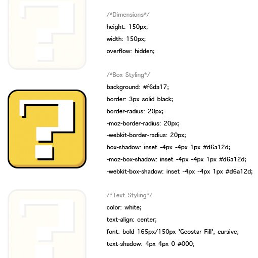
Dimensions
The first thing we need to do is simply set a height and width. This is fairly arbitrary, as long as you create a square, you’re good. I set mine to 150px for the width and height. Also be sure to set your overflow to “hidden” for the animation.
.block {
    /*Dimensions*/
    height: 150px;
    width: 150px;
    overflow: hidden;
}
Box Styling
Next up, we want to make our box look something like the question mark block from a Mario game. There are several versions so for all you devoted fans out there, we’ll be basing ours roughly on the one from Super Mario Bros 3.
In the code below I set my color, border, border radius and inner shadow to give the block some depth.
.block {
    /*Dimensions*/
    height: 150px;
    width: 150px;
    overflow: hidden;

    /*Box Styling*/
    background: #f6da17;
    border: 3px solid black;
    border-radius: 20px;
    -moz-border-radius: 20px;
    -webkit-border-radius: 20px;
    box-shadow: inset -4px -4px 1px #d6a12d;
    -moz-box-shadow: inset -4px -4px 1px #d6a12d;
    -webkit-box-shadow: inset -4px -4px 1px #d6a12d;
}
Text Styling
The final step is to style our question mark. Make the color white, center align the text, give it a hard shadow and set the font to something you like. I had a hard time finding a font that looked appropriate but the Google Web Font Geostar Fill comes close.
.block {
    /*Dimensions*/
    height: 150px;
    width: 150px;
    overflow: hidden;

    /*Box Styling*/
    background: #f6da17;
    border: 3px solid black;
    border-radius: 20px;
    -moz-border-radius: 20px;
    -webkit-border-radius: 20px;
    box-shadow: inset -4px -4px 1px #d6a12d;
    -moz-box-shadow: inset -4px -4px 1px #d6a12d;
    -webkit-box-shadow: inset -4px -4px 1px #d6a12d;

    /*Text Styling*/
    color: white;
    text-align: center;
    font: bold 165px/150px 'Geostar Fill', cursive;
    text-shadow: 4px 4px 0 #000;

}
Preview
At this point our Mario block is looking pretty good! All that’s left now is to bring it to life.
Animating the Block
Now that we have our block all nice and styled, it’s time to animate that little question mark. Now, if we set up the animation to use margins on our paragraph, the whole block will move, which isn’t what we want. So instead we use “text-indent” as the basis for our animation, which will only affect the question mark.
Since we want the animation to loop, we can’t use a plain old CSS transition and instead have to rely on a keyframe animation. The syntax for Webkit and Mozilla is identical aside from the prefixes. First, name your animation (I called mine “mariomation”). Next, define the state of the animation at the various points. We only need two frames, one to start and one to end, the browser will fill in the gaps. By giving a negative indent to start and a positive indent to finish, we’ll effectively make the question mark travel from left to right.
@-webkit-keyframes mariomation {
	0% {text-indent: -300px;}
	100% {text-indent: 300px;}
}

@-moz-keyframes mariomation {
	0% {text-indent: -300px;}
	100% {text-indent: 300px;}
}
To activate the animation, we first create a selector to target what we want to apply it to, in this case “p.block” does the job. Then we recall the animation name and define the parameters: duration, count and timing function.
p.block {
	-webkit-animation: mariomation 2s infinite linear;
	-moz-animation: mariomation 2s infinite linear;
}
With that, your block should be animating perfectly! If that’s all you wanted to achieve, feel free to stop here. I’m going to proceed a little further and add in some navigation-like functionality.
Creating the Navigation Menu: HTML
Since we used classes instead of IDs, we can easily repeat our block with only a copy and paste. This time around I created four blocks and added an extra tool tip that we’ll make appear on hover.
<div id="container">
    <div class="blockWrapper">
	   <p class="tip">Firepower</p>
	   <a href="#"><p class="block">?</p></a>
    </div>

    <div class="blockWrapper">
        <p class="tip">Mushroom</p>
        <a href="#"><p class="block">?</p></a>
    </div>

    <div class="blockWrapper">
        <p class="tip">Star</p>
        <a href="#"><p class="block">?</p></a>
    </div>

    <div class="blockWrapper">
        <p class="tip">Leaf</p>
        <a href="#"><p class="block">?</p></a>
    </div>
</div>
Navigation Menu CSS
To make everything look like we want it to there are several steps, each shown in the CSS below. The first thing I did was apply width and margins to my container, this was merely to center it on the page and is an optional step.
The most important thing in the next step is to float the “blockWrapper” class to the left. This will make your Mario blocks appear right next to each other as opposed to stacked vertically.
Lastly, I positioned each tooltip text snippet over its respective block and set the opacity to zero. Then with a CSS transition I make the text appear as you hover over the block.
#container {
	width: 624px;
	margin: 30px auto;
}

.blockWrapper {
	width: 156px;
	margin: 10px auto;
	float: left;
	overflow: hidden/auto;
}

.tip {
	color: black;
	font: bold 18px/4.5 Helvetica, sans-serif;
	text-align: center;
	width: 156px;
	opacity: 0;
	-webkit-transition: opacity 0.5s linear;
	-moz-transition: opacity 0.5s linear;
}

.blockWrapper:hover .tip {
	opacity: 1;
}
With that, we’re all finished! You should now have four animated blocks right next to each other.
Final Product
Demo: Click here to launch demo
Download: Click here to download
Conclusion
That concludes our tutorial on creating an animated Mario block with pure CSS. I hope you had as much fun building it as I did!
If you think of any improvements or find yourself utilizing this is any way, leave a comment below and I’ll check it out.