Code a Mountain Lion Style Notification Window With CSS
This one is for my fellow Mac nerds. Apple’s newest desktop operating system, OS X Mountain Lion, has a built-in notification system similar to what we’ve had on iOS for years. Today we’re going to build one of the notification windows using CSS.
To pull this off, we’ll use some basic HTML and a little bit of fancy CSS3. To finish it off, we’ll add a touch of jQuery magic to allow the user to drag the window around. It’ll be tons of fun, so boot up your favorite coding app and follow along!
What We’re Building
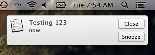
To make sure we get the details right, I set up a test notification and took a screen shot on my Mac. Here’s what the window looks like:

As you can see, we have a basic rounded rectangle with a gradient background and a slight transparency. It starts with an icon on the left, followed by a headline that states the alert text and a time stamp under that. Finally, on the right side we have two buttons: snooze and close.
I love looking at things like this and thinking about how to build them with CSS. It may seem like a pointless exercise, but it’s a great way to hone your coding chops. Never stop practicing! Let’s get started.
Step 1. The HTML
To start this project, let’s jump into the markup. Our goal here is to look at the example above and see if we can break it down into different elements. I like to start with my basic containers and think about how objects are grouped. Obviously, the window itself will need a div, and we can drop the icon right inside of that.
From here though, there are two text objects that need to be grouped and two buttons that need to be grouped. We’ll use a “message” div and “buttons” div for these.
<div class="notification">
  <img src="" alt="">

  <div class="message">
  </div>

  <div class="buttons">
  </div>

</div>
Filling in the Gaps
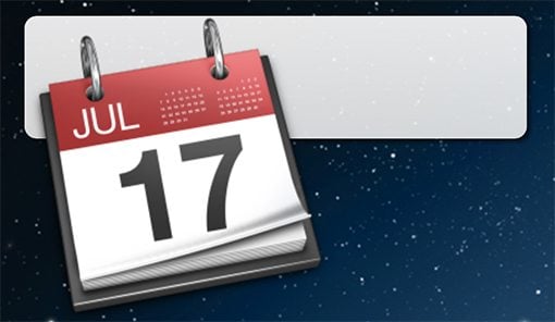
Now that we’ve got our containers set up, it’s time to fill them in. I started off by integrating a PNG for the app icon, I decided to go with the Calendar icon (I’m not sure I’ll ever stop thinking of it as iCal).
From here, I threw in an h2 for the alert message and a paragraph for the time stamp. To finish off, I used two simple anchor tags for the buttons and gave them the “Snooze” and “Close” text that we saw above.
<div class="notification">
  <img src="http://cl.ly/J49B/3951818241085781941.png" alt="Calendar icon">

  <div class="message">
    <h2>Follow the white rabbit</h2>
    <p>90 Minutes Ago</p>
  </div>

  <div class="buttons">
    <a href="#">Close</a>
    <a href="#">Snooze</a>
  </div>

</div>
Step 2. Starter CSS
To start off our CSS, we’ll need two things. First up is a lazy man’s reset just to make sure our positioning is going to be spot on. If you’re not a fan of the universal selector, feel free to code up your own reset or normalizer.
After that, I tossed in the default Mountain Lion desktop image as the background to the body so our finished project really communicates the OS X theme.
* {
  padding: 0;
  margin: 0;
}

body {
  background:#222 url(http://cl.ly/J3q4/universe.jpg);
}
Step 3. Window CSS
Now it’s time to code up our window. This will be accomplished in three distinct steps. First we’ll outline the basic shape, then we’ll assign some basic text styles and finally we’ll finish up with the visual icing that comes from our CSS3.
The Box
Coding up the basic shape is super easy. All we need is a height, width, margin (optional, just sets it out from the edge), and border-radius to round off the corners. Notice how we don’t require any browser prefixes for this anymore. It’s a beautiful thing.
I also threw on a relative positioning context. This will provide a starting point for the absolute positioning that we’ll use on the buttons later.
.notification {
  height: 100px;
  width: 410px;
  margin: 20px;
  border-radius: 10px;
  position: relative;
}
Type
Now let’s add a color and font-family to establish a baseline for any text inside the box. We’ll set the font styles individually for each item, but this provides a nice fallback.
.notification {
  height: 100px;
  width: 410px;
  margin: 20px;
  border-radius: 10px;
  position: relative;

  color: #4d4d4d;
  font-family: Helvetica, Arial, sans-serif;
}
CSS3
To finish up, let’s toss in a background gradient and box-shadow. Because I’ll be using CodePen for the demo, it’s easy enough to cheat with the gradient and use Compass (the syntax is much easier this way).
The gradient starts at white, then fades to a very light gray. Using RGBa, I was able to include a little bit of transparency here.
.notification {
  height: 100px;
  width: 410px;
  margin: 20px;
  border-radius: 10px;
  position: relative;

  color: #4d4d4d;
  font-family: Helvetica, Arial, sans-serif;

  @include background-image(linear-gradient(rgba(255,255,255,0.9), rgba(235,235,235,0.9)));
  -webkit-box-shadow: 3px 3px 3px rgba(0,0,0,0.5);
          box-shadow: 3px 3px 3px rgba(0,0,0,0.5);
}
Progress Check
With this code, our window itself looks just about perfect. The rest of the items are still a mess, but we’ll fix that!

Step 4. Icon CSS
As you saw in the screenshot, the icon image that I’m using is a bit on the large side. We need to knock it down to around 60px wide, float it to the left and add in some padding.
.notification img {
  float: left;
  padding: 10px 15px 0 15px;
  width: 60px;
}
Step 5. Type CSS
Now let’s get our text under control. We have two style hooks that we need to target: one for the h2 and one for the paragraph. The tricky part here is that you’ll want to apply a white text-shadow. This seems a little odd but it’ll give it a slight bevelled look that will make the text look inset.
.notification h2 {
  padding: 20px 0 0 0px;
  font: bold 18px Myriad, Helvetica, Arial, sans-serif;
  text-shadow: 0px 2px 1px #fff;
}

.notification p {
  font: bold 13px Myriad, Helvetica, Arial, sans-serif;
  text-shadow: 0px 1px 1px #fff;
}
Progress Check
With those quick changes, our notification window is looking much better! In fact, we’re nearly finished. We just need to code up the buttons and make the whole thing draggable.

Step 6. Button CSS
To get the buttons to look the way we want, we’ll need quite a bit of styling. Let’s break it up into a few manageable chunks so it’s not overwhelming.
Basic Button Styles
The first thing we need to do is define the shape and look of the buttons. We’ll split this code up just like we did with the window step above, starting with the basic size and shape, then moving onto the text and finishing up with the CSS3 stuff.
.buttons a {
  display: block;
  width: 60px;
  margin: 5px;
  padding: 8px;
  position: absolute;
  border: 1px solid #999;
  border-radius: 5px;

  color: #222;
  font: 13px Helvetica, Arial, sans-serif;
  text-align: center;
  text-decoration: none;

  -webkit-box-shadow: 0px 1px 1px #fff;
  box-shadow: 0px 1px 1px #fff;
  @include background-image(linear-gradient(rgba(255,255,255,0.5), rgba(235,235,235,0.5)));
}
As you can see, this is very similar to how we styled the window. One notable difference is that we set the position of the buttons to absolute so we can scoot them exactly where we want them within the confines of the relatively positioned parent, which is the “notifications” div.
The text styling is a little more robust this time because links require some extra default style clearing to look decent.
Button Hover
To help the buttons stand out on hover, we’ll tweak the gradient by eliminating the transparency. Easy and subtle!
.buttons a:hover {
   @include background-image(linear-gradient(rgba(255,255,255,1), rgba(235,235,235,1)));
}
Positioning the Buttons
Now that our buttons look nice and pretty, it’s time to shove them into place. Because we’re using absolute positioning, this is actually really easy. More interesting is how we’re targeting each button: the nth-child CSS3 selector. This allows us to grab specific buttons without adding any extra classes in our HTML.
These selectors should work great across the board, even on IE9. For IE8 and previous, hit up Selectivizr.
.buttons a:nth-child(1) {
  right: 10px;
  top: 8px;
}

.buttons a:nth-child(2) {
  right: 10px;
  top: 50px;
}
Progress Check
Our notification window is all done! It looks pretty awesome if I do say so myself. To make it even cooler, jump to the next step.

Step 7. Make it Draggable
Just for fun, I want to make it so that a user can click and drag this window all around the screen just like with windows in your operating system. Sounds complicated right? Actually, with a little jQuery magic, it only takes a tiny bit of JavaScript to pull off.
$(function() {
    $( ".notification" ).draggable();
});
That’s it! We simply target our “notification” div and call the draggable function. It couldn’t be any easier.
Check Out the Demo
We all finished with our Mountain Lion notification window. Check out the live demo, embedded below via CodePen.
[/code]


Interestingly enough, the click and drag functionality only works on the CodePen site, so go here to see the full page demo and be sure to drag the window around.
Update
Doh! I just noticed that I swapped around the "close" and "snooze" buttons from how they appear in Mountain Lion. I fixed the code so it should be correct now.
Conclusion
So there you have it, a Mountain Lion style notification window coded purely with good old HTML & CSS (and a tiny bit of optional jQuery). What other popular interface items would you like to see turned into tutorials? Leave a comment below and let us know!