Code a Spinning Circular Menu With CSS
Don’t be a square, break outside your boring box and try on a circle for size. Today we’re going to build a circular navigation menu that spins to different points as the user hovers over an anchor.
Along the way we’ll have to overcome several obstacles like how to structure our HTML to be conducive to a remote hover and how to position all of the elements just right so that everything works. It’s a fun challenge and there’s a lot to learn, let’s get started!
Step 1: Structural HTML
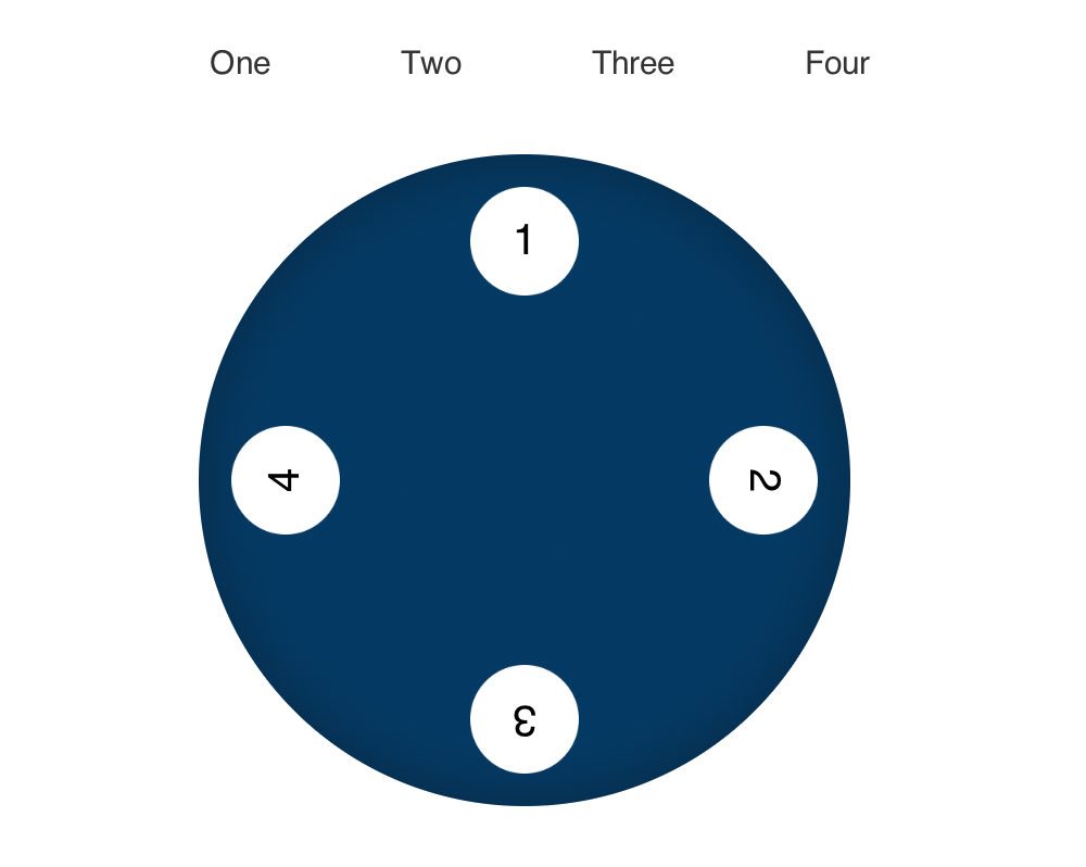
Before we write a single character of HTML, we have to figure out the structure of what it is that we’re building. For this, we can turn to Photoshop and make a basic sketch of how we want the menu to look. Here’s what I came up with:
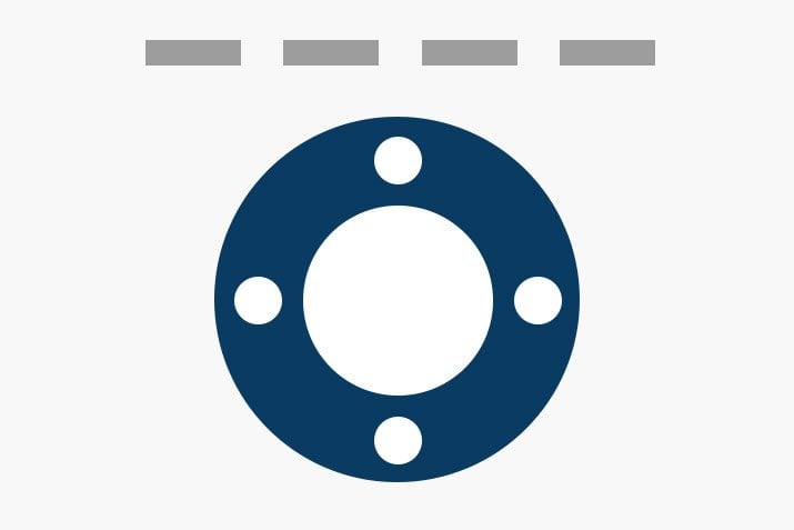
Basically, each of the rectangles at the top are tied to one of the four little circles inside of the big circle. When a rectangle is hovered over, its corresponding little circle will rotate up to the top of the menu. Again, we’re making use of the concept of a “remote” hover because the user interacts with one area and it affects another.
Every time I try to pull off a remote hover, it takes me a few tries to get the structure just right. This is because of the way CSS selectors work, and more specifically, the way the hover pseudo class works. Consider the following:
<div class="item-1">
  <a href="#">anchor</a>
</div>

<div class="item-2">
  <p>target</p>
</div>
Let’s say that we put this structure into place with the idea that we wanted a hover over the anchor to change the color of the paragraph. If you have a basic idea of how remote hovers work, you might come up with some CSS like this:
a:hover p {
  color: blue;
}
As it turns out, this simply doesn’t work. In our CSS selector, we have to tie the anchor being hovered in with the paragraph to be acted upon, but our elements are in two completely separate divs. There’s no easy way to climb this far up and across the DOM tree.
So what do we do? The answer lies in restructuring our HTML. This time we’ll toss the two elements onto the same level of the tree.
<div class="item-1">
  <a href="#">anchor</a>
  <p>target</p>
</div>
Now our paragraph is a sibling of our anchor, which means we have a clear way to tie them together in our CSS. Here’s how it works:
a:hover + p {
  color: blue;
}
This time around, we’re telling the browser to trigger a color shift on any paragraph that is the immediate sibling of an anchor that is being hovered over.
Application
If we apply this knowledge to our scenario, we can come up with a structure that works. Start by creating three divs: wrapper, menu and circle. Nest menu inside of wrapper and circle inside of menu.
<div class="wrapper">
  <div class="menu">
    <div class="circle">
    </div>
  </div>
</div>
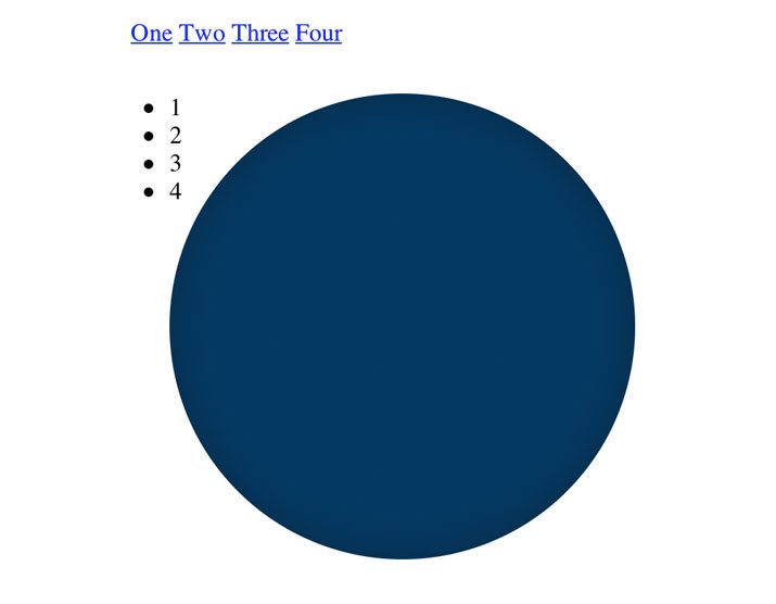
Inside of the menu div, place four anchors, each with a unique class. Inside of the circle div, place an unordered list containing the numbers one through four.
<div class="wrapper">
  <div class="menu">
    <a href="#" class="one">One</a>
    <a href="#" class="two">Two</a>
    <a href="#" class="three">Three</a>
    <a href="#" class="four">Four</a>

    <div class="circle">
      <ul>
        <li>1</li>
        <li>2</li>
        <li>3</li>
        <li>4</li>
      </ul>
    </div>

  </div>
</div>
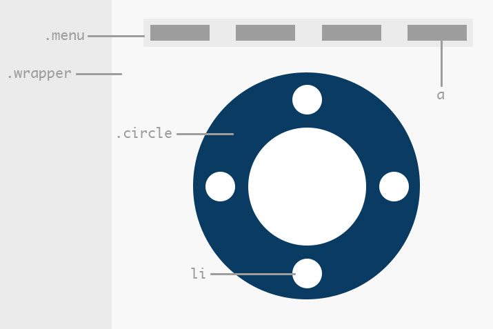
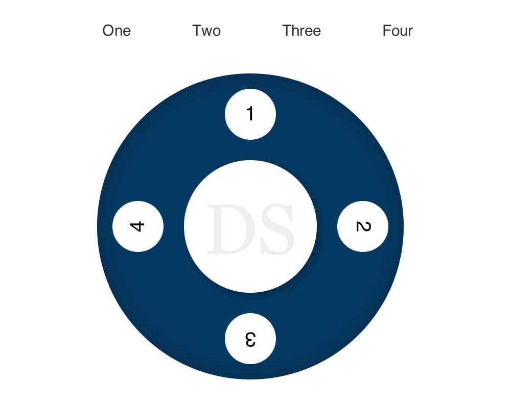
It might still be a little confusing as to how all of these pieces relate to our previous sketch, so let’s update it with some visual cues to give you an idea of what everything does.
Step 2: Wrapper CSS
The code above represents all of the HTML that we’ll need for this little project. The rest of our work is all CSS. To begin, let’s lay down some basic resent and positioning code:
* {
  margin: 0;
  padding: 0;
  -webkit-backface-visibility: hidden;
}

/*WRAPPER*/
.wrapper {
  position: relative;
  margin: 20px auto;
  width: 3670px;
}
There’s not much here to be confused about, we’re simply sketching out our wrapper. Note that the -webkit-backface-visibility bit is to prevent a bug that causes Webkit to flicker on CSS transitions.
Step 3: Circle CSS
Next we’ll jump to coding that big circle. Making a circle in CSS is pretty easy, just make sure that the height and width are equal and that the border-radius is set to at least 50%. Everything else here just helps position everything nicely.
/*MAIN CIRCLE*/
.circle {
  position: relative;
  margin-top: 30px;
  margin-bottom: 20px;
  margin-left: 25px;
  width: 300px;
  height: 300px;
  border-radius: 50%;
  background: #093b62;
}
To make the circle look a little fancier, let’s add in an inset shadow. Finally, we toss in a transition so that the circle will animate the rotation that happens later.
/*MAIN CIRCLE*/
.circle {
  position: relative;
  margin-top: 30px;
  margin-bottom: 20px;
  margin-left: 25px;
  width: 300px;
  height: 300px;
  border-radius: 50%;
  background: #093b62;

  box-shadow: inset 0px 0px 30px rgba(0,0,0,0.3);
  -webkit-box-shadow: inset 0px 0px 30px rgba(0,0,0,0.3);

  -webkit-transition: all 0.5s ease;
  -moz-transition: all 0.5s ease;
  -ms-transition: all 0.5s ease;
  -o-transition: all 0.5s ease;
  transition: all 0.5s ease;
}
If we take a look at our live preview, we should have a nice big circle and some other various scattered elements that we’ll address next.
Step 4: Menu CSS
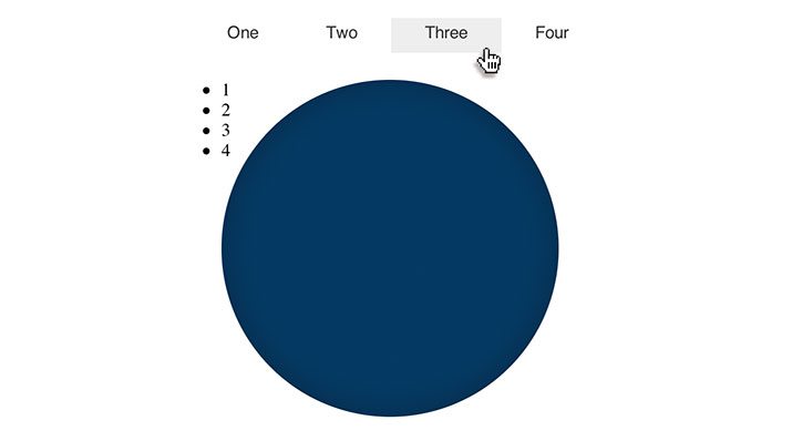
For our next trick, we’ll style the menu items. To do this, target the anchors, add in some margin and padding, set the width and the color, strip out the text-decoration and style the font. Then target the hover state and add in a background color. Here’s the code:
.menu a {
  margin-right: -4px;
  padding: 10px 30px;
  width: 50px;
  color: #333;
  text-decoration: none;
  font: 15px/25px Helvetica, Arial, sans-serif;
}

.menu a:hover {
  background: #eee;
}
Now if we check out our live preview, the links in our menu will look much nicer. The list items are still all out of whack though so we’ll attack those next.
Step 5: Little Circle CSS
To create the little circles, we first target the list items and set them up very similar to the big circle: make the height and width equal and set the border-radius to 50%. Also be sure to clear the bullet points, set the background to white, and style the font like you see below.
/*LITTLE CIRCLES*/
.circle li {
  position: absolute;
  width: 50px;
  height: 50px;
  border-radius: 50%;
  background: white;
  list-style: none;
  text-align: center;
  font: 20px/50px Helvetica, Arial, sans-serif;
}
Here’s the tricky part. Above, we gave each of the circles absolute positioning, so now we have to scoot them into place. We can target each individual circle with nth-child, then use top and left to nudge them where we want them. Finally, we want to make it so that the top of each number faces the outer edge of the big circle so that when the whole element rotates, the number on top is always right side up. We do this by using a CSS transform.
.circle li:nth-child(1) {
  top: 15px;
  left: 125px;
}

.circle li:nth-child(2) {
  top: 125px;
  left: 235px;
  -webkit-transform: rotate(90deg);
  -moz-transform: rotate(90deg);
  -ms-transform: rotate(90deg);
  -o-transform: rotate(90deg);
  transform: rotate(90deg);
}

.circle li:nth-child(3) {
  top: 235px;
  left: 125px;
  -webkit-transform: rotate(180deg);
  -moz-transform: rotate(180deg);
  -ms-transform: rotate(180deg);
  -o-transform: rotate(180deg);
  transform: rotate(180deg);
}

.circle li:nth-child(4) {
  top: 125px;
  left: 15px;
  -webkit-transform: rotate(270deg);
  -moz-transform: rotate(270deg);
  -ms-transform: rotate(270deg);
  -o-transform: rotate(270deg);
  transform: rotate(270deg);
}
If we take a look at our preview now, everything is pretty great. There’s one thing that’s not quite right though…
Step 6: Inner Circle CSS
Our original concept wasn’t just one big circle, there was also centered inner circle. We can pull this off without any extra HTML markup using our old friend before. Create an element before wrapper, set the content to “DS”, make it a circle like the others (130px this time), align and style the text, move it to the top with z-index and scoot it into place with absolute positioning.
/*INNER CIRCLE*/
.wrapper:before {
  content: "DS";
  text-align: center;
  font: 70px/135px Georgia, Times, serif;
  color: #efefef;
  position: absolute;
  top: 140px;
  left: 110px;
  z-index: 10;
  width: 130px;
  height: 130px;
  border-radius: 50%;
  background: #fff;

  -webkit-box-shadow: 3px 3px 10px rgba(0,0,0,0.3);
  box-shadow: 3px 3px 10px rgba(0,0,0,0.3);
}
That looks much better! With that, our visual styling is completely finished. Now all that’s left is to bring this sucker to life.
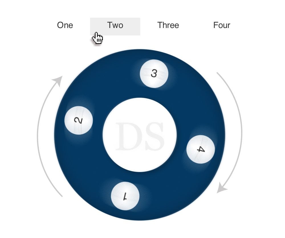
Step 7: Hover Circle CSS
To make our menu spin, we have to use our remote hover trick combined with a CSS transform. When the user hovers over one of the top menu items, the entire circle element will spin so that the corresponding number is on top.
The trickiest part of this is figuring out the selector. We start at the highest level that contains both the circle div and the menu items. This is of course the menu div. Then we narrow our options down to a specific child of the menu and target it on hover. Finally, we tell the browser that we want to act upon any sibling of that item being hovered over with a class of “circle.” Here’s what that looks like in practice:
.menu > .two:hover ~ .circle {
}
It’s a beast of a selector, but it gets the job done and is good enough for our fun little experiment. Now, since we’re targeting the second circle here, we need to rotate the whole div by 90 degrees. Also, since we want to go counter-clockwise, the number will be negative:
.menu > .two:hover ~ .circle {
  -webkit-transform: rotate(-90deg);
  -moz-transform: rotate(-90deg);
  -ms-transform: rotate(-90deg);
  -o-transform: rotate(-90deg);
  transform: rotate(-90deg);
}
That’s all there is to it, now we simply use this technique across all four circles. We start with a rotation of 0, then -90, -180 and finally, -270.
/*HOVER STATES*/
.menu > .one:hover ~ .circle {
  -webkit-transform: rotate(0deg);
  -moz-transform: rotate(0deg);
  -ms-transform: rotate(0deg);
  -o-transform: rotate(0deg);
  transform: rotate(0deg);
}

.menu > .two:hover ~ .circle {
  -webkit-transform: rotate(-90deg);
  -moz-transform: rotate(-90deg);
  -ms-transform: rotate(-90deg);
  -o-transform: rotate(-90deg);
  transform: rotate(-90deg);
}

.menu > .three:hover ~ .circle {
  -webkit-transform: rotate(-180deg);
  -moz-transform: rotate(-180deg);
  -ms-transform: rotate(-180deg);
  -o-transform: rotate(-180deg);
  transform: rotate(-180deg);
}

.menu > .four:hover ~ .circle {
  -webkit-transform: rotate(-270deg);
  -moz-transform: rotate(-270deg);
  -ms-transform: rotate(-270deg);
  -o-transform: rotate(-270deg);
  transform: rotate(-270deg);
}
Take a Look!
Congratulations, you’re finished! Now it’s time to check out the fruits of our hard labor. Here’s a demo.
Demo: Click here to launch.
As always, thanks a bunch for reading and feel free to leave a comment below to let me know what you think. There are a bunch of different ways that you could approach this project, how would you have done it differently?