Now to add the hover effect. The first thing we want to do is make the thumbnails expand when you hold your mouse over them, this is accomplished easily with the hover psuedo-class.
Now, with just this code, we’ll get the basic layout changes that we want. This is important because this means that any browsers that don’t support what we do next will still function just fine on this page, albeit in a simplified manner.
To make the effect more interesting though we’ll throw in a basic CSS transition. First, we specify that the width is what we want to target, then we implement a duration and how we want the animation to progress (easing). Finally, as always, we make sure to cover our bases with the browser prefixes.
If you’re ever unsure about a CSS3 transition, or any other syntax for that manner, check out CSS3Maker.com, which will generate the code for you from simple controls.
Preview
That’s all there is to it! With that, we have a cool sliding doors effect similar to something you frequently see in jQuery. Click here or on the image below to see a live preview of what we just built.
As you can see, as you hover over an image, it slowly expands. The layout adapts nicely as the other images move over. It’s super simple but quite fun to play with.
Going Further: A Thumbnail Gallery
Now that we have our basic concept figured out and working smoothly, it’s time to see how you could design an entire web page around this concept. Instead of just three images, we’ll be expanding to a larger gallery of thumbnails. Let’s get started with some HTML.
Images HTML
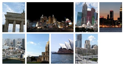
The first thing we want to do is lay out our images just like we did before. This time however, we will have two rows of four. Notice that I’ve separated them into two distinct sections. My original idea was to have the gallery reflow so that as an image expanded and pushed the others forward, they would automatically jump down into the next row. This worked great at first, but I noticed that hovering over the last image in a row was problematic as it would jump down while you were hovering. It worked, but was simply too awkward. I think this solution is much more elegant and still easily expandable.
[/code]
Basic Starter CSS
Next we’ll toss in a big chunk of CSS to start making everything look good. This is a lot of code so let’s go through it step by step. First, we start off with a basic reset of margins and padding just to make sure all browsers are on the same page. Next, we added a width and some margins to our container. Finally, we styled the actual gallery.
The gallery images are basically the same thing we did in the previous example only with the addition of more rows. Again I used classes for both rows and individual gallery items to make sure that our code is succinct and that the gallery can grow easily.
At this point, your grid of images should start taking shape. Now we’ll go through the same steps as we did before to bring it to life.
Transition CSS
All we have to do to make this thing work is to add a hover effect and a transition. I applied the same transition as we did before but I changed the size of the expanded width this go around. I wanted the grid to stay nice and clean so I made the expanded width of one image take up the same exact amount of space as two non-expanded images.
Since each image is 150px wide, two images will obviously be 300px wide. However, there is also a margin of 5px added to each and when we take that into consideration we see that the proper size is 310px wide for the expanded thumbnail.
With this code, our gallery is complete. The animations are fluid and having multiple rows really makes the effect more impressive. If you wanted to add another row, just copy and paste a galleryRow div; no more CSS is necessary.
Here’s what the gallery looks like now. Notice how the expanded image is exactly the same width as the two smaller images below it.
Finishing the Page: HTML
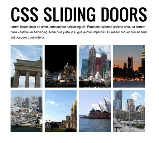
I never like to leave an example so plain so let’s finish out the design. To do this, we add a basic header and paragraph explaining the gallery.
CSS Sliding Doors
Lorem ipsum dolor sit amet…
[/code]
I’ll also throw this snippet into my header so I can use “Oswald” from the Google Font Library.
[/code]
Finishing the Page: CSS
Our final step is to style these two portions of text. Notice that I’m using shorthand for the font, which saves a ton of space in our CSS. You can see that I declared the Oswald font just like I would any other. Though the options are still fairly limited, I really love how simple and non-restrcitive the Google Font Library is to implement.
Finished Product
Our little project is now complete. Take a look at the live demo below to see it in action. Isn’t it great how much we can now accomplish without a single line of JavaScript?
Live Demo: Click Here
Leave a comment below and let us know what you think of this effect. Also be sure to mention any ideas you have for improving it!